Home / Work / Natureza & André Cury
Natureza & André Cury — Billboard and bus-back ads
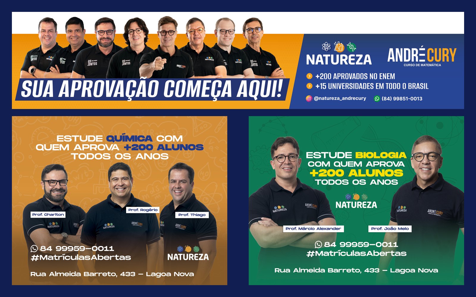
Enrollment campaign in out-of-home media for a test-prep school: a panoramic billboard and a bus-back series by subject, designed to be read in a few seconds, from a distance and on the move.
STAGE 01Context and goal
Natureza and André Cury are test-prep schools for the national university entrance exam that present themselves together. The enrollment campaign called for out-of-home media: a panoramic billboard and bus-back ads, where the brand competes with traffic for attention.
The goal of every piece: to be understood in a few seconds, to convey credibility (real teachers, approval numbers) and to lead people to WhatsApp. The brands already existed; my work was the art direction and layout of the campaign.
About authorship: the brands, logos and identities belong to the clients and already existed. Here I show my art direction, layout and application of the identity across the pieces.STAGE 02The out-of-home challenge
People passing by car or bus read a piece in 3 to 5 seconds. So the layout follows fast-reading rules:
- One idea per piece: the headline takes about a third of the area and carries the message on its own.
- Three reading levels: headline, support (numbers or course name) and contact. Nothing more.
- Real faces looking straight ahead: the teachers' photo builds trust and directs the eye to the text beside it.
- Contact last and prominent: WhatsApp, hashtag and address grouped in the footer, where the eye ends.
- High contrast: saturated backgrounds and large uppercase text to survive distance, sunlight and motion.
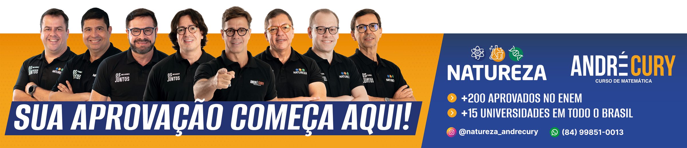
STAGE 03Panoramic billboard: “Your approval starts here!”
The panoramic format (about 4.6 : 1) calls for a band composition. The eight teachers form a continuous horizontal line that guides the eye from left to right, to the information block.
The layout splits the piece in two: on the left, the emotional side (people, orange, slanted headline); on the right, the rational side (blue, brands, numbers and contacts). The headline on the slanted band creates movement and a sense of progress.
STAGE 04Bus-back series by subject
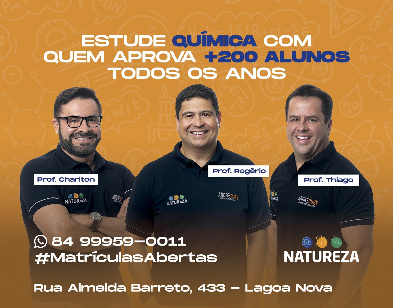
The series works as a system: the layout is fixed (headline on the left, teacher or teachers on the right, footer with WhatsApp, hashtag and address) and only the background color, the photo and the subject change. Each bus is different, yet all read as the same campaign.



STAGE 05ENEM campaign: day 2
For exam week, the campaign spoke straight to the student: “Your 2nd ENEM day deserves the best team”. The headline on a light-blue band is the highest-contrast point of the piece, and the group photo shows the strength of the teaching team. A second version, on a dark background, uses a question (“is it taking your approval?”) to provoke and then delivers the answer in the support text, with address and WhatsApp highlighted.


STAGE 06Color theory
The base is a complementary pair: blue (hue ≈ 226°) and orange (≈ 34°) sit on opposite sides of the color wheel, which produces the strongest possible contrast between two hues. Blue conveys trust, seriousness and focus; orange brings energy, optimism and calls to action (“enroll now”).
Each subject gets its own background color (green for Biology, orange for Chemistry, blue for Physics and Math). This is color coding: students associate the color with the subject, and the campaign gains variety without losing unity, because footer, typography and logos do not change.
- #111E52Azul-marinho profundoFundos, autoridade e confiança
- #223675Azul de marcaFaixas, rótulos e detalhes
- #DE8D22LaranjaÊnfase, chamadas e destaques
- #02704EVerdeConquista, aprovação e Biologia
- #FEFEFEBrancoRespiro e fundos claros
- #151C25GrafiteFundos escuros (peça do 2º dia)
| Pair | Use | Contrast | WCAG |
|---|---|---|---|
| Aa | White text on navy (contact footer) | 15.77:1 | AAA |
| Aa | White text on brand blue | 11.34:1 | AAA |
| Aa | White text on green (Biology) | 6.12:1 | AA |
| Aa | Navy on orange (highlights) | 5.96:1 | AA |
| Aa | White text on orange (Chemistry) | 2.65:1 | fails |
Critical read: white on navy reaches 15.77:1 and works very well. White text on the Chemistry orange sits at 2.65:1, below the WCAG minimum of 4.5:1. In out-of-home this is offset by the huge size and heavy weight of the type, but it is a point I would test with a navy headline (which reaches 5.96:1) in a next version.
Hex values sampled from the published final pieces.STAGE 07Typography and hierarchy
Headlines use a heavy, condensed sans-serif, in uppercase and italic on the billboard, which adds rhythm and speed. Condensing the letters allows a bigger headline in the same width, which is essential when space is tight and reading is quick. Supporting text uses a more neutral sans-serif in medium weight.
Hierarchy comes from size, weight and color: key words in the headline take the accent color (for example, the subject name), and the contact data stays smaller but grouped and aligned.
STAGE 08What I take from this project
Out-of-home is the opposite of a layout to read at leisure: every element has to justify the space it takes. Working in series with a system (fixed layout, variable color) taught me to deliver many versions consistently and quickly, something I also use in product design.