Arthê Studio — Social media
Social media pieces for a beauty salon specialized in hair color and curly hair: team posters, Instagram highlights, feed posts and educational carousels in a bold magenta and lime palette.
STAGE 01Context and goal
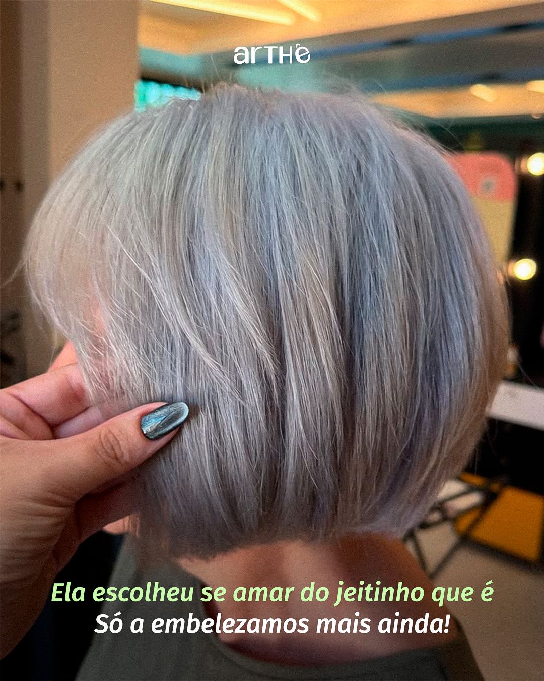
Arthê Studio is a beauty salon in Rio Grande do Norte, Brazil, specialized in hair color and curly hair, with a team of six professionals. The social goal is twofold: to show results (real photos of transformations) and to educate the client about care and coloring, so she trusts the salon before booking.
About authorship: the brands, logos and identities belong to the clients and already existed. Here I show my art direction, layout and application of the identity across the pieces.STAGE 02Visual direction
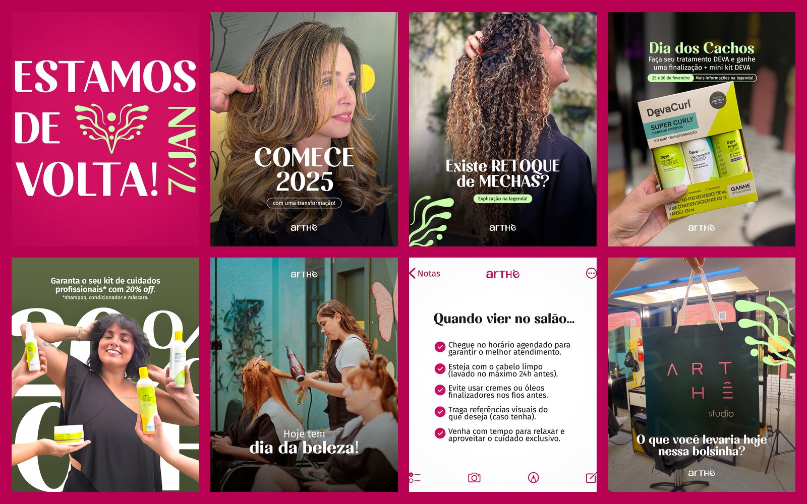
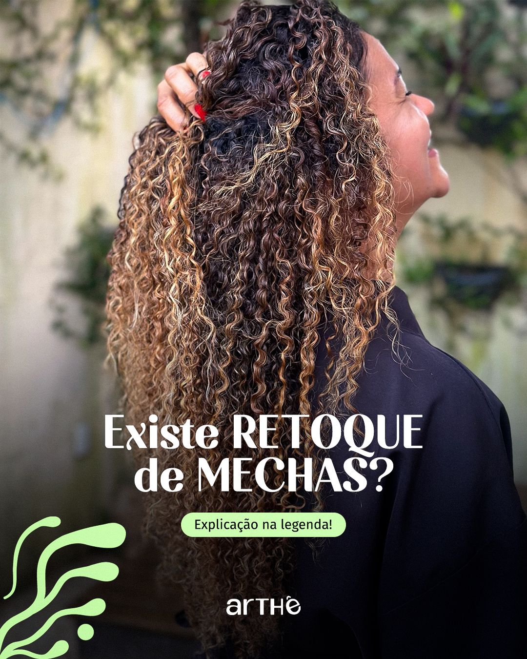
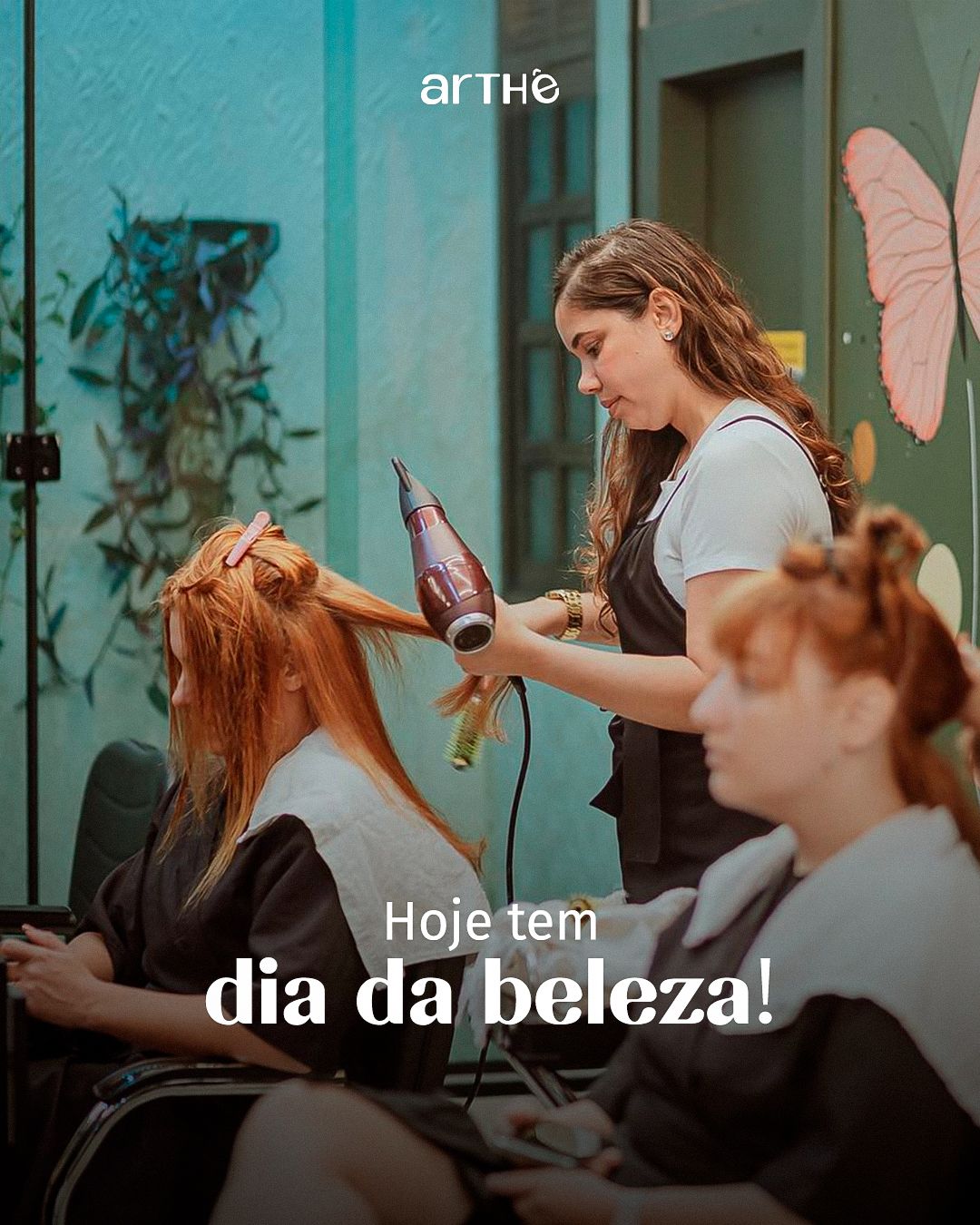
The brand already had a bold identity. My art direction reinforced three ideas: vibrant color (magenta as the signature), organic shapes (curves and green leaves that echo curls and growth) and high-contrast serif headlines, which bring elegance and femininity. Real hair photos are always the center of the piece.
STAGE 03Team posters
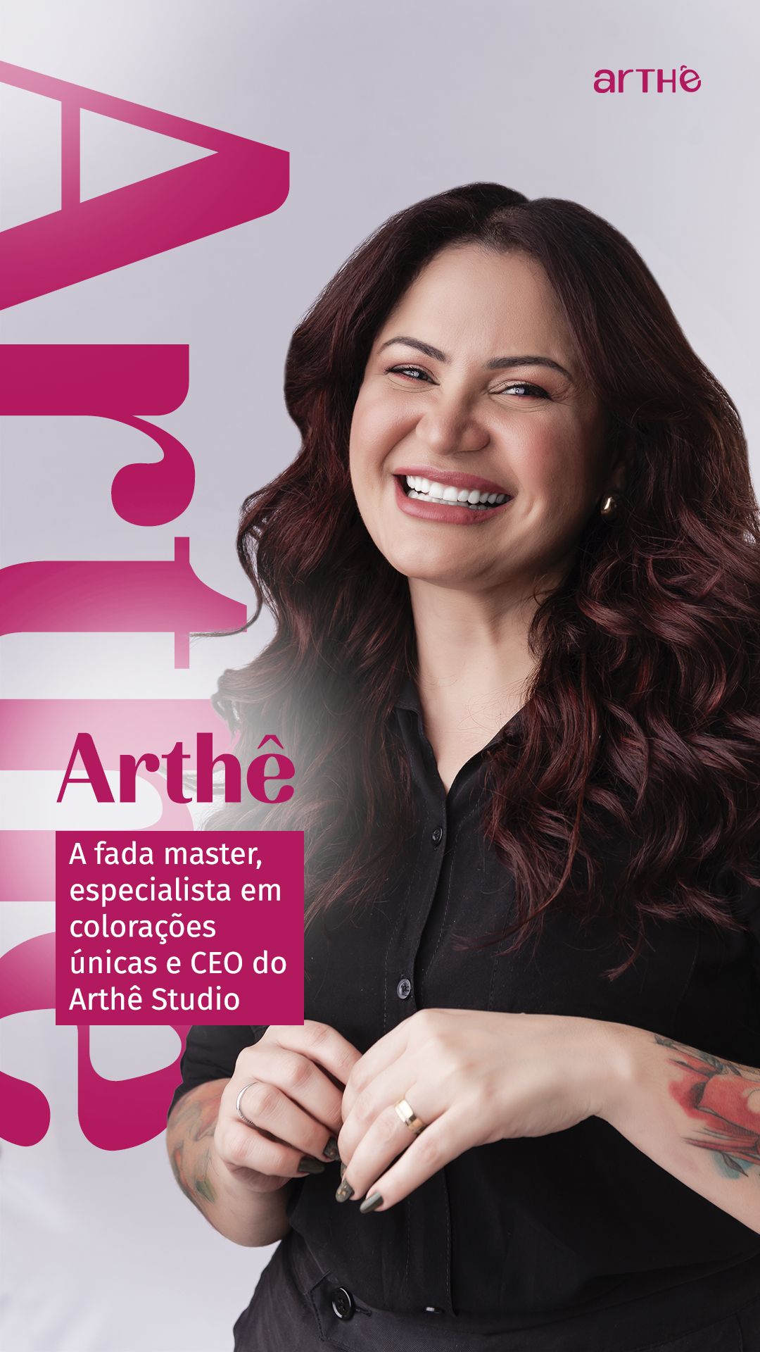
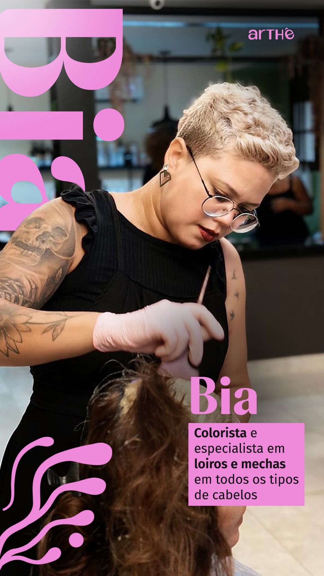
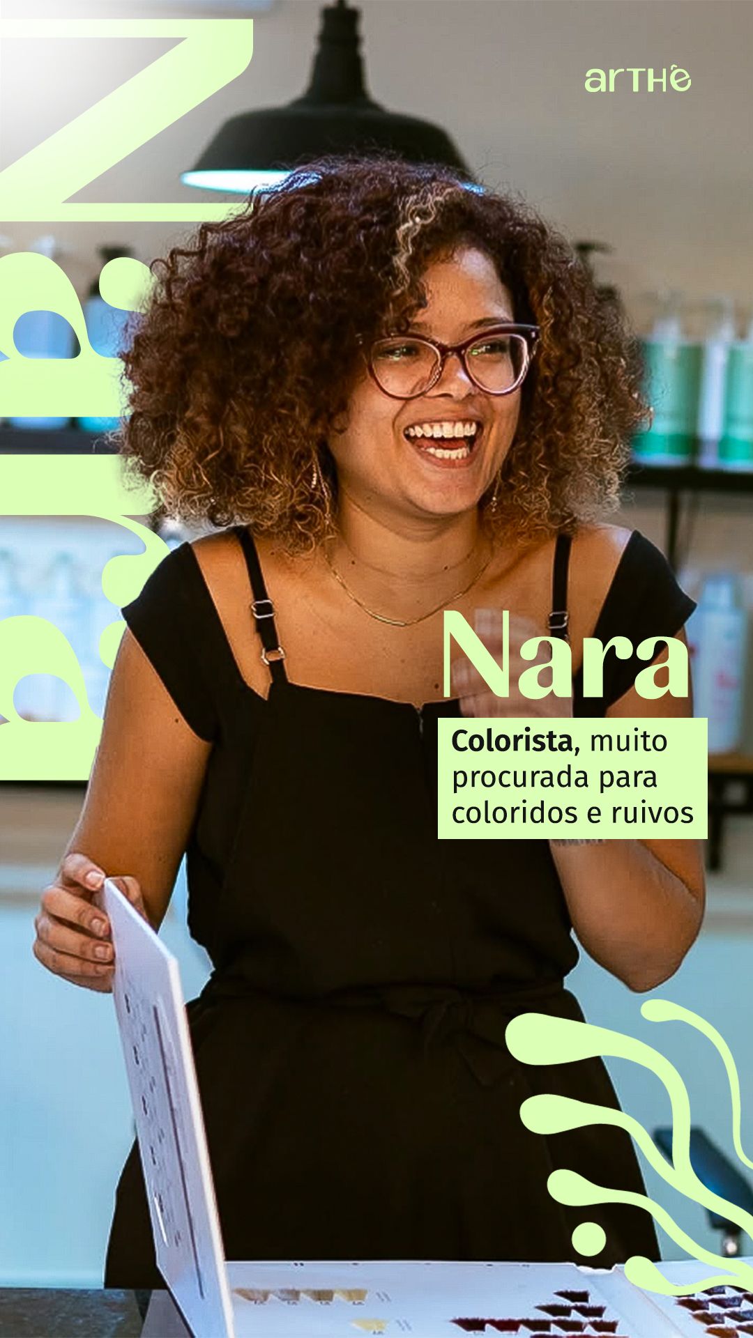
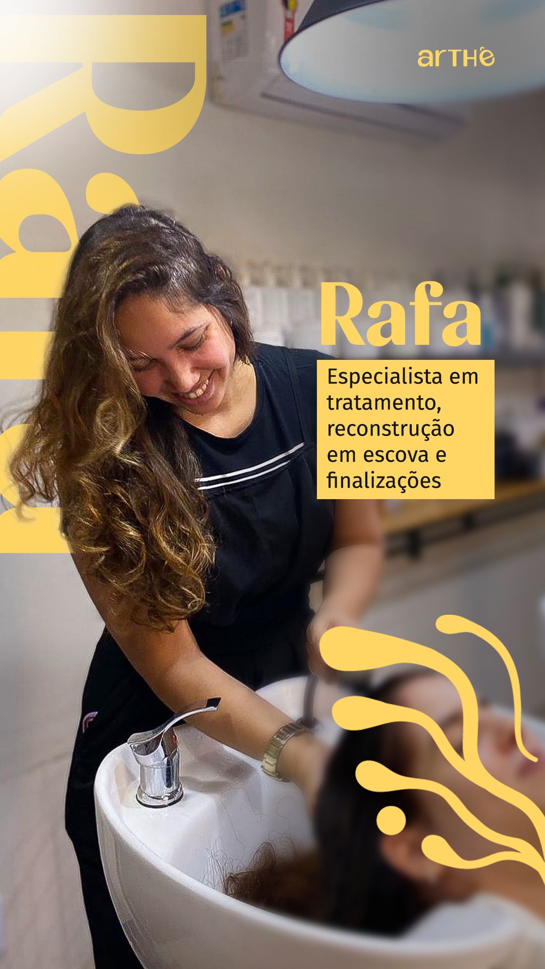
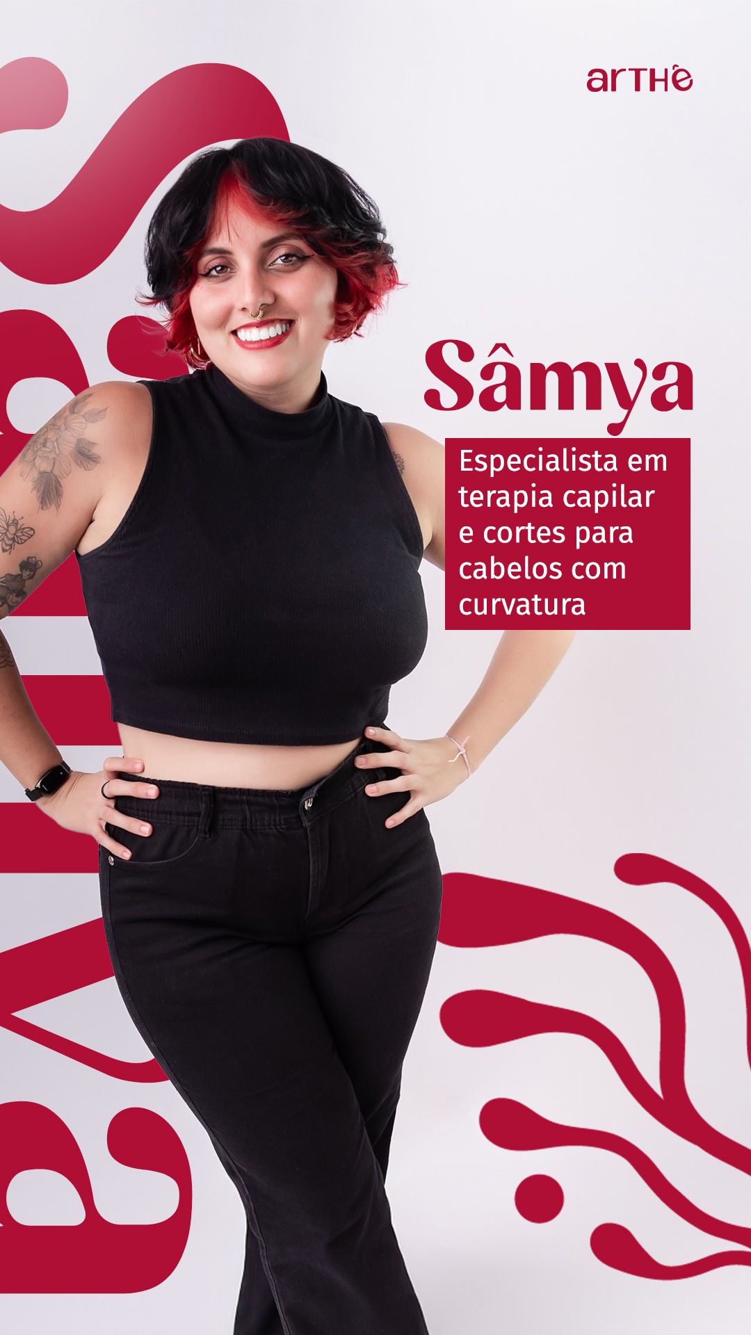
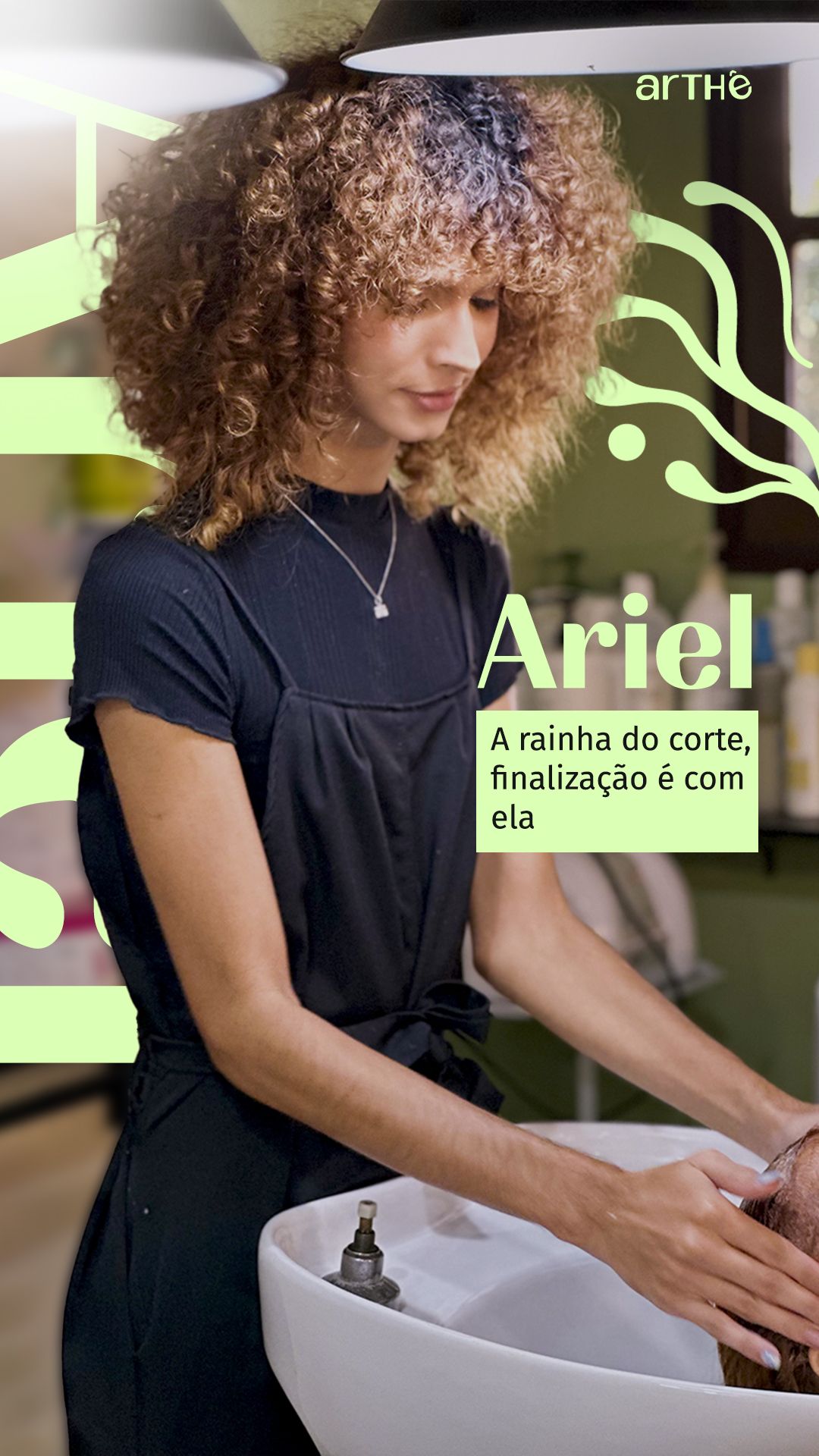
Each professional got a story poster. The oversized, rotated name behind the photo creates depth and makes the person the protagonist. A bright badge explains the specialty in one sentence. Each poster uses a different support color (pink, yellow, green, red), which gives individual identity within a shared pattern.
STAGE 04Instagram highlights
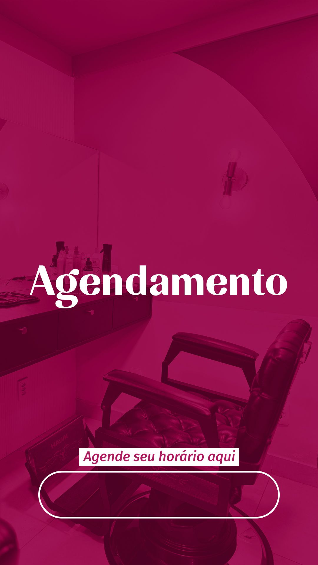
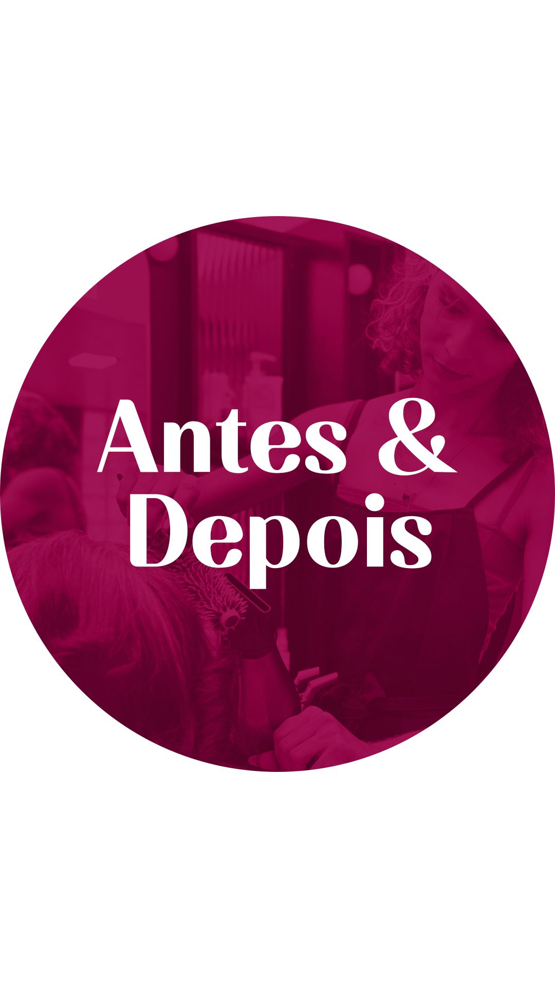
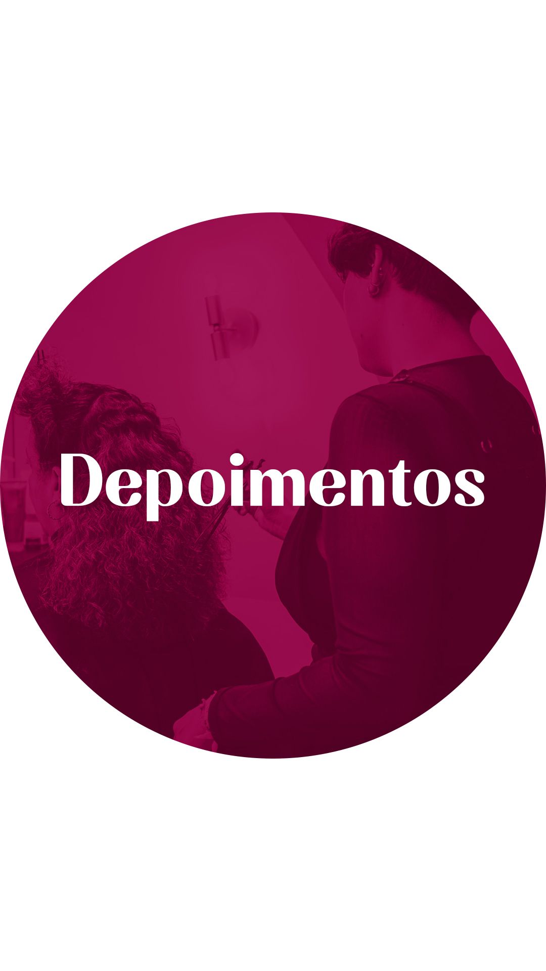
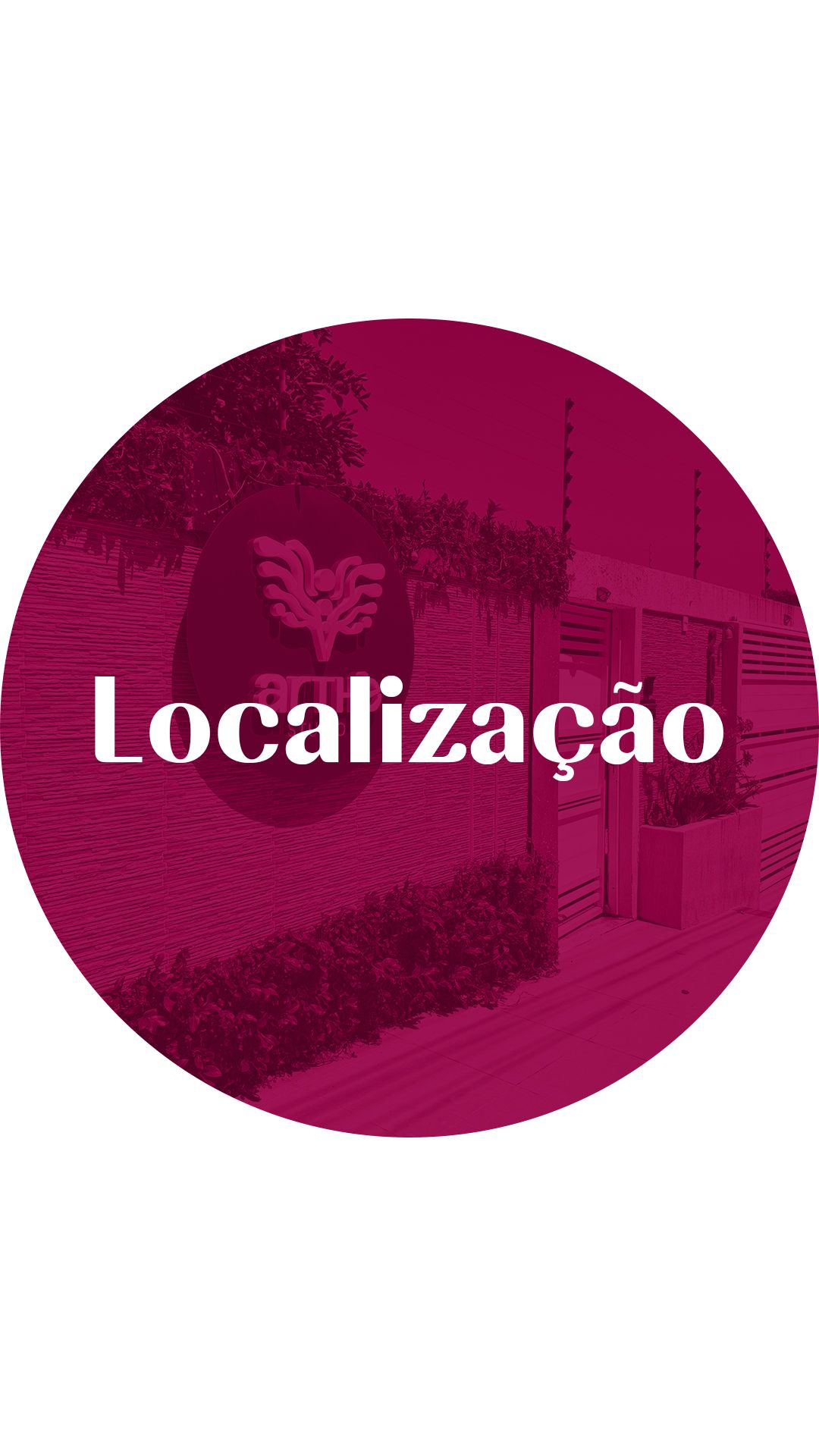
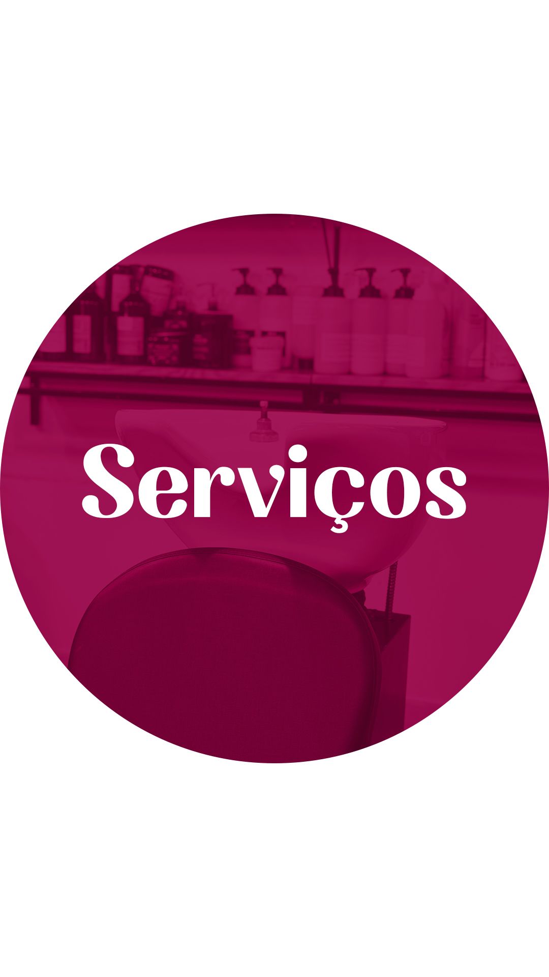
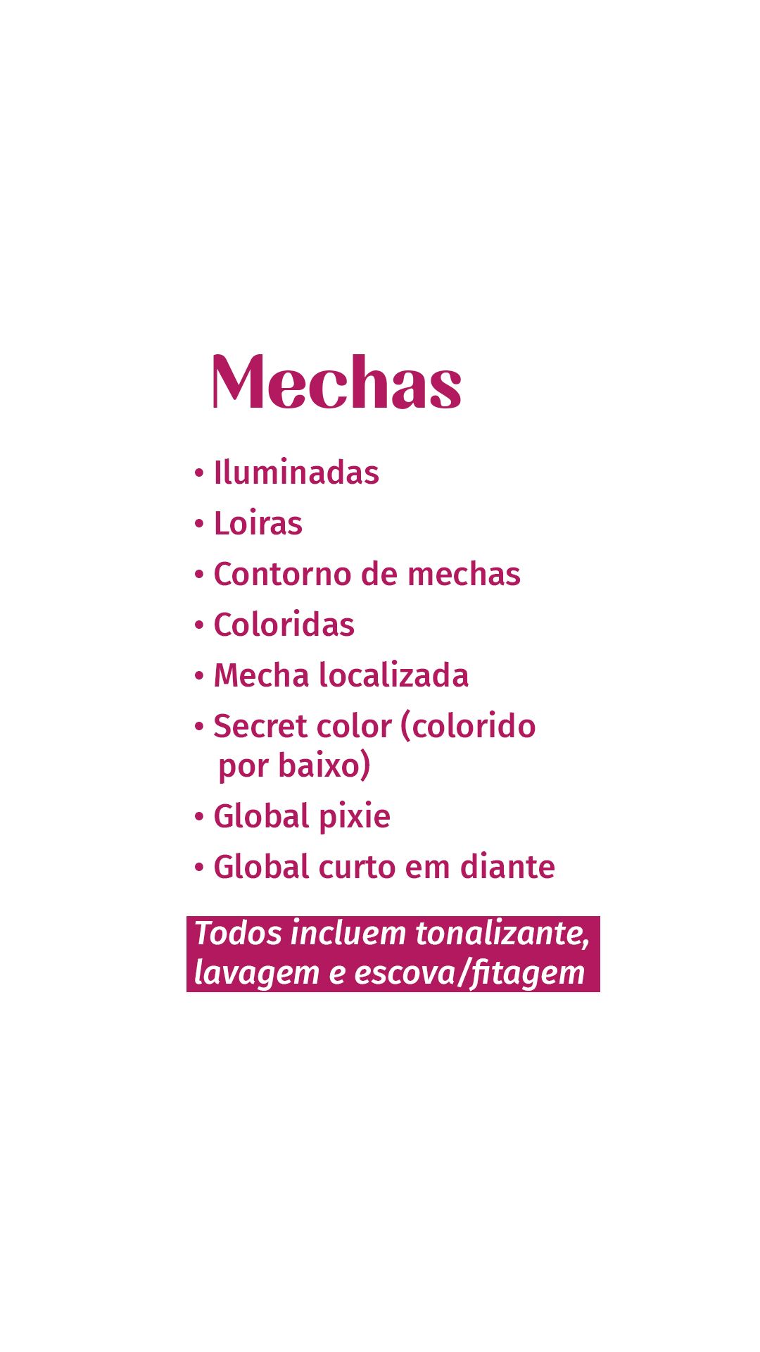
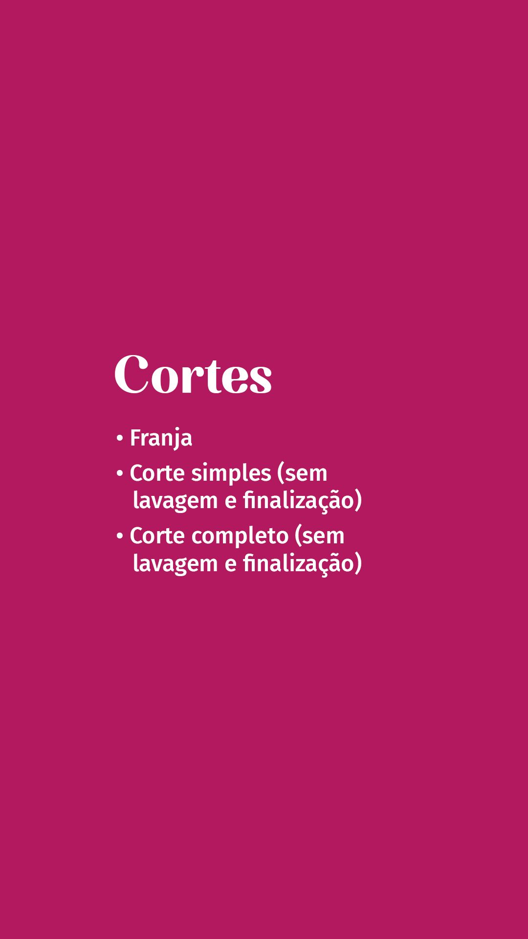
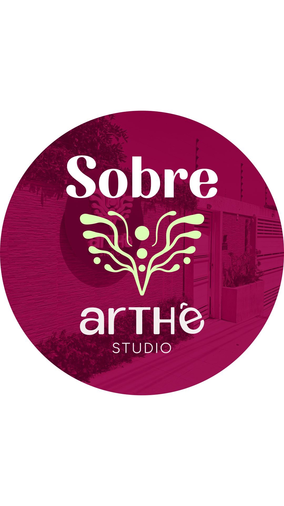
Highlights organize what the client looks for first: booking, services, location, before and after, testimonials and about us. The covers alternate a magenta circle on white with a magenta background, which creates a row with rhythm, and the service screens use short lists with colored bullets, easy to read on a phone.
STAGE 05Feed
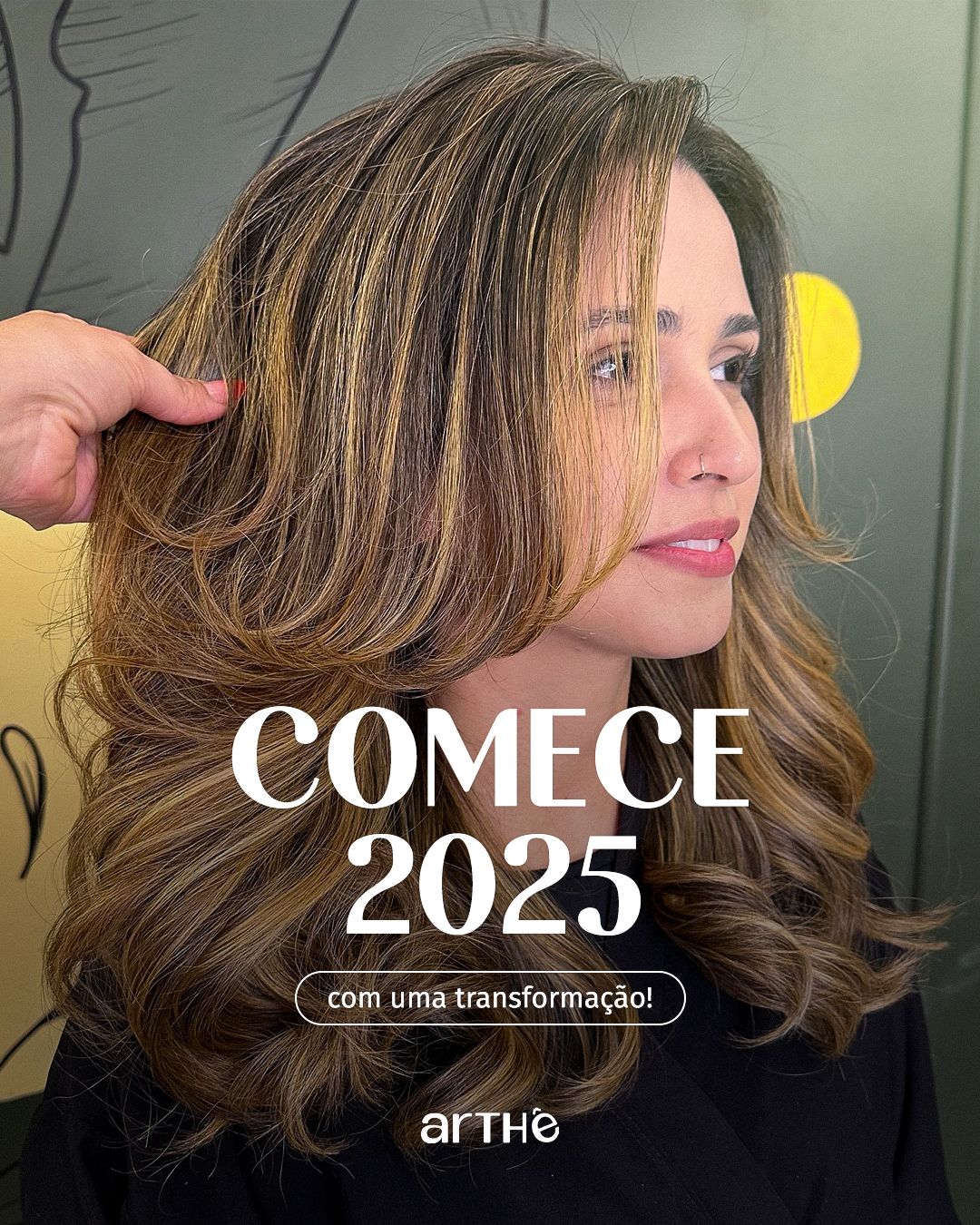
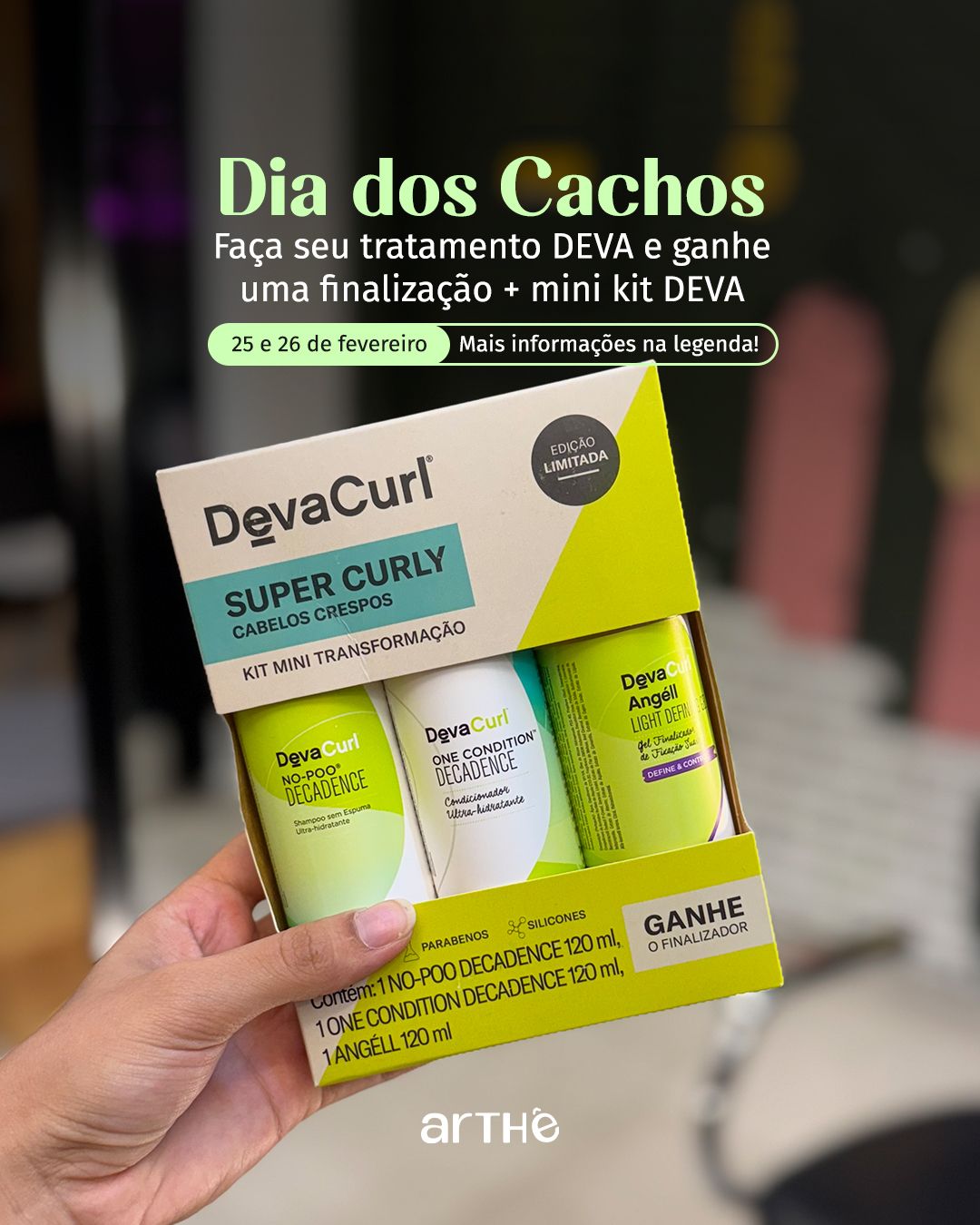
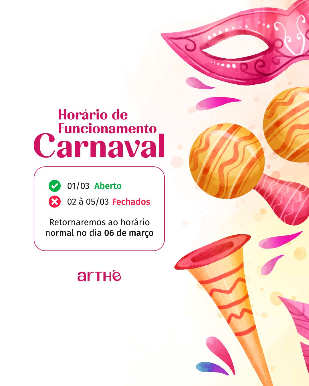
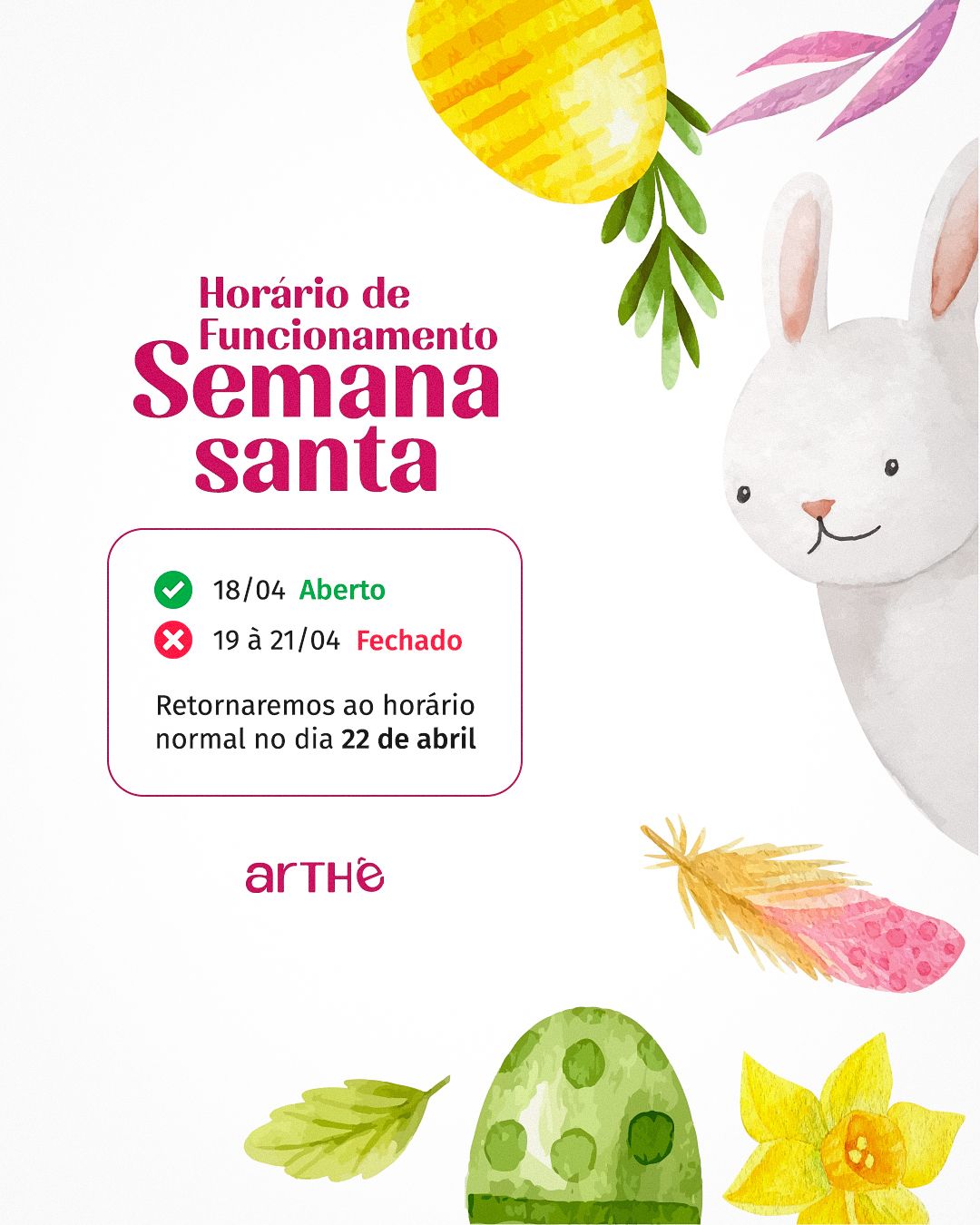
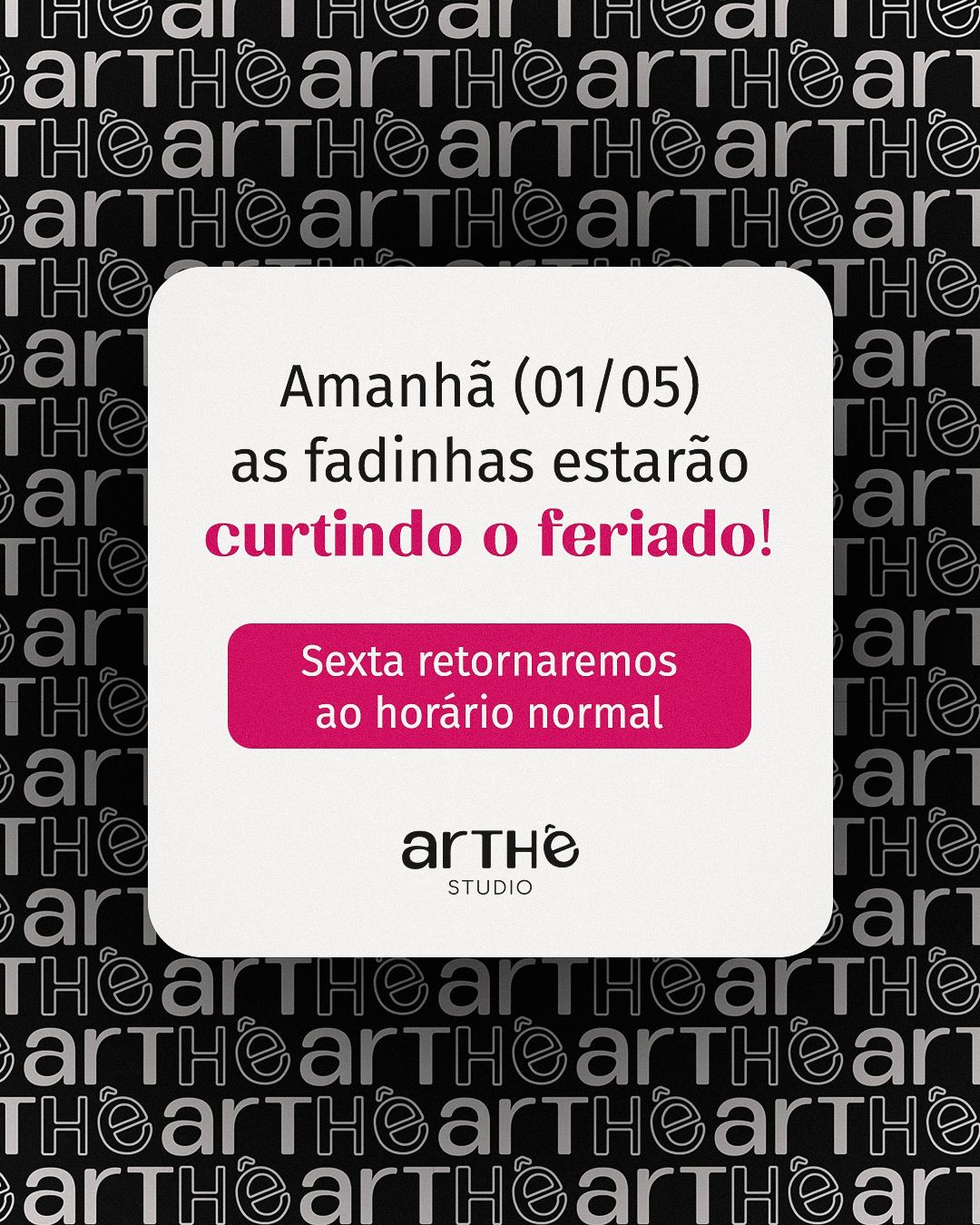
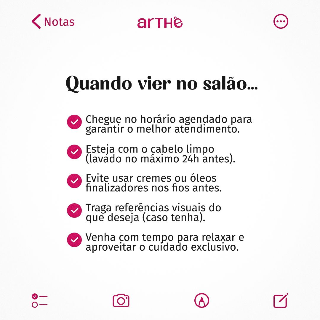
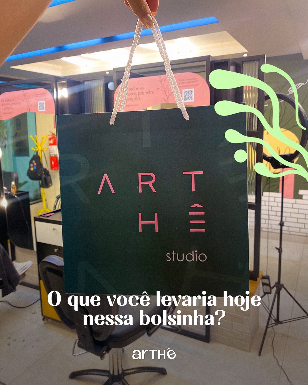
The feed mixes three kinds of pieces: photos with overlaid headlines (results and inspiration), graphic notice pieces (hours, holidays, campaigns) and featured products. The discreet logo always sits in a fixed position, which ties everything together.


STAGE 06Educational carousels
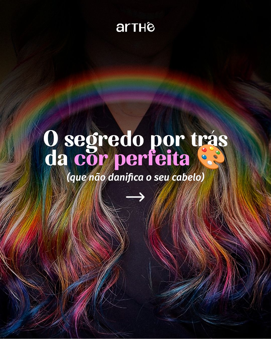
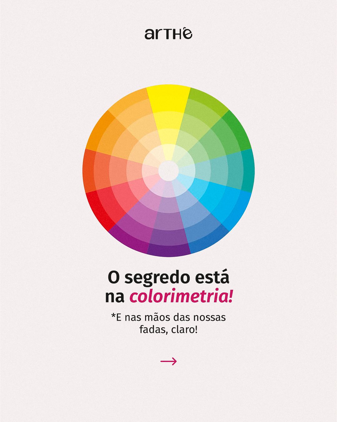
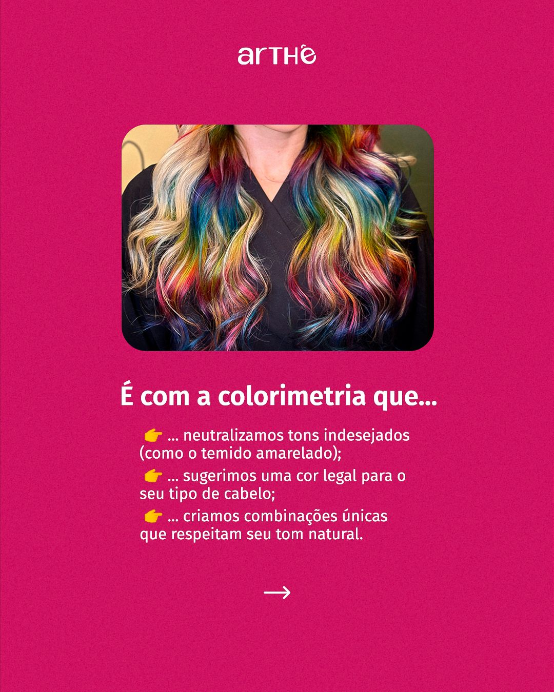
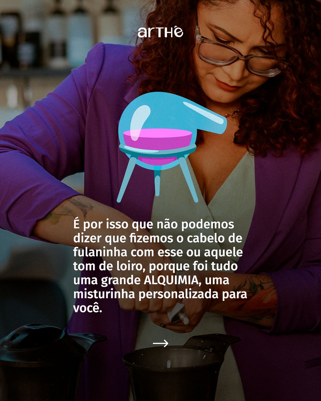
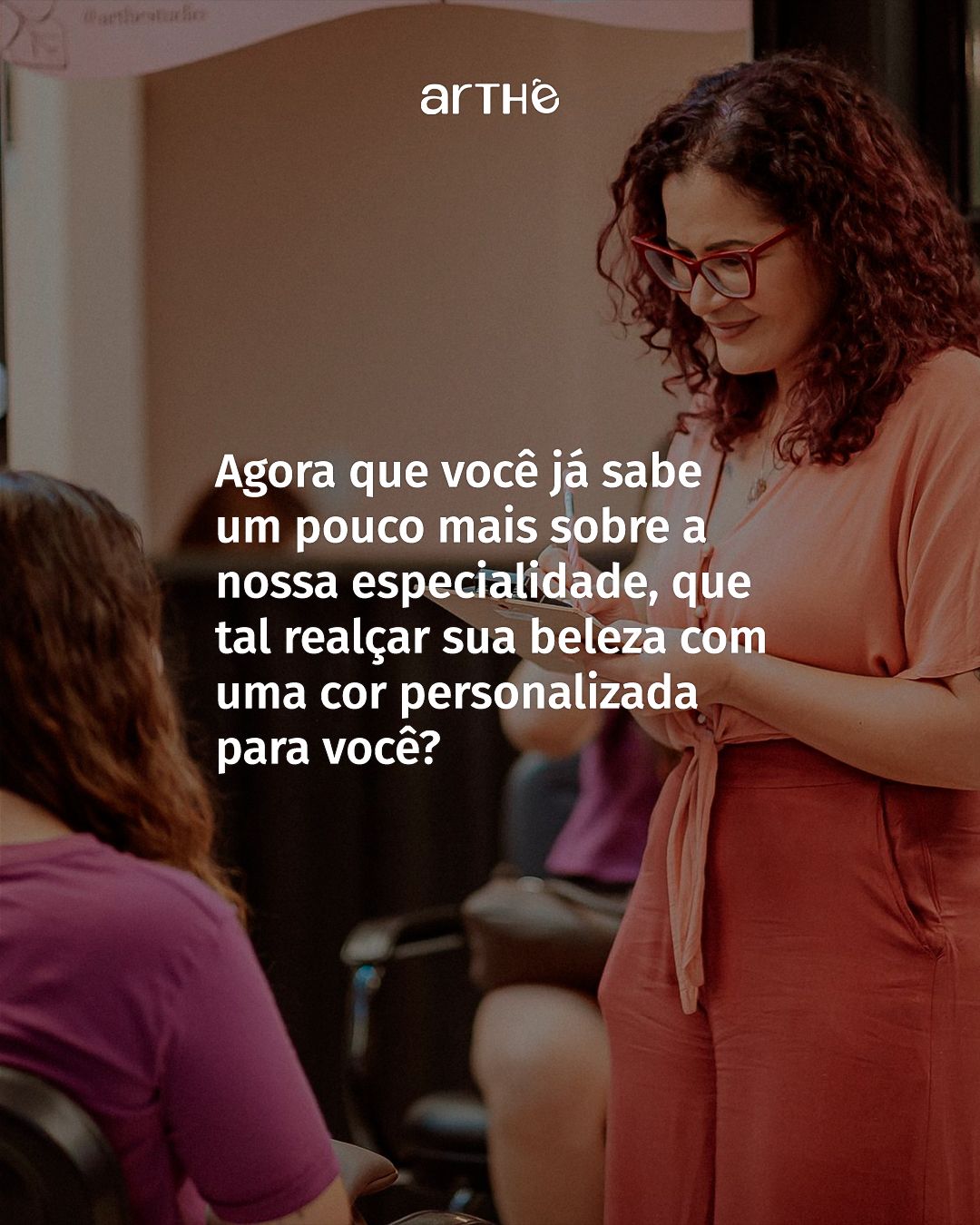
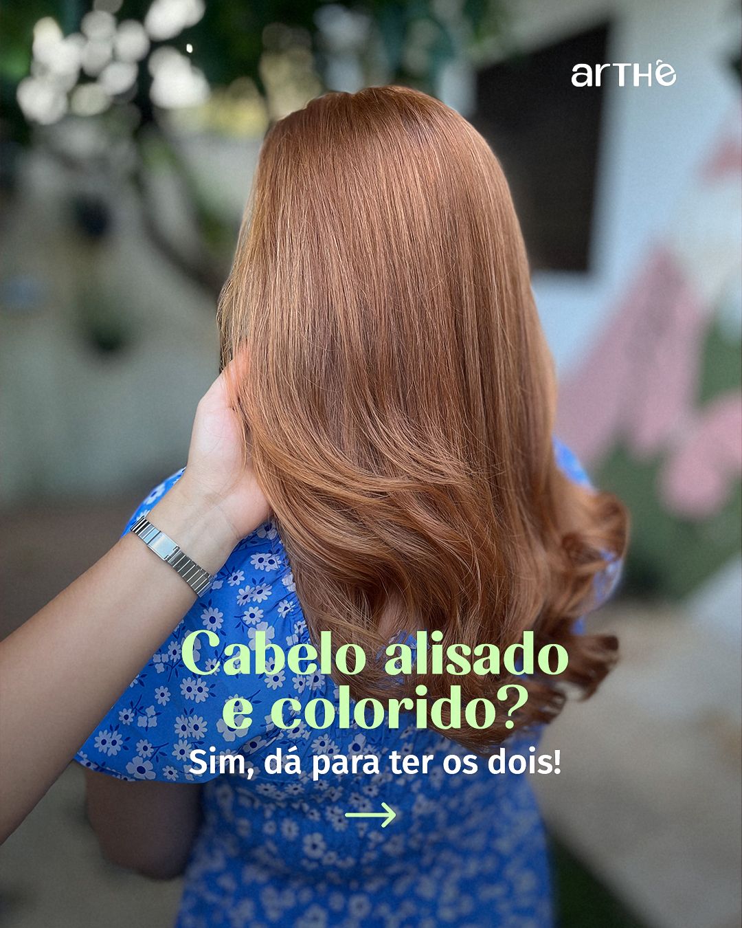
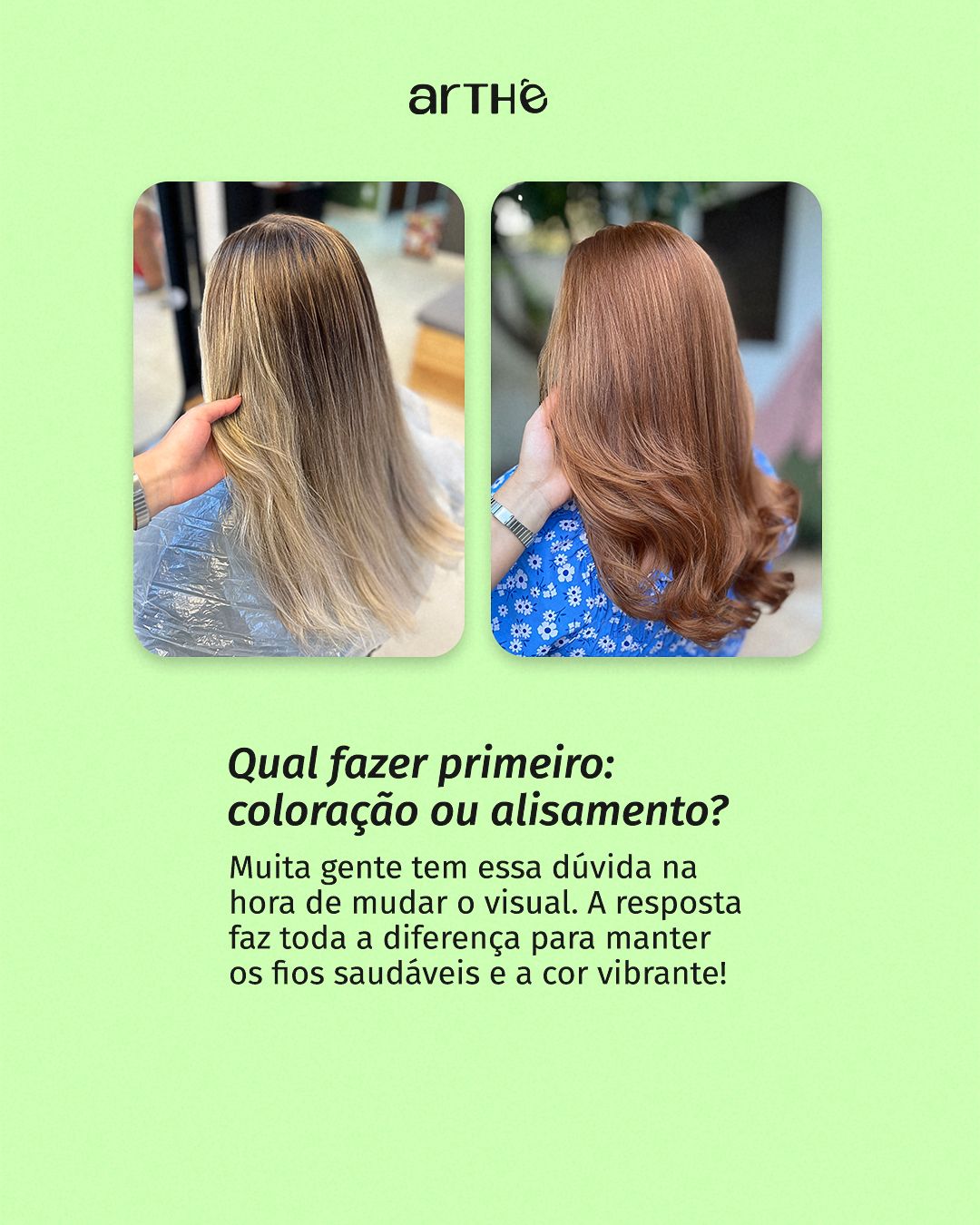
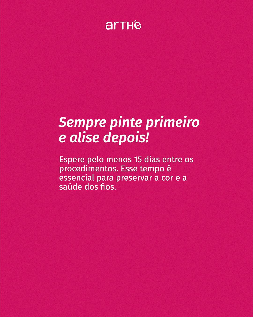
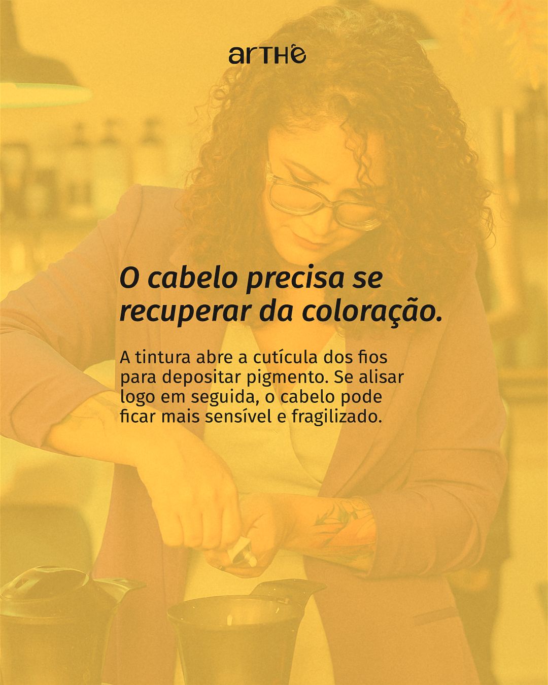
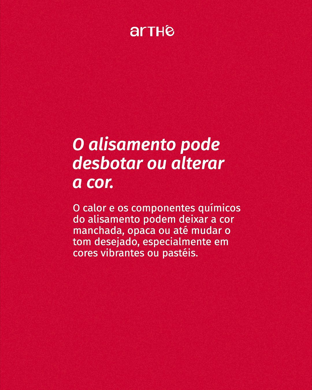
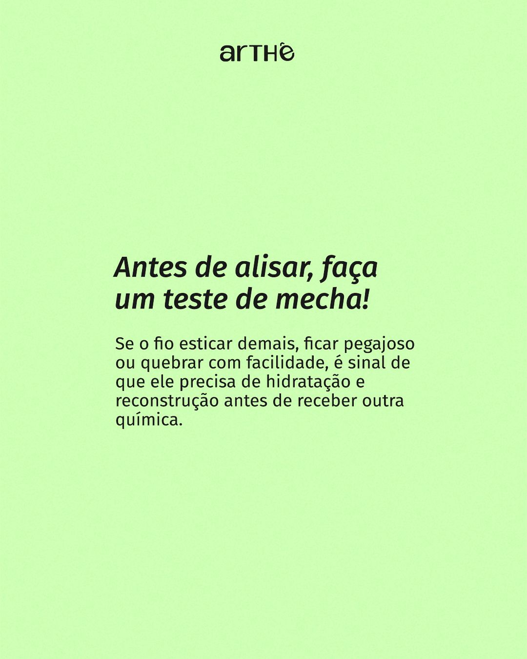
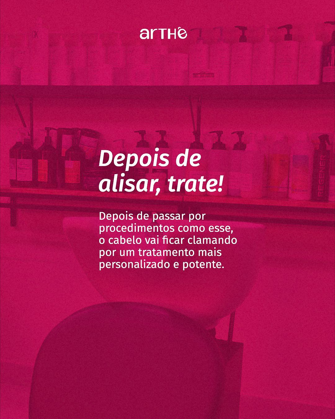
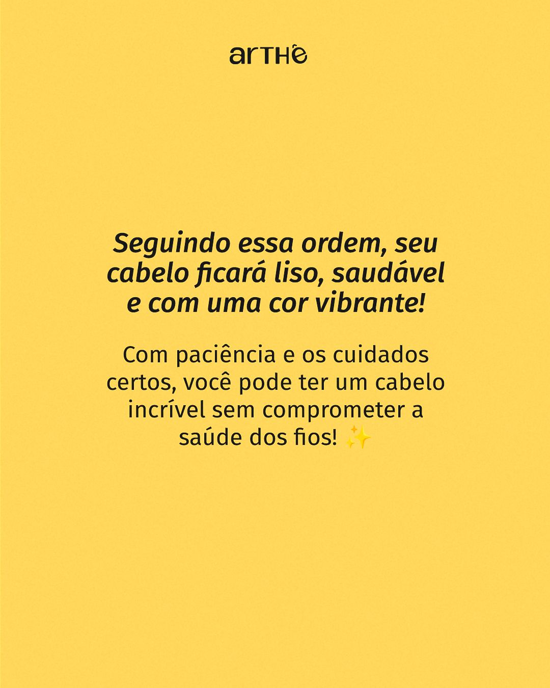
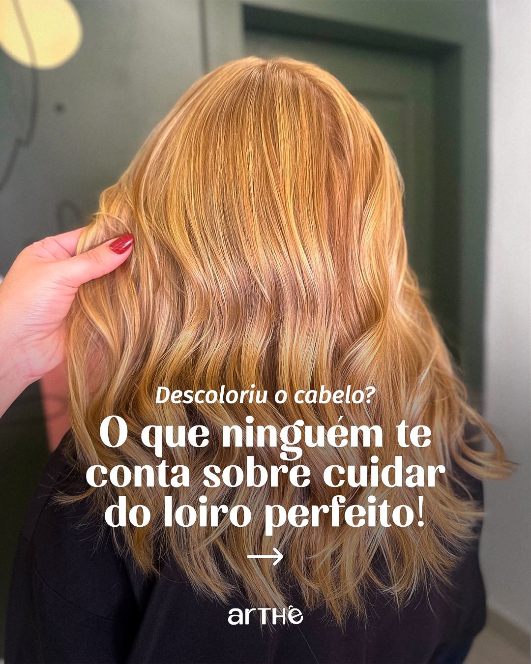
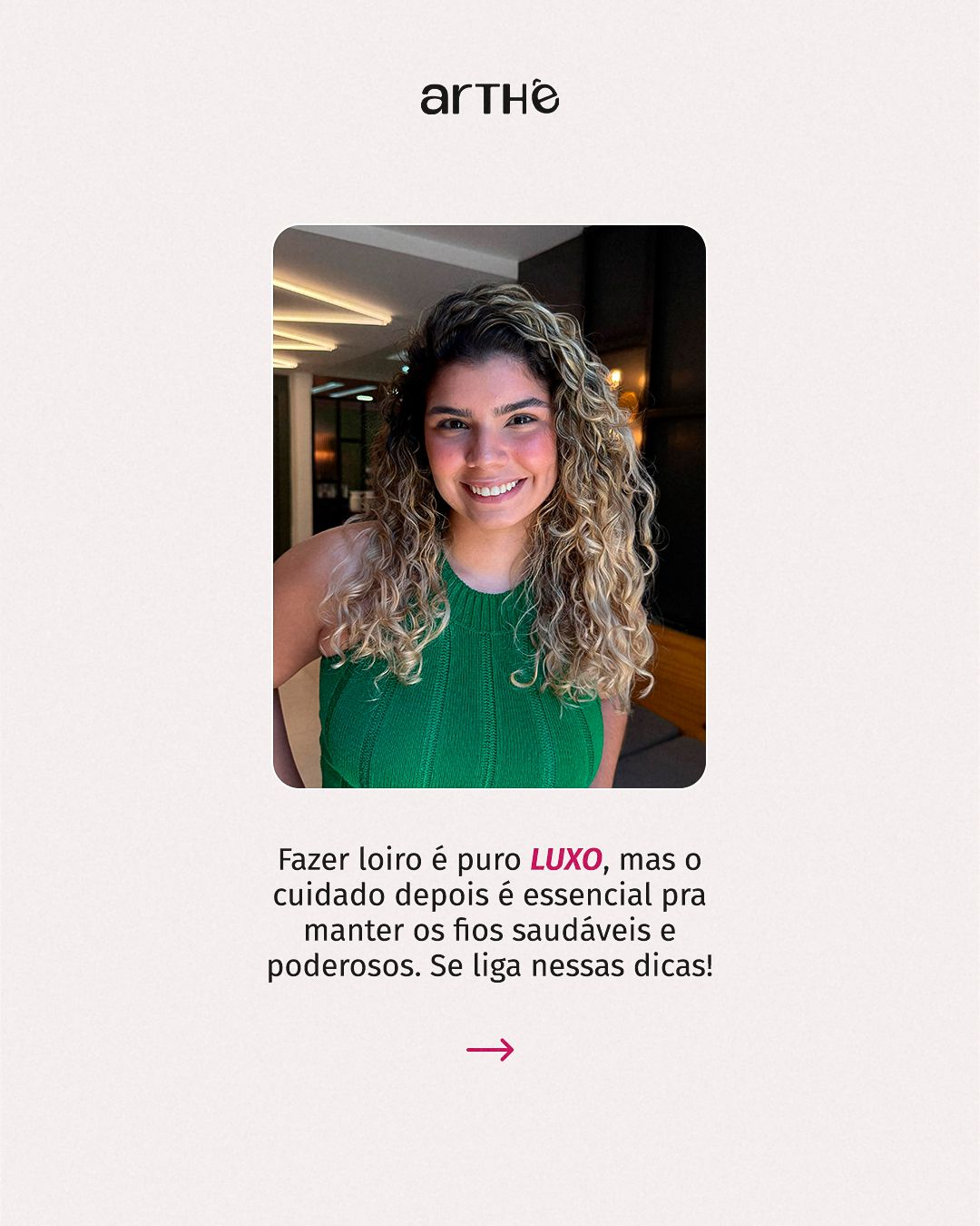
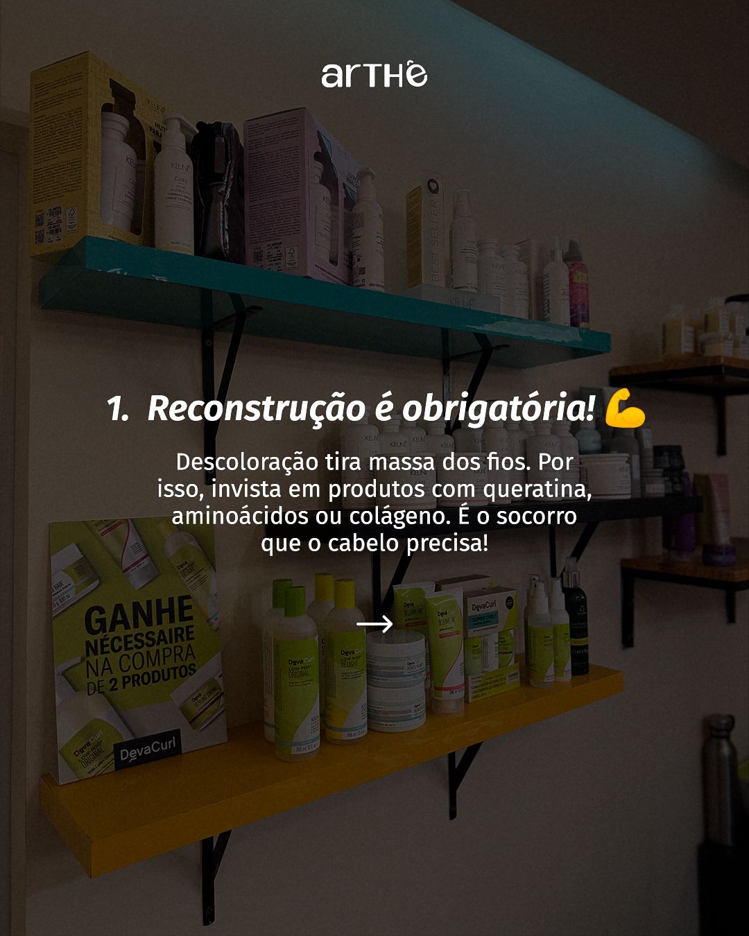
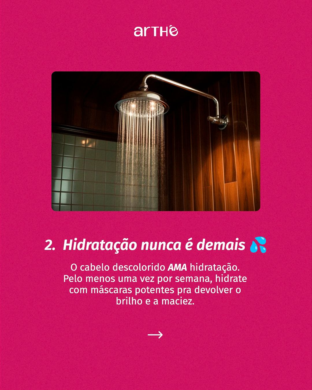
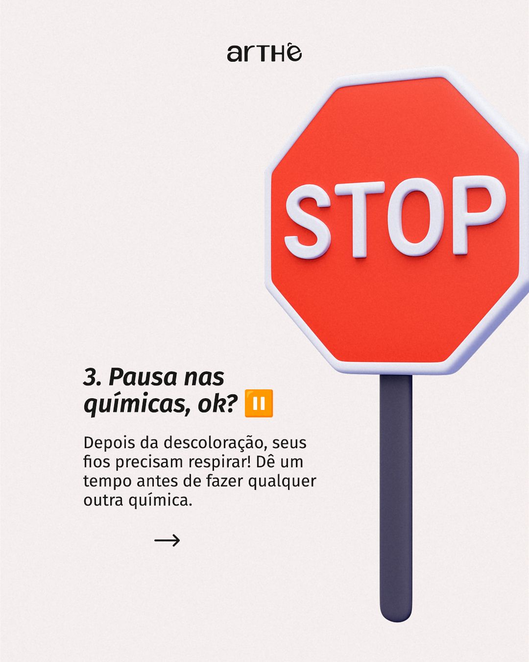
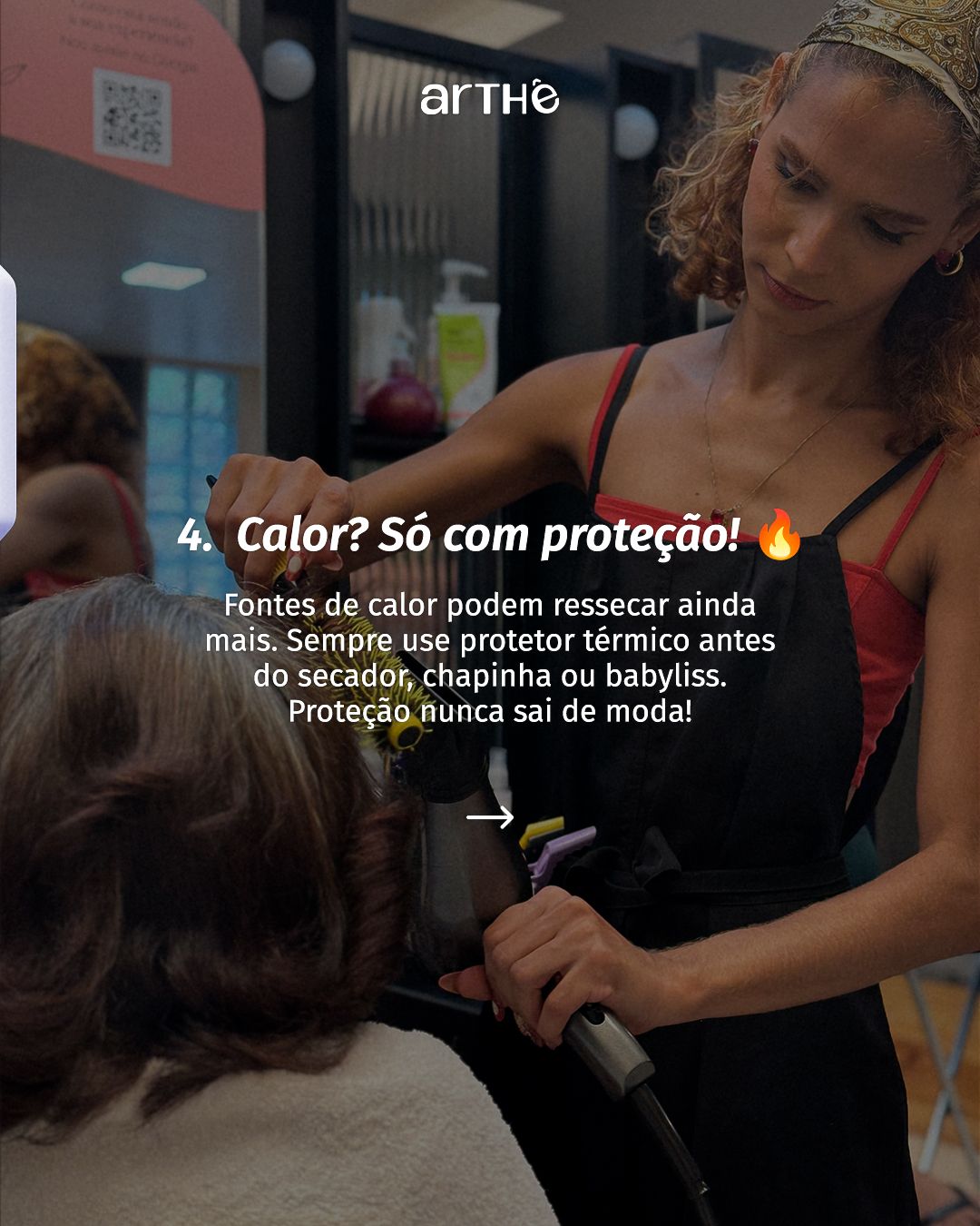
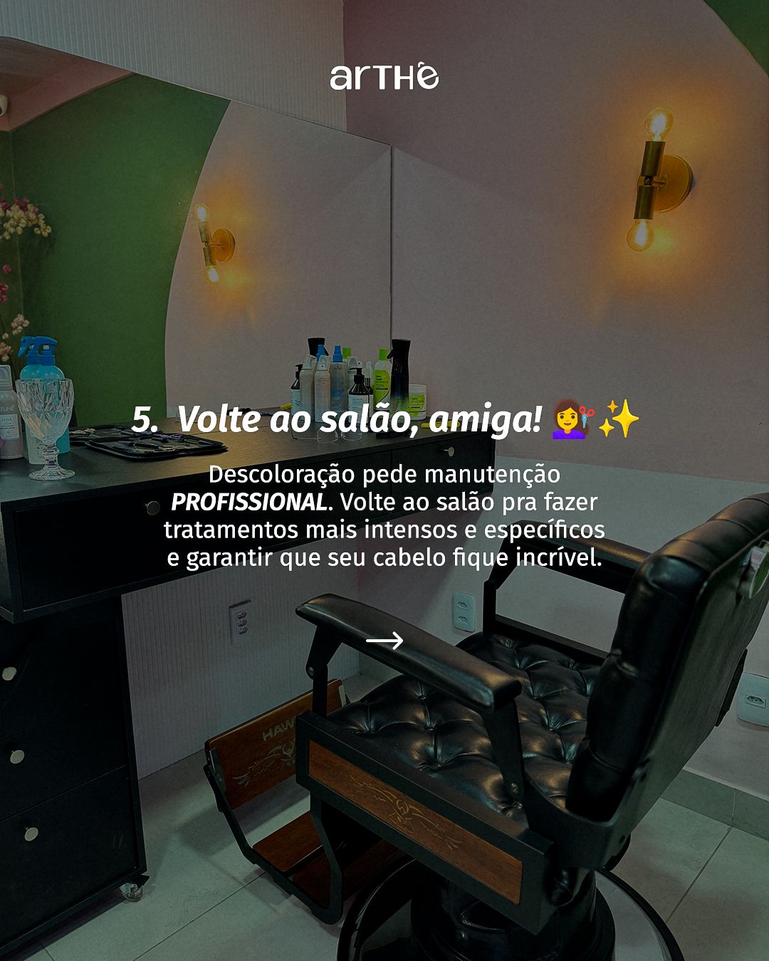
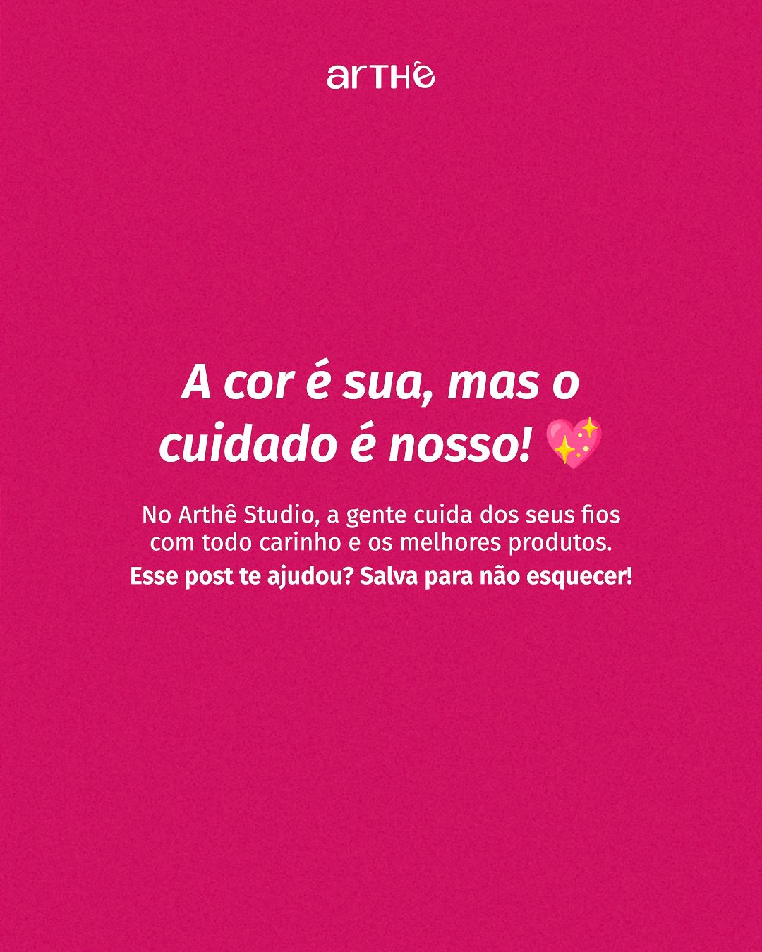
The carousels teach and sell the service at the same time. In “The secret behind the perfect color”, the color wheel itself appears as a visual aid to explain colorimetry. In the straightened-and-colored hair one, each slide changes color (lime, magenta, yellow, red), creating a vibrant rhythm that holds attention.
STAGE 07Color theory
The palette revolves around magenta (hue ≈ 333°) and lime (≈ 100°). They sit on nearly opposite sides of the color wheel, a complementary relationship that creates vibration and emphasis. Magenta brings femininity, boldness and energy; lime works as a fresh counterpoint, associated with growth, and appears in badges and details. Yellow enters as an occasional accent of joy, and wine gives depth.
Since real hair (brown, blonde, red, colorful) already brings a lot of color, flat color backgrounds are reserved for text pieces, and photos get a dark gradient so the headline can breathe.
- #B80153MagentaCor-assinatura, fundos e títulos
- #CF1562Rosa-choqueVariação mais viva do magenta
- #7E0139VinhoProfundidade e ênfase
- #CDFFB4Verde-lima claroContraponto e selos de especialidade
- #FFD75BAmareloAlegria e destaque pontual
- #F9F9F9Off-whiteFundos limpos e respiro
| Pair | Use | Contrast | WCAG |
|---|---|---|---|
| Aa | White text on magenta | 6.63:1 | AA |
| Aa | Magenta on off-white (titles) | 6.30:1 | AA |
| Aa | Dark text on lime | 15.38:1 | AAA |
| Aa | White text on lime | 1.13:1 | fails |
| Aa | Dark text on yellow | 12.53:1 | AAA |
| Aa | White text on yellow | 1.39:1 | fails |
Critical read: white on magenta reaches 6.63:1 and magenta on off-white 6.30:1, both good. On lime and yellow only dark text works (15.38:1 and 12.53:1); white would fail (1.13:1 and 1.39:1), which is why dark text is always used on those slides.
Hex values sampled from the published final pieces.STAGE 08Typography
Headlines use a high-contrast serif with elegant curves that suit the beauty world, and supporting text uses a humanist sans-serif that stays clean at small sizes. Team names become graphic elements at giant scale. The serif + sans pairing balances sophistication and clarity.