Home / Work / Natureza · Social
Natureza & André Cury — Social media
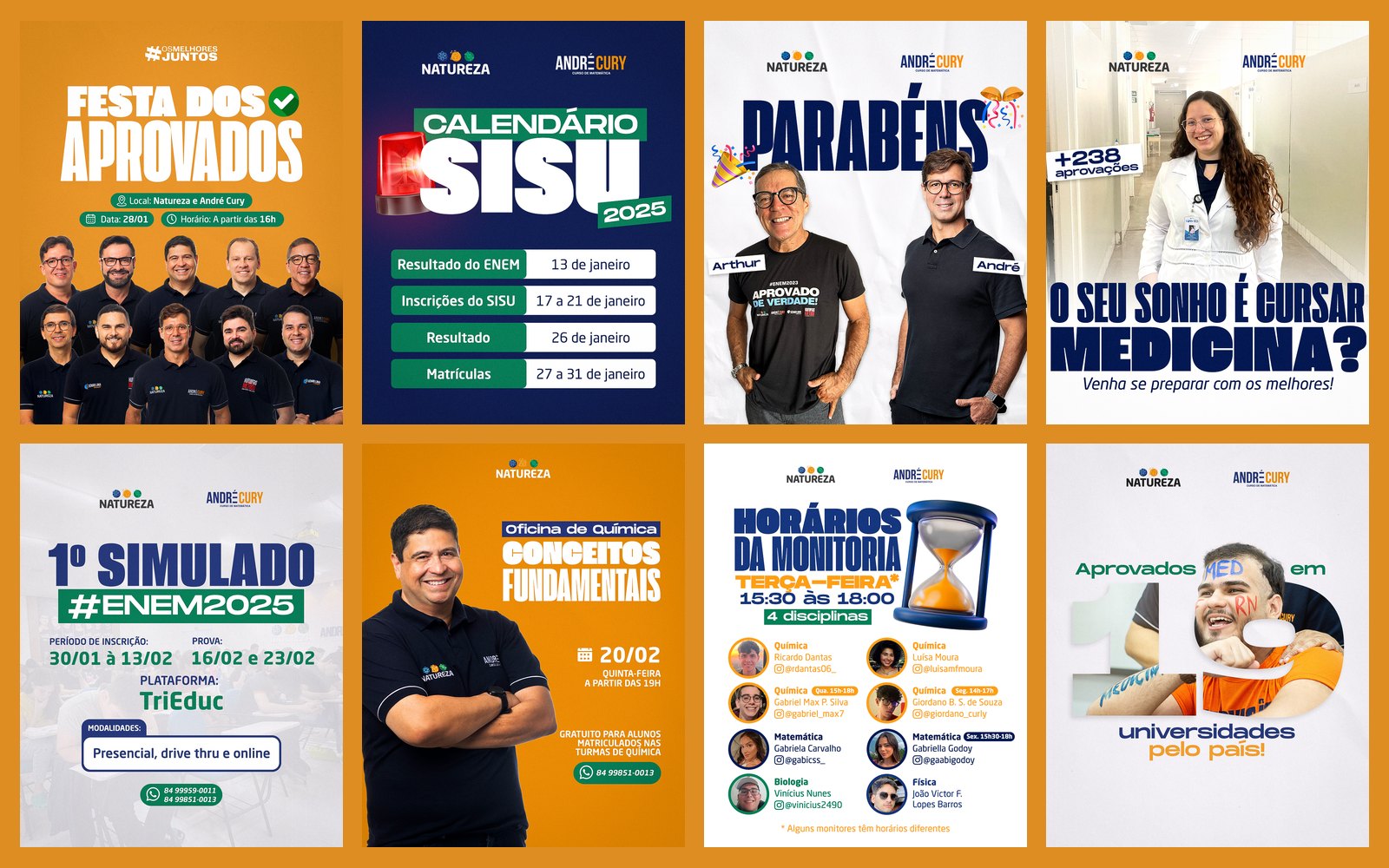
A system of pieces for a test-prep school's social channels: calendars, results of admitted students, mock exams and workshops, with reusable templates and carousels that explain a topic step by step.
STAGE 01Context and goal
Natureza and André Cury need to keep their social channels active all year: ENEM and SISU dates, mock exams, workshops, admitted students and notices. The design challenge is to produce a lot, quickly, without losing the brand's look and without each piece feeling like it comes from a different profile.
About authorship: the brands, logos and identities belong to the clients and already existed. Here I show my art direction, layout and application of the identity across the pieces.STAGE 02Feed: a system of pieces
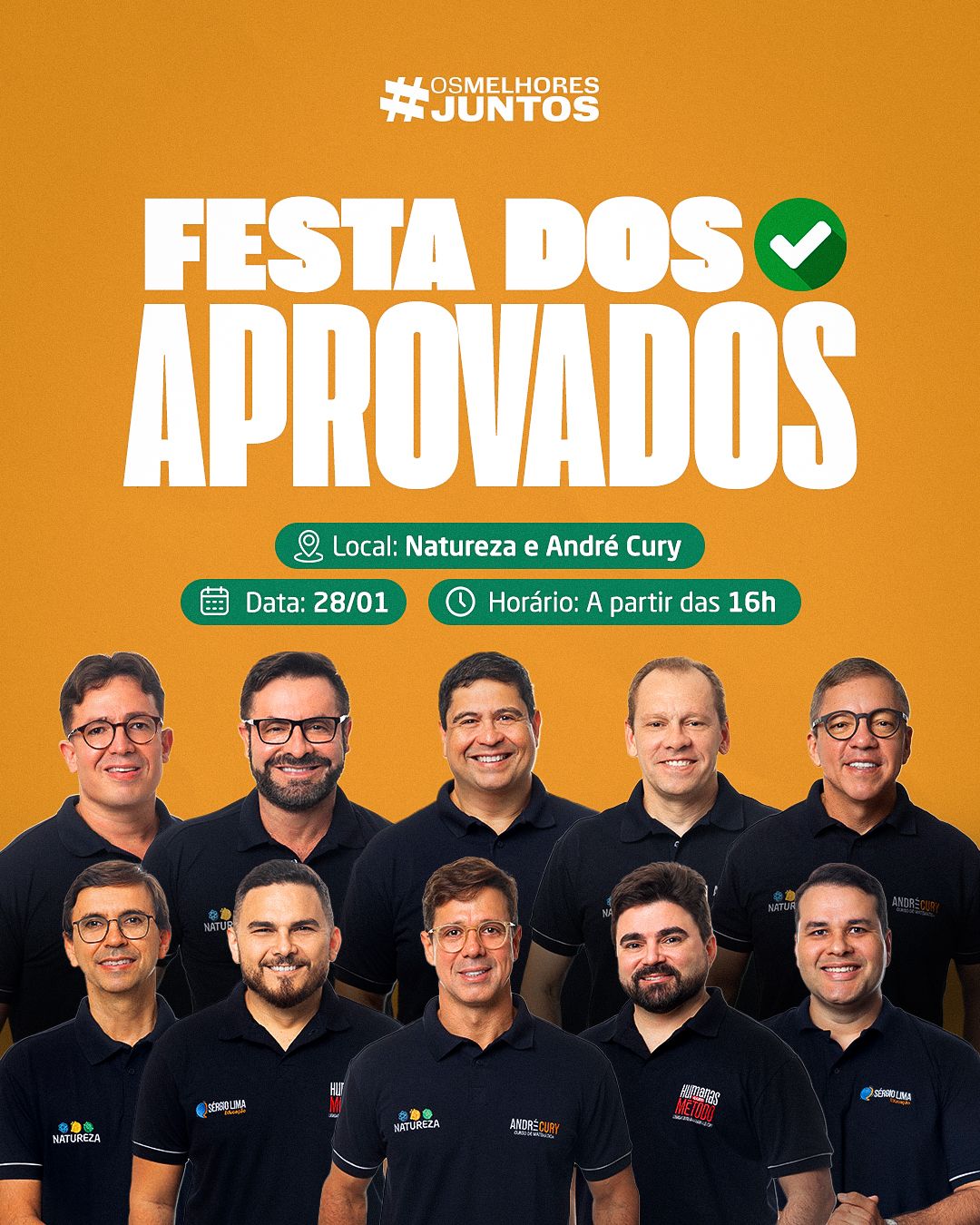
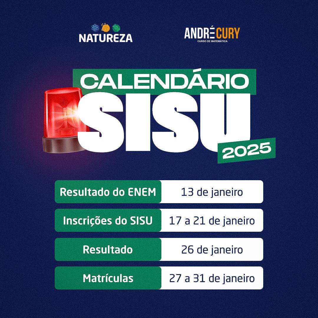
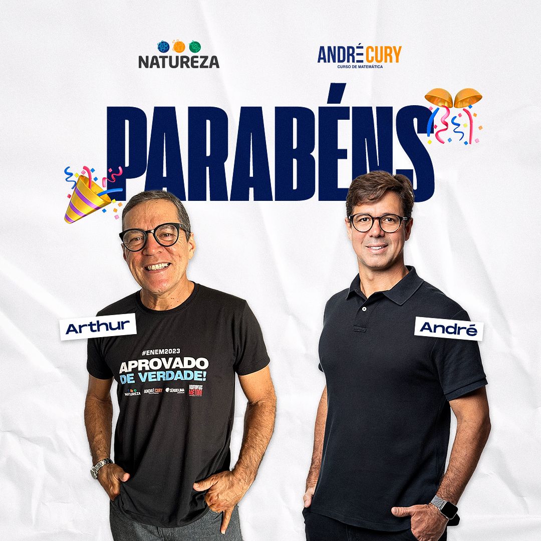
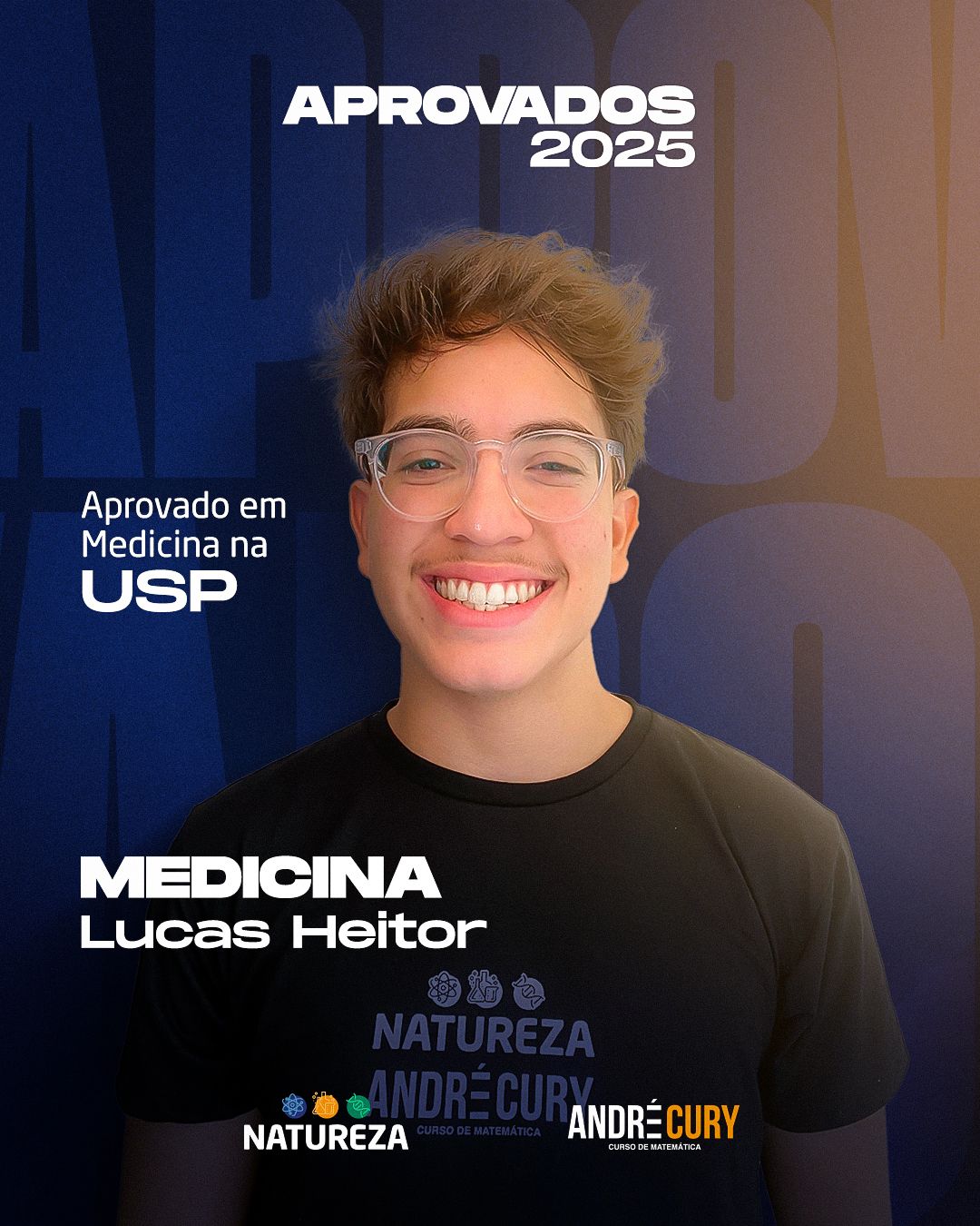
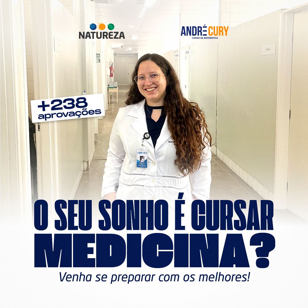
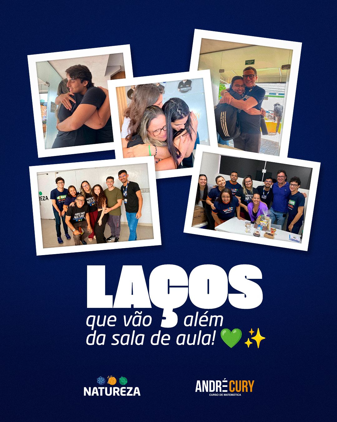
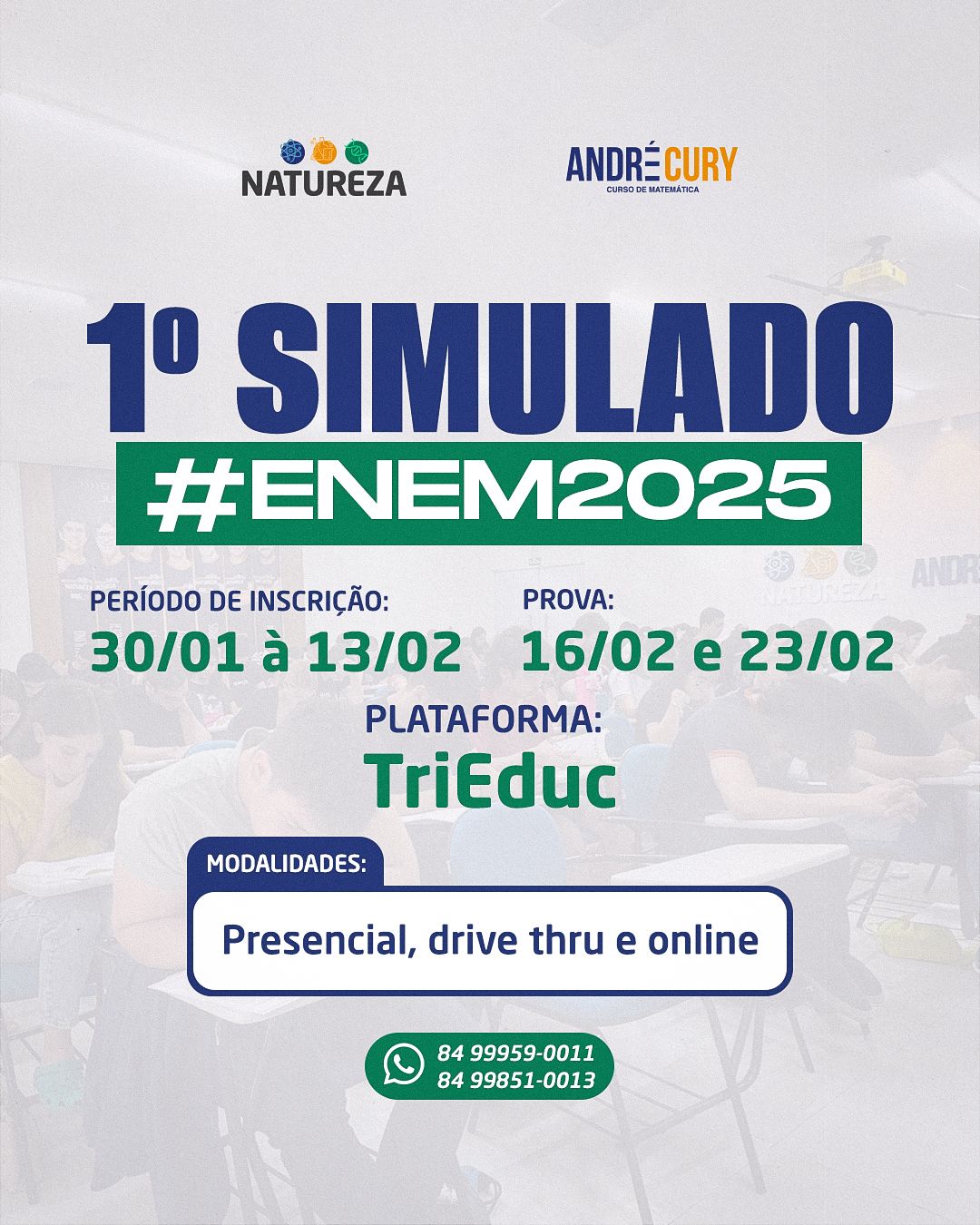
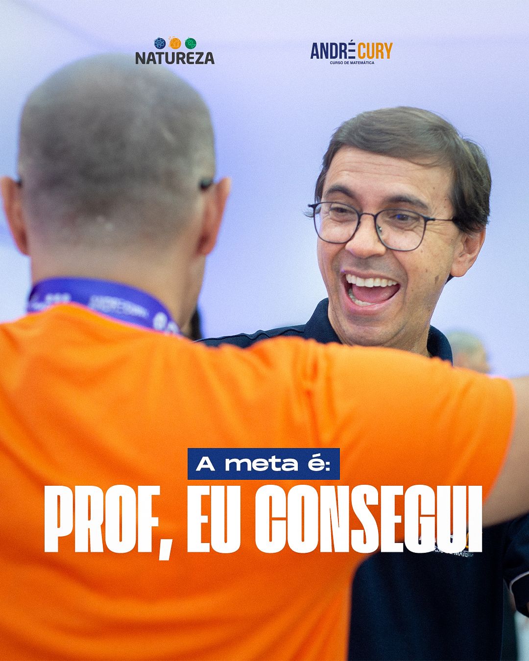
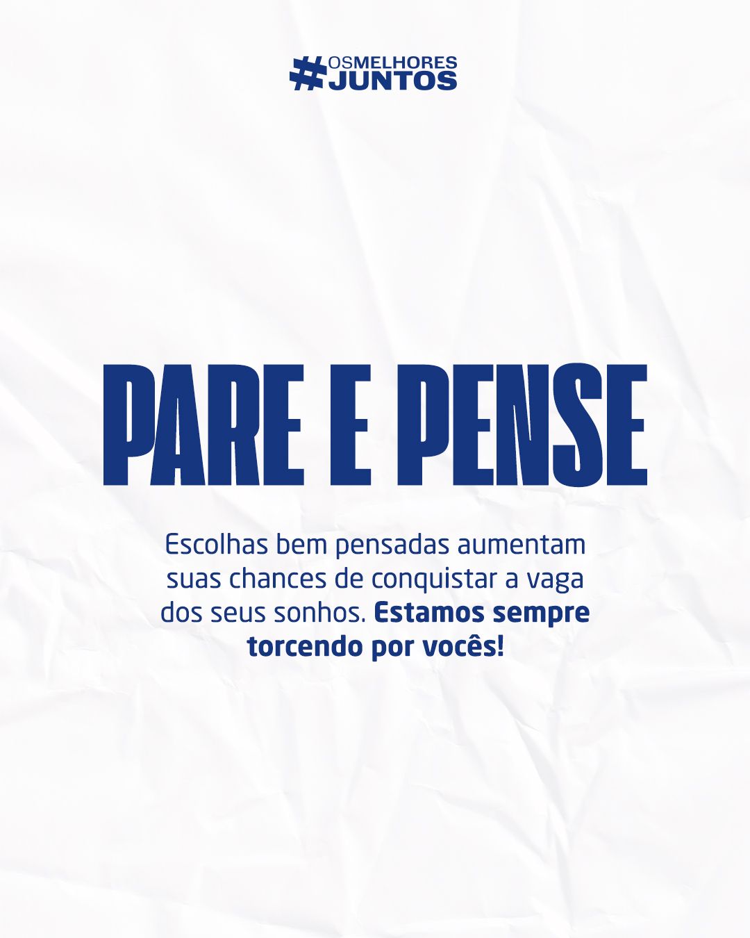
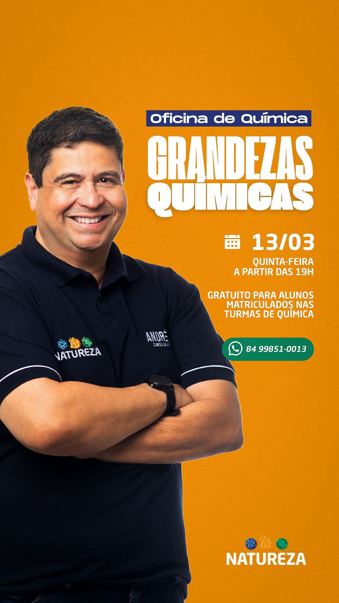
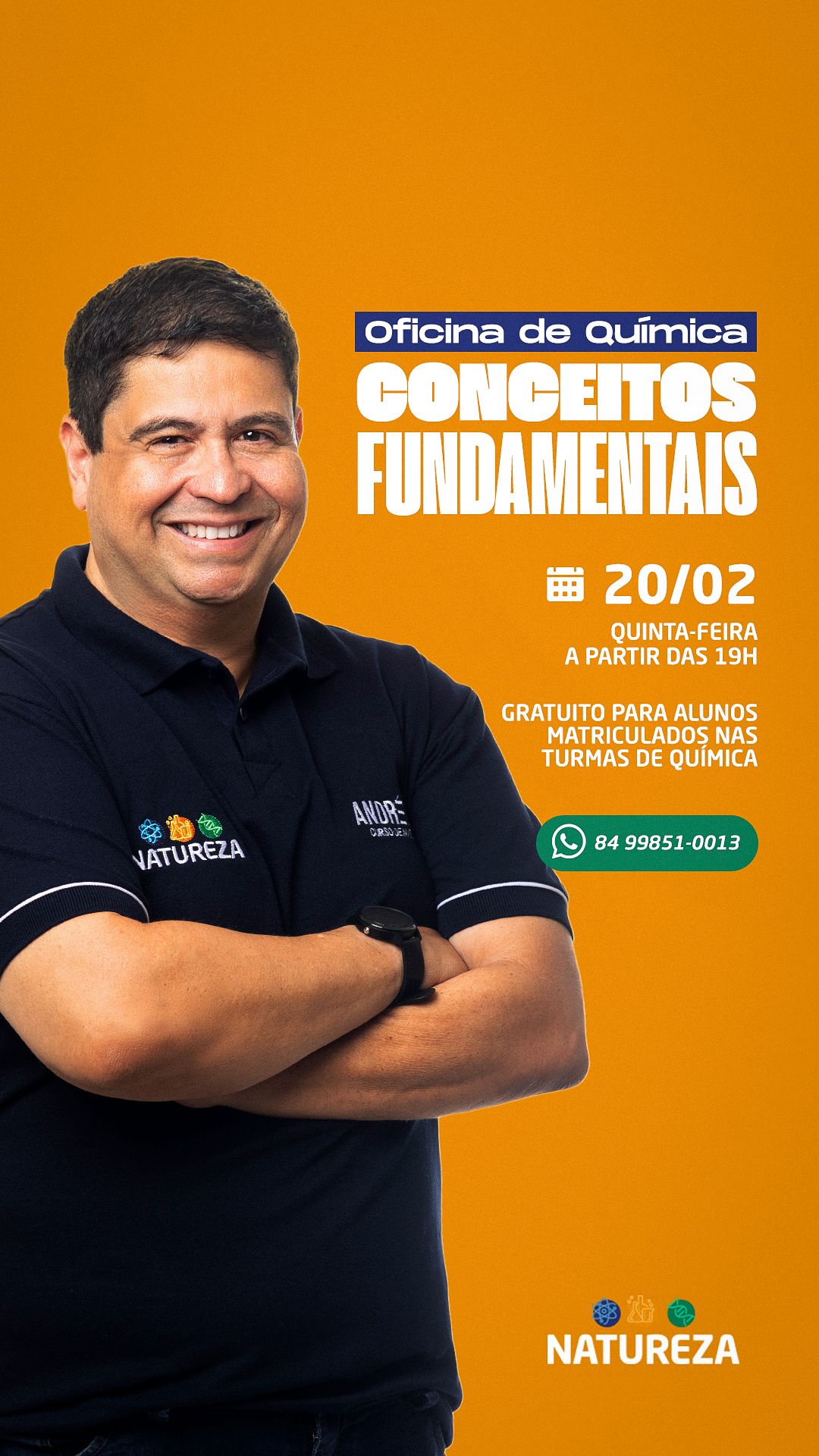
All pieces share the same structure: logos side by side at the top, main message in the center and action information (date, link, WhatsApp) at the bottom. This creates a reading pattern that followers learn without noticing. Colors change by subject: orange for events and workshops, navy for calendars and results, paper-textured white for notices, green for achievements.
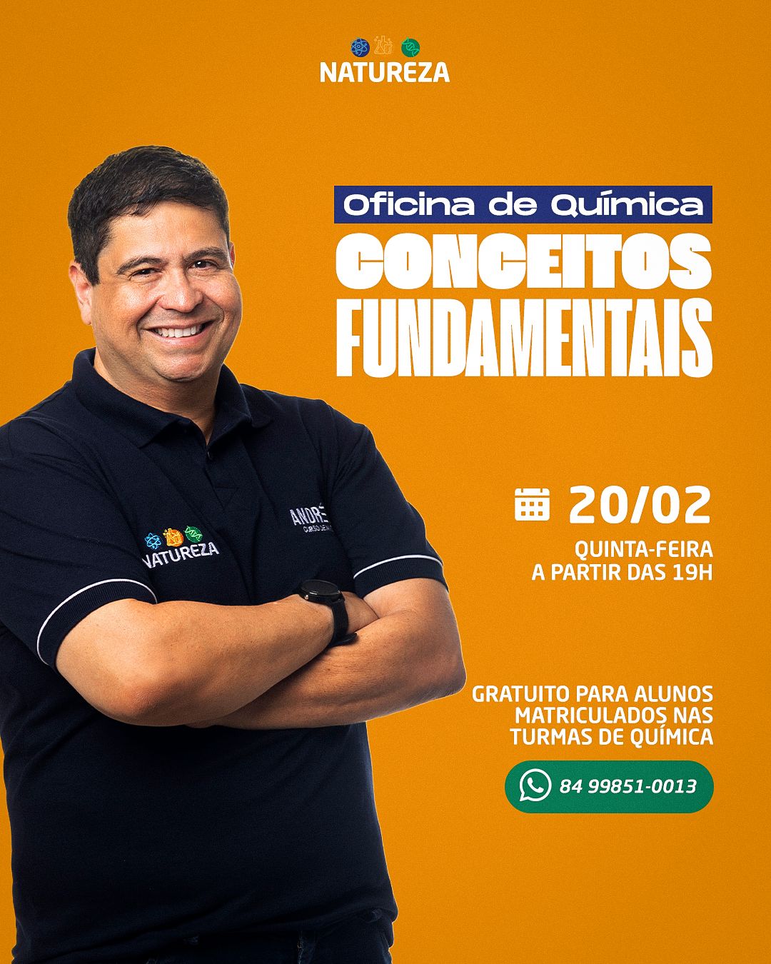
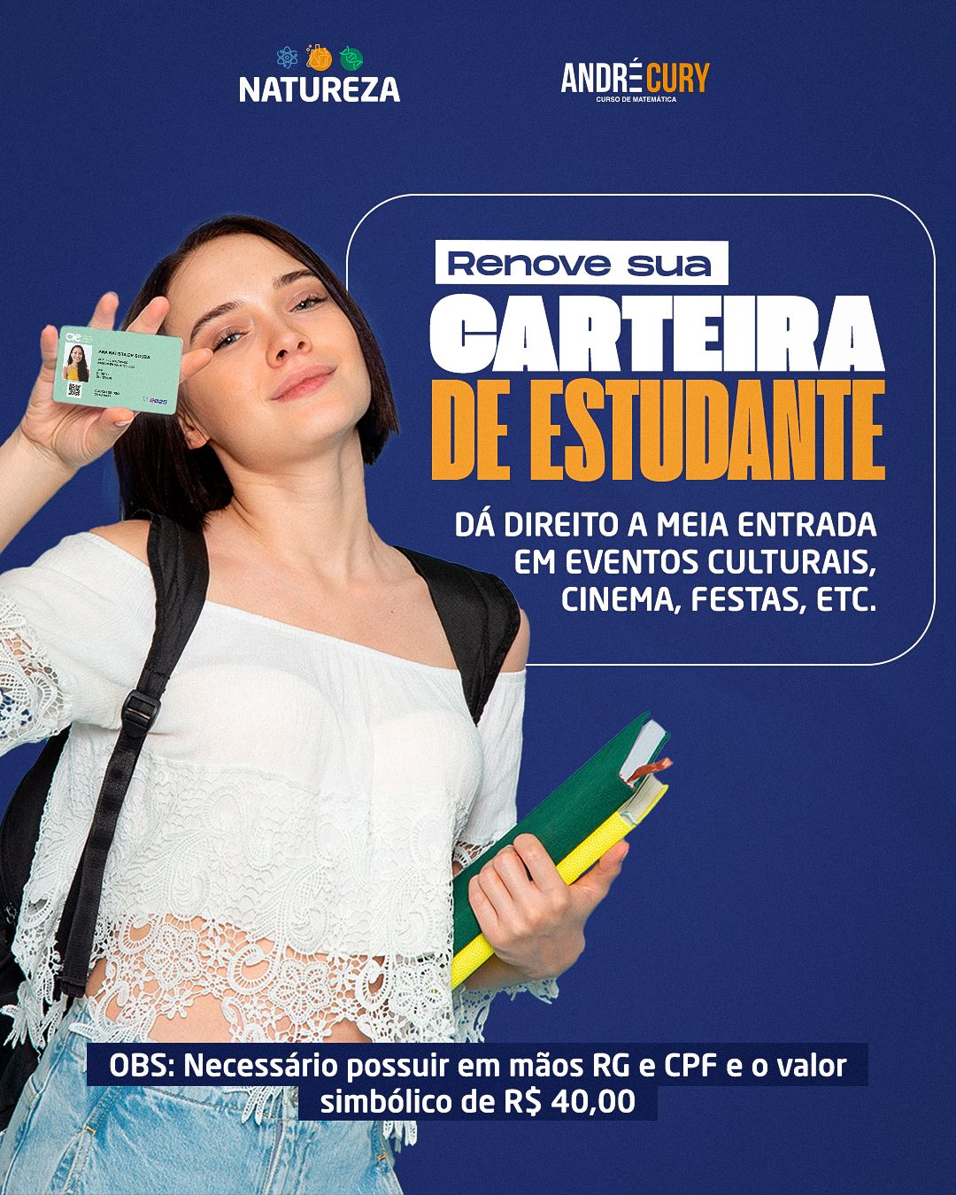
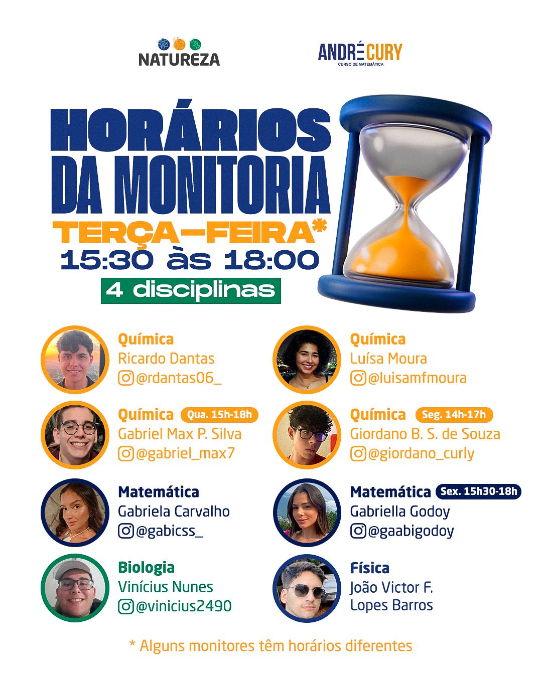
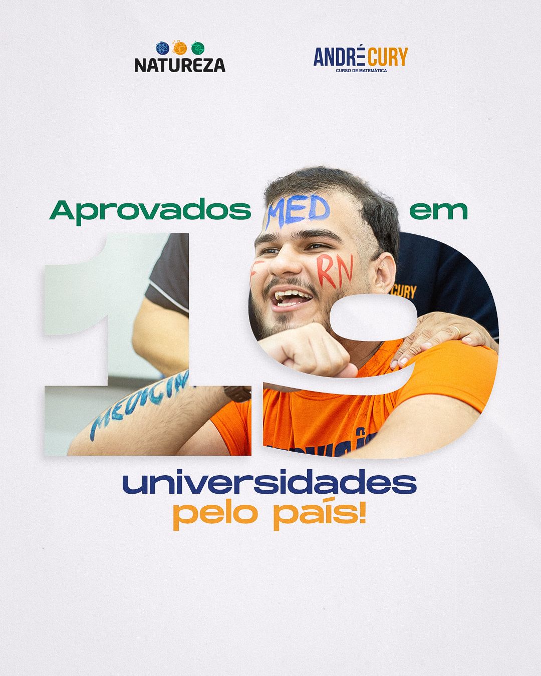
STAGE 03Reusable templates
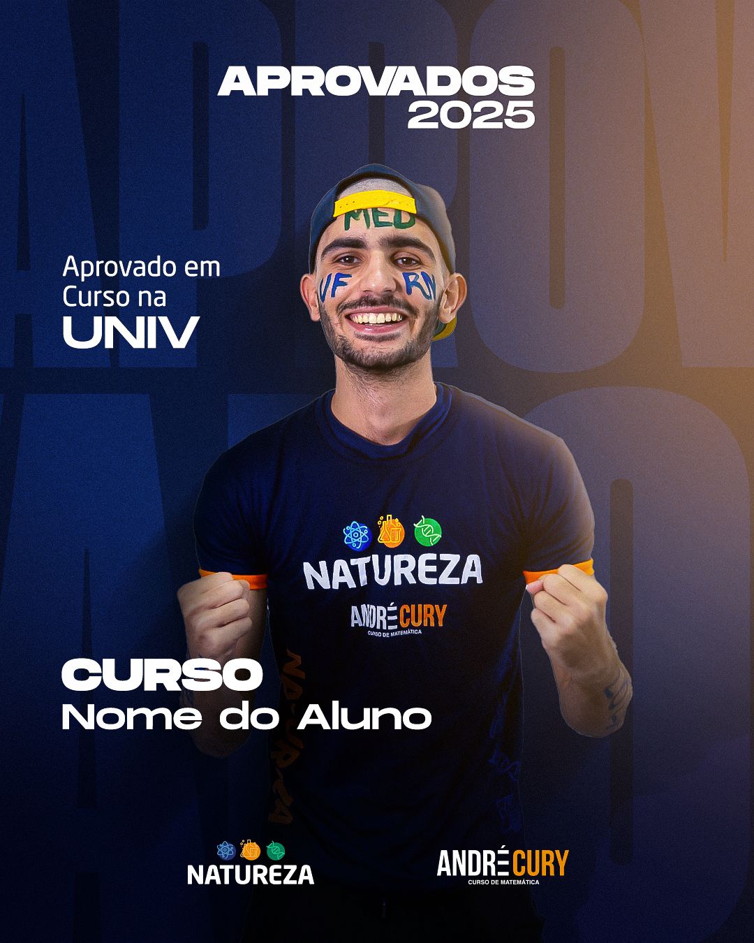
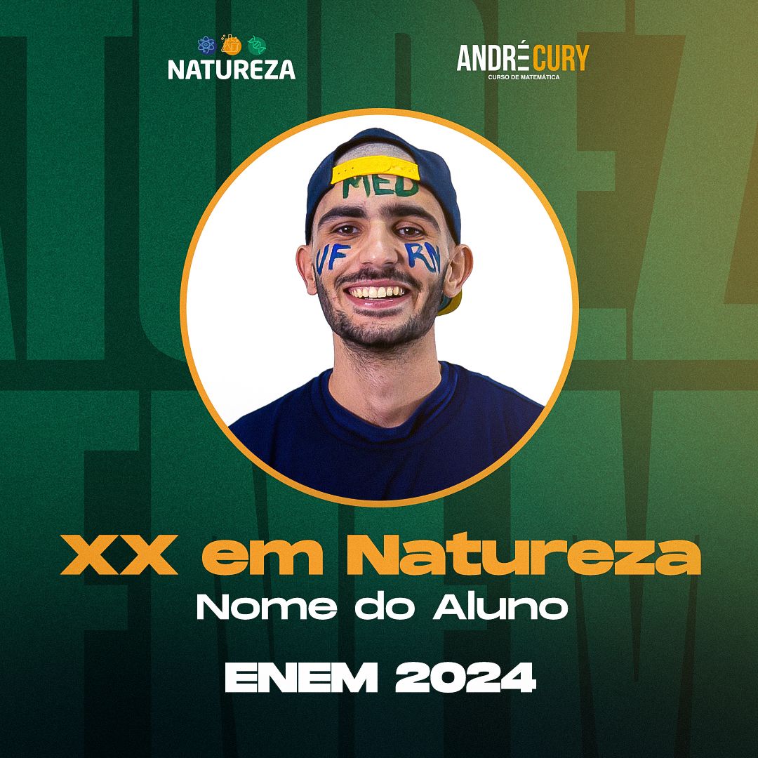
For recurring tasks (admitted students, ENEM scores, workshops), I built models with ready-made fields: photo, name, course and score go into fixed places. The client's team gains speed and the visual standard holds even when someone else edits.
STAGE 04Educational carousels
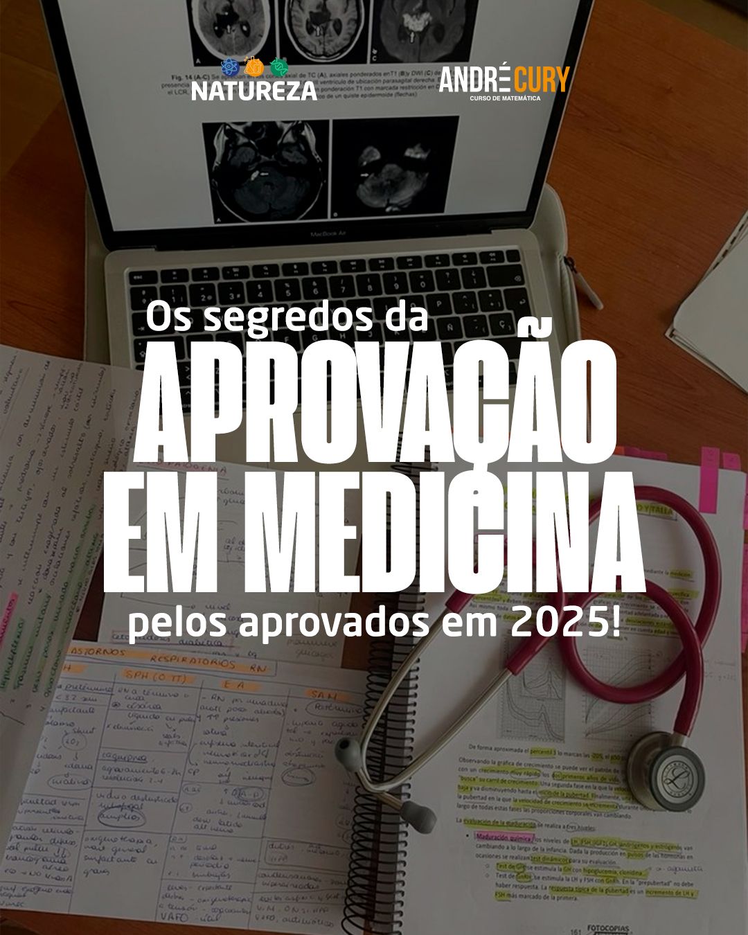
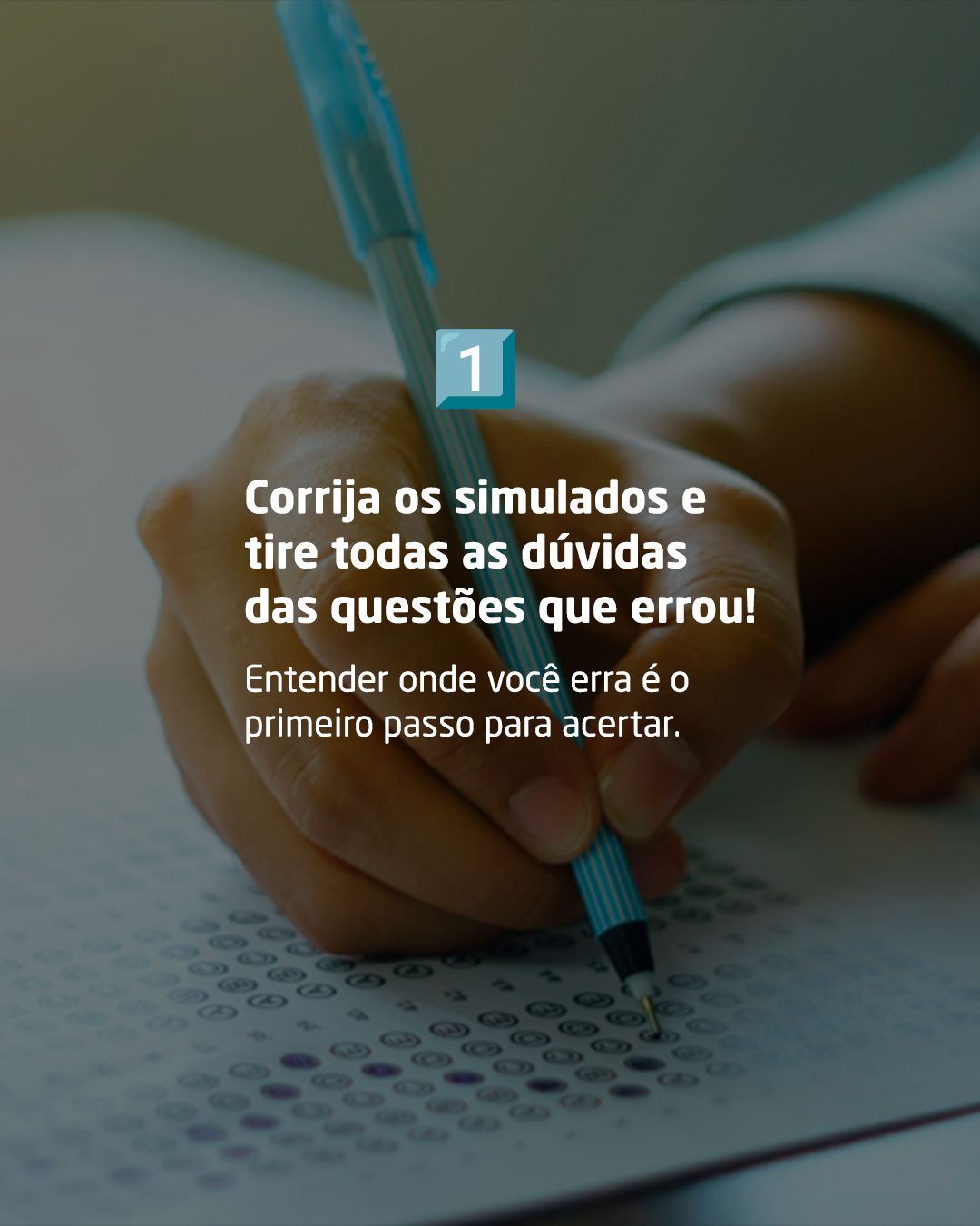
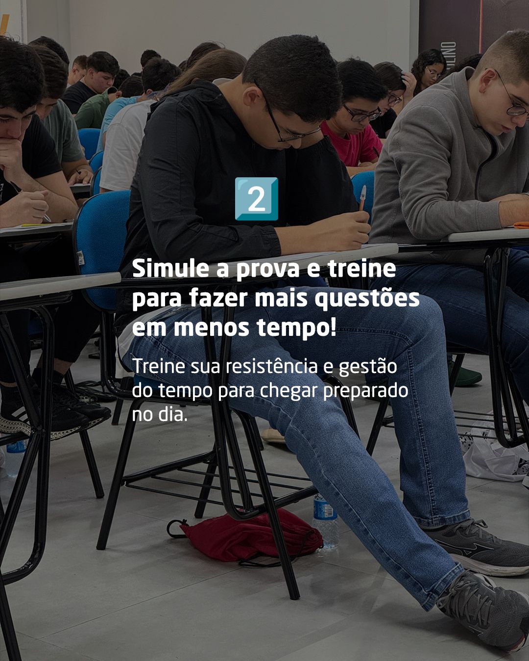
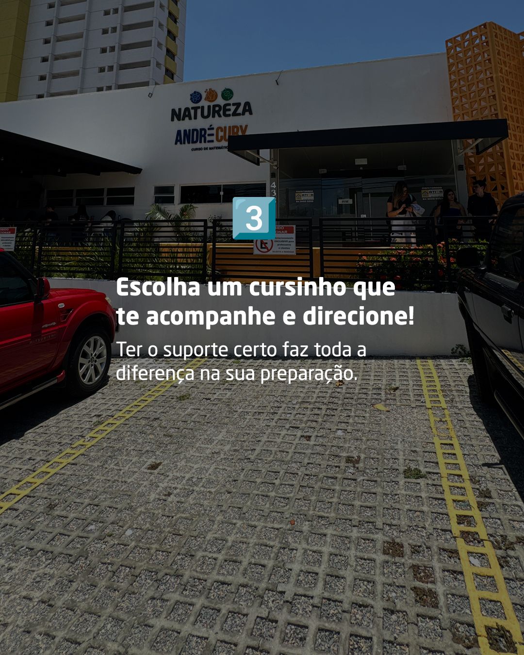
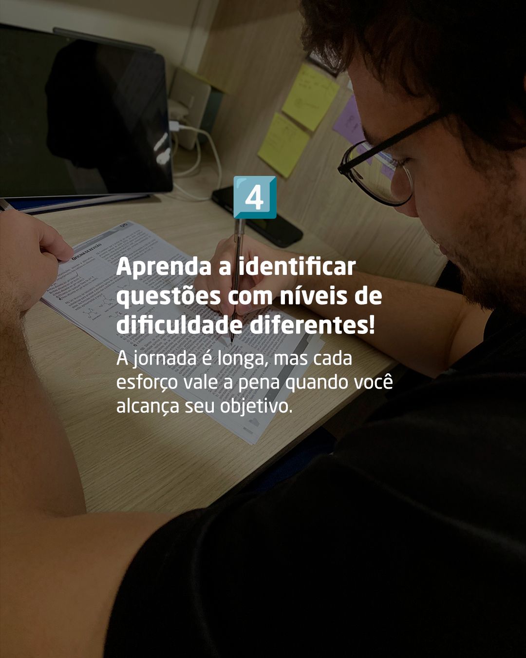
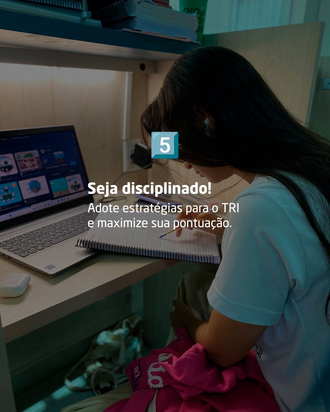
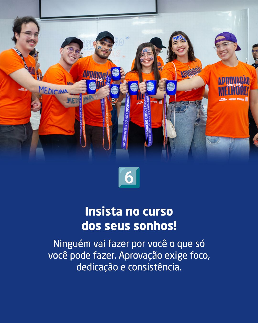
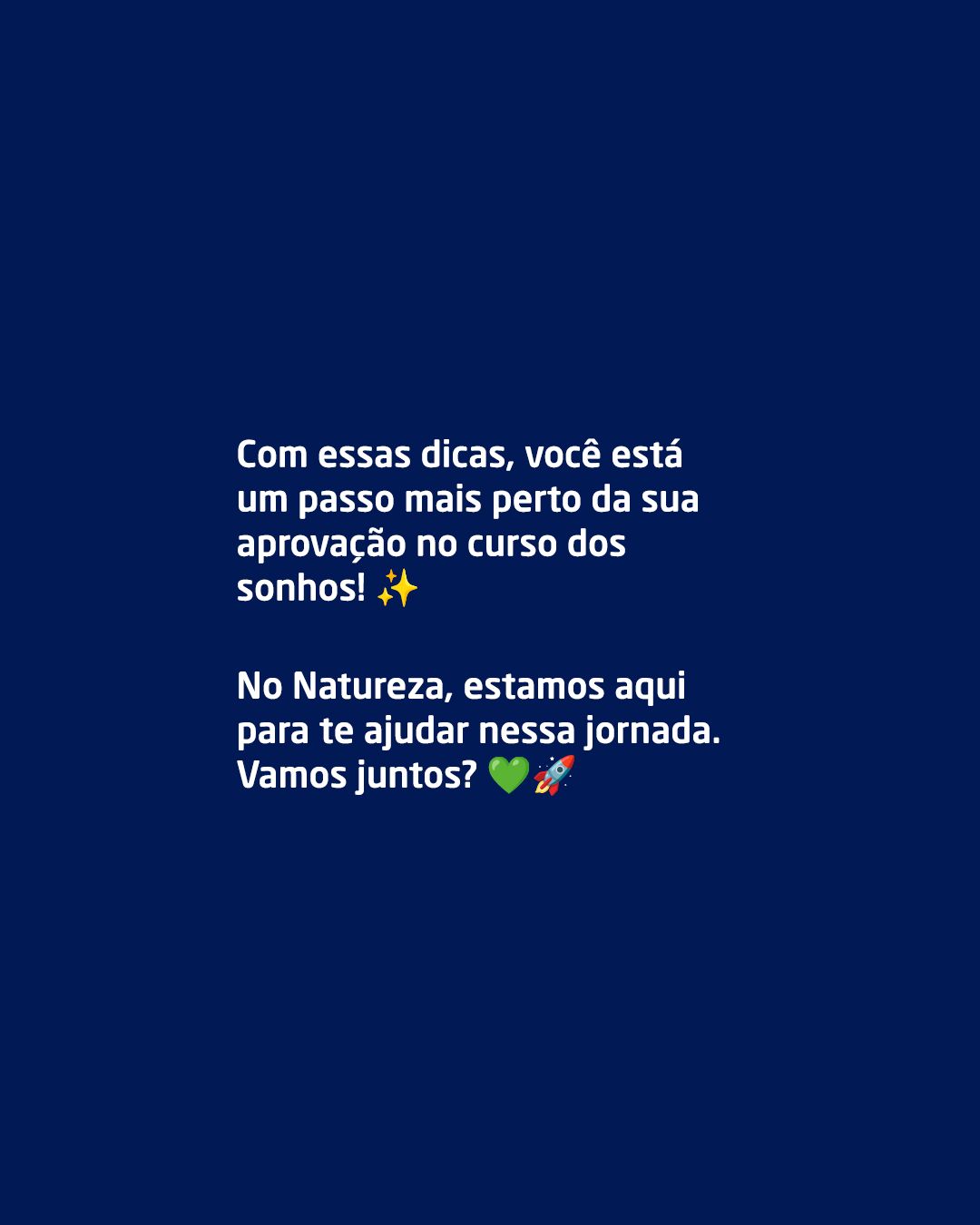
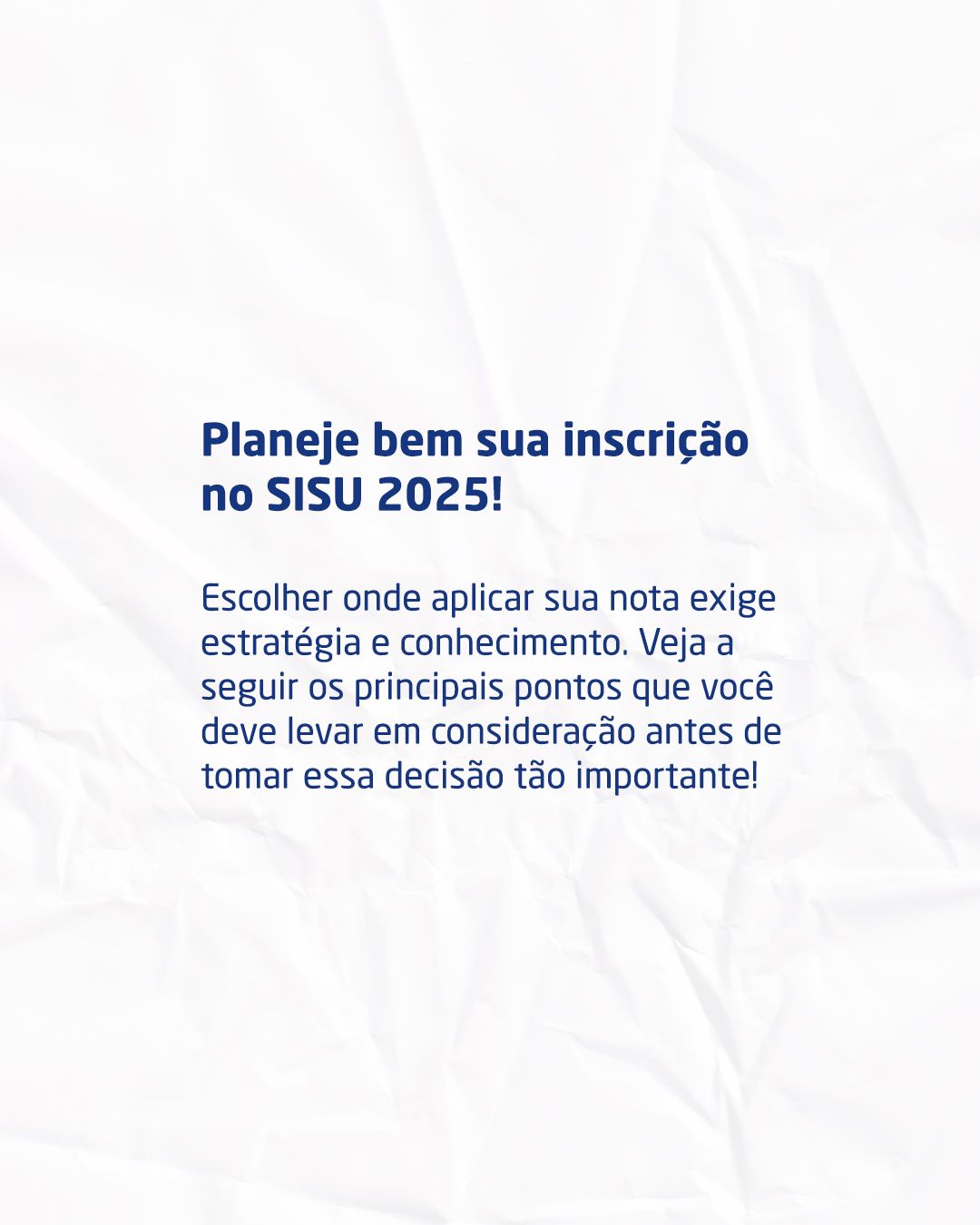
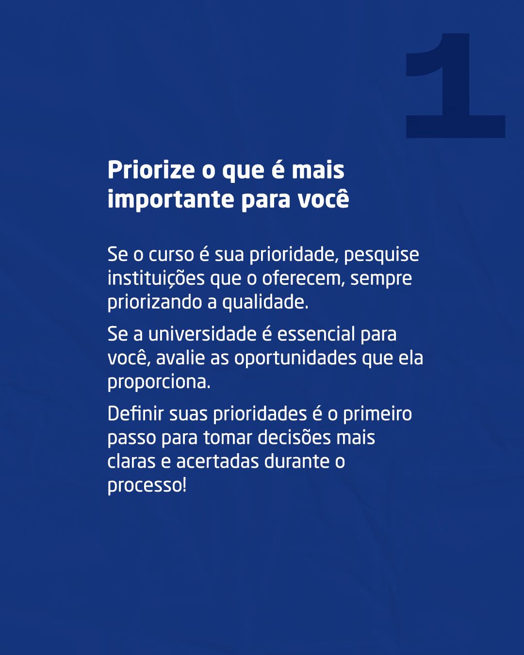
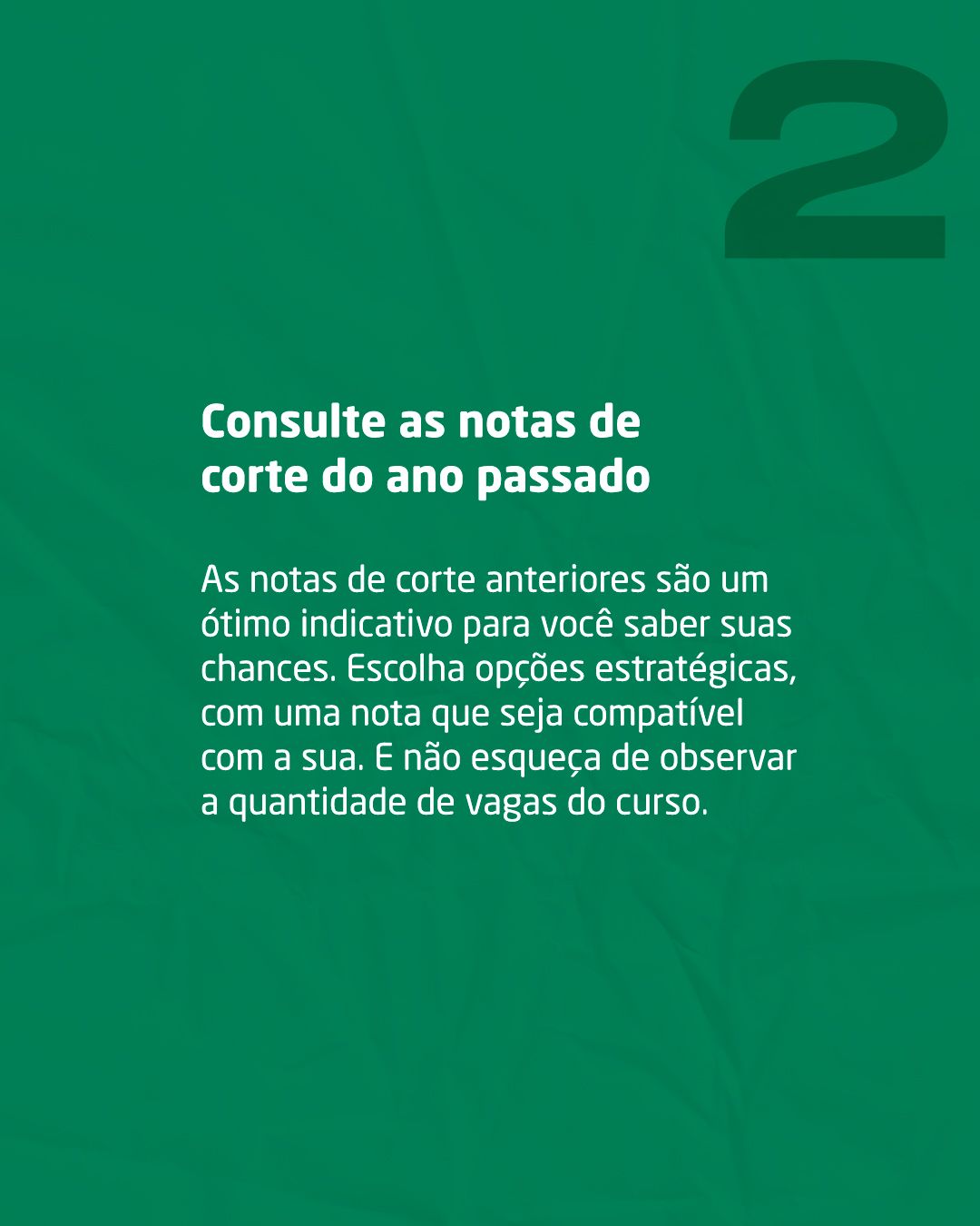
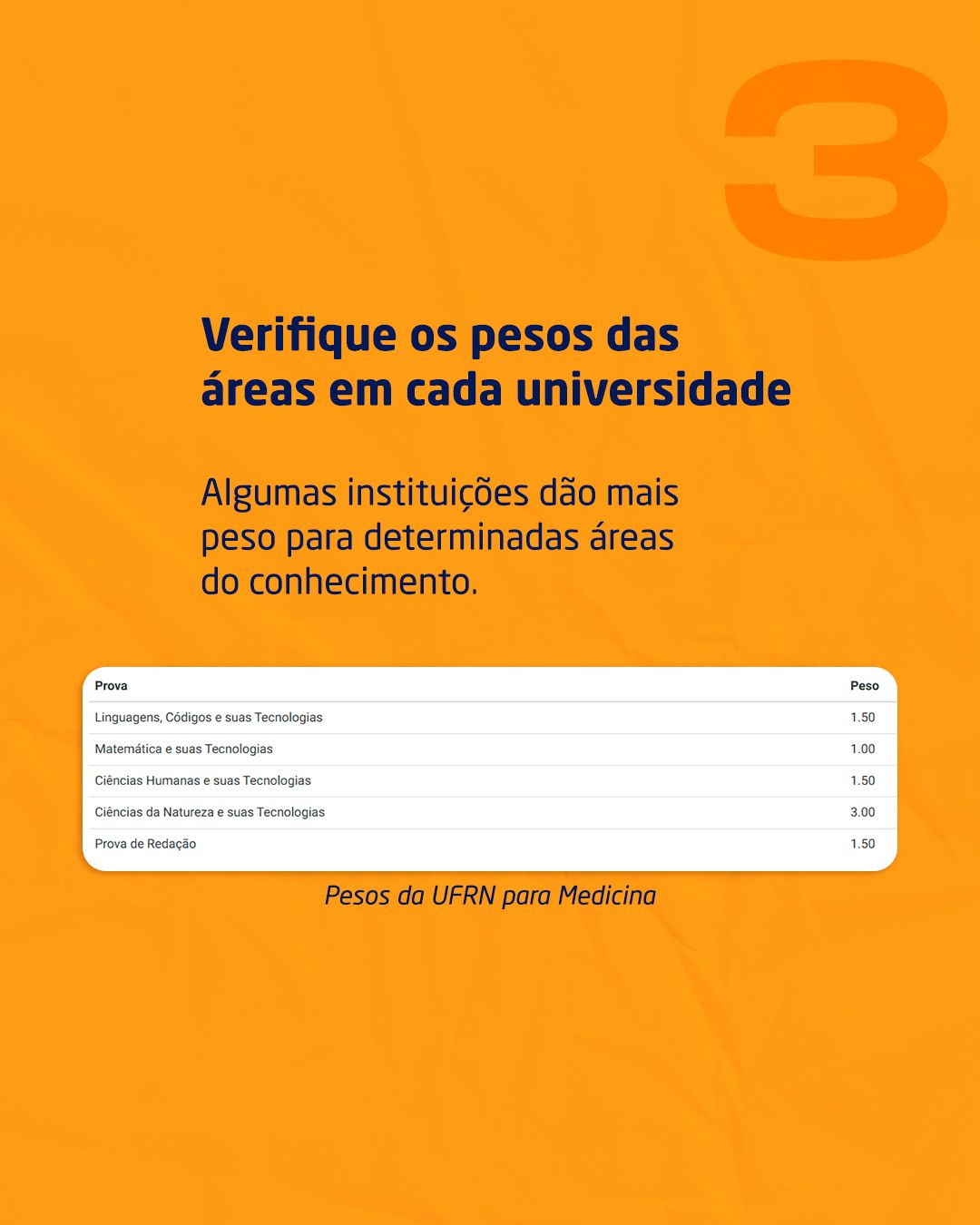
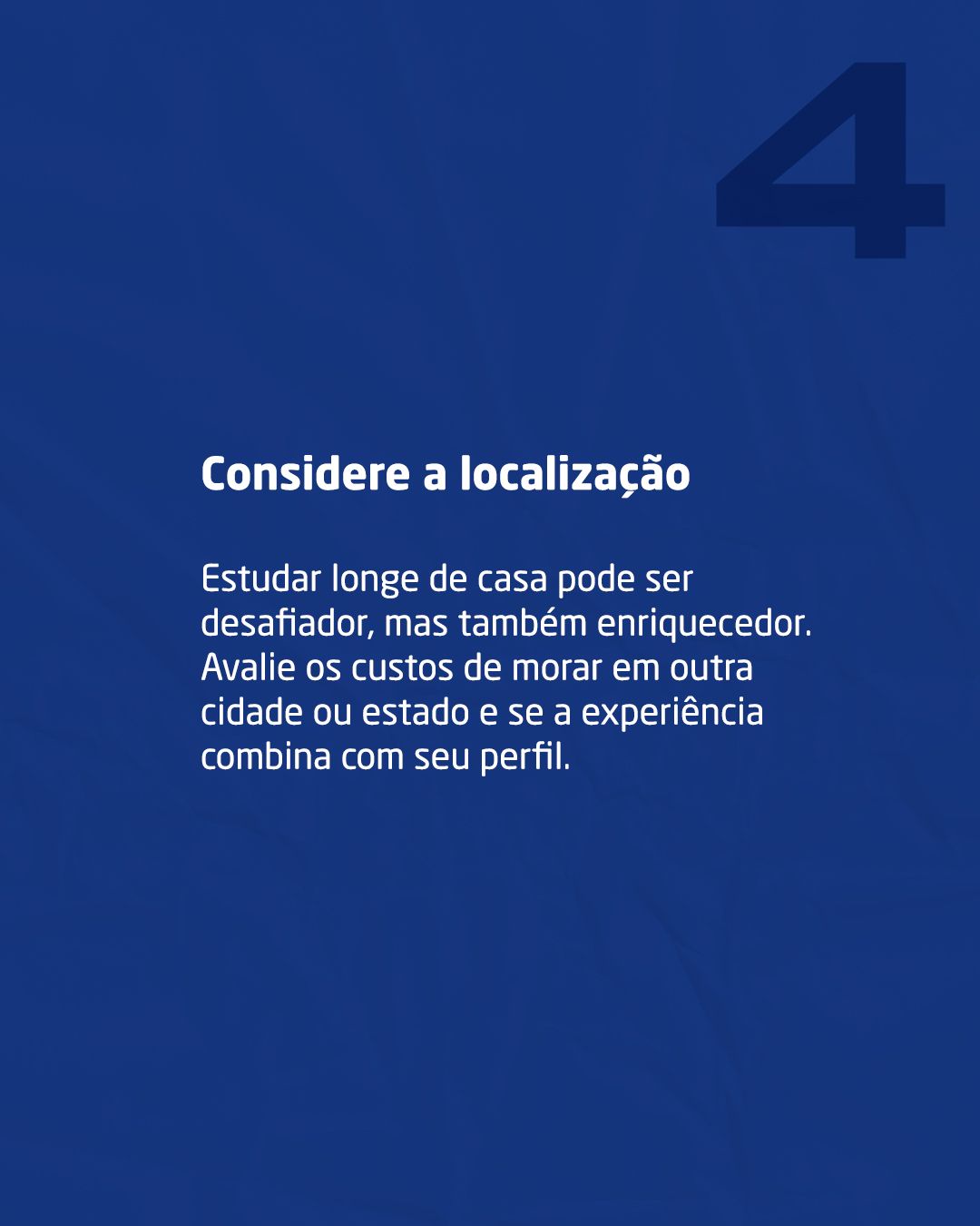
The carousels follow a three-beat narrative: a hook cover (promises an answer), a numbered development (one point per slide) and a closing call. In “Stop and think”, each tip gets a different background color (blue, green, orange), which gives rhythm to the swipe and helps remember the order.

STAGE 05Stories
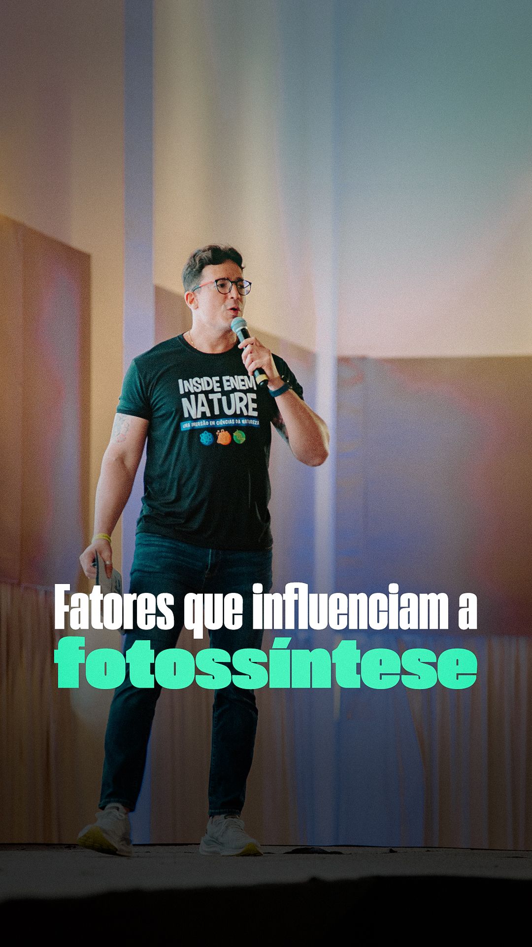
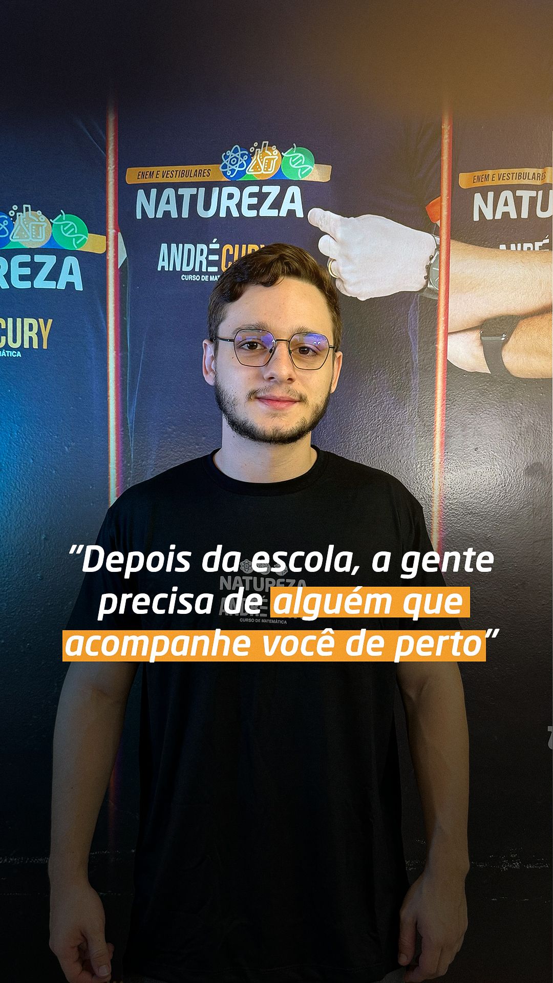
In stories (9:16), text stays within the safe zones, away from the top and bottom where the app interface covers the art. Real photos of students and teachers support social proof, and big type guarantees reading in seconds.
STAGE 06Color theory
The palette combines the complementary pair blue and orange with green as a third color for achievement. Navy is the institution's color: it conveys seriousness and trust, important for those deciding where to study. Orange is the action color: it appears in dates, buttons and keywords. Green marks results (admitted, check).
- #111E52Azul-marinho profundoFundos, autoridade e confiança
- #223675Azul de marcaFaixas, rótulos e detalhes
- #DE8D22LaranjaÊnfase, chamadas e destaques
- #02704EVerdeConquista, aprovação e Biologia
- #FEFEFEBrancoRespiro e fundos claros
- #151C25GrafiteFundos escuros (peça do 2º dia)
| Pair | Use | Contrast | WCAG |
|---|---|---|---|
| Aa | White text on navy | 15.77:1 | AAA |
| Aa | Navy on white | 15.64:1 | AAA |
| Aa | Navy on orange | 5.96:1 | AA |
| Aa | White text on green | 6.12:1 | AA |
| Aa | White text on orange | 2.65:1 | fails |
Critical read: navy passes comfortably on white (15.64:1) and on orange (5.96:1). White on orange sits at 2.65:1; it works for big heavy headlines, but for small text I would use navy.
Hex values sampled from the published final pieces.STAGE 07Typography
The piece font kit brings together Extenda (uppercase headlines, ultra-heavy and condensed), Monument Extended (labels in expanded width) and Neo Sans Pro (supporting text). The contrast between the condensed headline and the expanded label creates personality and makes the hierarchy immediate: headline first, then label, then text.
Project kit fonts: Extenda, Monument Extended and Neo Sans Pro.