Home / Work / Dr. Pedro Batista
Dr. Pedro Batista — Plastic surgery
Social media for a plastic surgeon: myths and truths, procedures and recovery, in navy blue with the doctor's photography in focus and plenty of sobriety.
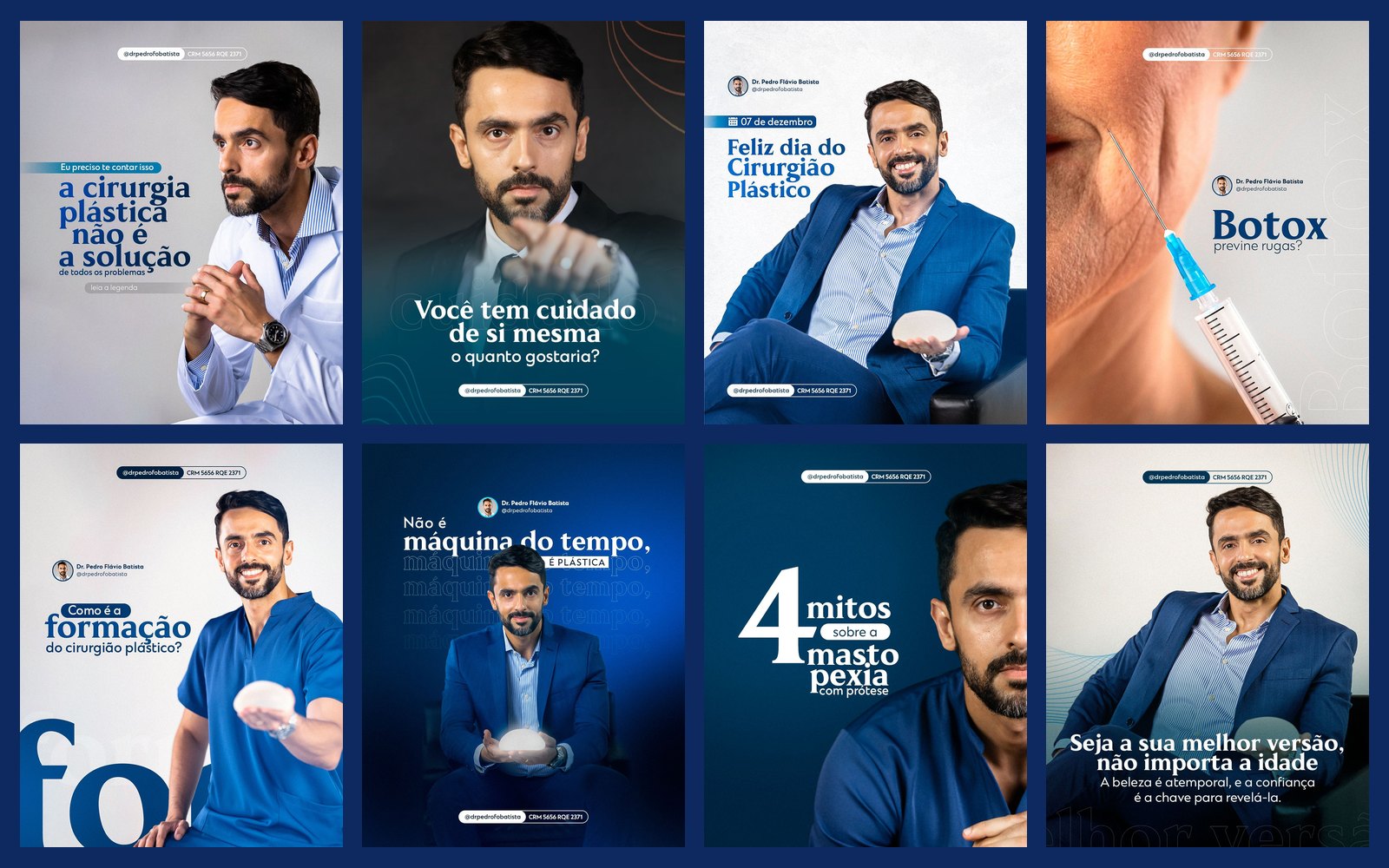
STAGE 01Context and goal
Dr. Pedro works in plastic surgery, a field where the patient decides with fear and expectation. The content needs to explain procedures (liposuction, breast surgery, botox) seriously, bust myths and convey safety, without sensationalism and within medical advertising rules.
About authorship: each doctor's brand, logo and identity already existed and were not created by me. My work here was creating the social media art: feed, carousels and stories.STAGE 02Visual system
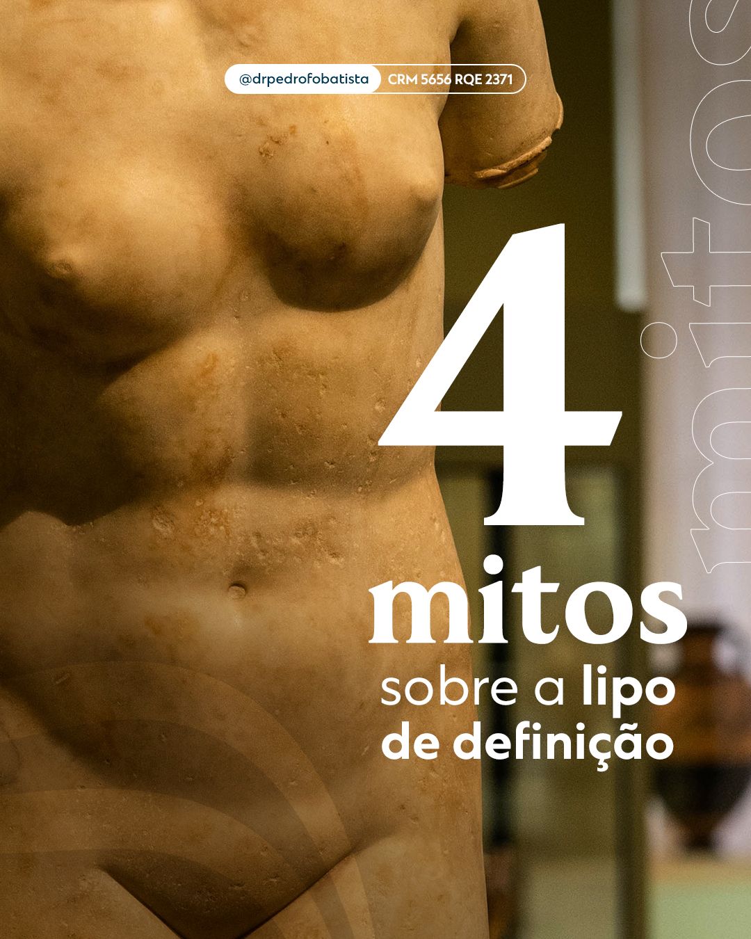
The doctor's photography is the center of the system: he appears in a lab coat, a suit or surgical scrubs depending on the subject, showing authority and closeness. A giant number or word (“4 myths”, “10 years”, “Botox”) anchors the piece and creates hierarchy. Headers carry the handle and professional identification.
STAGE 03Feed
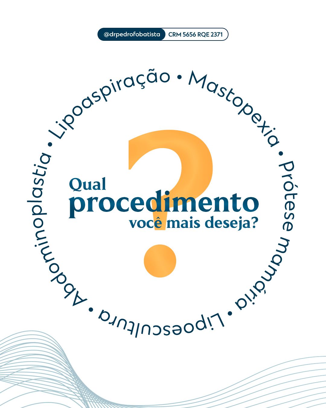
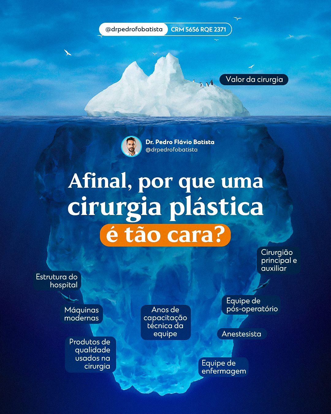
The feed mixes education, myths and truths and specialty dates, always with the same header structure so the profile feels like a single voice.

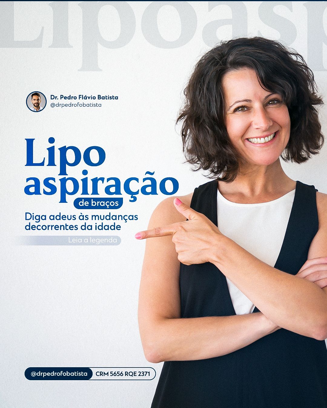




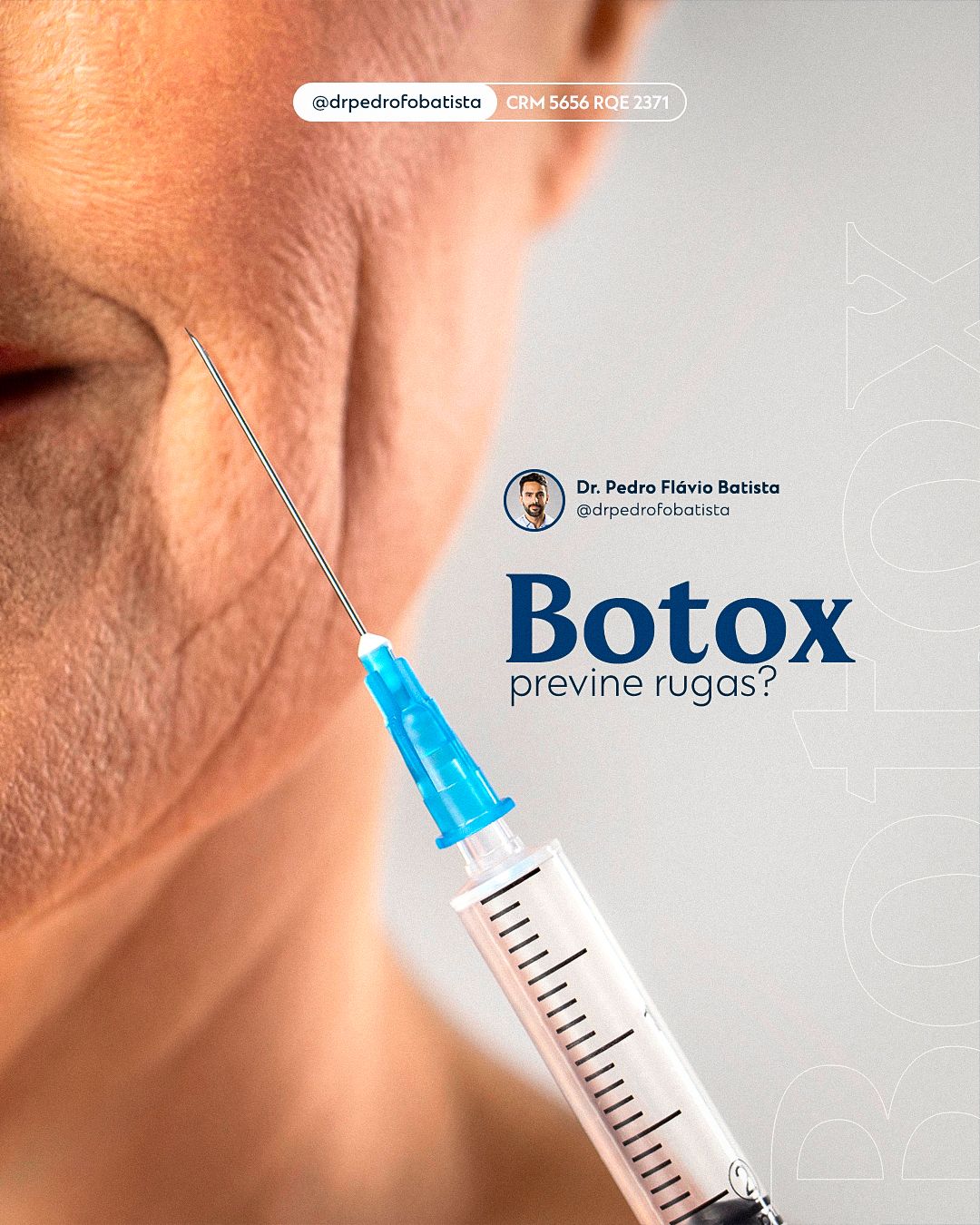
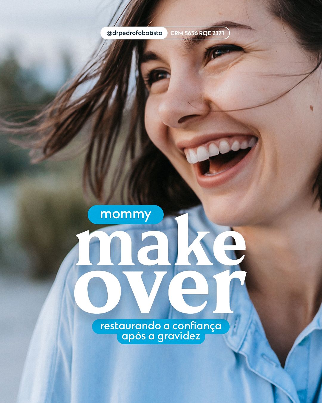





STAGE 04Carousels
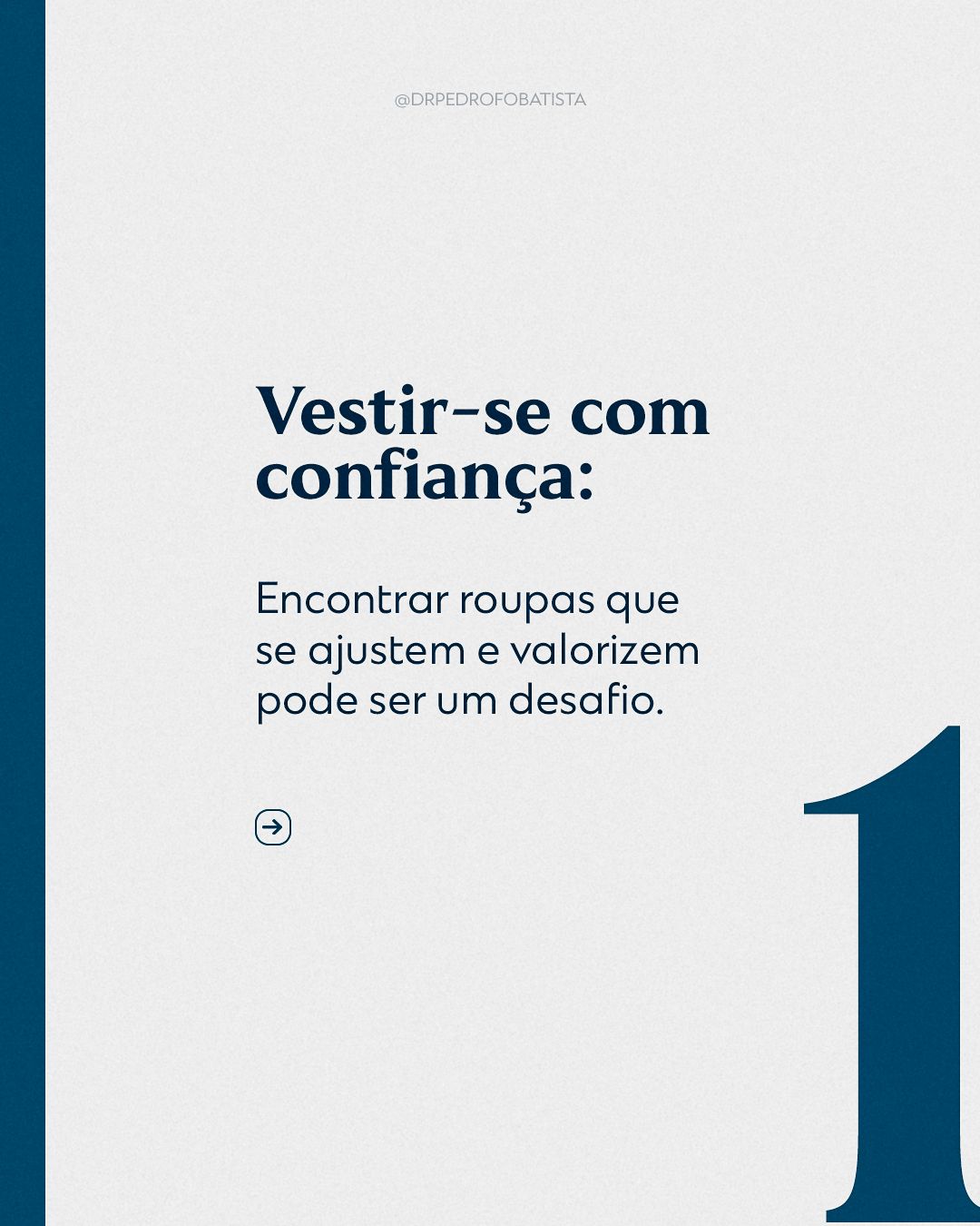
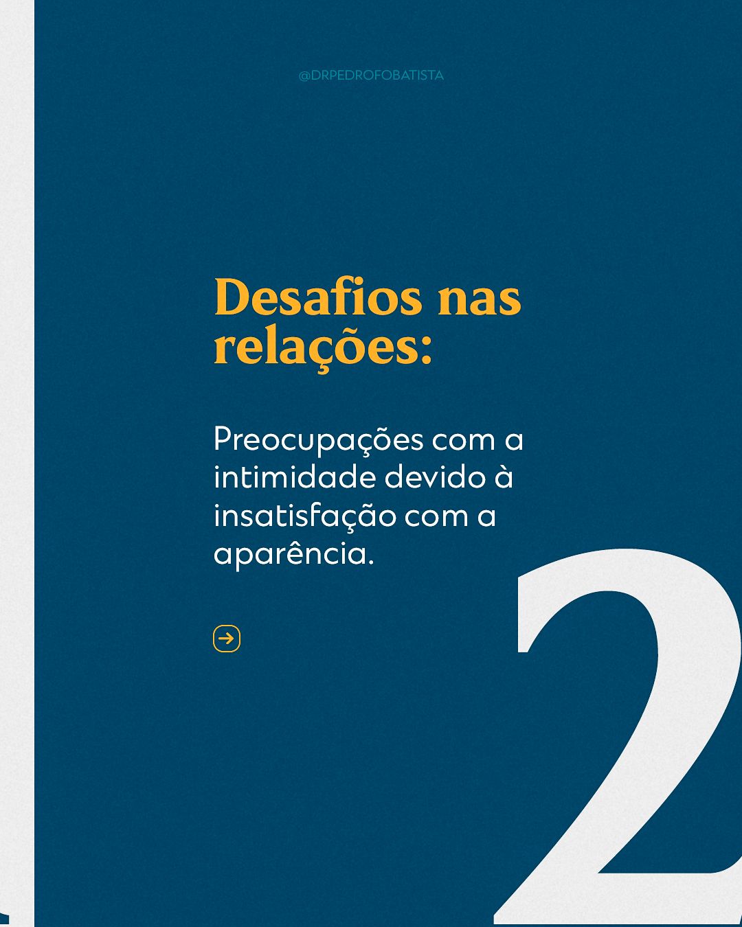
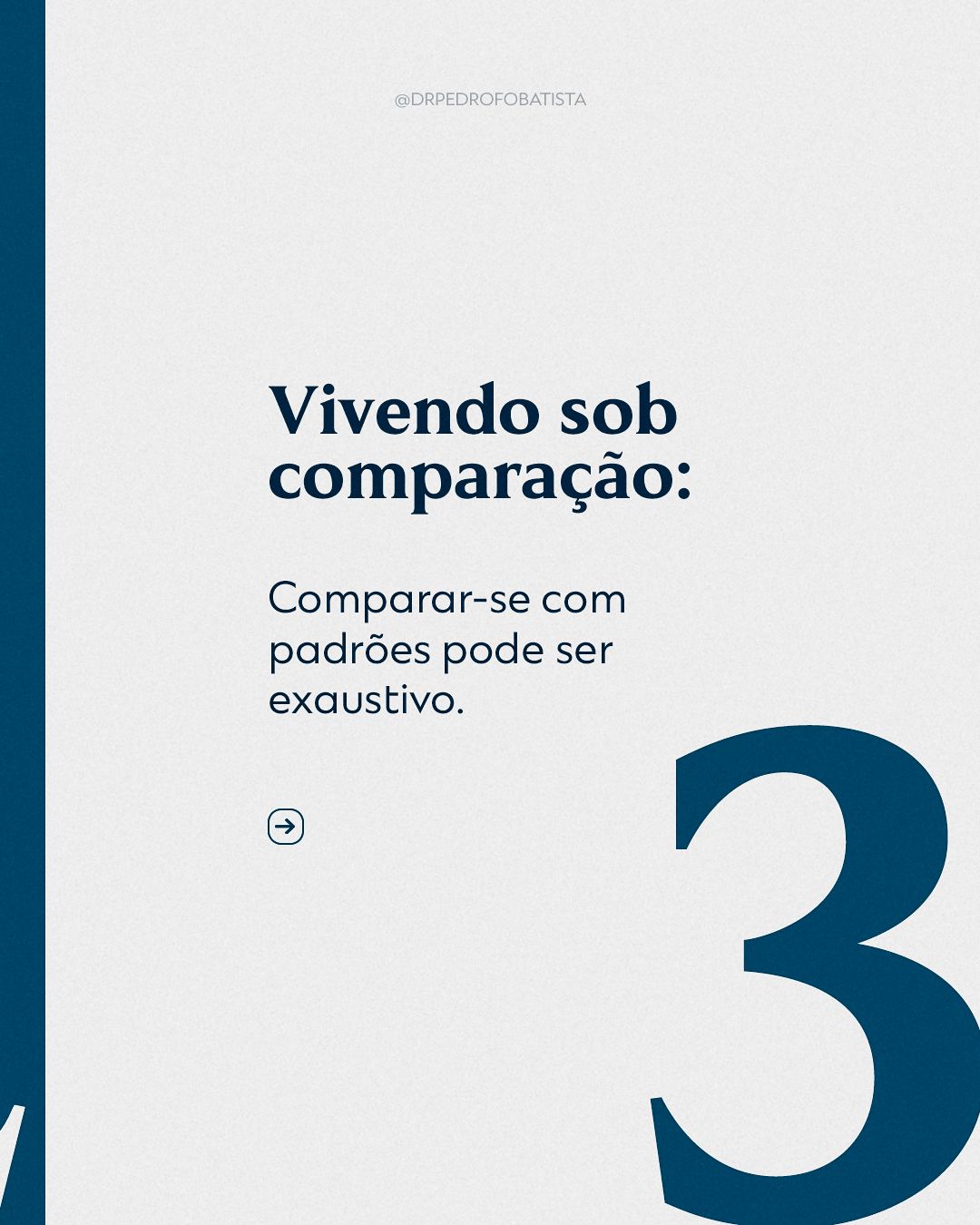
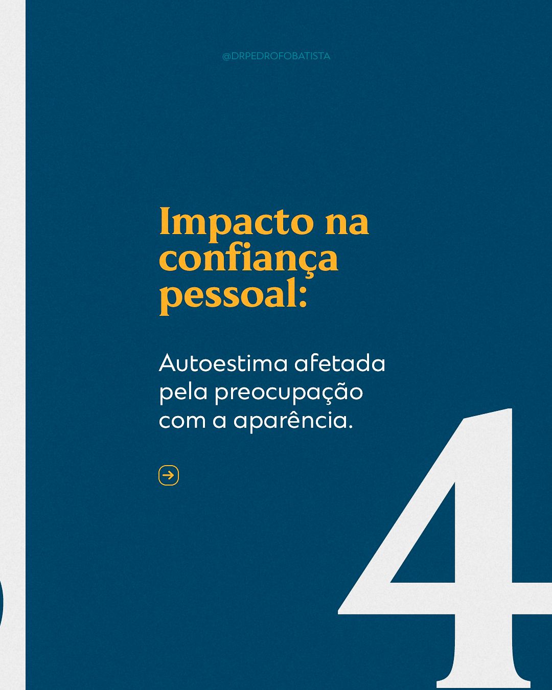
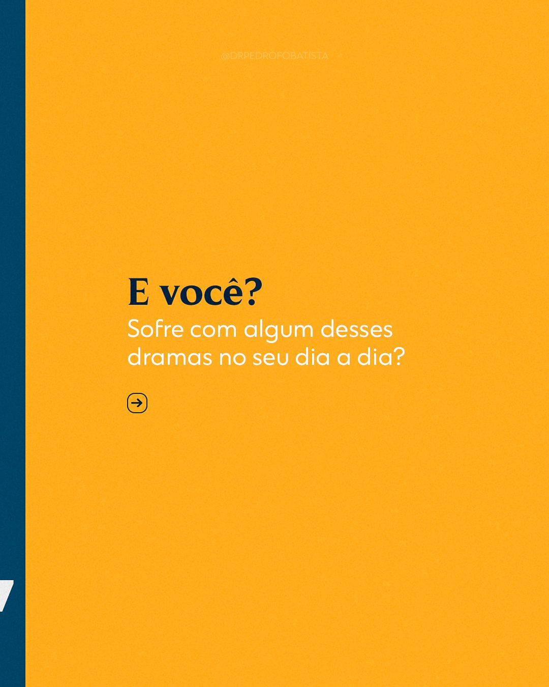
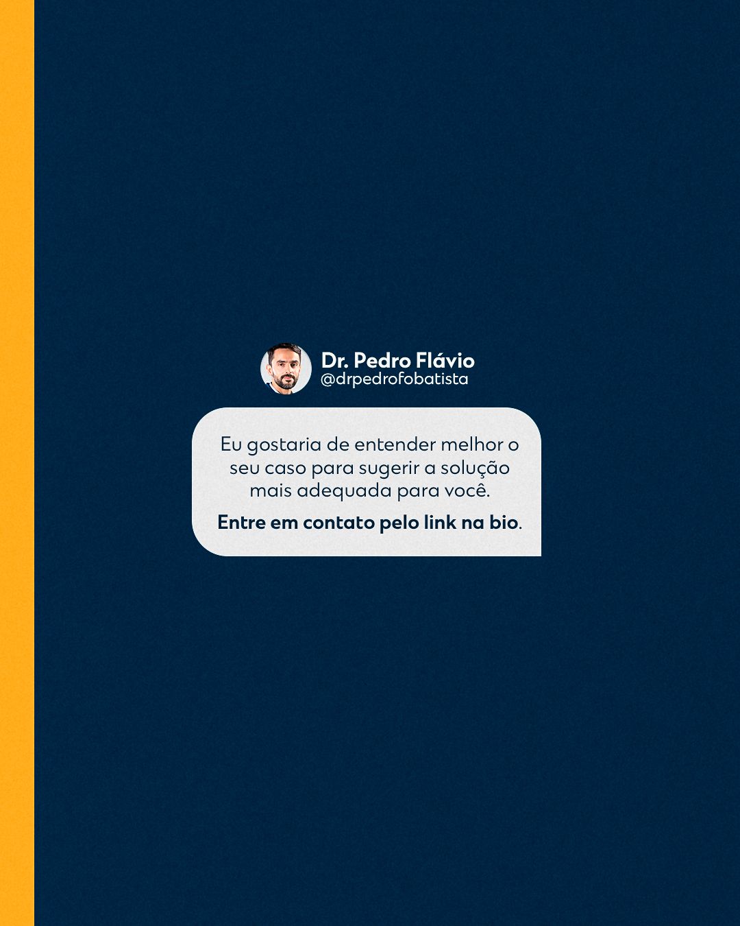
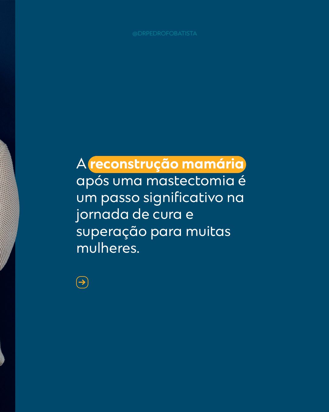
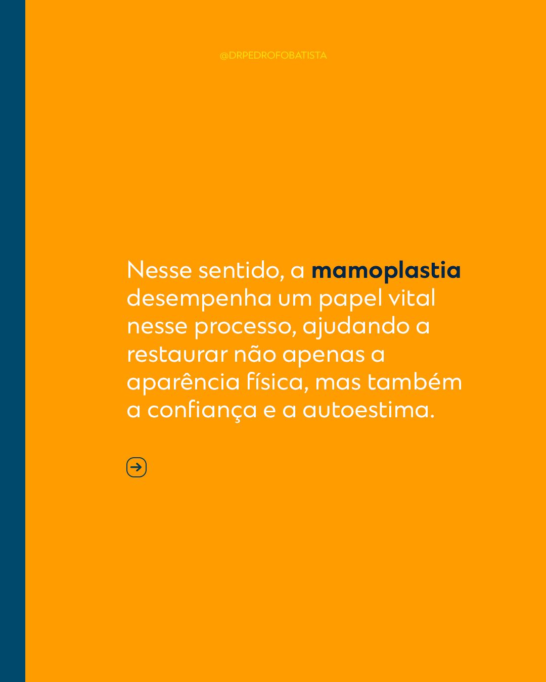
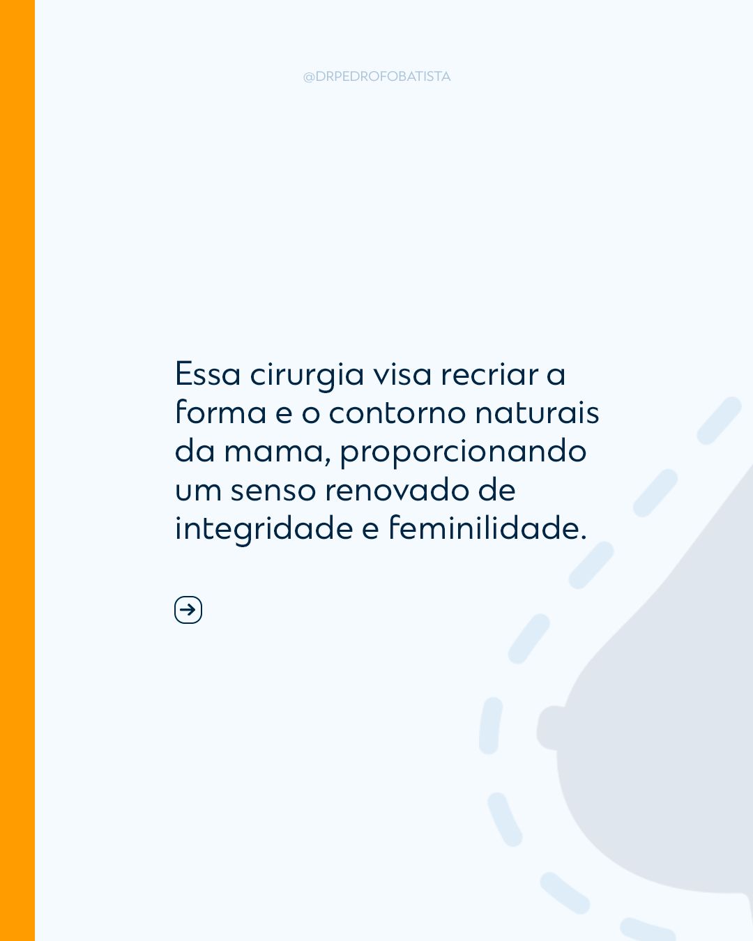
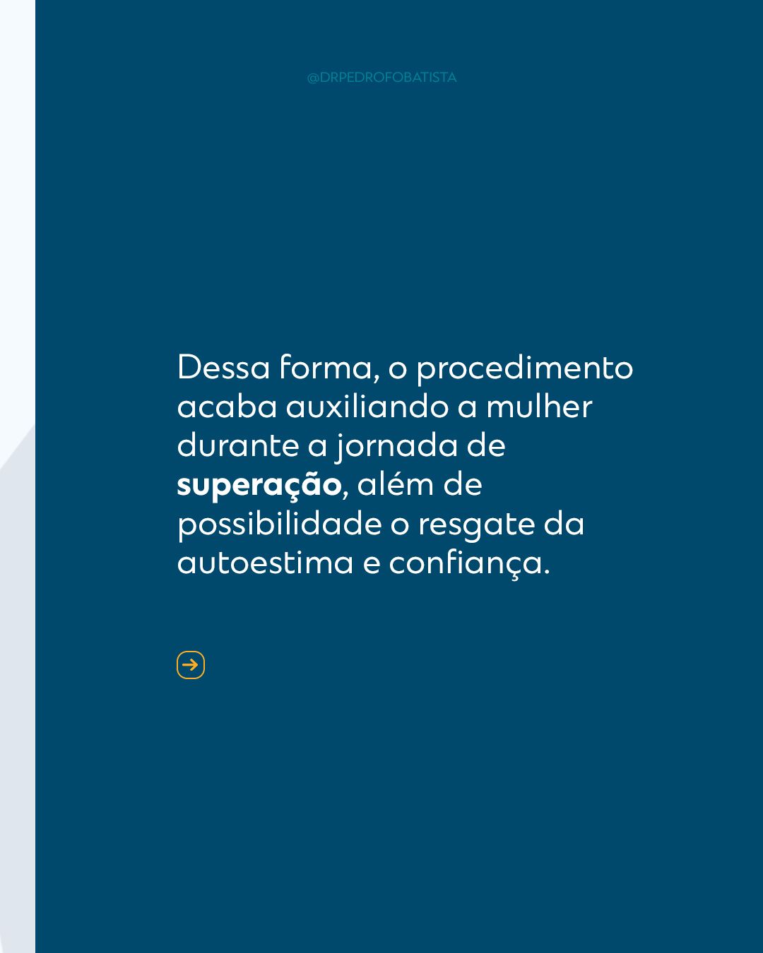
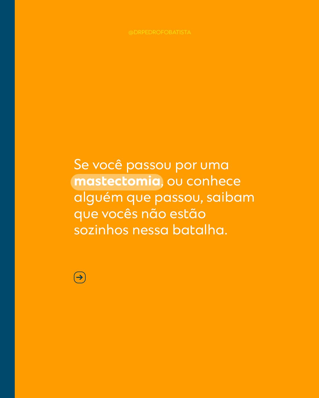
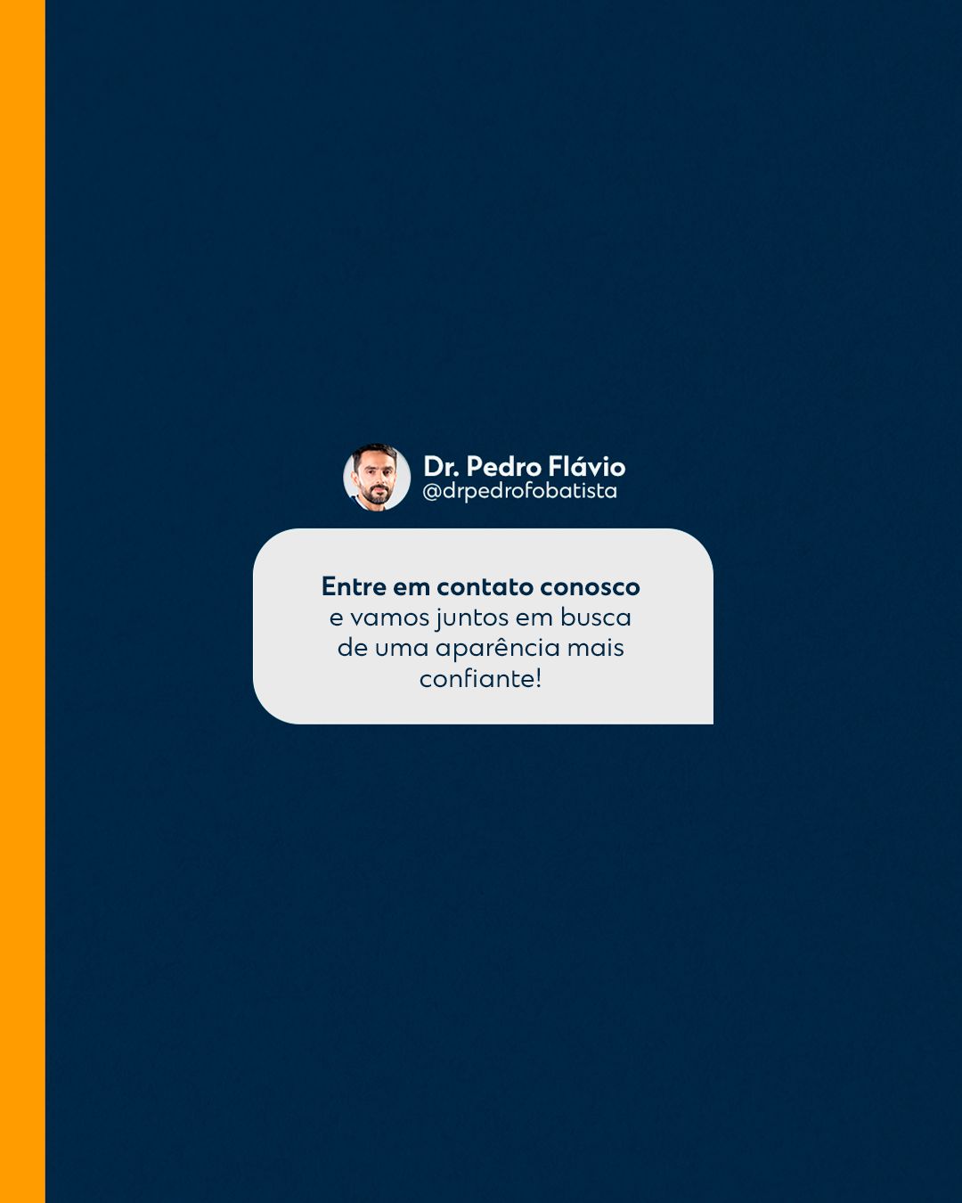
The carousels follow the same narrative logic: a cover with a question or promise, one idea per slide in short sentences and a closing call to book. Repeating colors and positions makes followers recognize the format before reading.


STAGE 05Color theory
The palette is monochromatic blue, a strategic choice for plastic surgery: blue communicates trust, technique and safety, the opposite of flashy aesthetic appeal. Lightness variations (from navy to light blue) create depth without introducing another color, and white evokes a clinical, clean setting.
- #082545NavyBackgrounds and authority
- #025095BlueSignature color
- #7AAAD1Light blueDetails and transitions
- #030813Near blackDramatic backgrounds
- #FFFFFFWhiteClinical background and text
- #D69E55GoldAccent on special dates
| Pair | Use | Contrast | WCAG |
|---|---|---|---|
| Aa | White text on navy | 15.43:1 | AAA |
| Aa | White text on blue | 8.13:1 | AAA |
| Aa | Navy on white | 15.43:1 | AAA |
| Aa | Navy on light blue | 6.24:1 | AA |
| Aa | White text on light blue | 2.47:1 | fails |
Critical read: in the table above, pairs above 4.5:1 are safe for small text; the others should only be used in big, heavy headlines or swapped for a darker color.
Hex values sampled from the published final pieces.STAGE 06Typography and layout
Titles use heavy geometric sans-serif, white on blue, with keywords in another color or at giant scale. Big numbers and words, sometimes partly hidden behind the doctor, create layers. Supporting text is short and always stays in a single block.
The layout follows the 4:5 feed grid with constant inner margin, and the call-to-action footer always sits in the same place. In health topics, clarity comes before effect: one idea per piece and enough contrast for reading on a small screen.