Home / Work / Dr. Augusta Almeida
Dr. Augusta Almeida — Vascular surgery
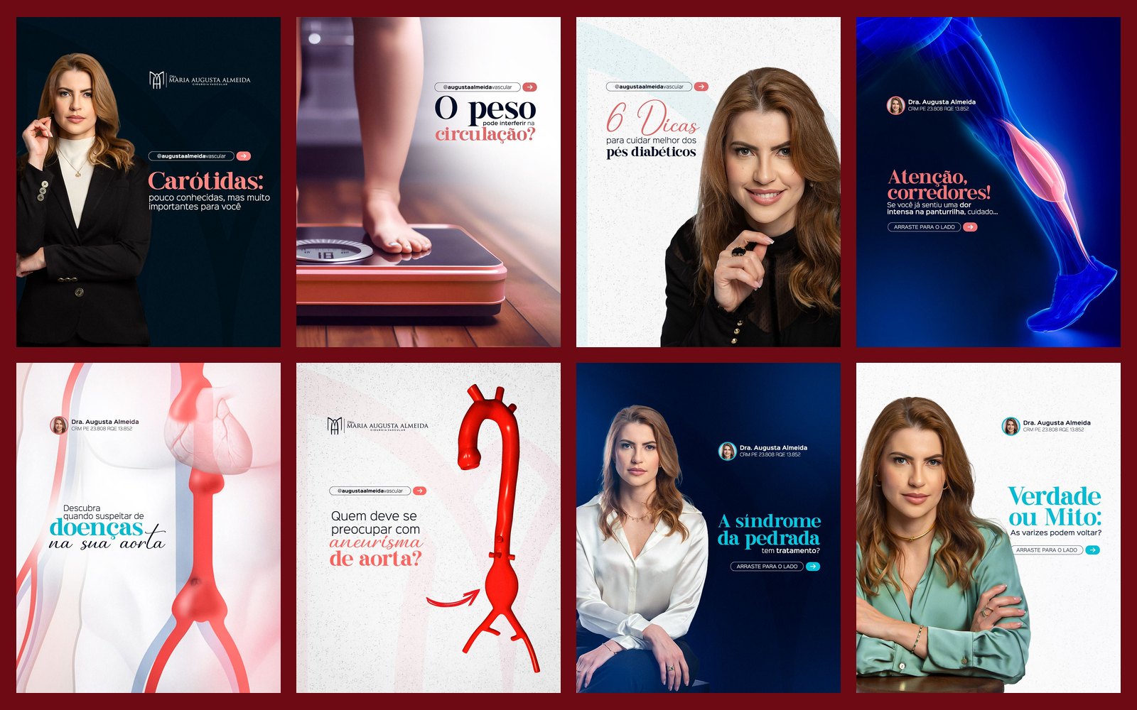
Social media for a vascular surgeon: varicose veins, aneurysms, diabetic foot and circulation, in red and deep teal with portraits of the doctor, feed, carousels and reels.
STAGE 01Context and goal
Dr. Augusta treats vein and artery diseases, subjects many people only look up when they are already in pain. The goal of the content is to make the public recognize warning signs (varicose veins, swelling, aneurysm, diabetic foot) and seek help early.
About authorship: each doctor's brand, logo and identity already existed and were not created by me. My work here was creating the social media art: feed, carousels and stories.STAGE 02Visual system
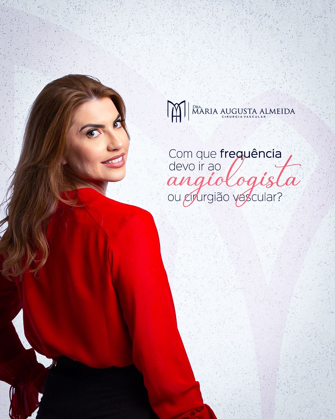
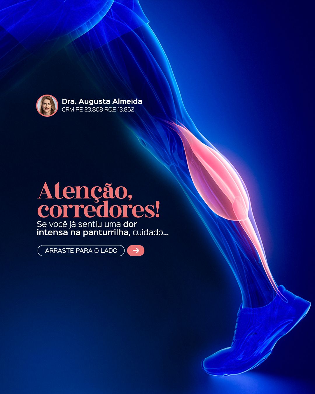
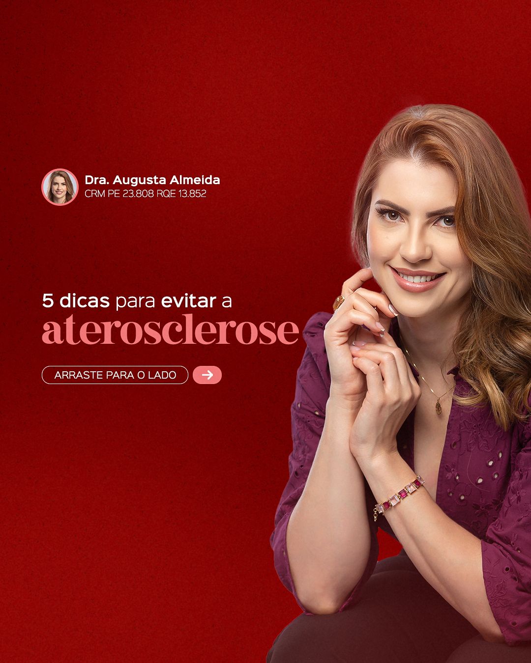
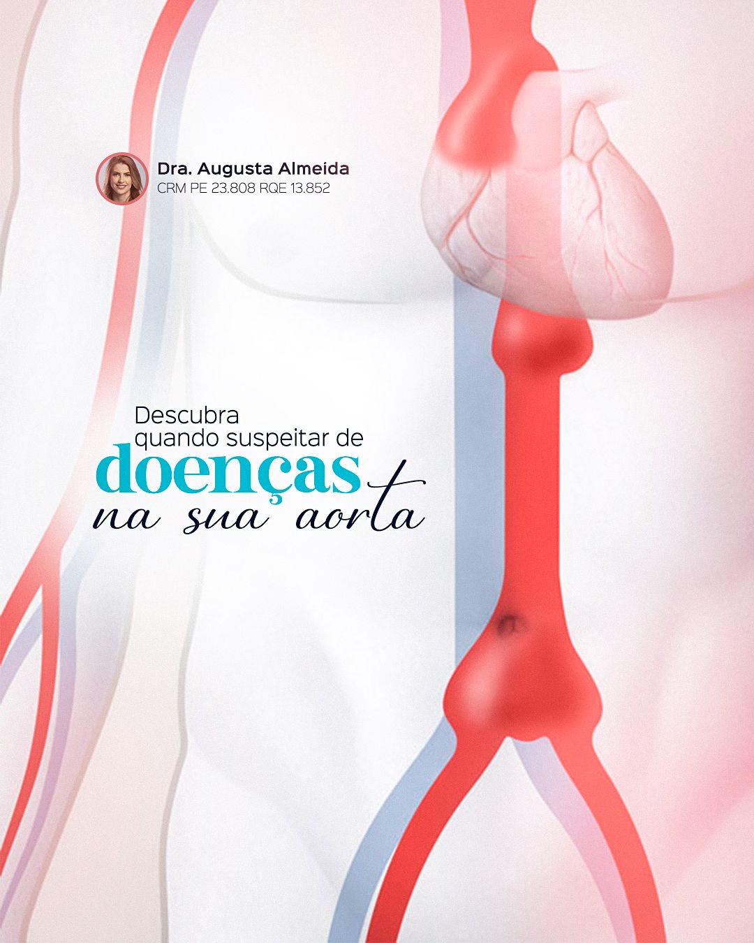
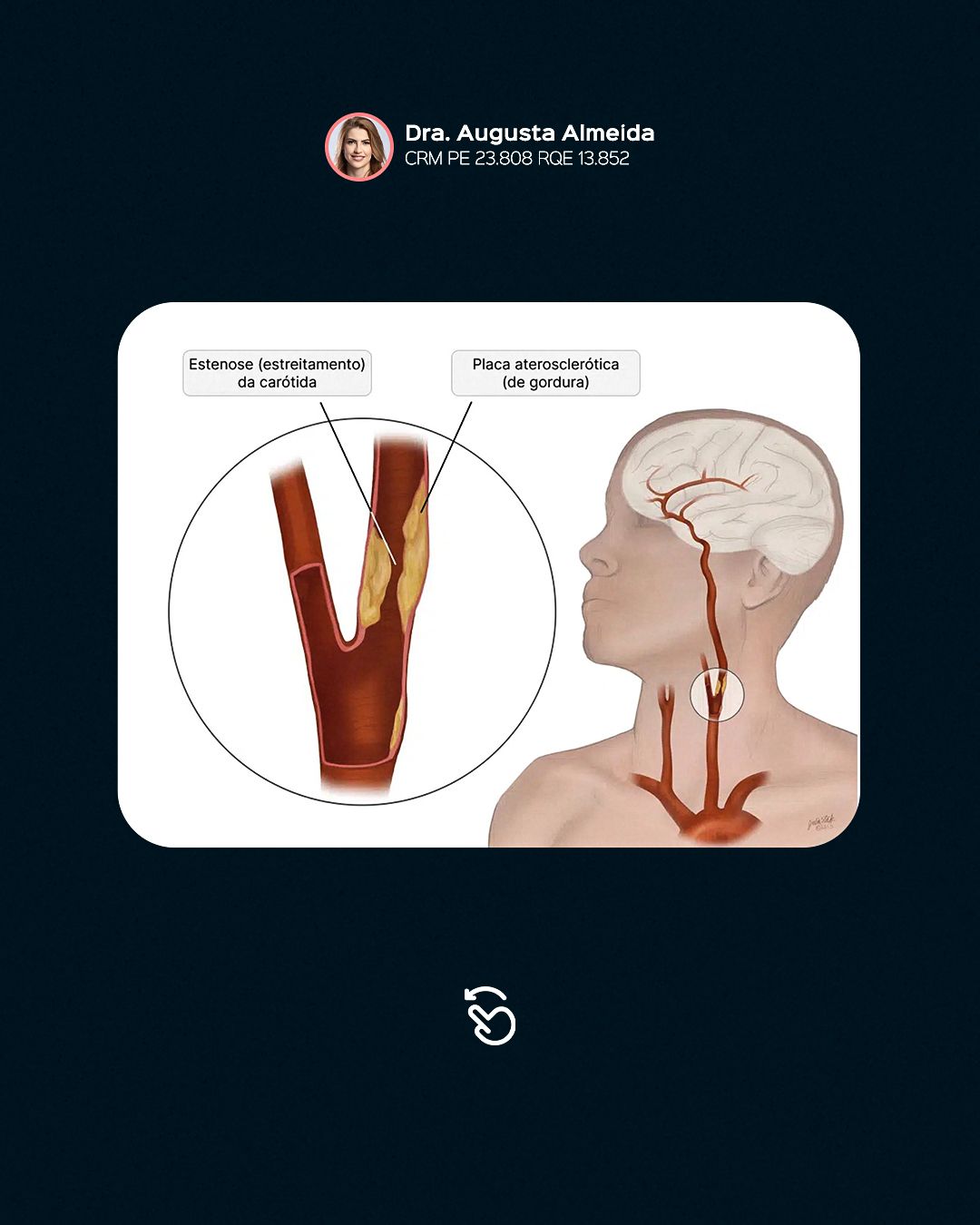
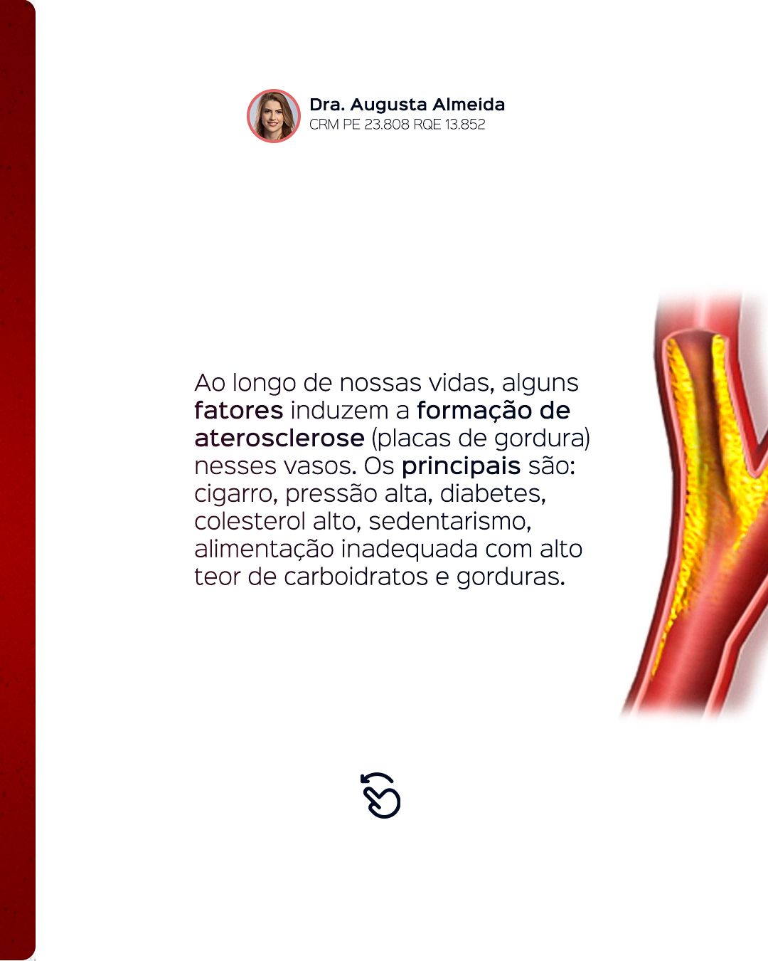
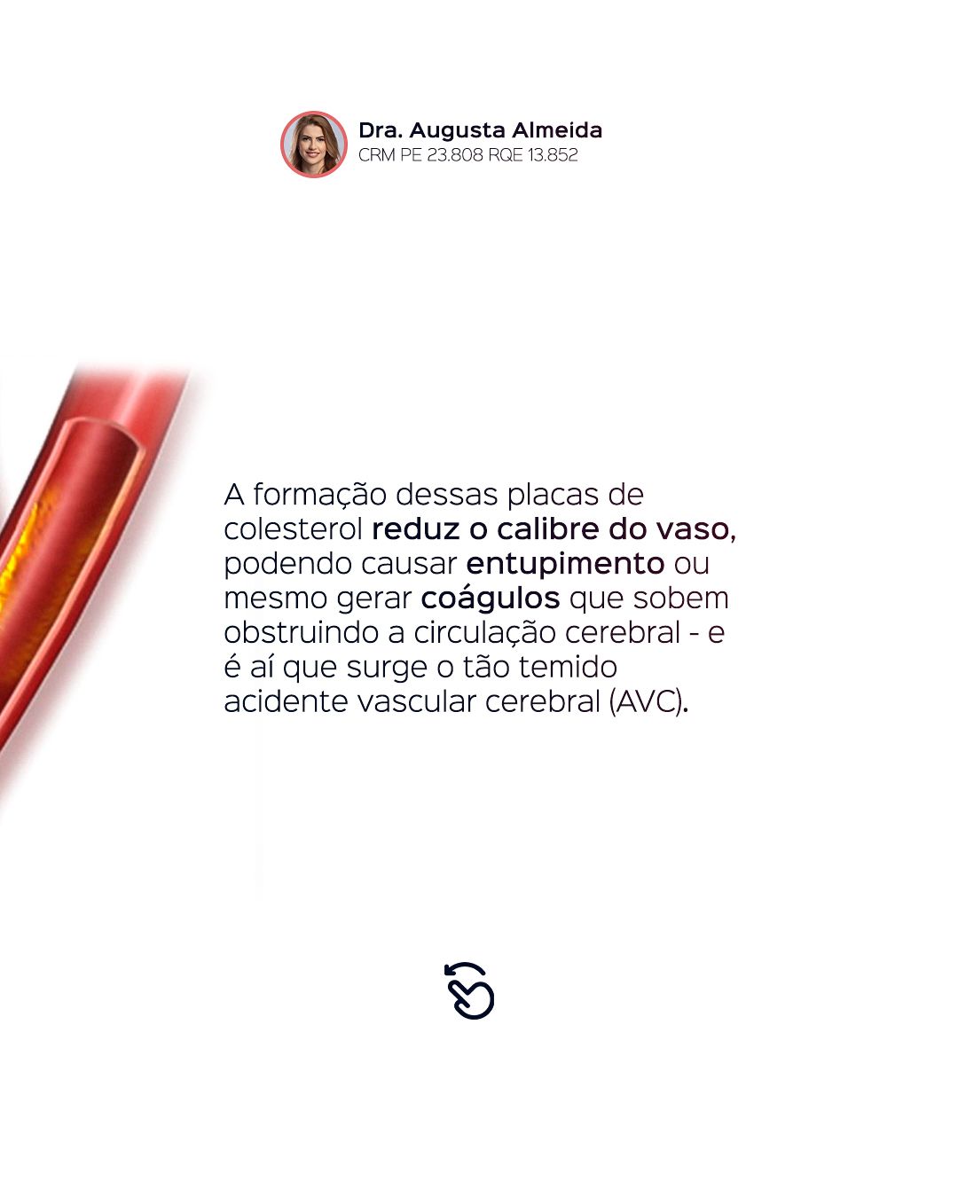
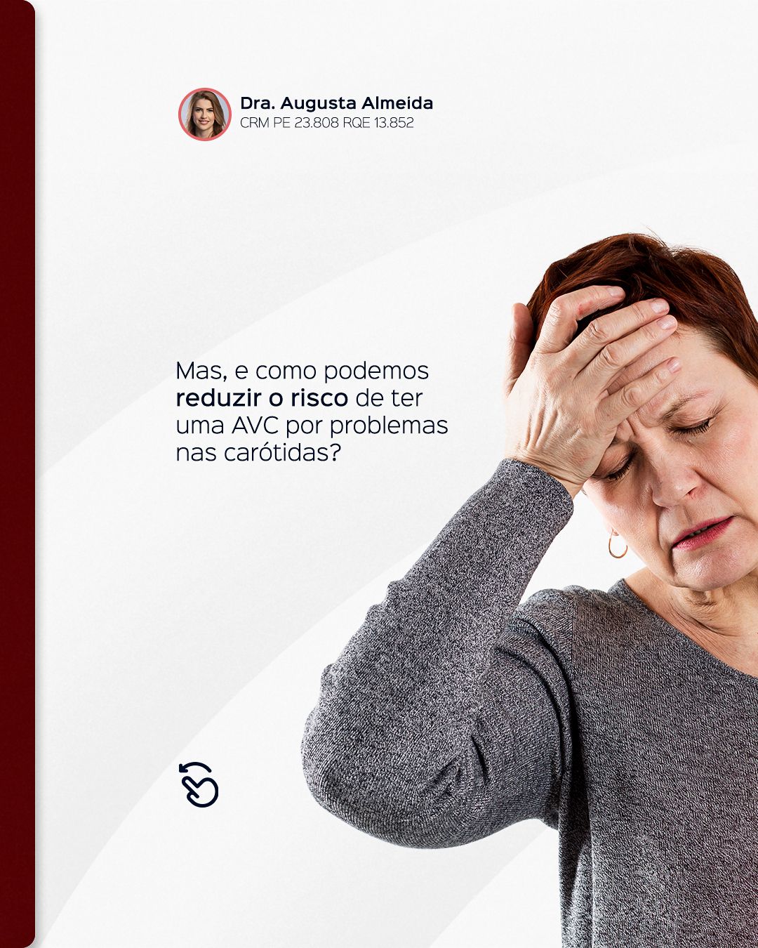
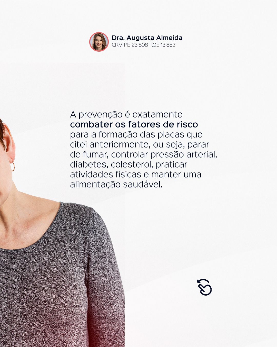
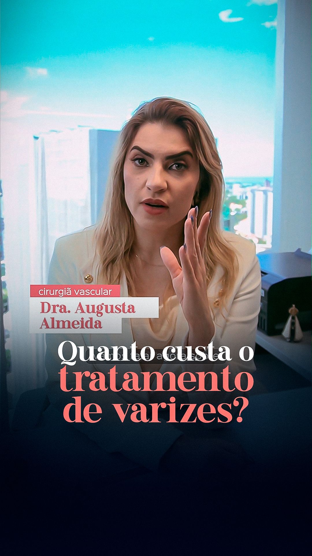
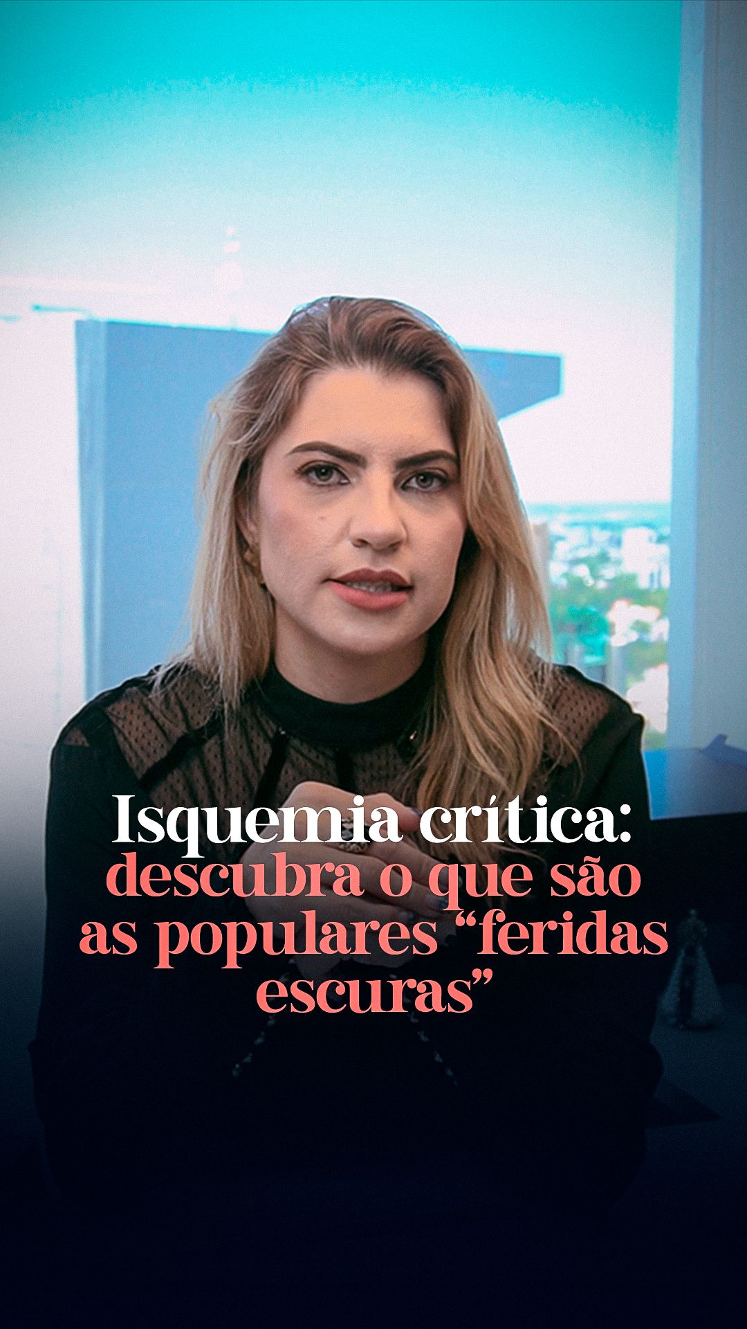
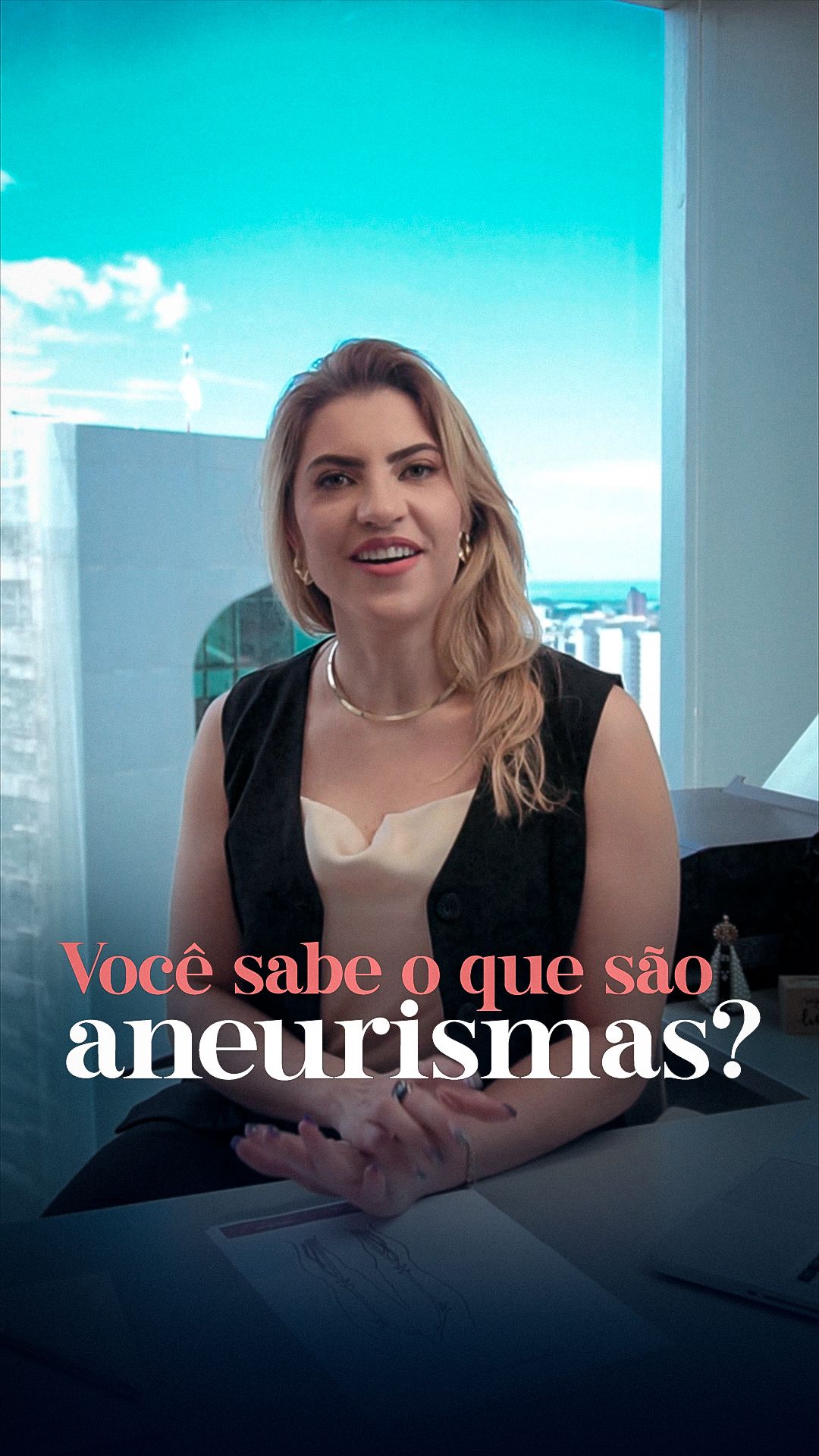
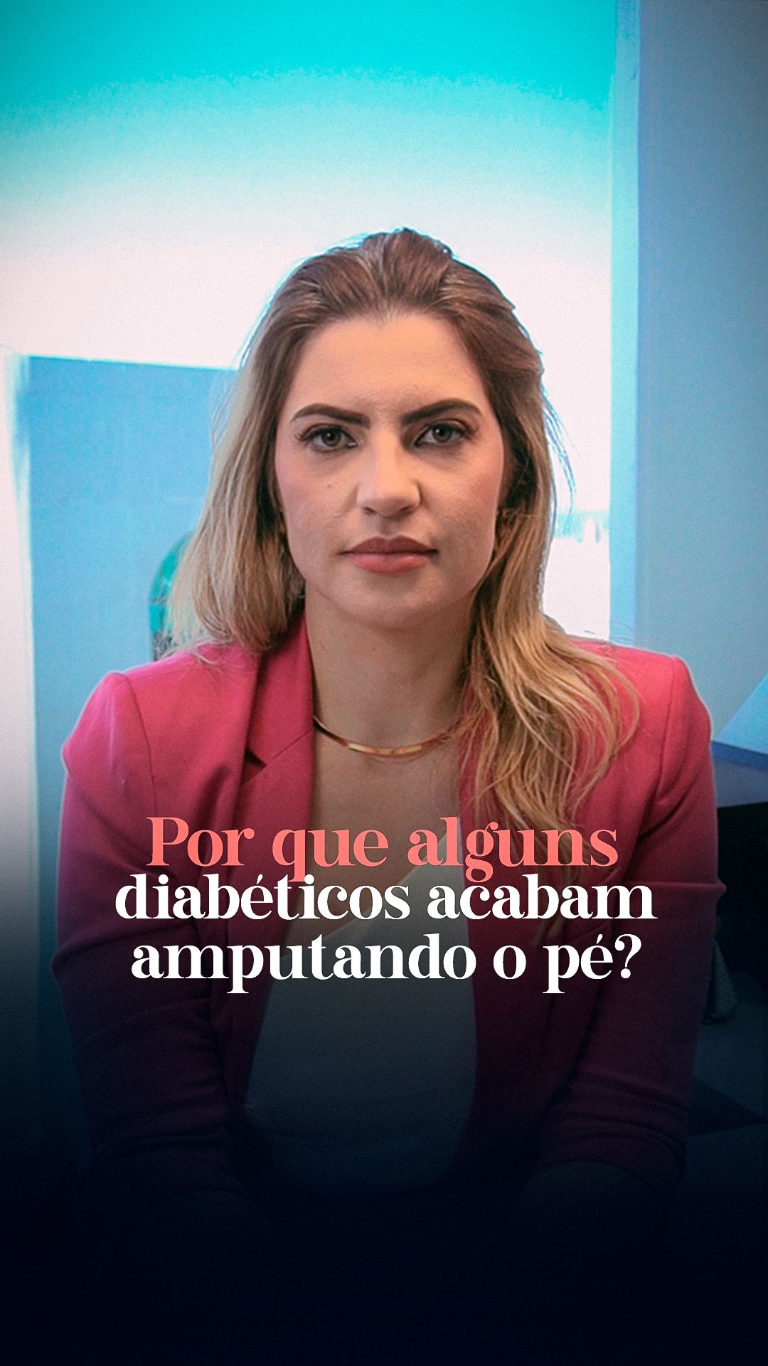
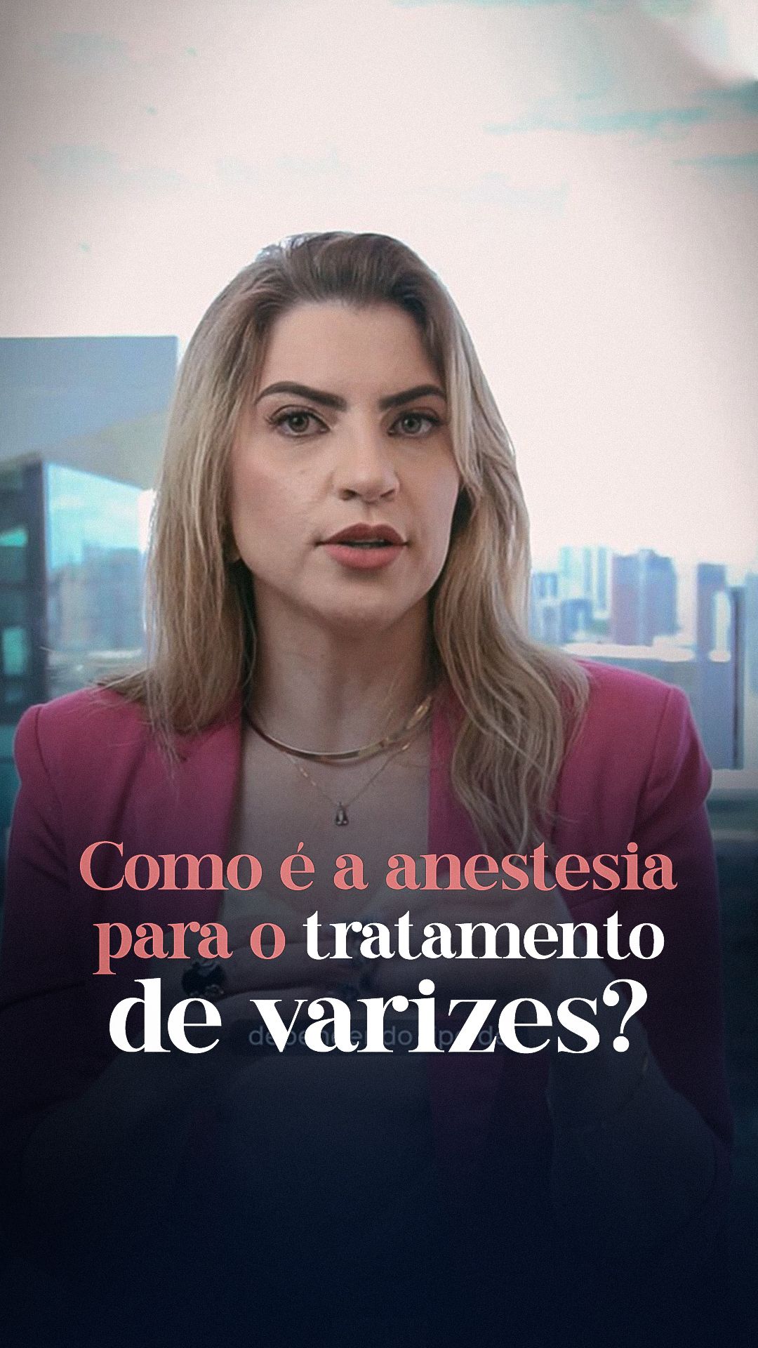
The system alternates portraits of the doctor in different poses and outfits (which humanize and add variety) with anatomical illustrations (aorta, vessels, heart) that explain. The title font has an elegant, almost handwritten stroke for keywords. There are also 9:16 reels and stories with the doctor speaking to camera, with large titles over the video.
STAGE 03Feed
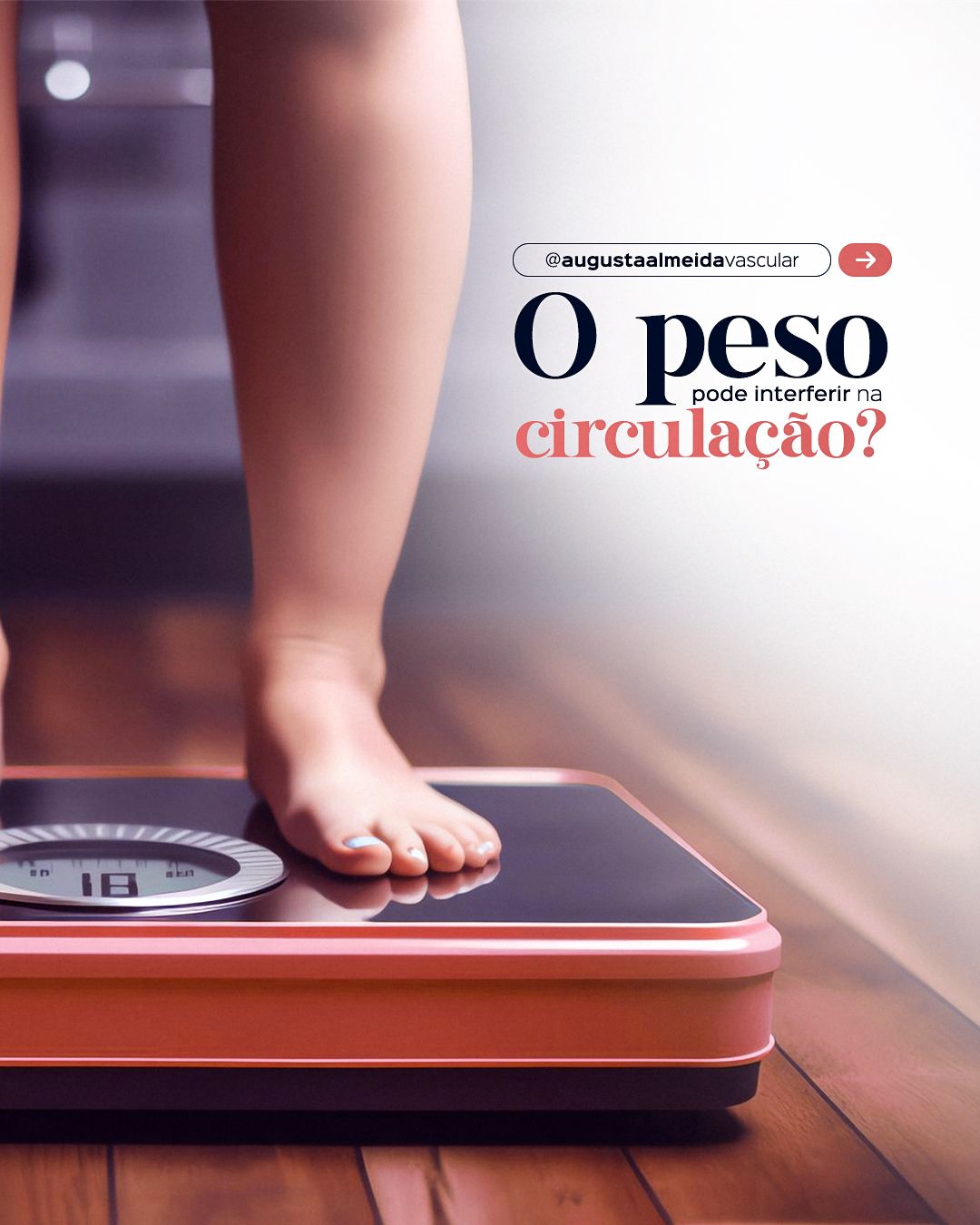
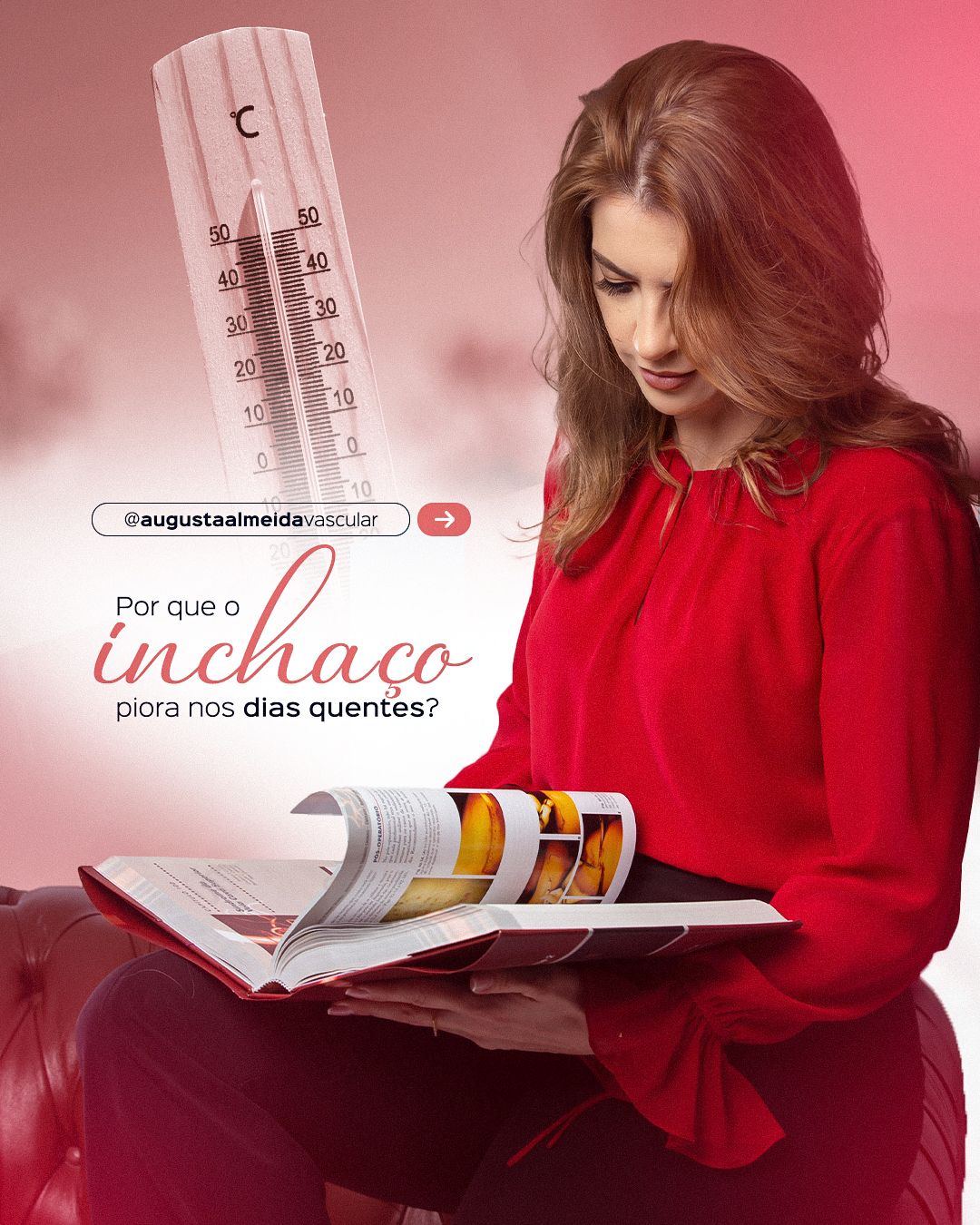
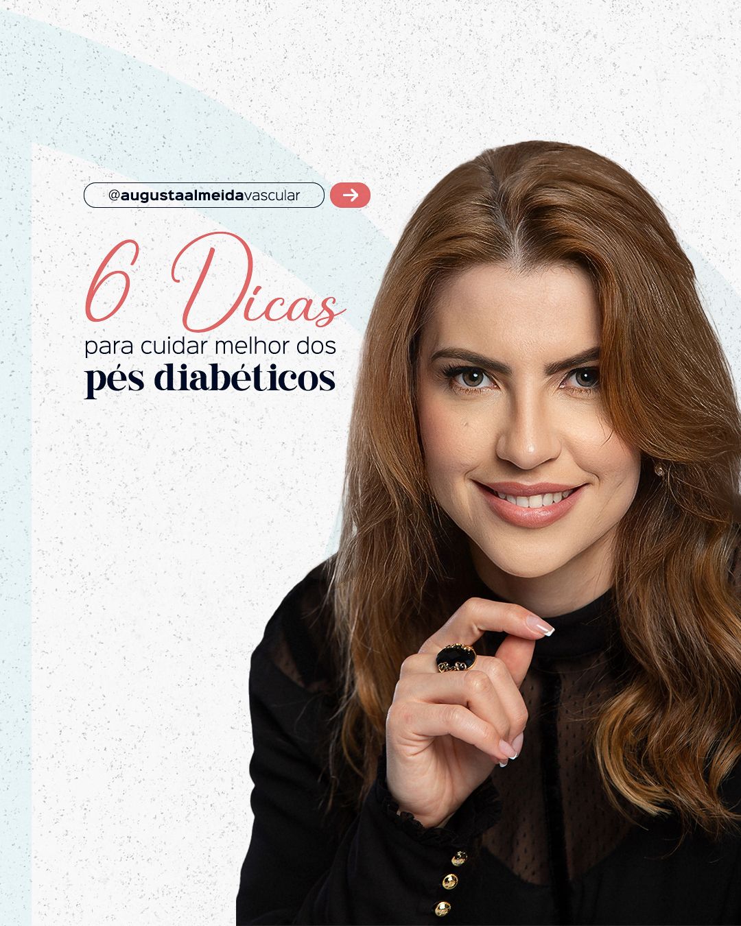
The feed mixes education, myths and truths and specialty dates, always with the same header structure so the profile feels like a single voice.





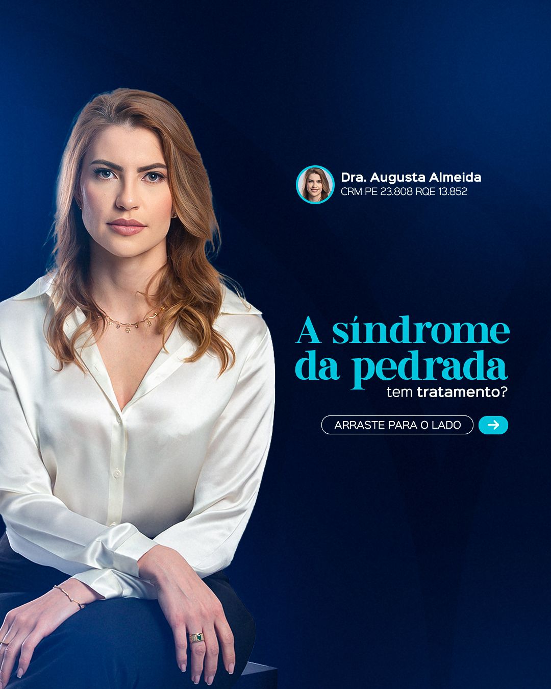
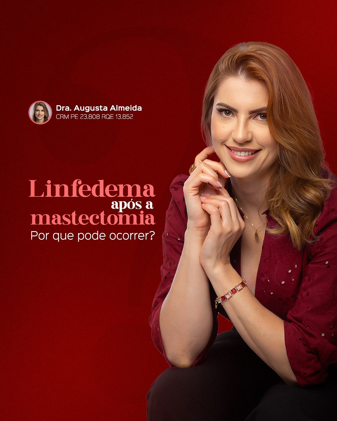
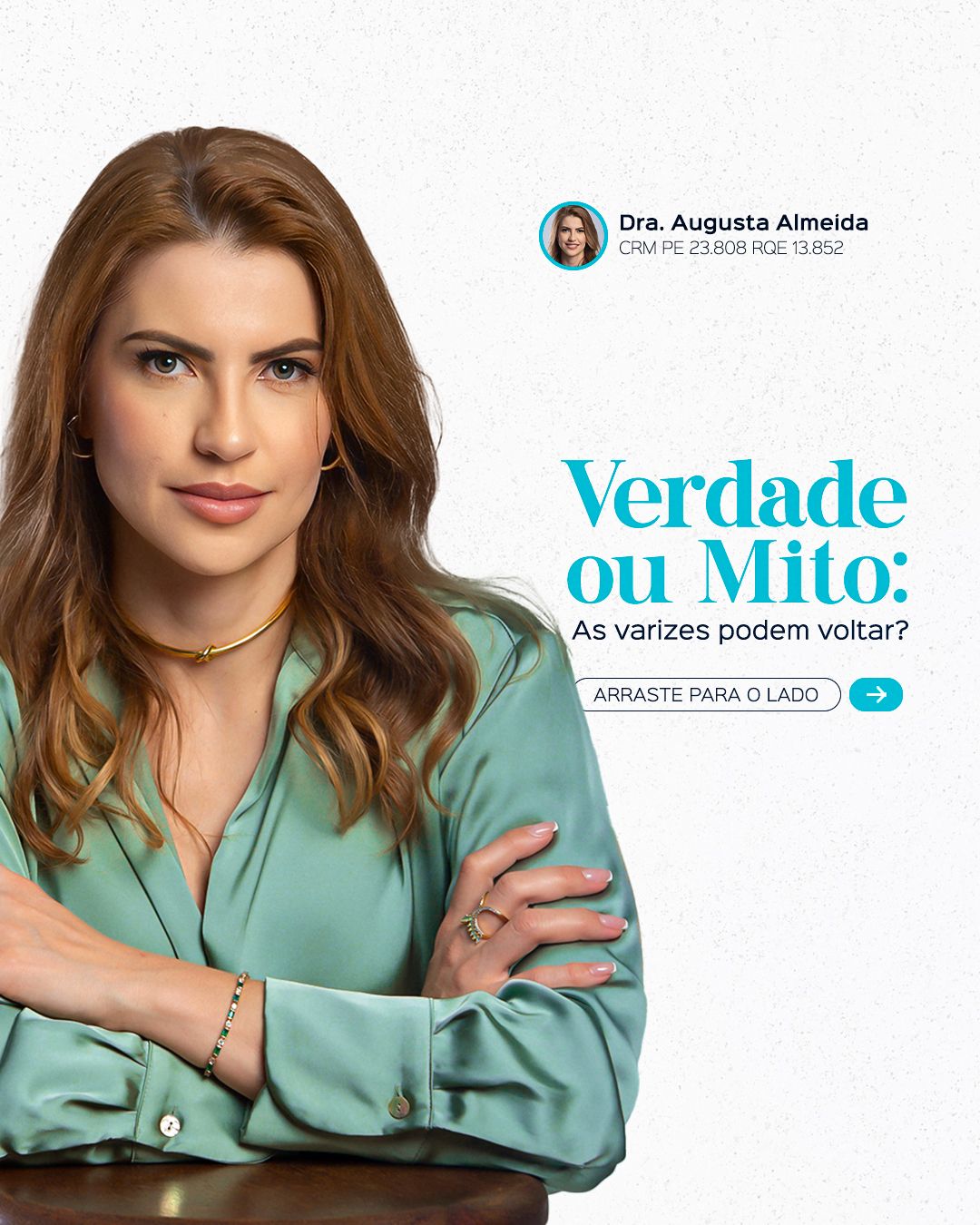
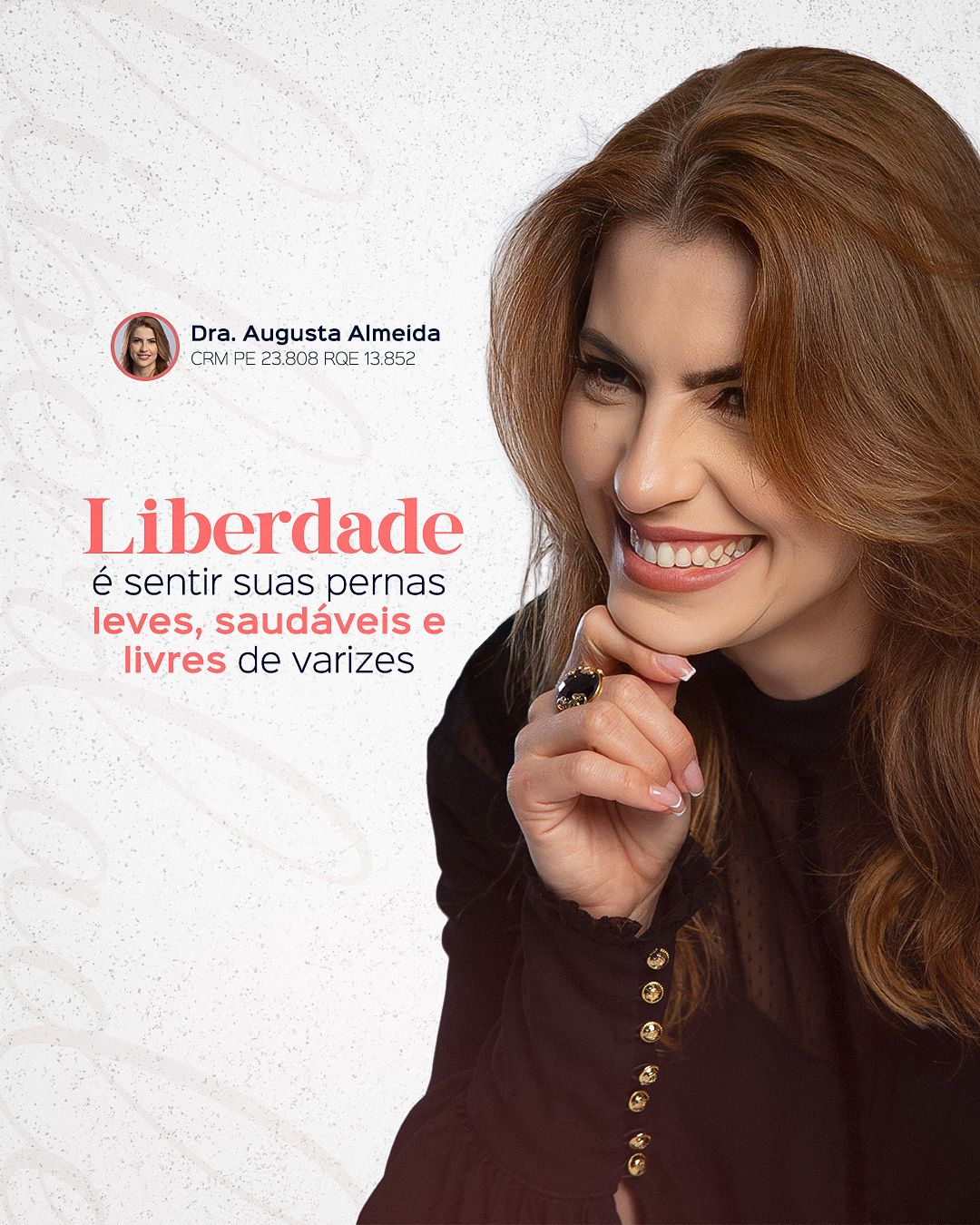
STAGE 04Carousels and reels
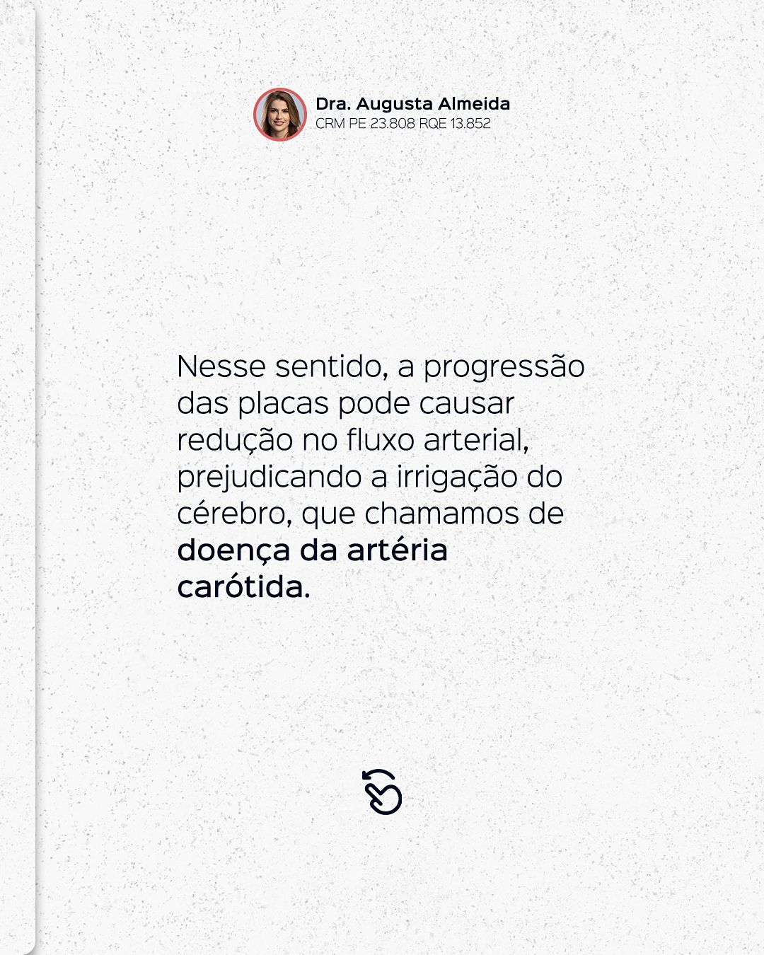
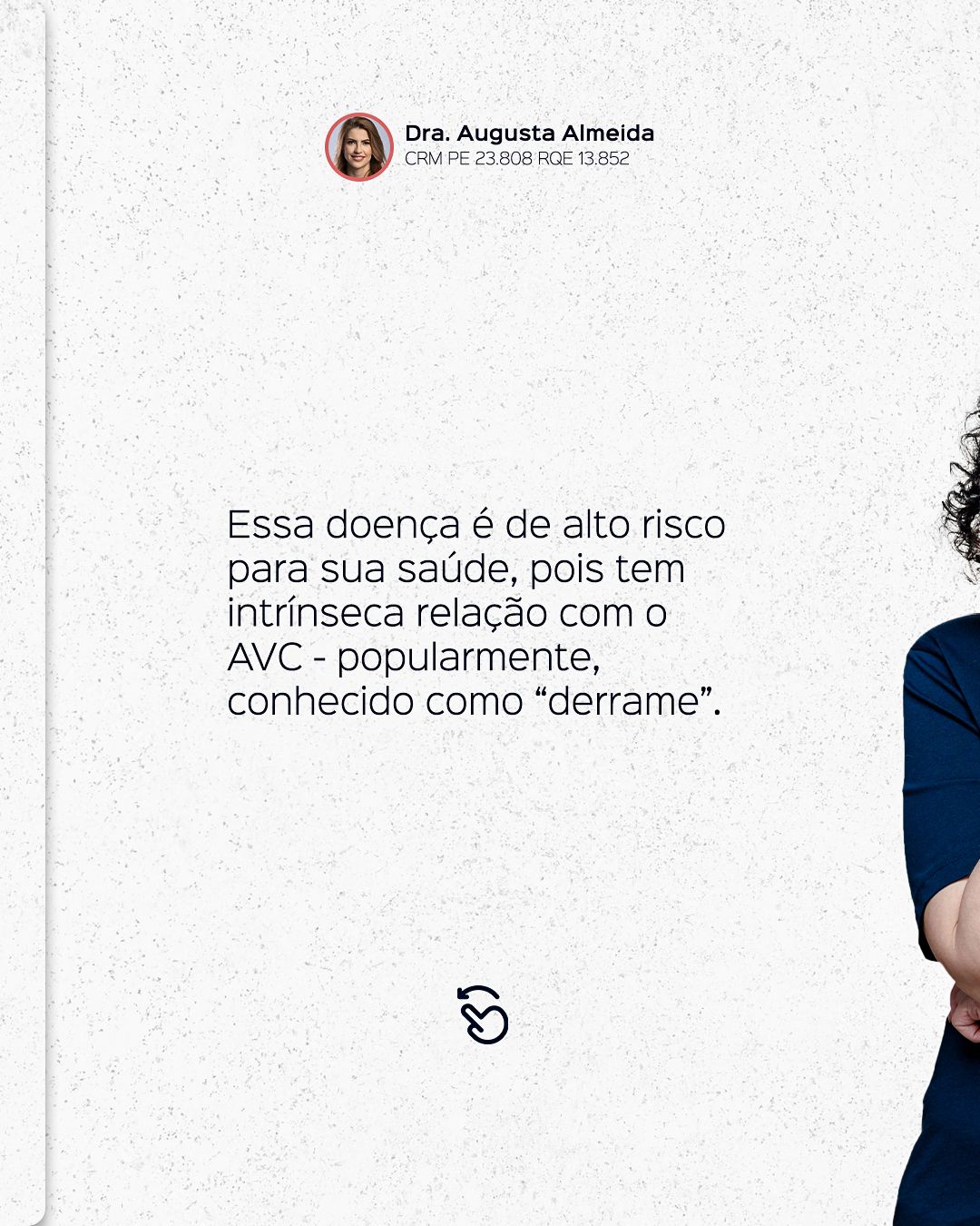
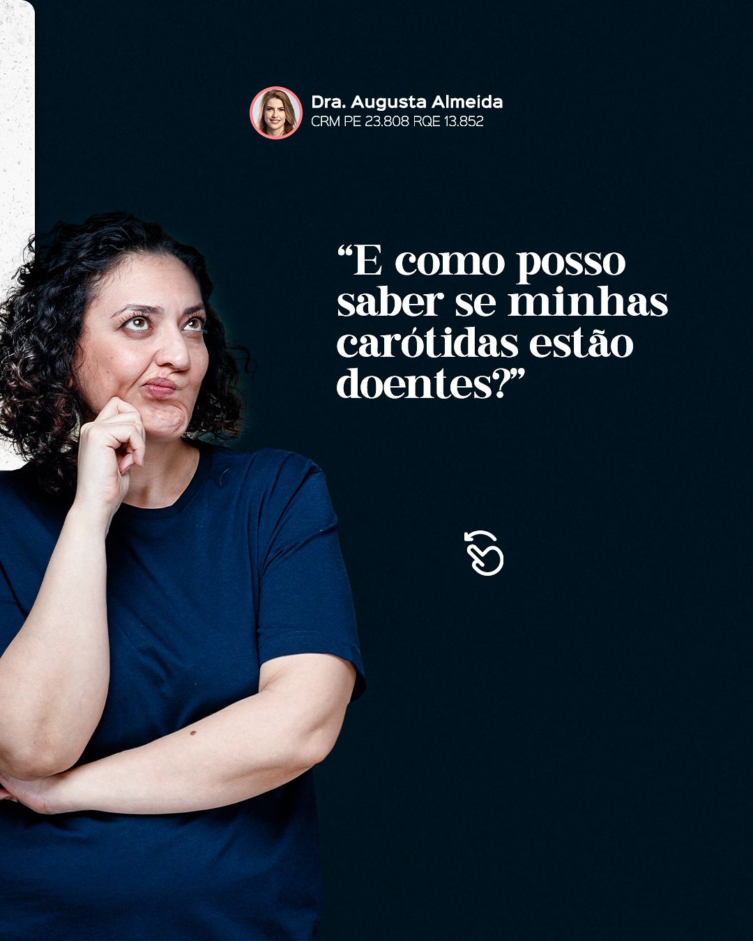
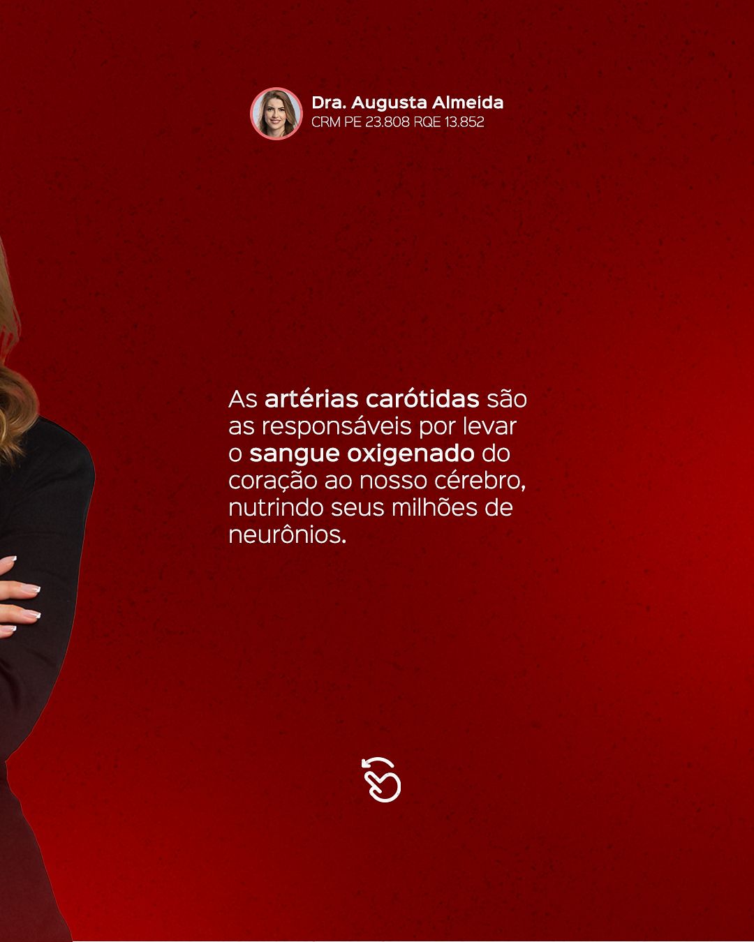
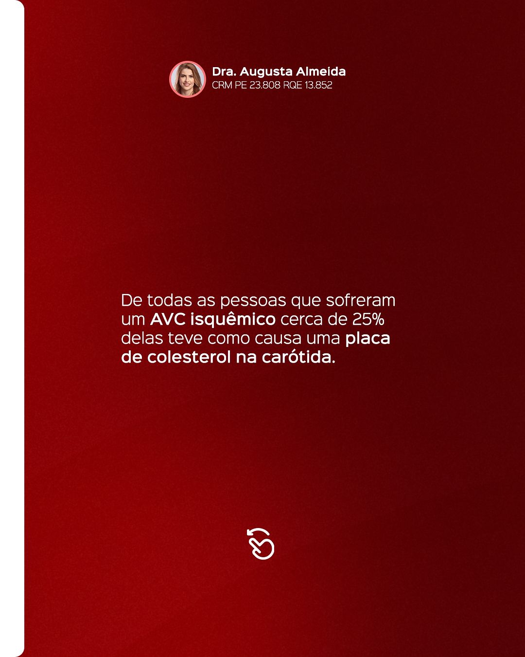
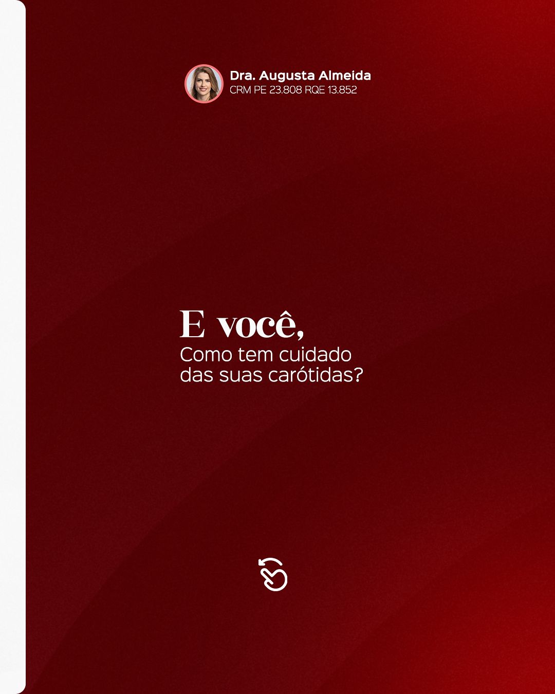
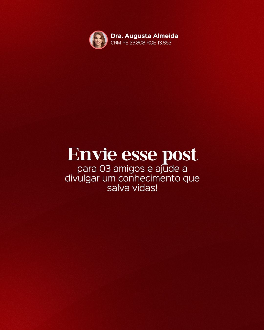
The carousels follow the same narrative logic: a cover with a question or promise, one idea per slide in short sentences and a closing call to book. Repeating colors and positions makes followers recognize the format before reading.




STAGE 05Color theory
Red is the signature color and speaks to the subject: blood, circulation, alert. In contrast, deep teal recalls veins and gives breathing room, forming a pair of opposite temperatures (warm and cool), like arteries and veins. The light background with soft pink brings delicacy for the female audience, which is large for varicose veins.
- #880301Deep redBackgrounds and signature color
- #D01006Bright redHighlights and alerts
- #01131FDeep teal-blackContrast backgrounds
- #72B9B6AquaReels and cool details
- #F1C0C6Light pinkSoft backgrounds
- #F6F6F6Off-whiteClean background
| Pair | Use | Contrast | WCAG |
|---|---|---|---|
| Aa | White text on deep red | 10.19:1 | AAA |
| Aa | White text on bright red | 5.59:1 | AA |
| Aa | Deep red on off-white | 9.43:1 | AAA |
| Aa | White text on deep teal | 18.85:1 | AAA |
| Aa | White text on aqua | 2.25:1 | fails |
Critical read: in the table above, pairs above 4.5:1 are safe for small text; the others should only be used in big, heavy headlines or swapped for a darker color.
Hex values sampled from the published final pieces.STAGE 06Typography and layout
Titles combine a thin, elegant serif (sometimes with a handwriting stroke) for keywords and a clean sans-serif for support. The mix conveys sophistication and care without losing legibility. In reels, text is large and kept within the safe zones of the video.
The layout follows the 4:5 feed grid with constant inner margin, and the call-to-action footer always sits in the same place. In health topics, clarity comes before effect: one idea per piece and enough contrast for reading on a small screen.