Home / Work / Dr. Nickson Alves
Dr. Nickson Alves — Rheumatology
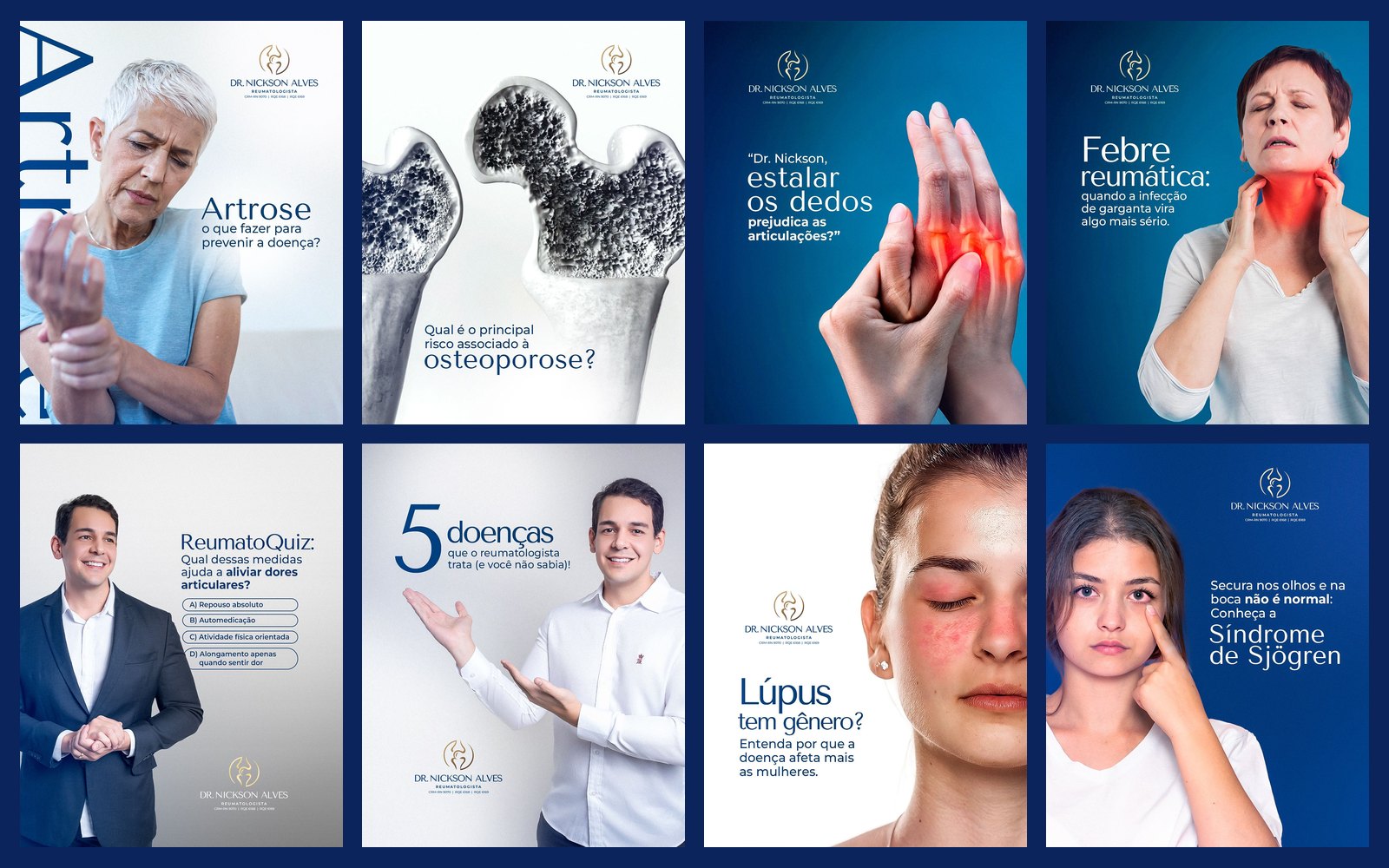
Social media for a rheumatologist: osteoarthritis, osteoporosis, lupus, gout and fibromyalgia, in deep blue with anatomical illustrations and the pain area highlighted in red.
STAGE 01Context and goal
Rheumatology deals with poorly understood diseases (lupus, fibromyalgia, Sjögren's syndrome) and common myths (“arthritis is only for the elderly”, “osteoporosis doesn't hurt”). Dr. Nickson's content aims to name the problem, explain it in simple language and bring the patient to the office.
About authorship: each doctor's brand, logo and identity already existed and were not created by me. My work here was creating the social media art: feed, carousels and stories.STAGE 02Visual system
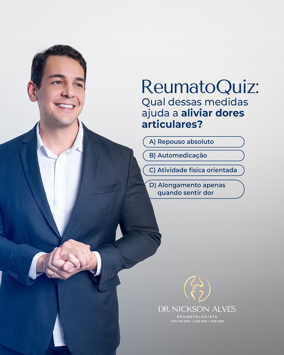
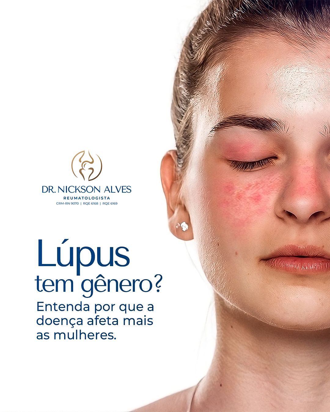
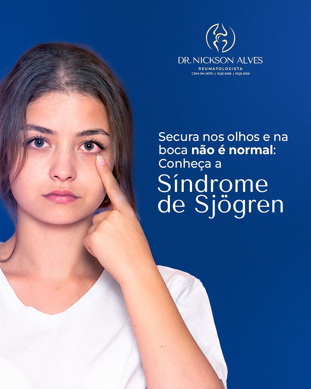
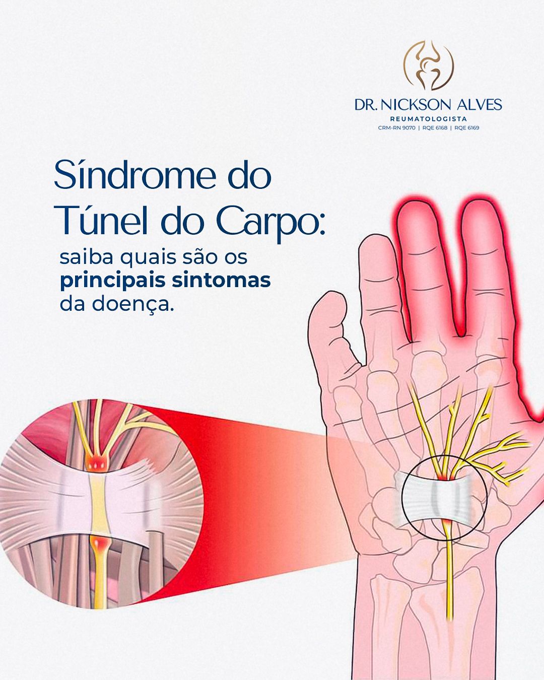
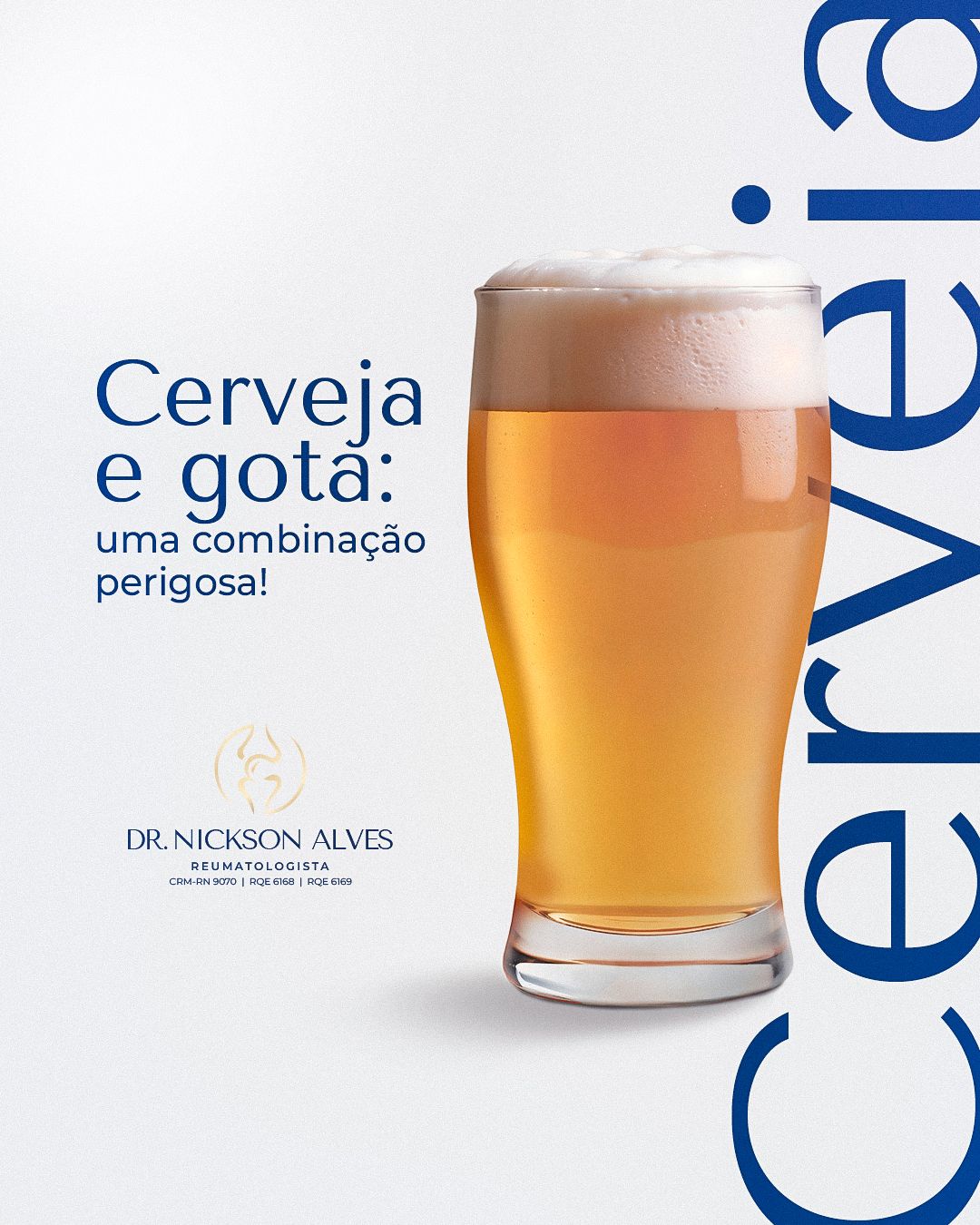
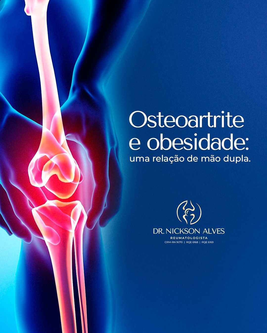
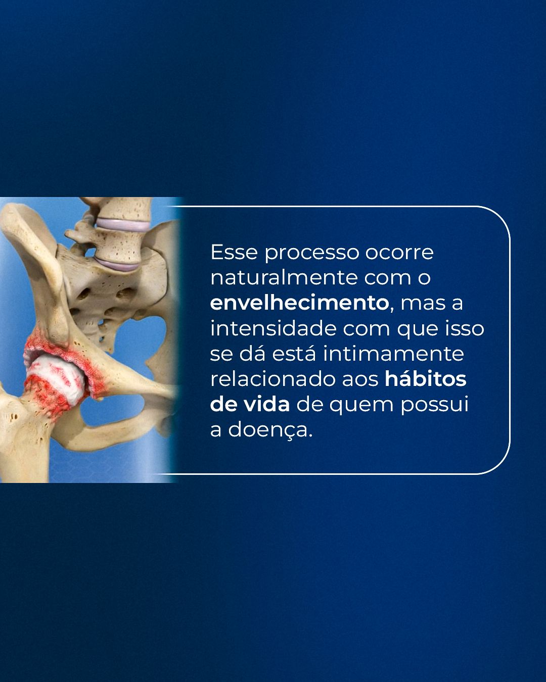
Each piece has a direct question or statement (“Does lupus have a gender?”, “Beer and gout: a dangerous combination!”) and an image that locates the problem in the body. When pain is the subject, the area appears highlighted in red or orange over blue anatomy. The office's gold logo stays discreet, and there are quiz-format pieces with the doctor.
STAGE 03Feed
The feed mixes education, myths and truths and specialty dates, always with the same header structure so the profile feels like a single voice.
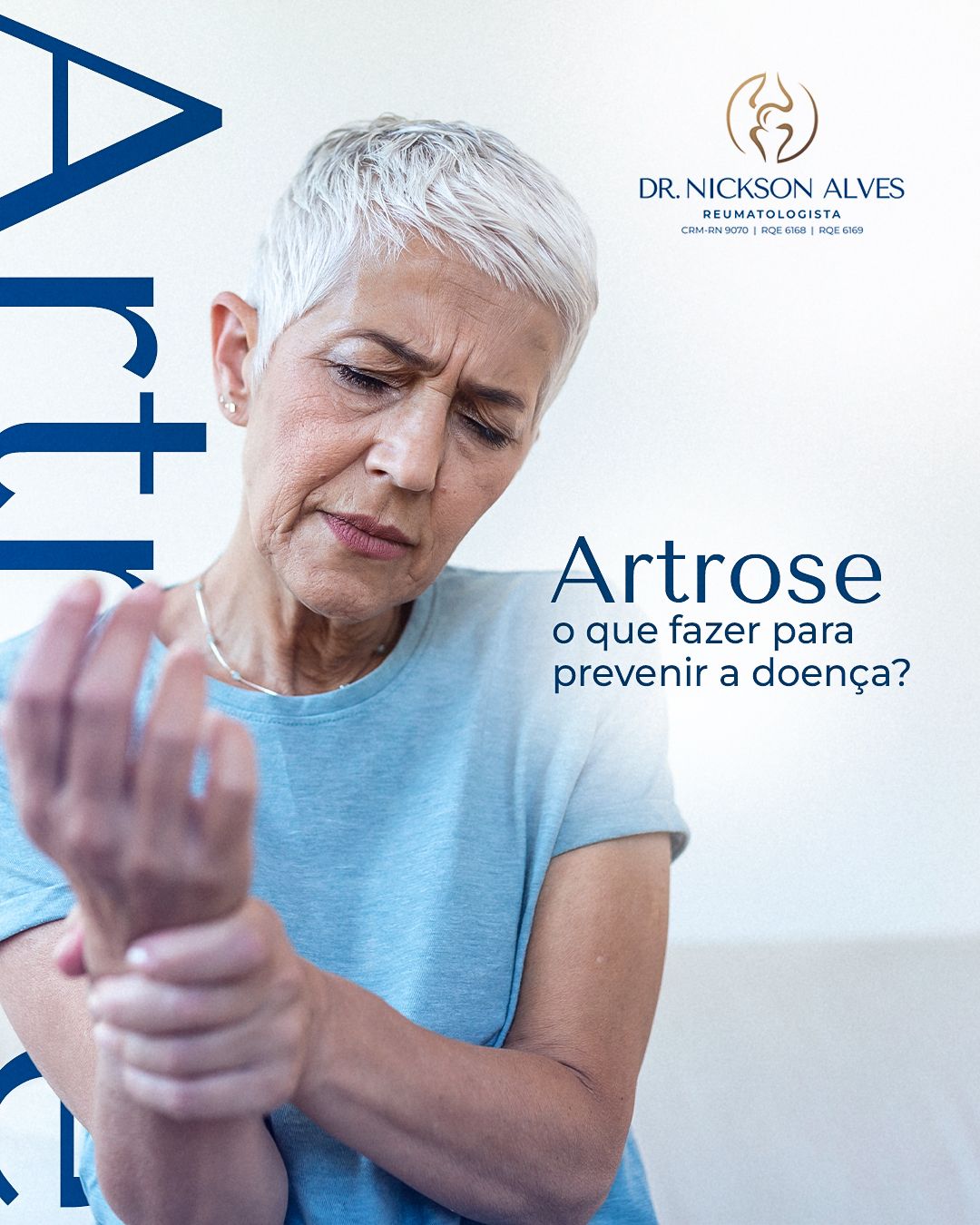
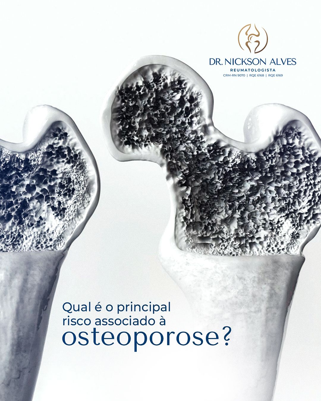
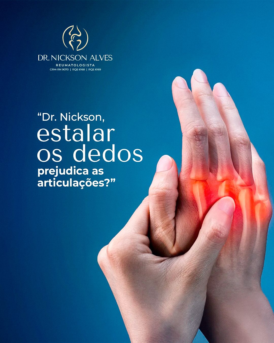



STAGE 04Carousels
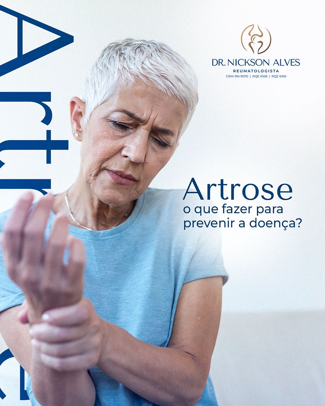
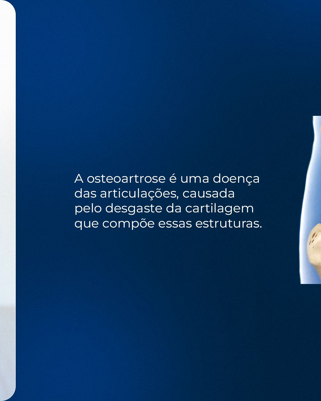
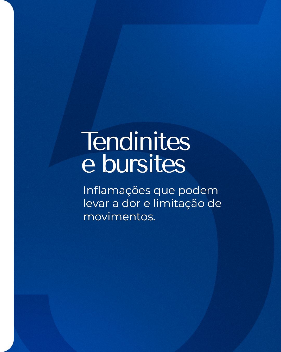
The carousels follow the same narrative logic: a cover with a question or promise, one idea per slide in short sentences and a closing call to book. Repeating colors and positions makes followers recognize the format before reading.


STAGE 05Color theory
The base is blue: trust, science and calm. The palette's trick is the opposite-color accent: the red and orange of the inflamed area contrast with blue (warm against cool, nearly complementary) and lead the eye exactly to the pain point. The color thus has an informative role, not just a decorative one. The logo's gold adds sophistication.
- #0D0C54Midnight blueDeep backgrounds
- #013879Brand blueSignature color
- #0172A6Mid blueGradients and anatomy
- #E29C48GoldLogo and highlights
- #DCDFE8Blue-grayLight backgrounds
- #FFFFFFWhiteBreathing room and text
| Pair | Use | Contrast | WCAG |
|---|---|---|---|
| Aa | White text on brand blue | 11.39:1 | AAA |
| Aa | White text on midnight blue | 17.53:1 | AAA |
| Aa | Brand blue on white | 11.39:1 | AAA |
| Aa | White text on mid blue | 5.30:1 | AA |
| Aa | Midnight blue on gold | 7.58:1 | AAA |
Critical read: in the table above, pairs above 4.5:1 are safe for small text; the others should only be used in big, heavy headlines or swapped for a darker color.
Hex values sampled from the published final pieces.STAGE 06Typography and layout
Titles use heavy geometric sans-serif, with keywords in light blue or in a colored box. There are giant vertical words on the edge (“Arthrosis”, “Beer”) crossing the piece. Supporting text is short, and quizzes use lists with lettered circles, easy to read.
The layout follows the 4:5 feed grid with constant inner margin, and the call-to-action footer always sits in the same place. In health topics, clarity comes before effect: one idea per piece and enough contrast for reading on a small screen.