Home / Work / Dr. Taís Suassuna
Dr. Taís Suassuna — Pediatrics
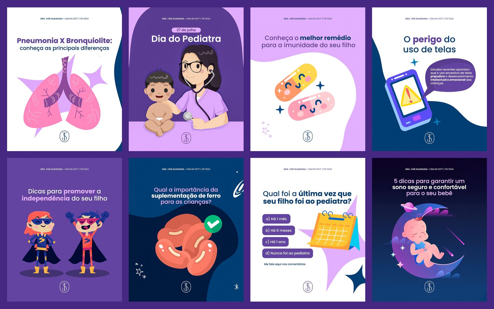
Social media for a pediatrician with illustrations of the children's world: sleep, screens, immunity and little ones' health, in purple, blue and lilac with coral and yellow accents.
STAGE 01Context and goal
Dr. Taís's audience is parents, often anxious. The content has to be warm and light without ceasing to be trustworthy: a tone that reassures and guides instead of frightening.
About authorship: each doctor's brand, logo and identity already existed and were not created by me. My work here was creating the social media art: feed, carousels and stories.STAGE 02Visual system
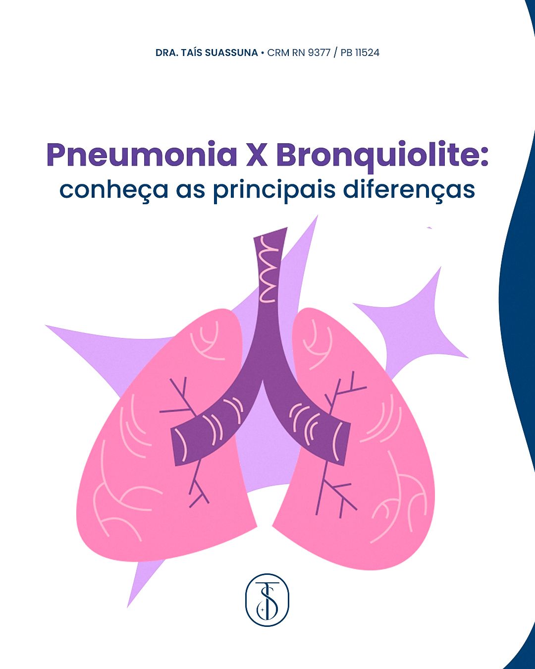
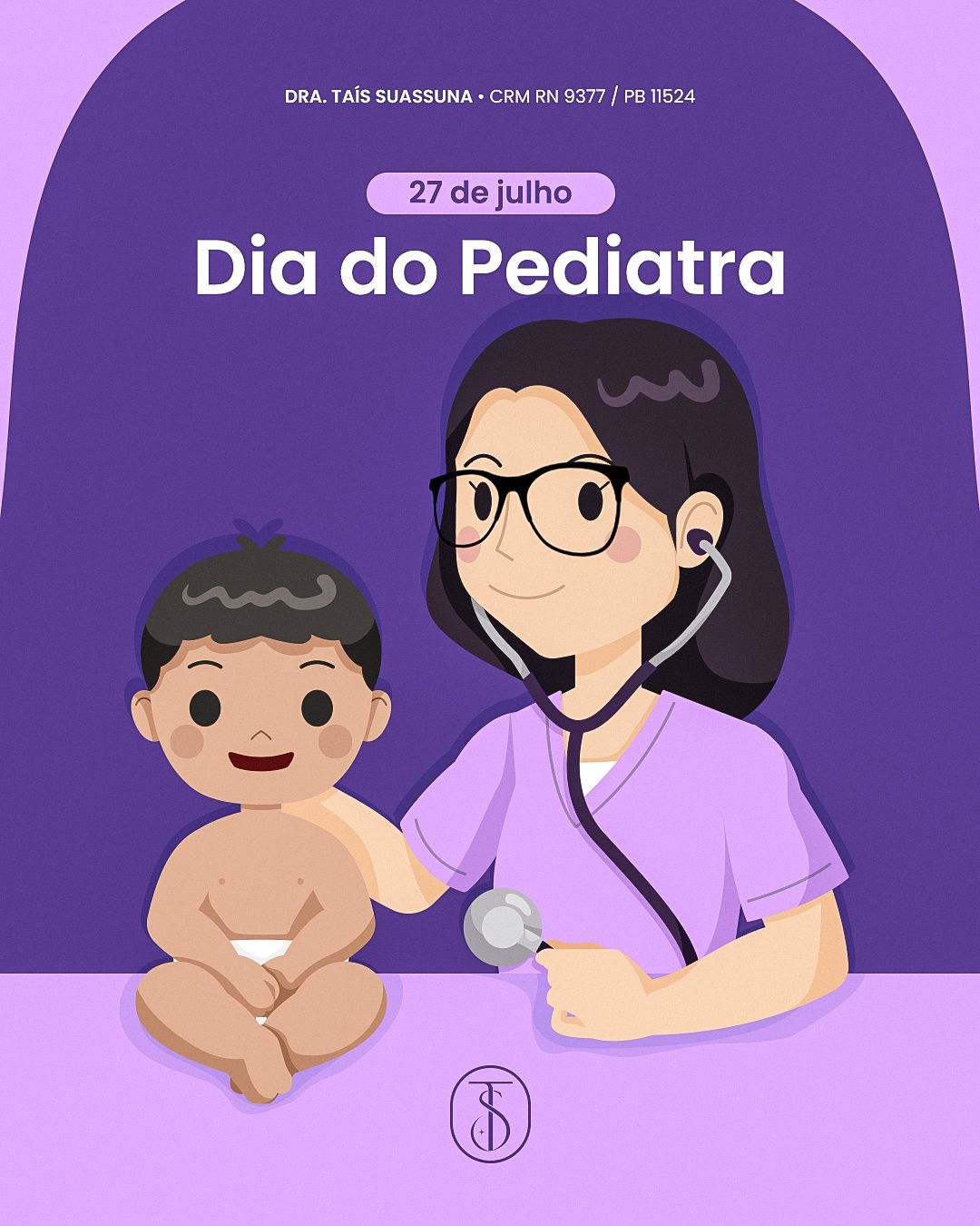
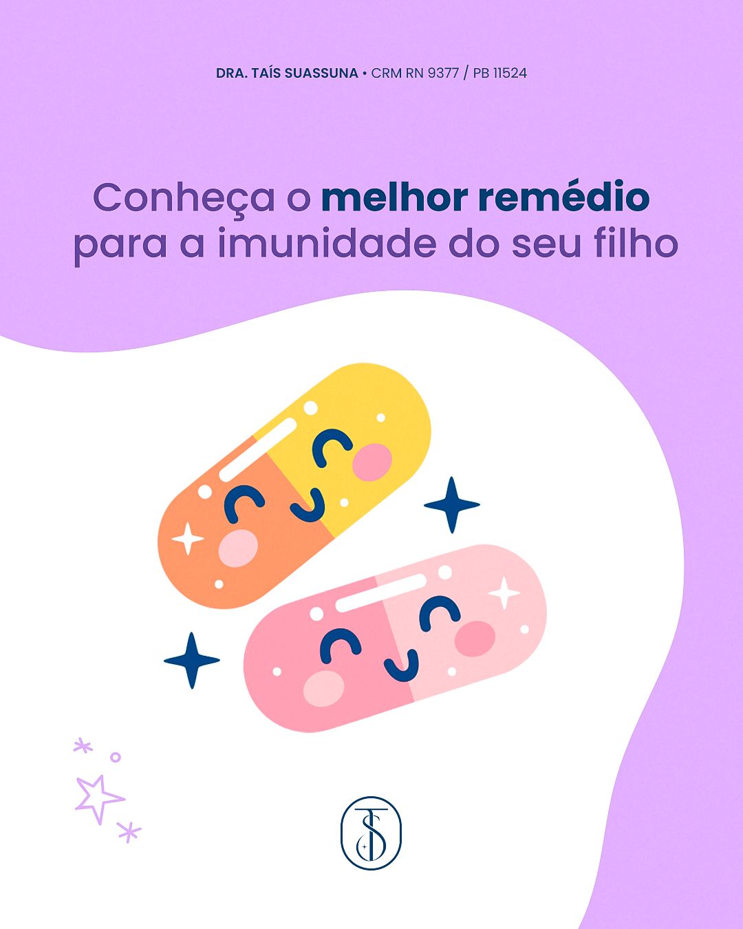
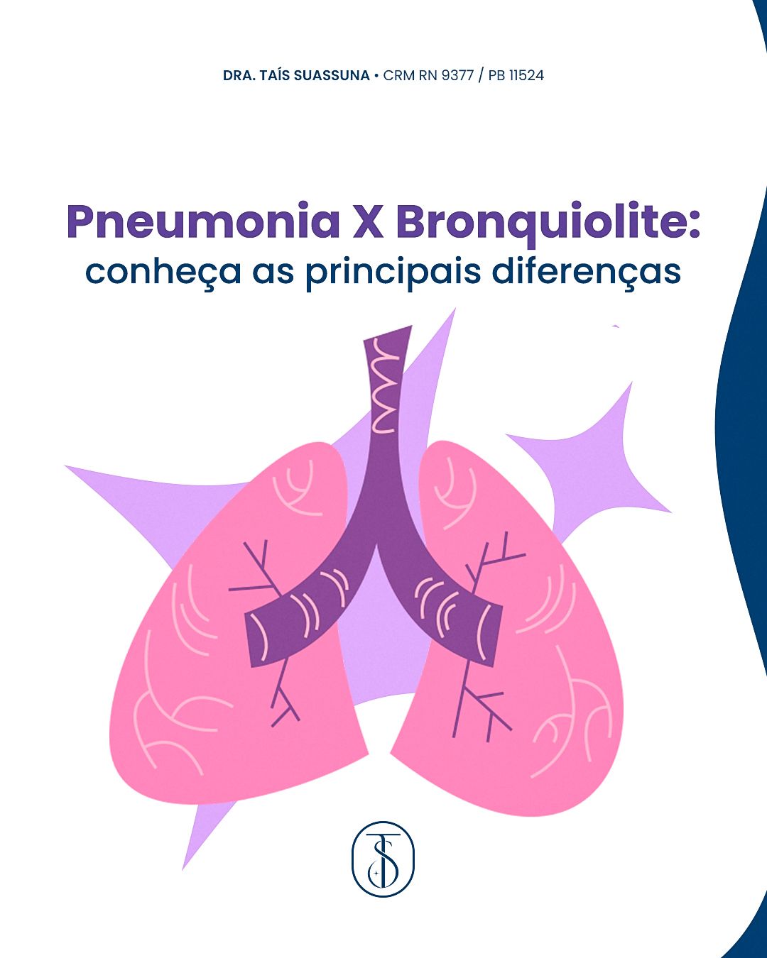
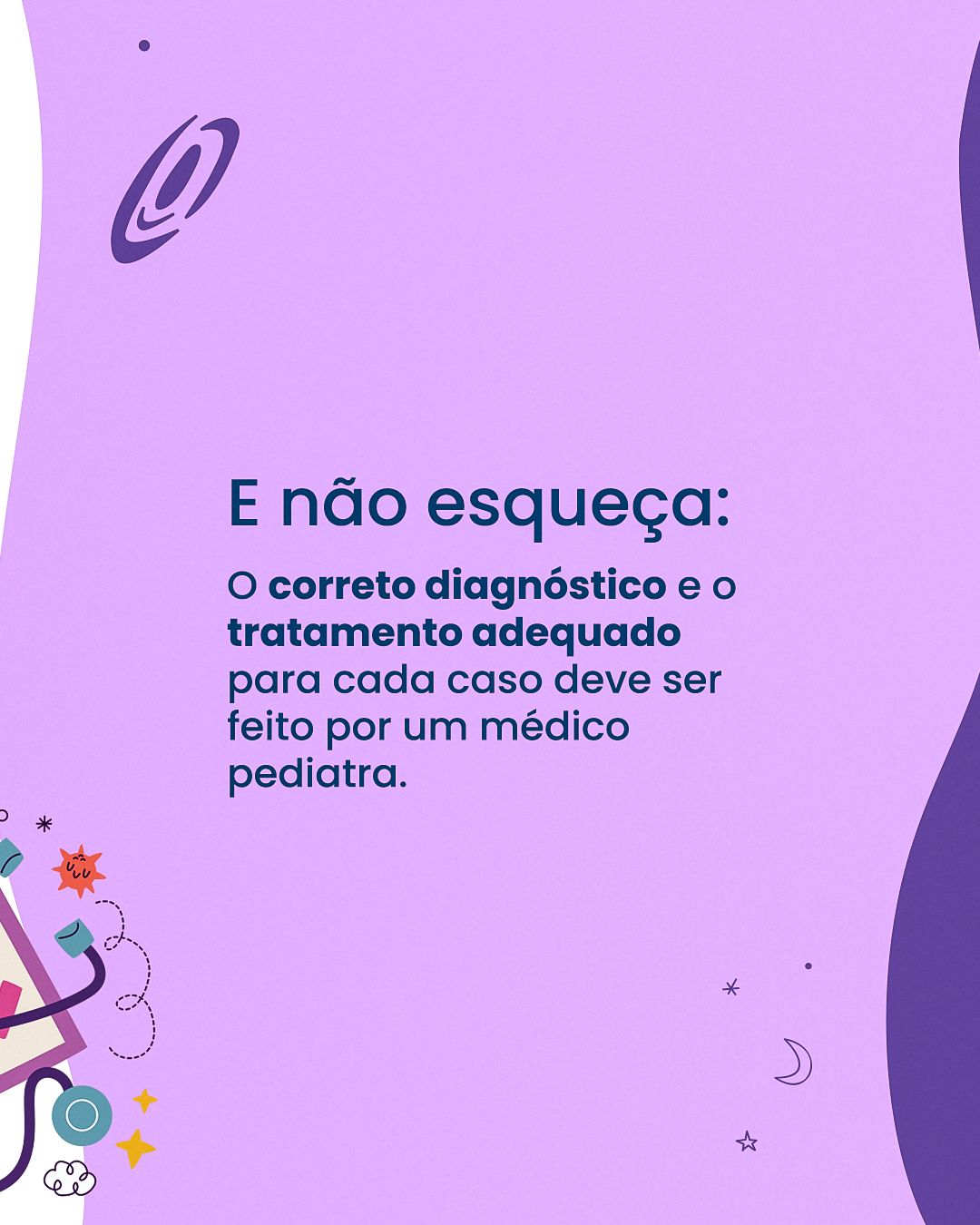
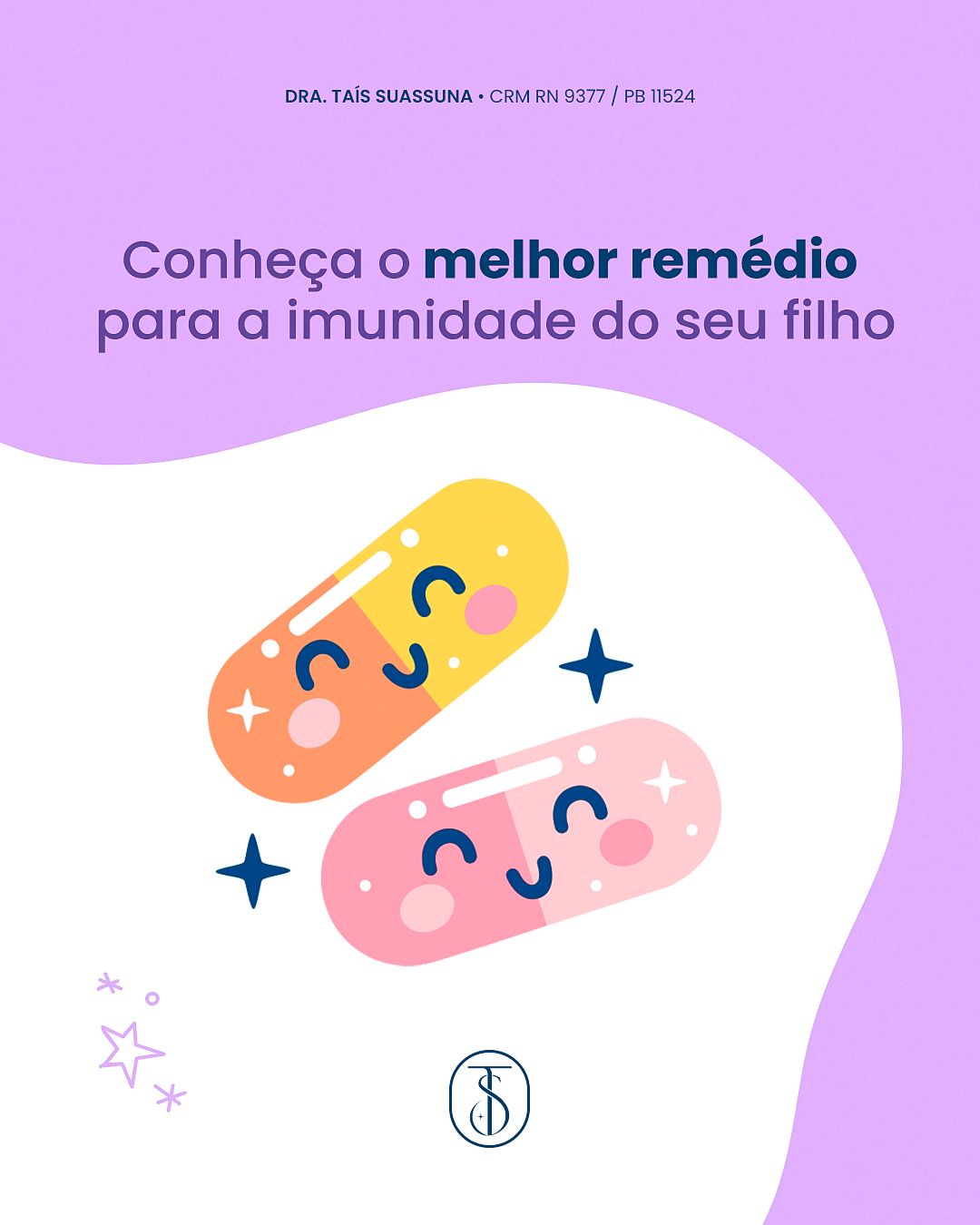
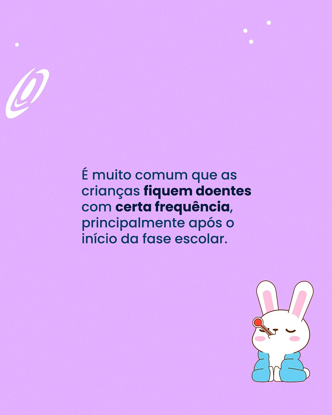
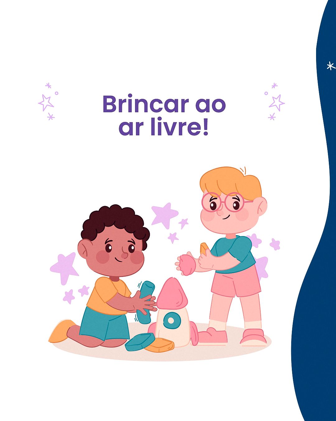
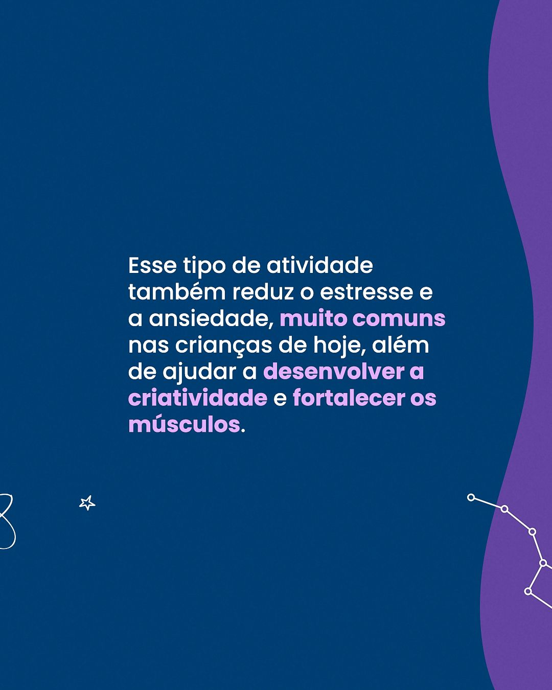
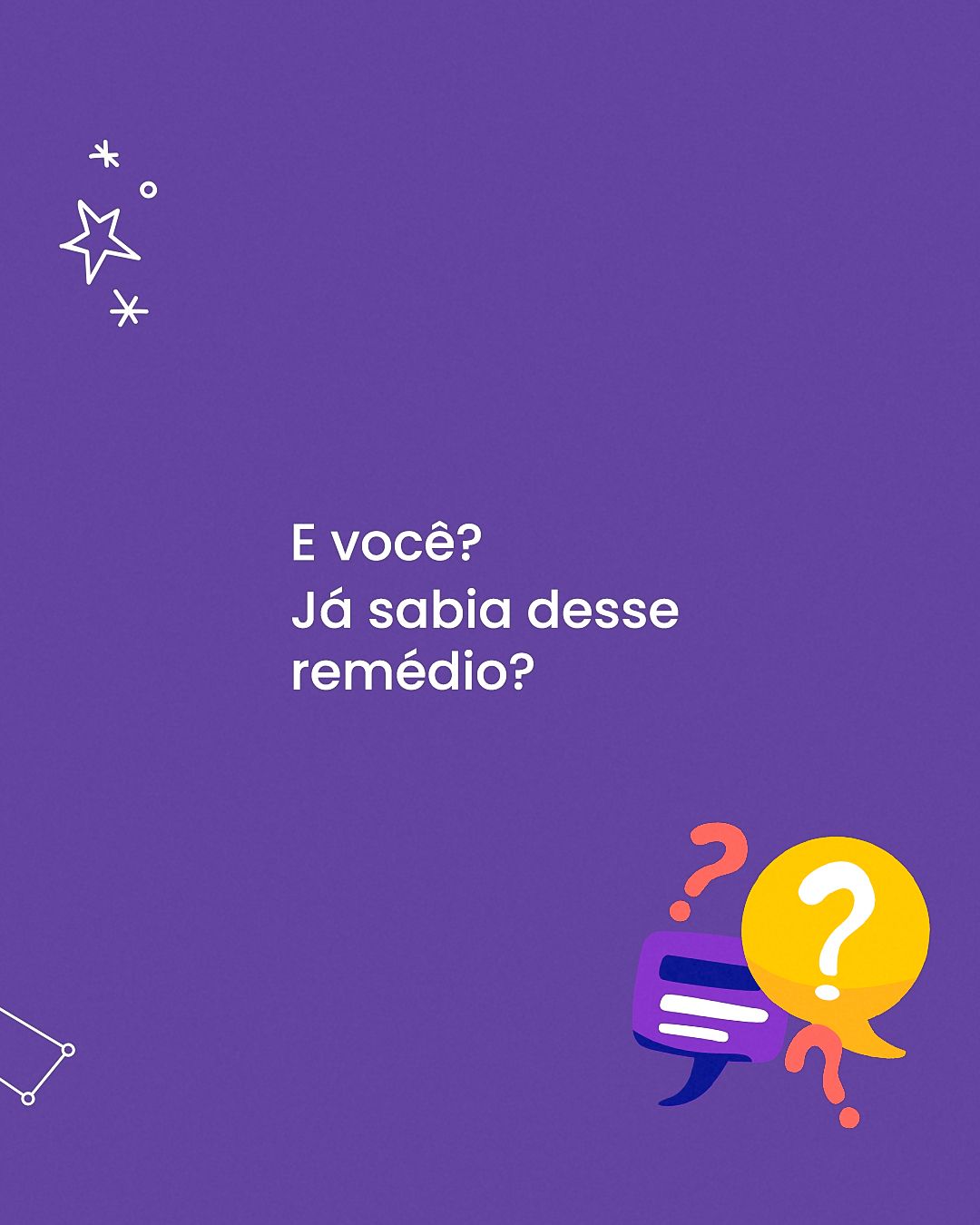
Instead of photos, the system uses vector illustrations with friendly characters (lungs, little pills, superhero kids, a baby on the moon), which make medical topics friendly. Organic shapes and little stars decorate the background, and questions become polls to encourage comments. The header keeps the name and professional registration.
STAGE 03Feed
The feed mixes education, myths and truths and specialty dates, always with the same header structure so the profile feels like a single voice.
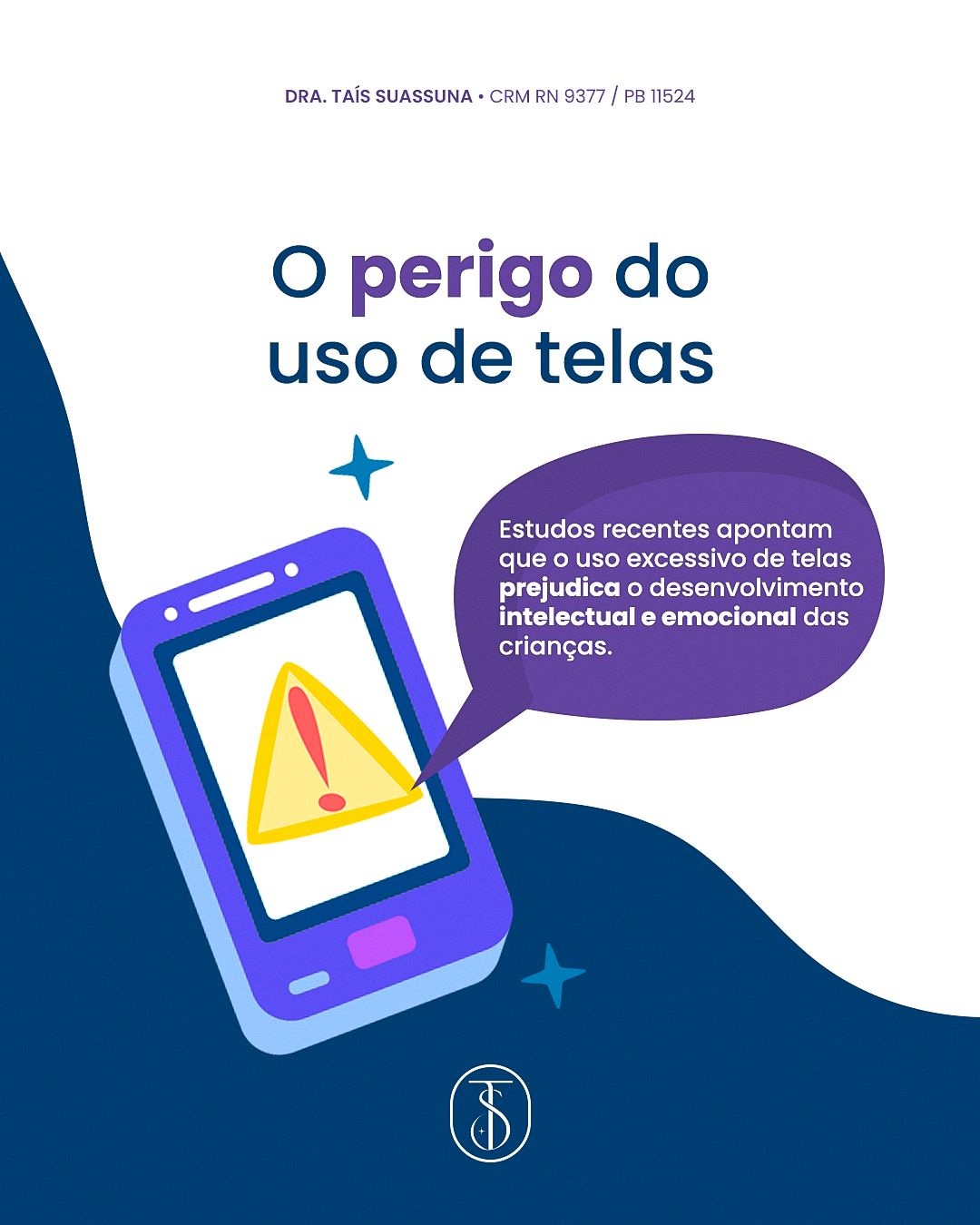
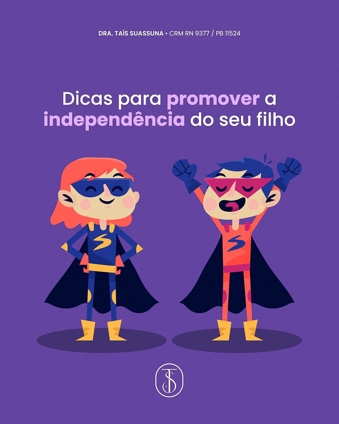
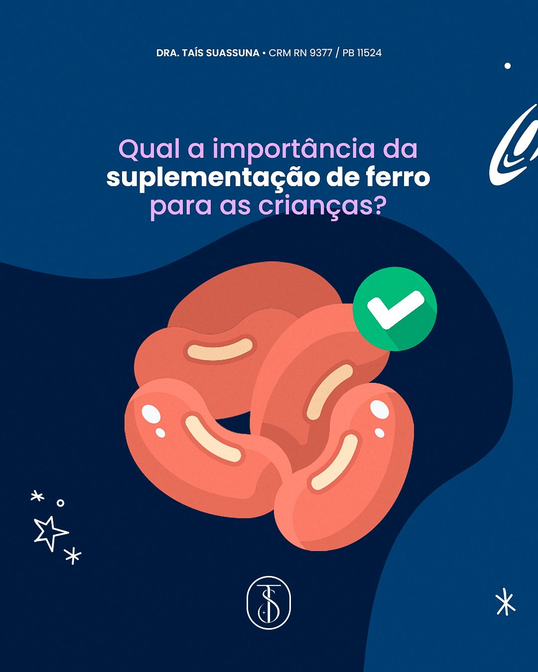
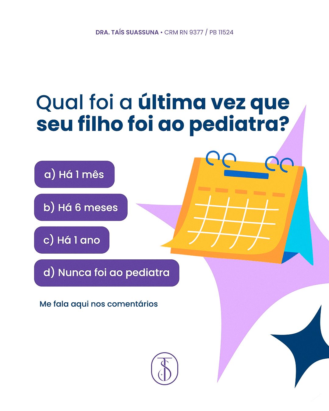

STAGE 04Carousels
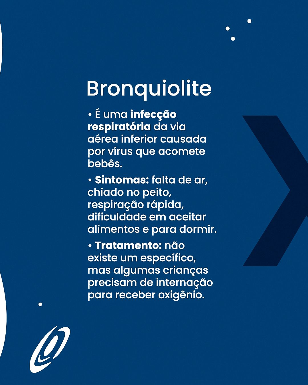
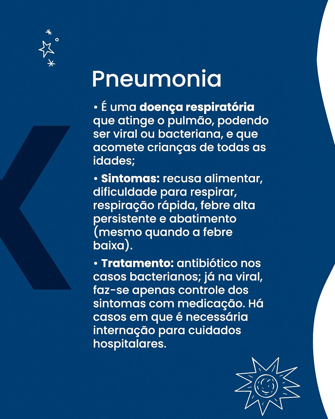
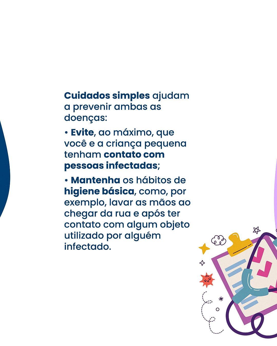
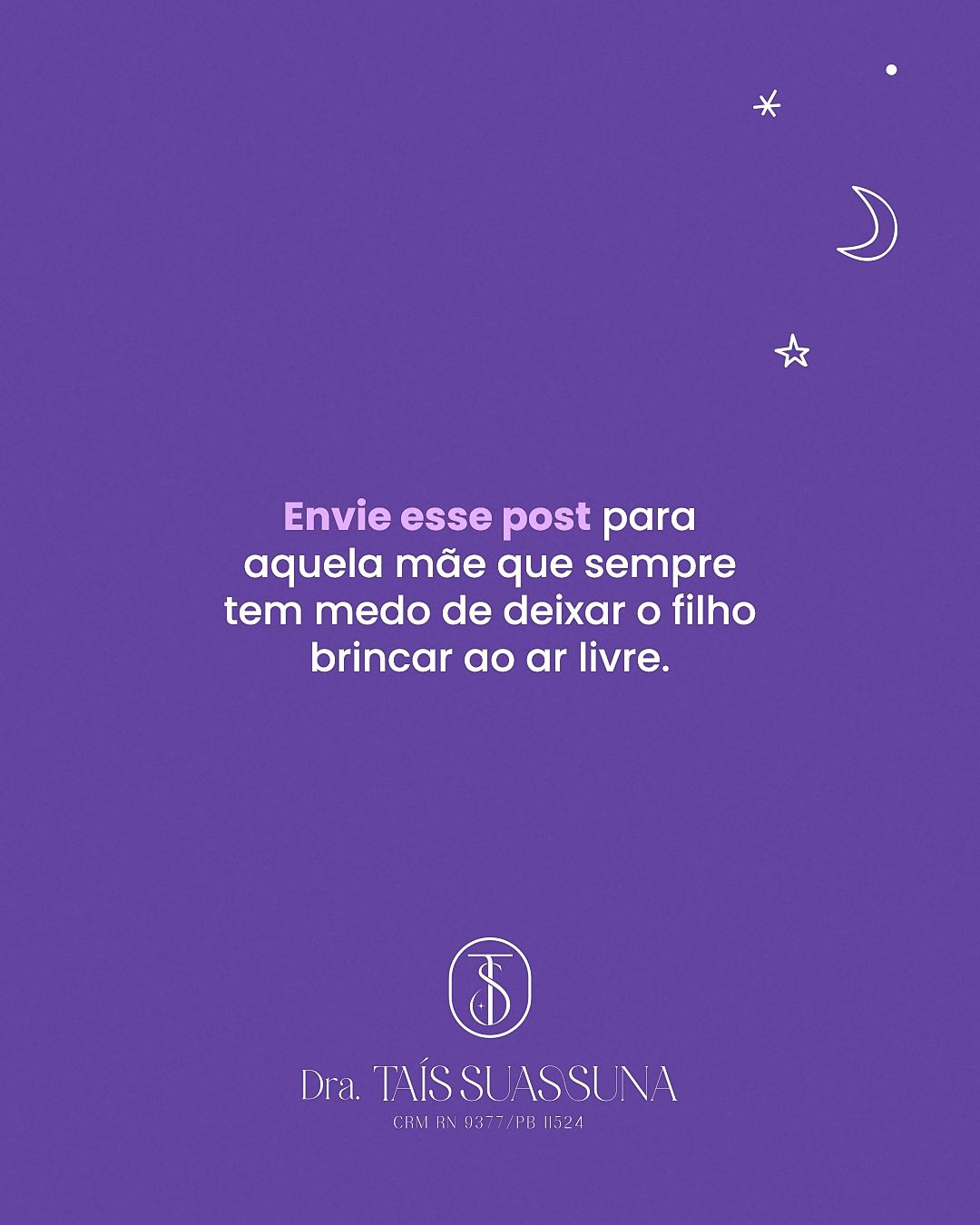
The carousels follow the same narrative logic: a cover with a question or promise, one idea per slide in short sentences and a closing call to book. Repeating colors and positions makes followers recognize the format before reading.
STAGE 05Color theory
The palette is cool analogous (purple and blue) with warm accents in coral and yellow. Purple and lilac convey imagination and care, blue brings trust and calm (midnight blue appears in sleep pieces), and coral and yellow bring joy and draw the eye to small details. White predominates to keep things light.
- #6344A1PurpleSignature color
- #003D73BlueBackgrounds and contrast
- #001A3FMidnight blueNight backgrounds (sleep)
- #E2AEFFLilacSoft backgrounds
- #EA6E59CoralWarm accents
- #FDC132YellowStars and highlights
| Pair | Use | Contrast | WCAG |
|---|---|---|---|
| Aa | White text on purple | 7.31:1 | AAA |
| Aa | White text on blue | 10.97:1 | AAA |
| Aa | Purple on white | 7.31:1 | AAA |
| Aa | Midnight blue on lilac | 9.62:1 | AAA |
| Aa | White text on coral | 3.06:1 | AA large text/UI only |
Critical read: in the table above, pairs above 4.5:1 are safe for small text; the others should only be used in big, heavy headlines or swapped for a darker color.
Hex values sampled from the published final pieces.STAGE 06Typography and layout
Titles use a rounded geometric sans-serif in purple or white, friendly to read, with bold keywords. Speech bubbles and labels mimic the language of comics and children's apps. Hierarchy is simple: big title, illustration, one supporting sentence.
The layout follows the 4:5 feed grid with constant inner margin, and the call-to-action footer always sits in the same place. In health topics, clarity comes before effect: one idea per piece and enough contrast for reading on a small screen.