Home / Work / Dr. Keli Holanda
Dr. Keli Holanda — Ophthalmology
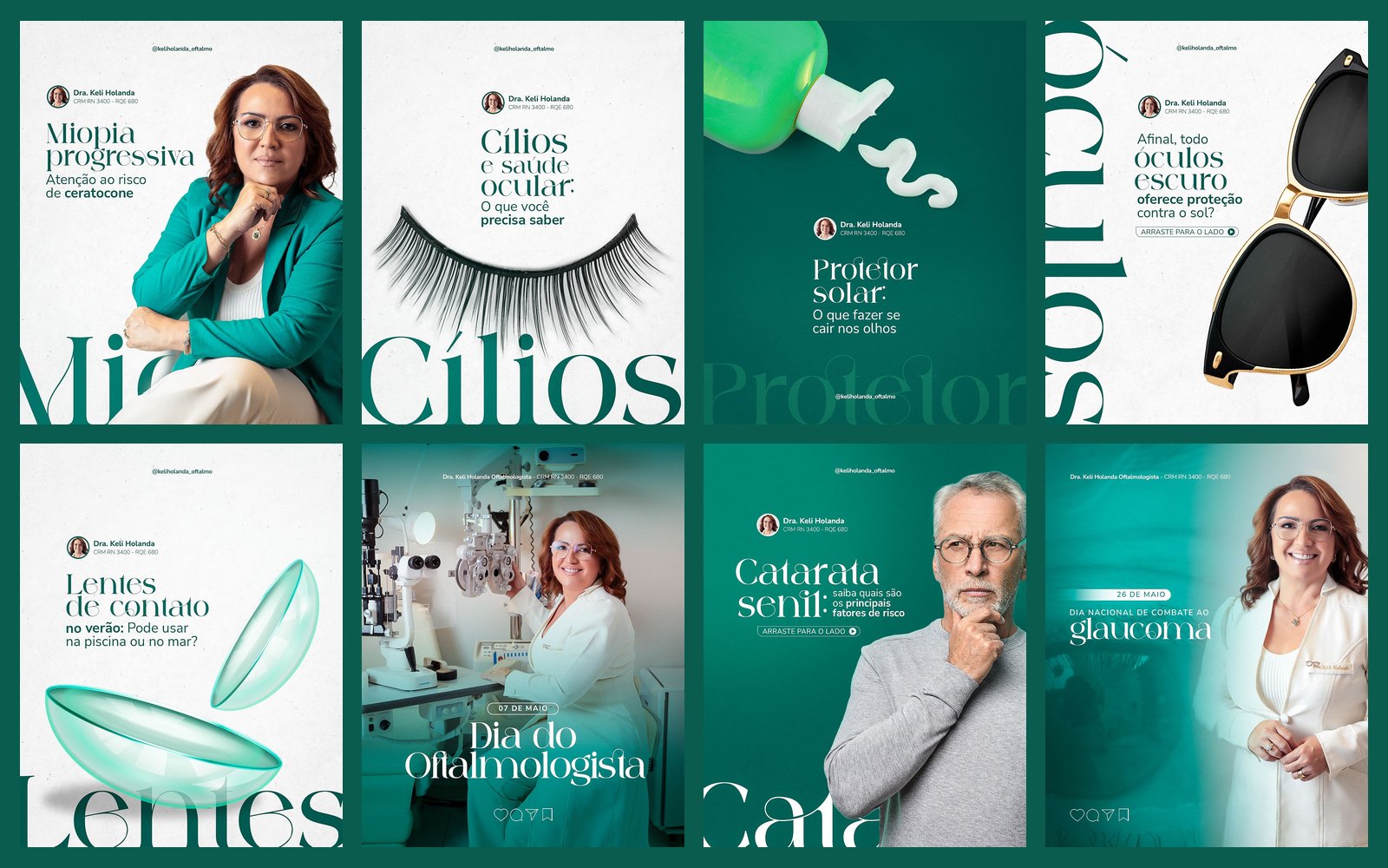
Social media for an ophthalmologist: lenses, glasses, cataracts, glaucoma and children's eye health, in teal and white with giant serif type crossing the piece.
STAGE 01Context and goal
Dr. Keli needs to guide the public about eye health, from lashes and lenses to cataracts, glaucoma and children's exams, and also communicate her presence at congresses and specialty dates. The communication must be clear, welcoming and professional.
About authorship: each doctor's brand, logo and identity already existed and were not created by me. My work here was creating the social media art: feed, carousels and stories.STAGE 02Visual system
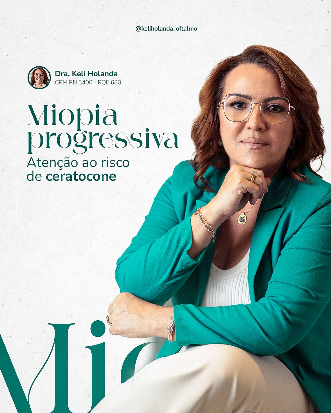
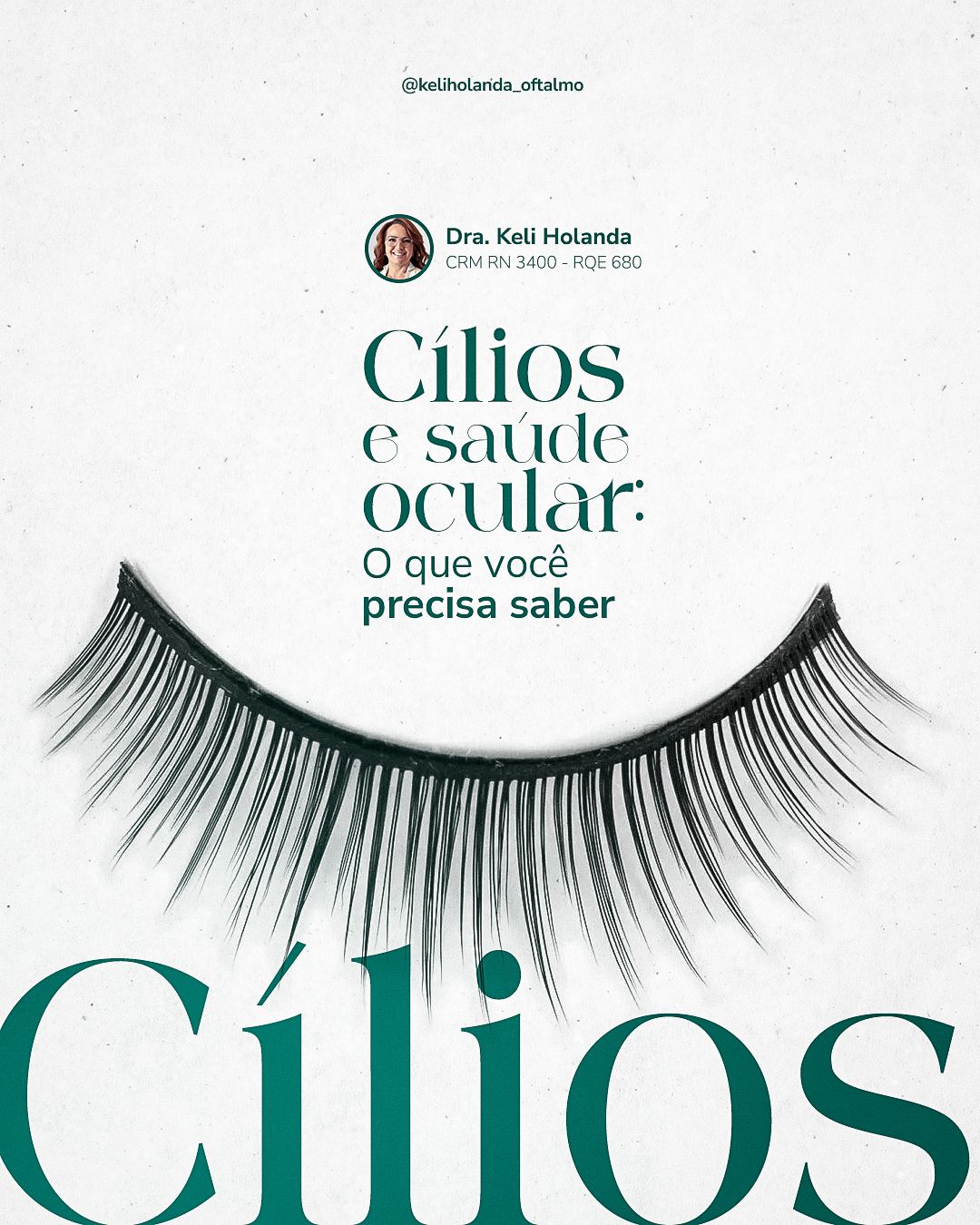
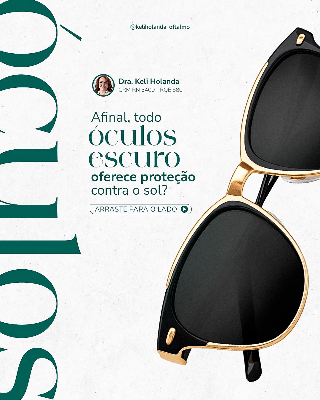
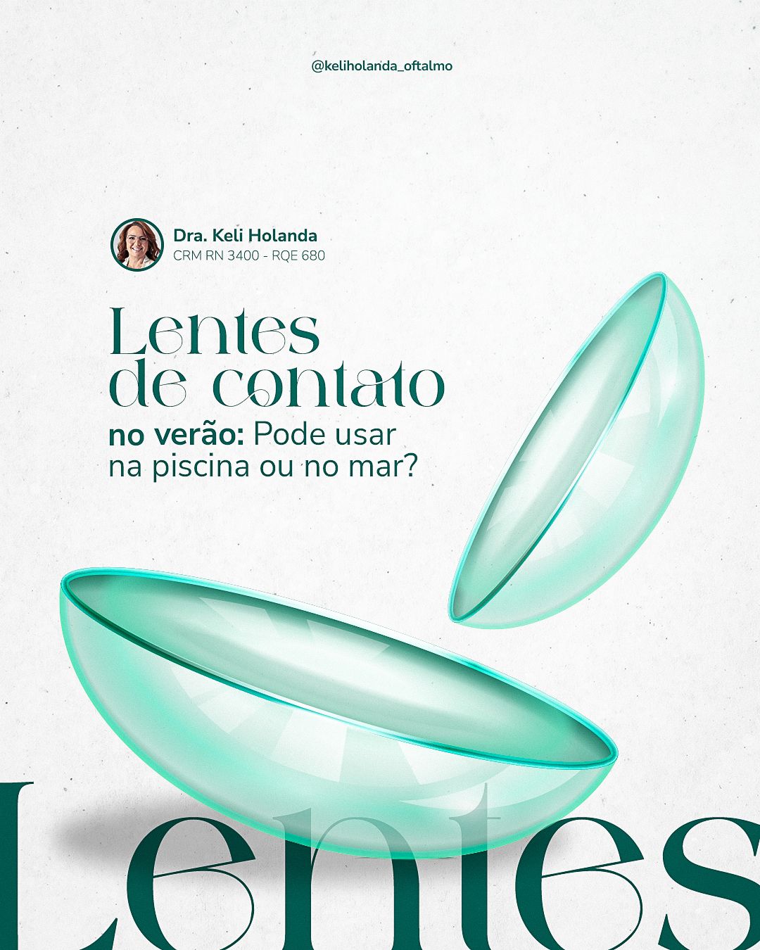
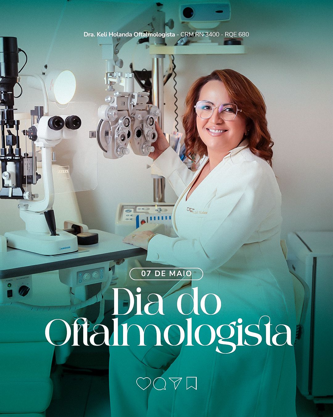
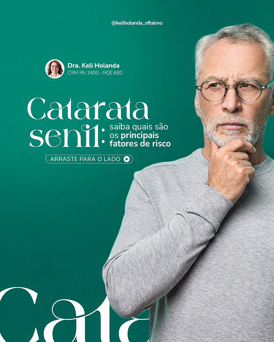
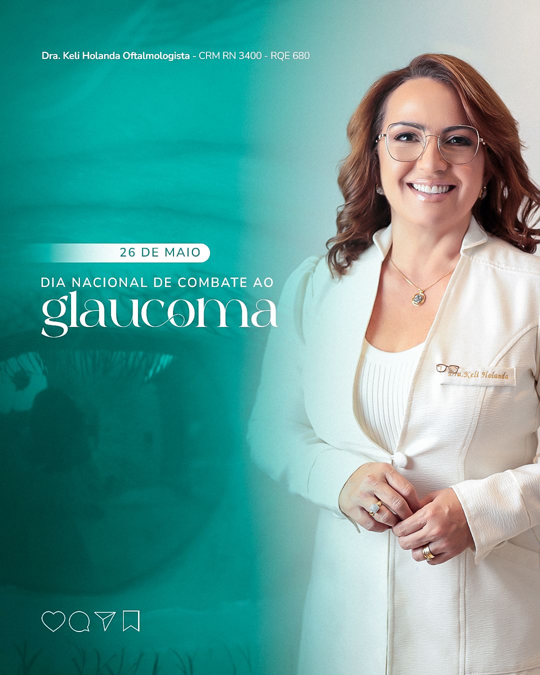
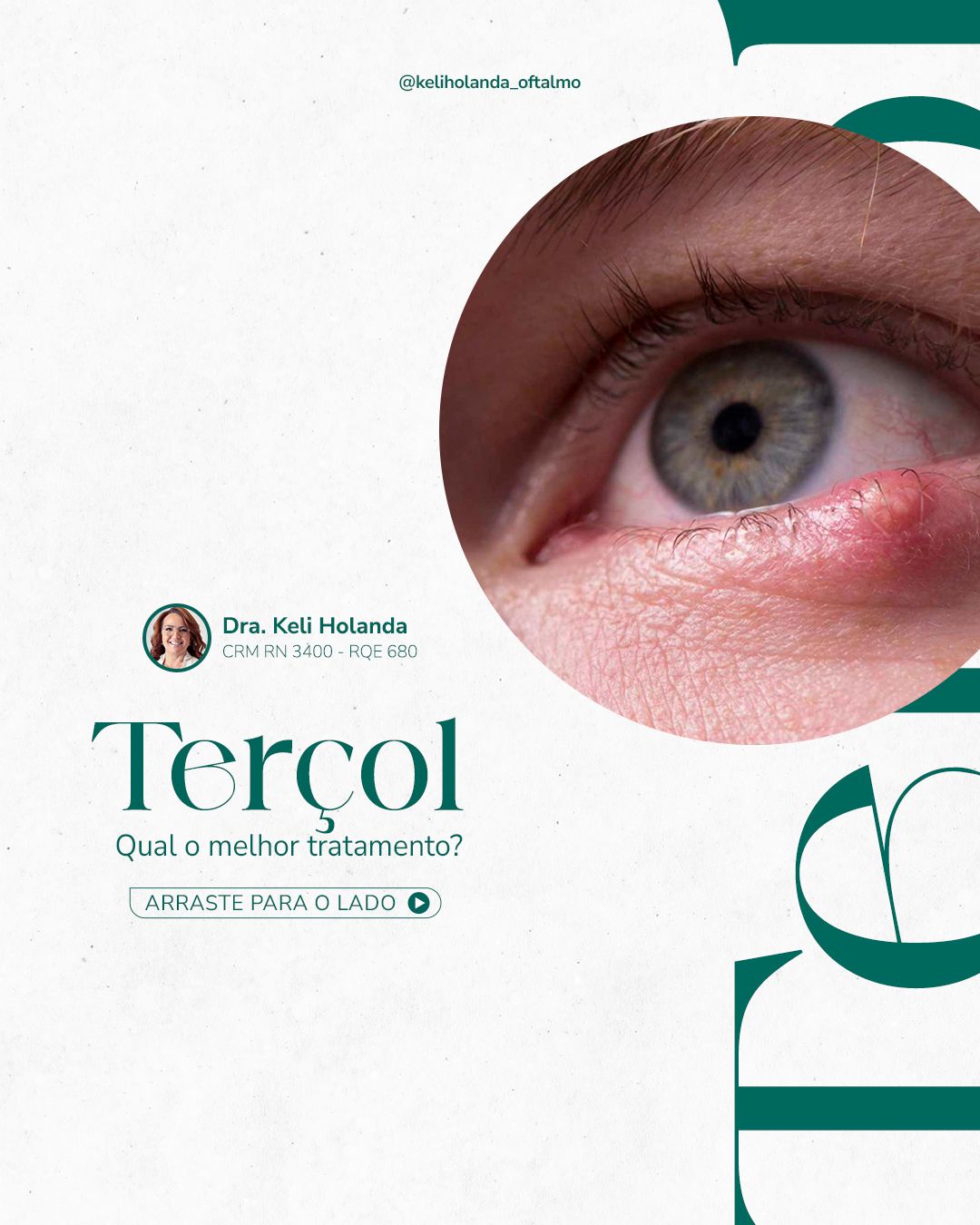
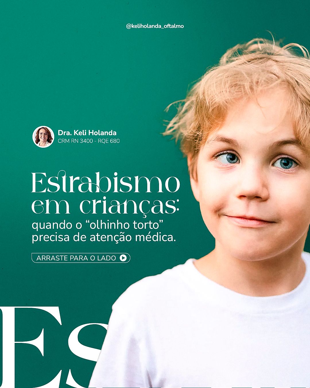
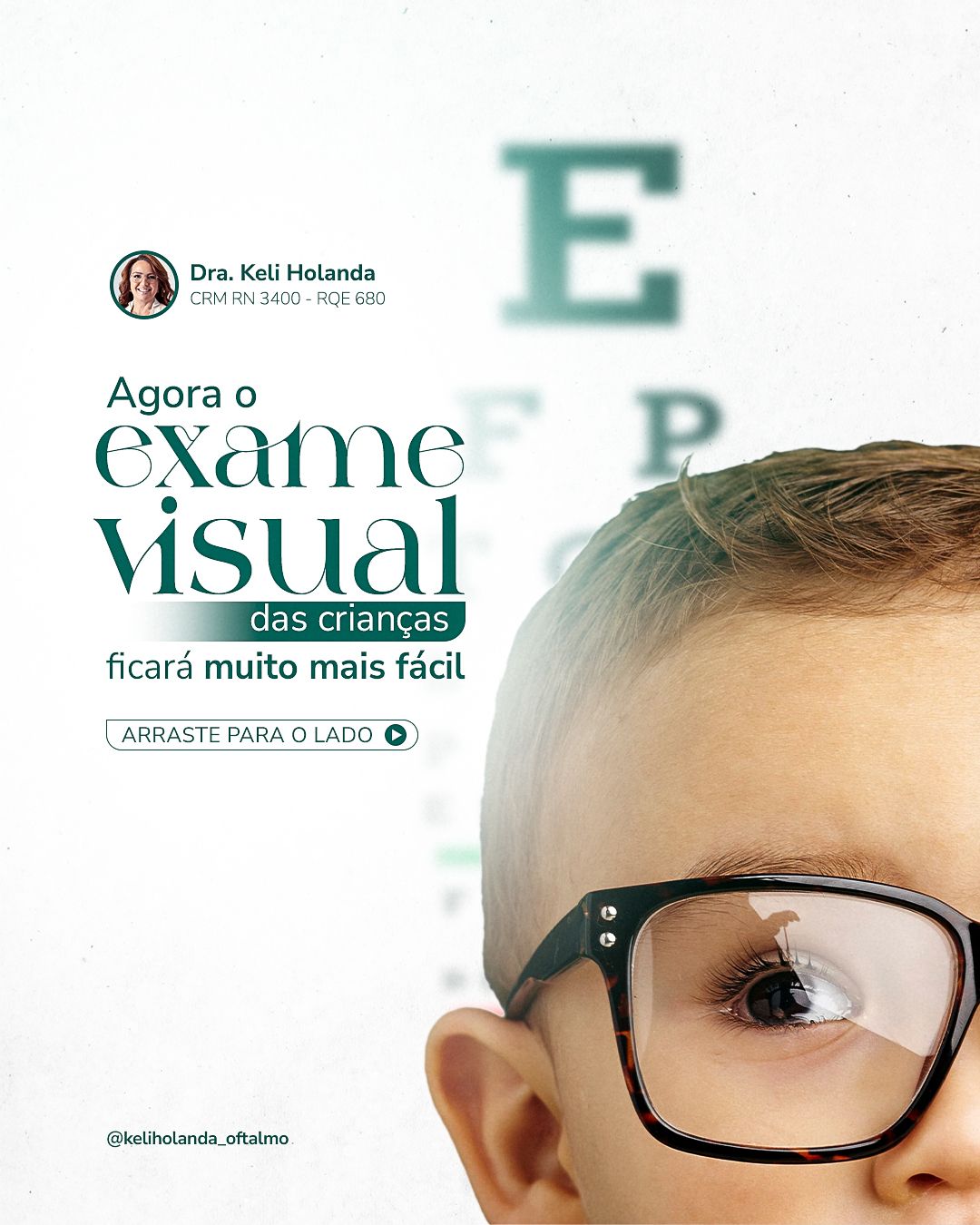
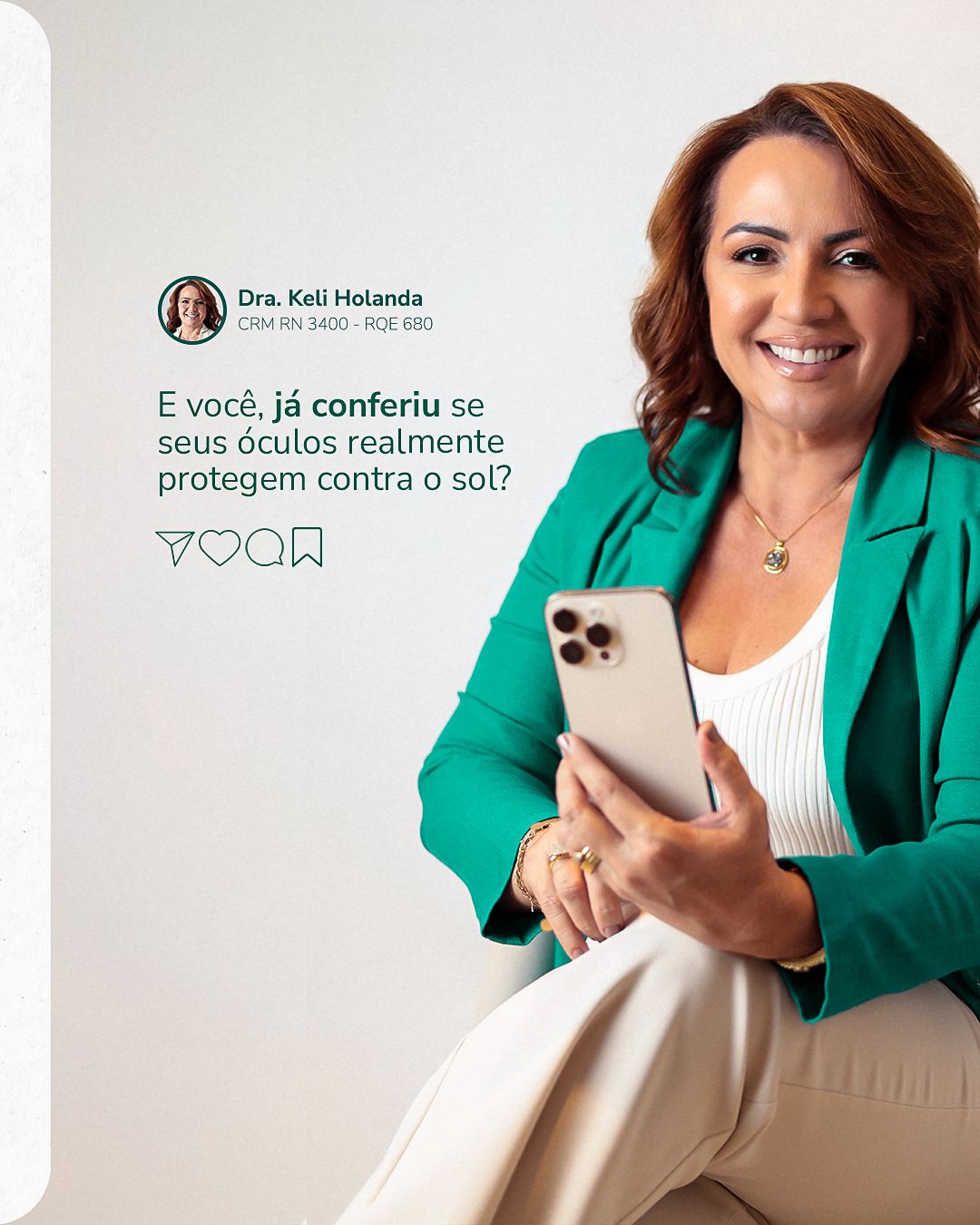
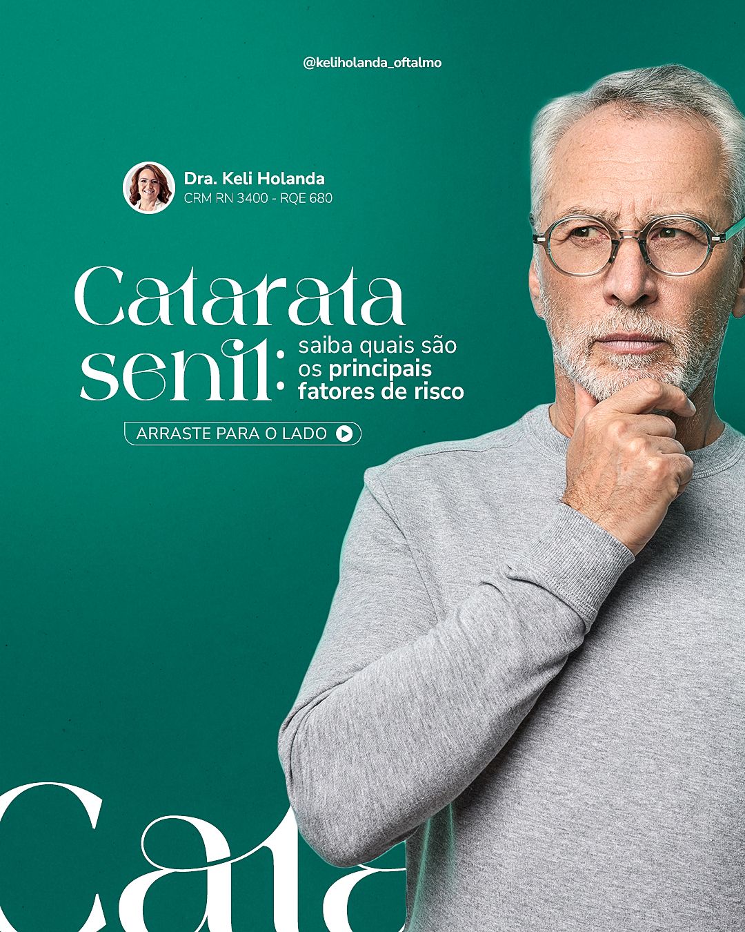
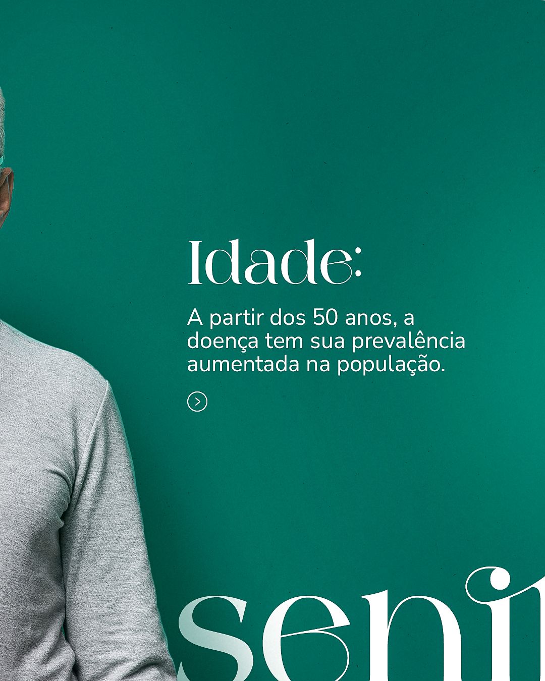
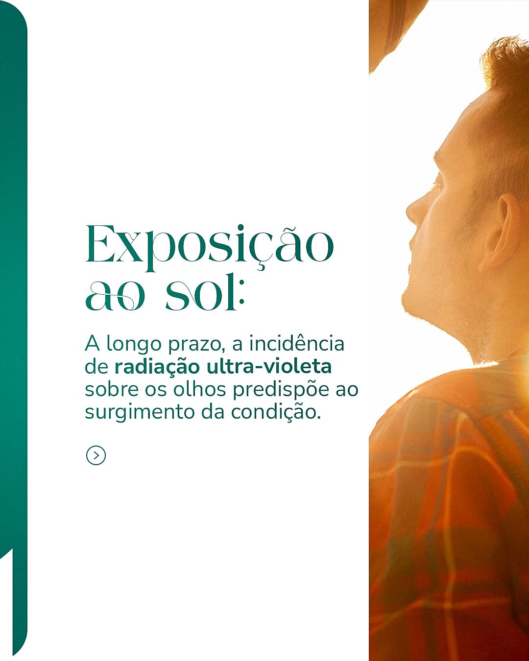
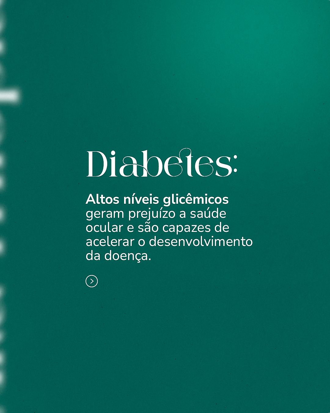
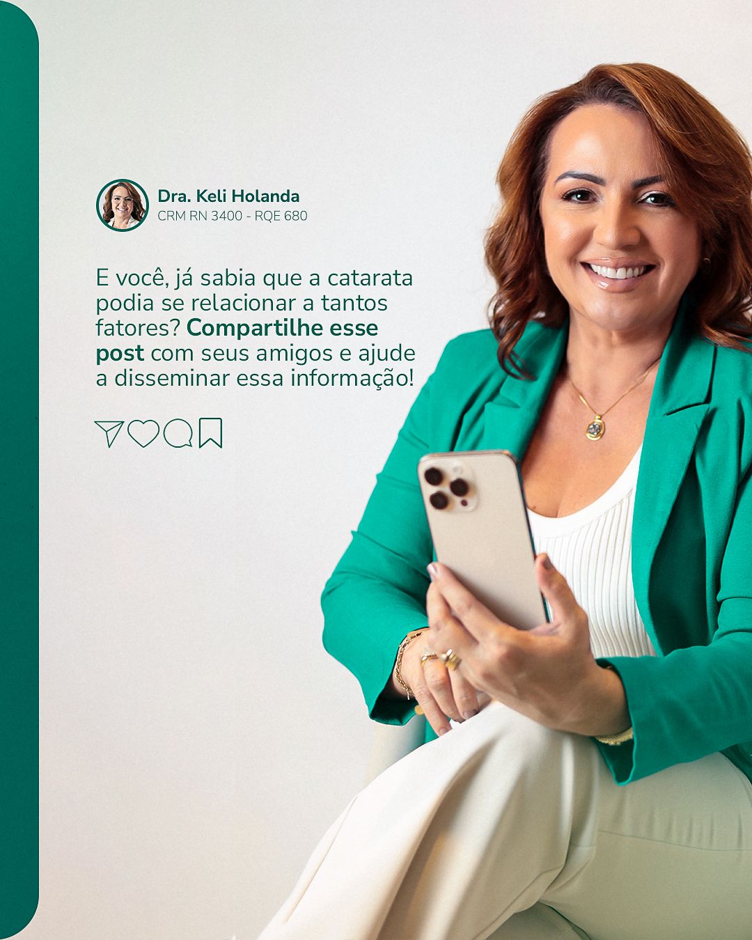
The system repeats a header with the handle and the doctor's identification and a structure of two piece families: photos of the doctor on green, which humanize, and topic images (lens, eye, glasses) on a light background, which illustrate. The keyword appears in giant serif cropped at the edge (“Lashes”, “Lenses”), creating a recognizable pattern in the feed.
STAGE 03Feed
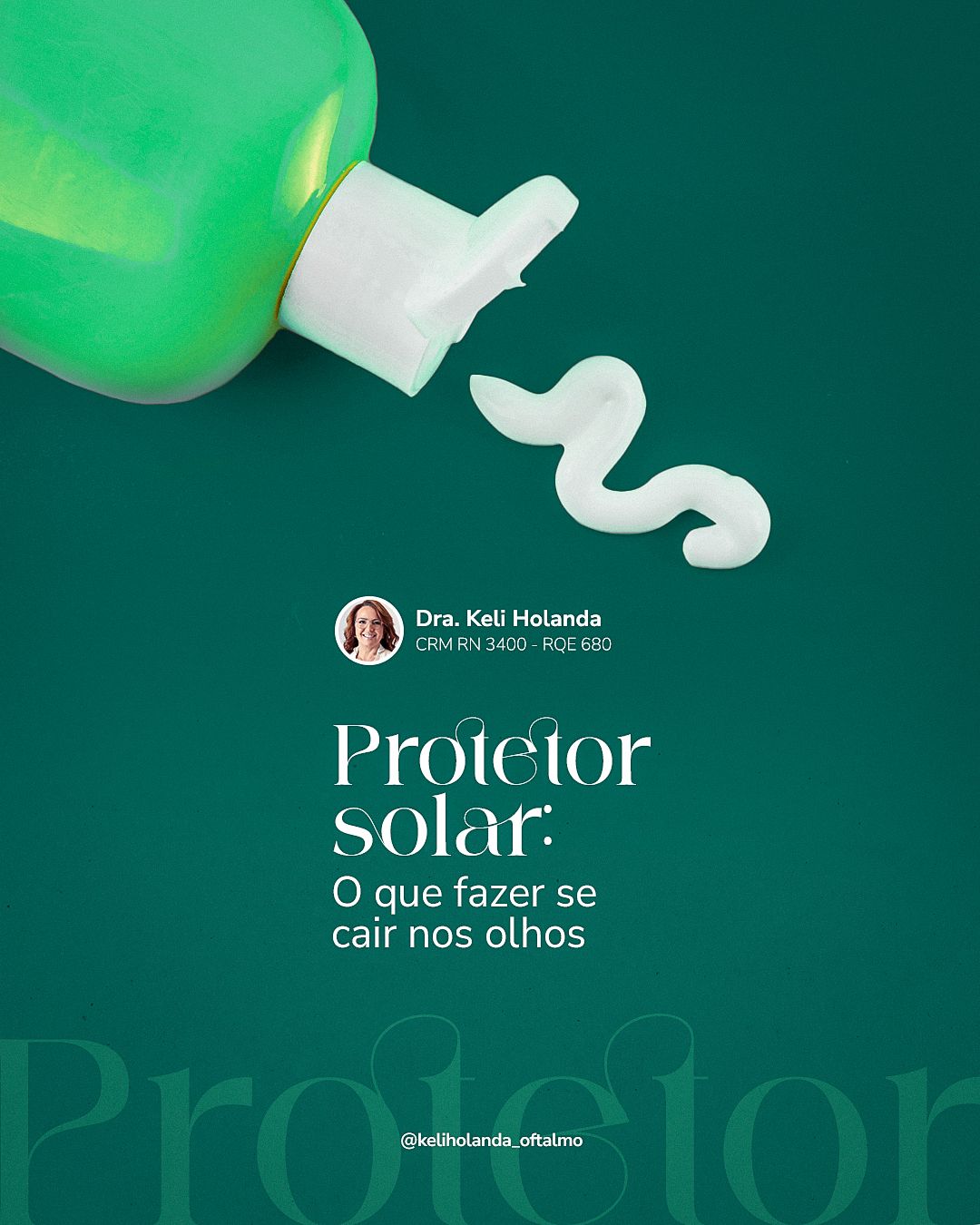
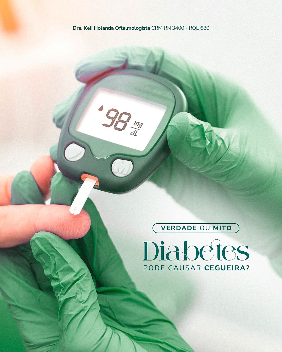
The feed mixes education, myths and truths and specialty dates, always with the same header structure so the profile feels like a single voice.
STAGE 04Carousels
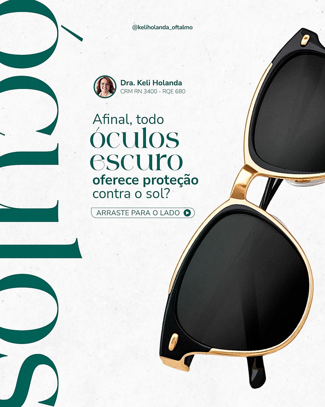
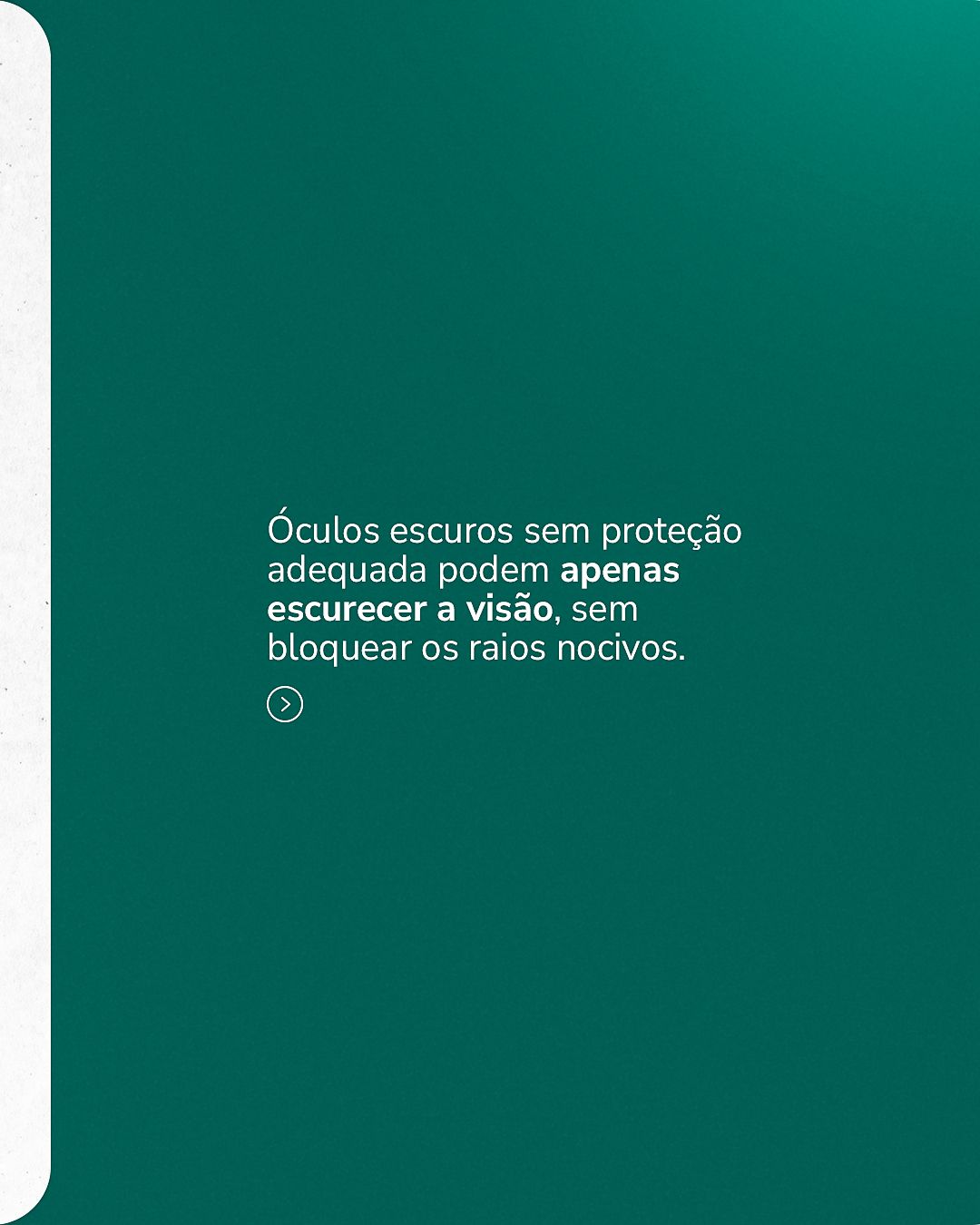
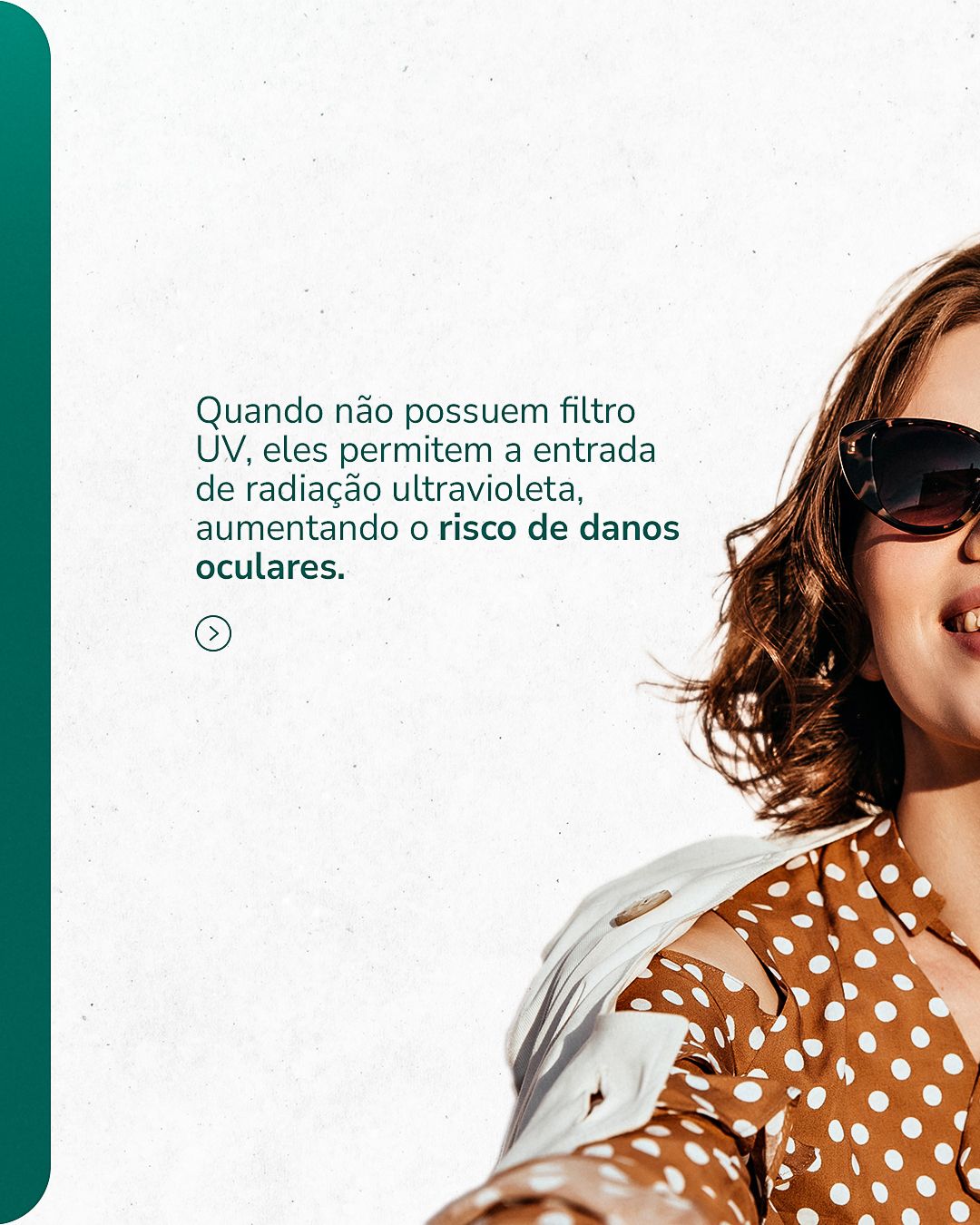
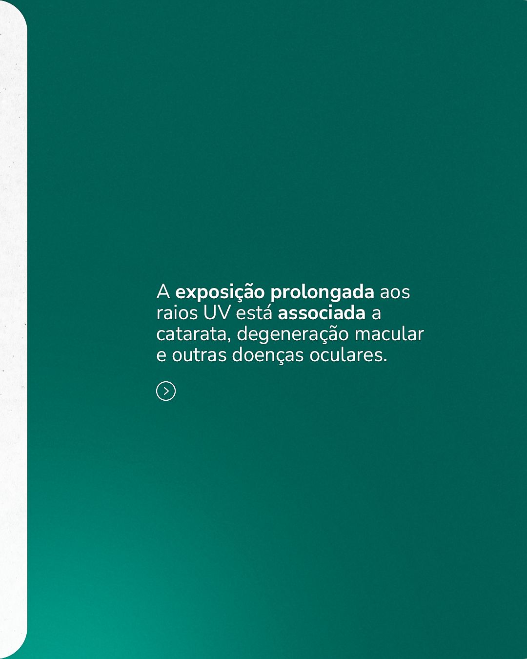
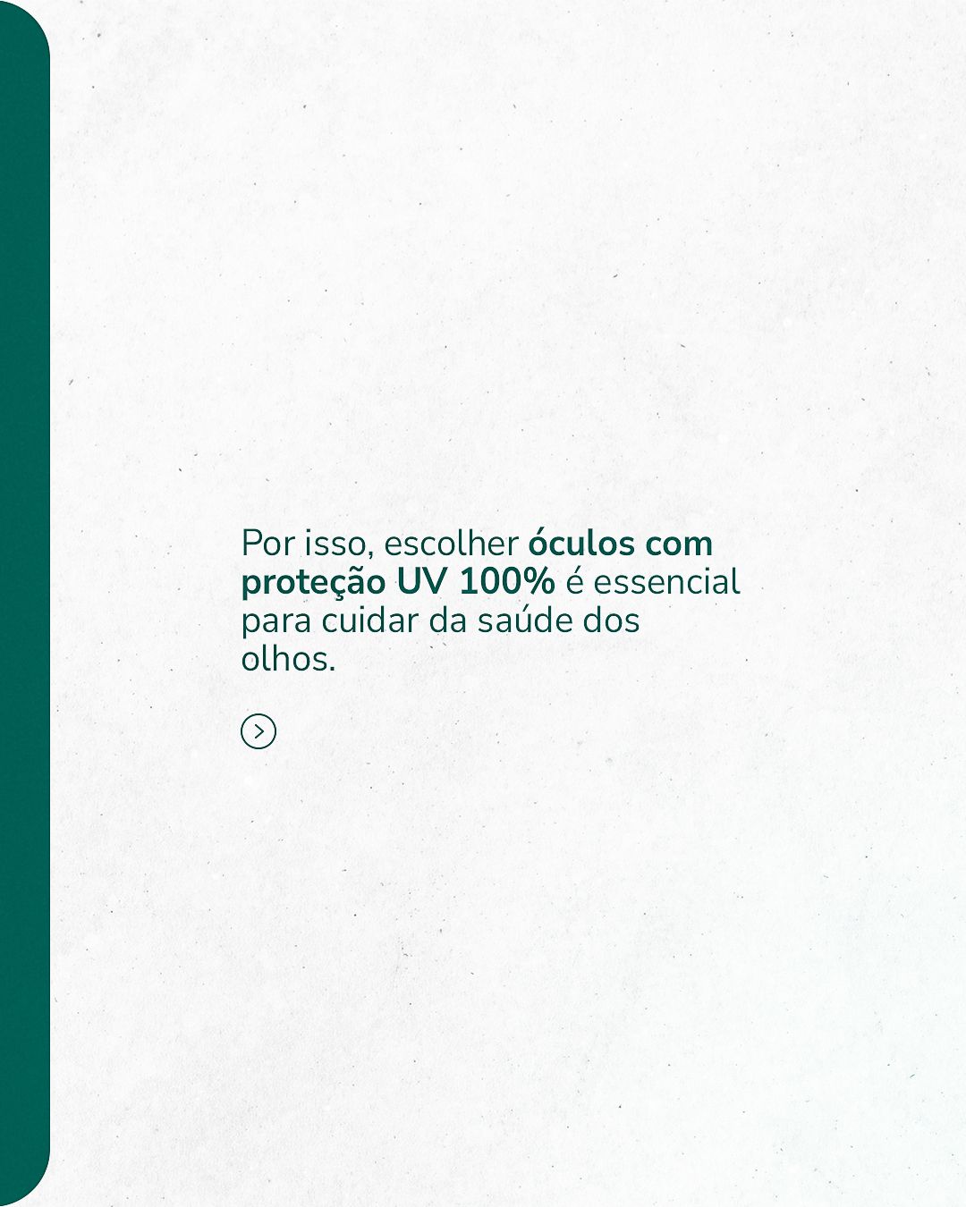
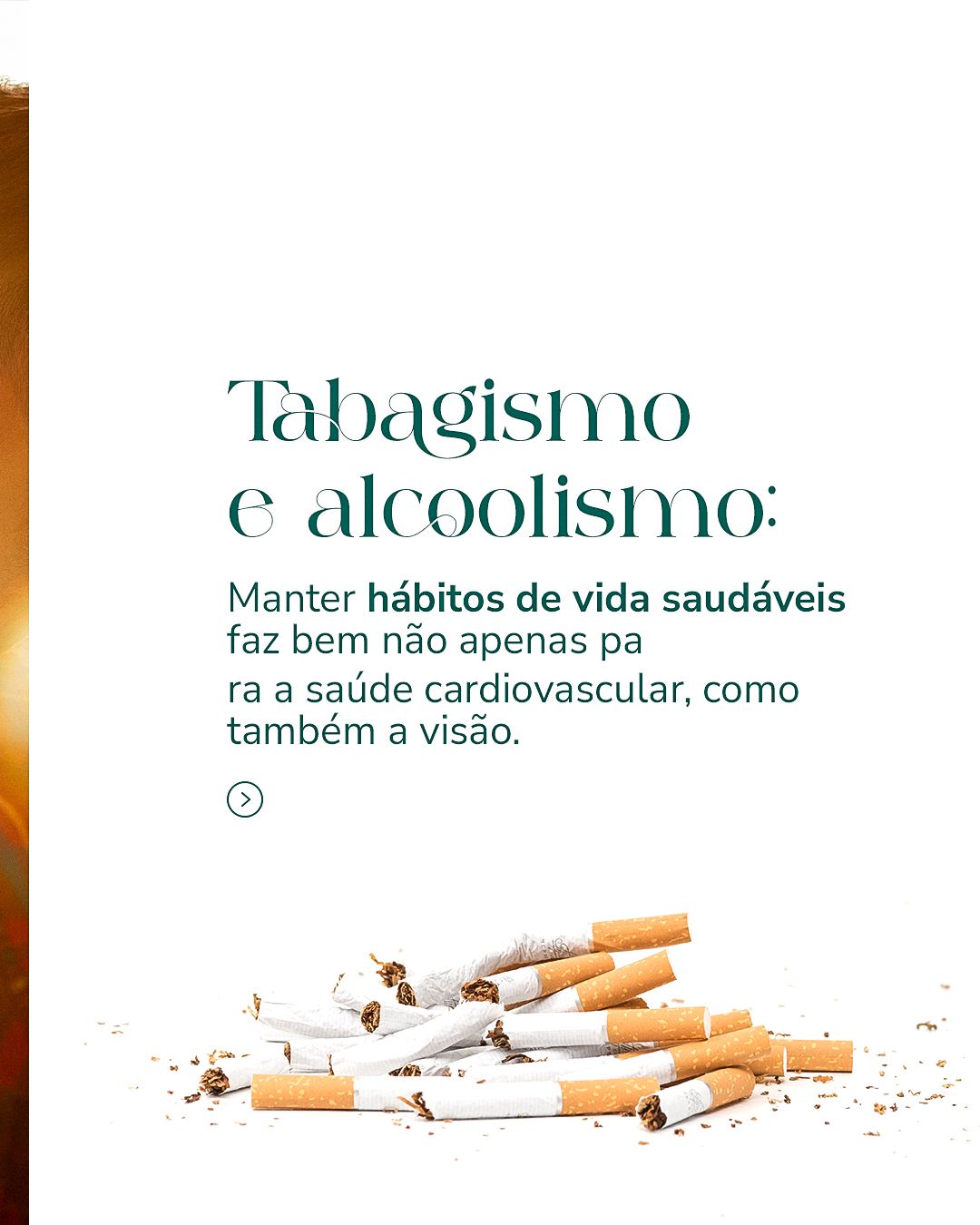
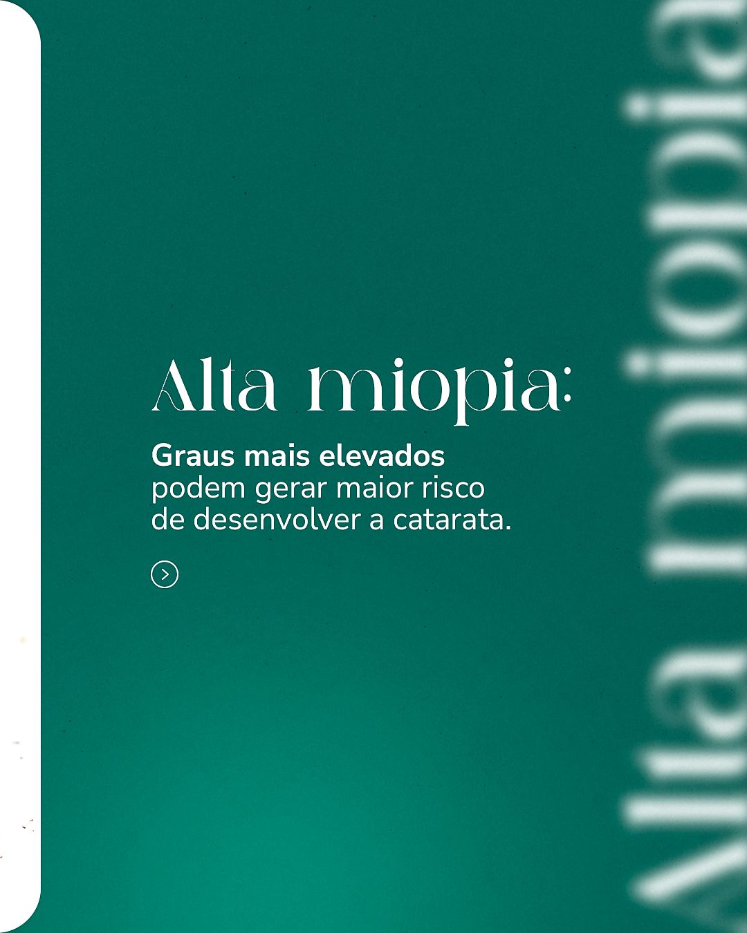
The carousels follow the same narrative logic: a cover with a question or promise, one idea per slide in short sentences and a closing call to book. Repeating colors and positions makes followers recognize the format before reading.


STAGE 05Color theory
The palette is monochromatic green: from deep green to turquoise, varying only lightness. Blue-green is associated with calm, cleanliness and health, and it is a color that rests the eye, consistent with a specialty that cares for vision. The light background gives breathing room, and bright green appears only in small accents.
- #015149Deep greenDark backgrounds and titles
- #008773TealSignature color
- #01AEA6TurquoiseHighlights and gradients
- #2DC87DBright greenOccasional accents
- #F8F8F8Off-whiteLight paper-textured background
- #191919GraphiteText on light background
| Pair | Use | Contrast | WCAG |
|---|---|---|---|
| Aa | White text on teal | 4.46:1 | AA large text/UI only |
| Aa | White text on deep green | 9.23:1 | AAA |
| Aa | Deep green on off-white | 8.69:1 | AAA |
| Aa | Graphite on off-white | 16.56:1 | AAA |
| Aa | White text on turquoise | 2.76:1 | fails |
Critical read: in the table above, pairs above 4.5:1 are safe for small text; the others should only be used in big, heavy headlines or swapped for a darker color.
Hex values sampled from the published final pieces.STAGE 06Typography and layout
The highlight is a high-contrast serif at giant scale, reminiscent of an eye chart (the letters of an eye exam), crossing the piece. The rest uses clean sans-serif in medium weight. The contrast between the elegant and the functional creates a signature of its own.
The layout follows the 4:5 feed grid with constant inner margin, and the call-to-action footer always sits in the same place. In health topics, clarity comes before effect: one idea per piece and enough contrast for reading on a small screen.