Home / Work / Dr. Candice Esmeraldo
Dr. Candice Esmeraldo — Gastroenterology
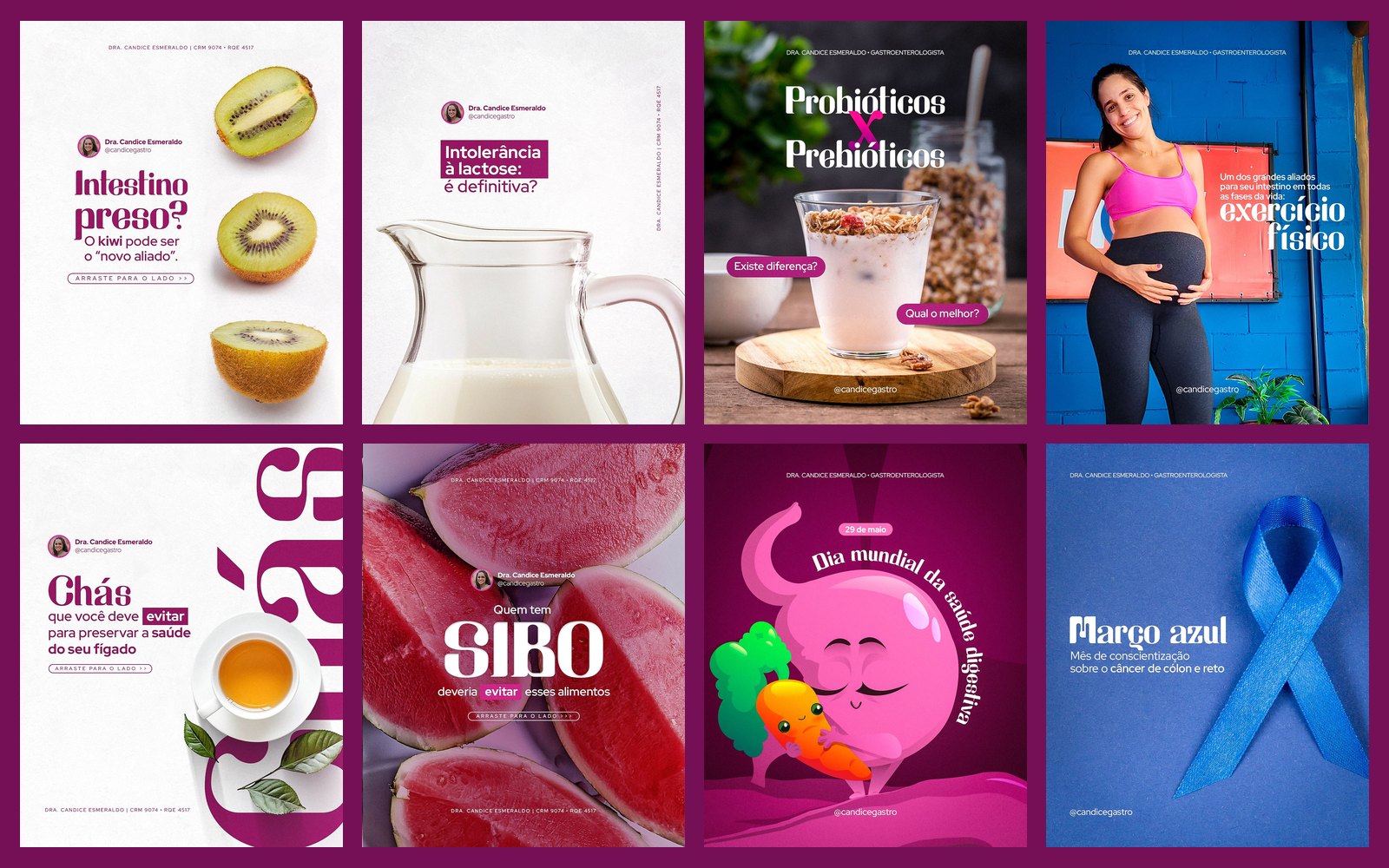
Educational social media content for a gastroenterologist: gut, reflux, intolerances, liver and awareness dates, in magenta and wine with plenty of white space.
STAGE 01Context and goal
Dr. Candice uses Instagram to inform and bust myths about the digestive system (constipation, SIBO, reflux, lactose intolerance, hepatitis). The challenge is to make uncomfortable subjects light, visual and trustworthy, in communication that respects medical advertising rules.
About authorship: each doctor's brand, logo and identity already existed and were not created by me. My work here was creating the social media art: feed, carousels and stories.STAGE 02Visual system
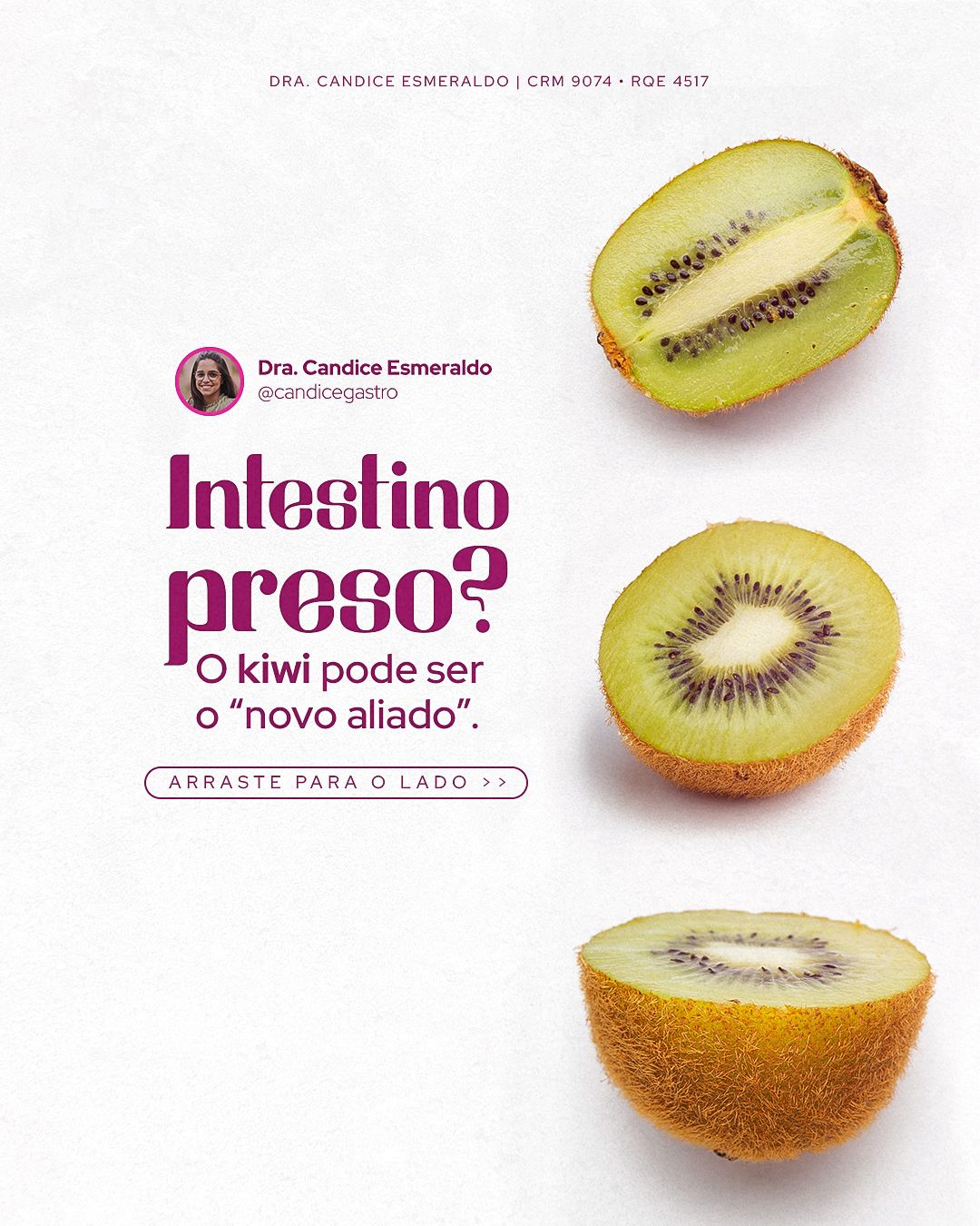
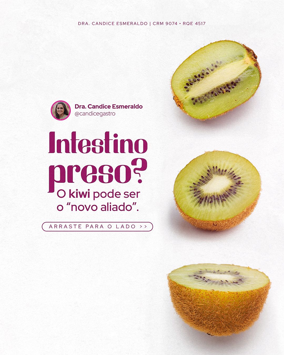
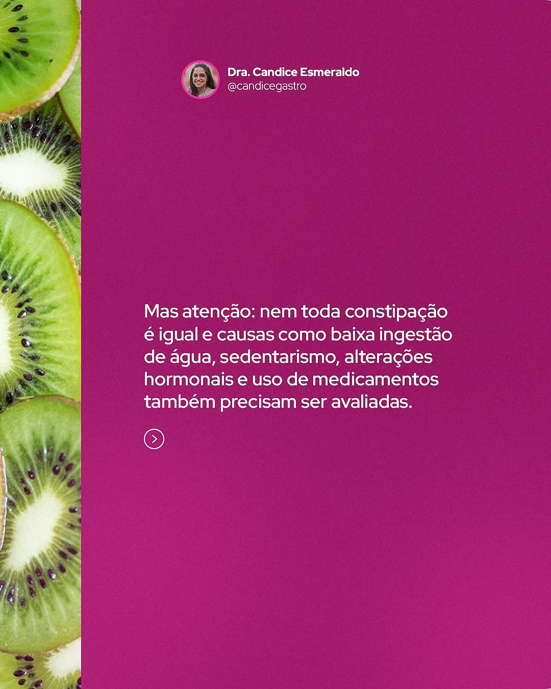
Every piece has a fixed header with photo, name and specialty (and the CRM/RQE line that medical advertising requires) and a call-to-action footer (“swipe”). In the middle, the idea appears through a metaphor image: a kiwi for constipation, a watermelon for SIBO, a 3D organ for hepatitis. The keyword sometimes appears giant and cropped at the edge, adding dynamism and hierarchy.
STAGE 03Feed
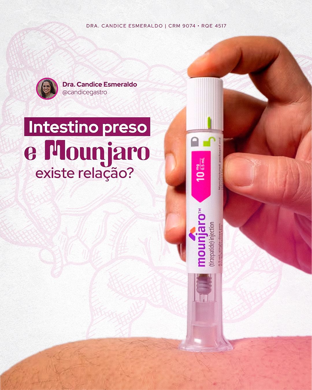
The feed mixes education, myths and truths and specialty dates, always with the same header structure so the profile feels like a single voice.


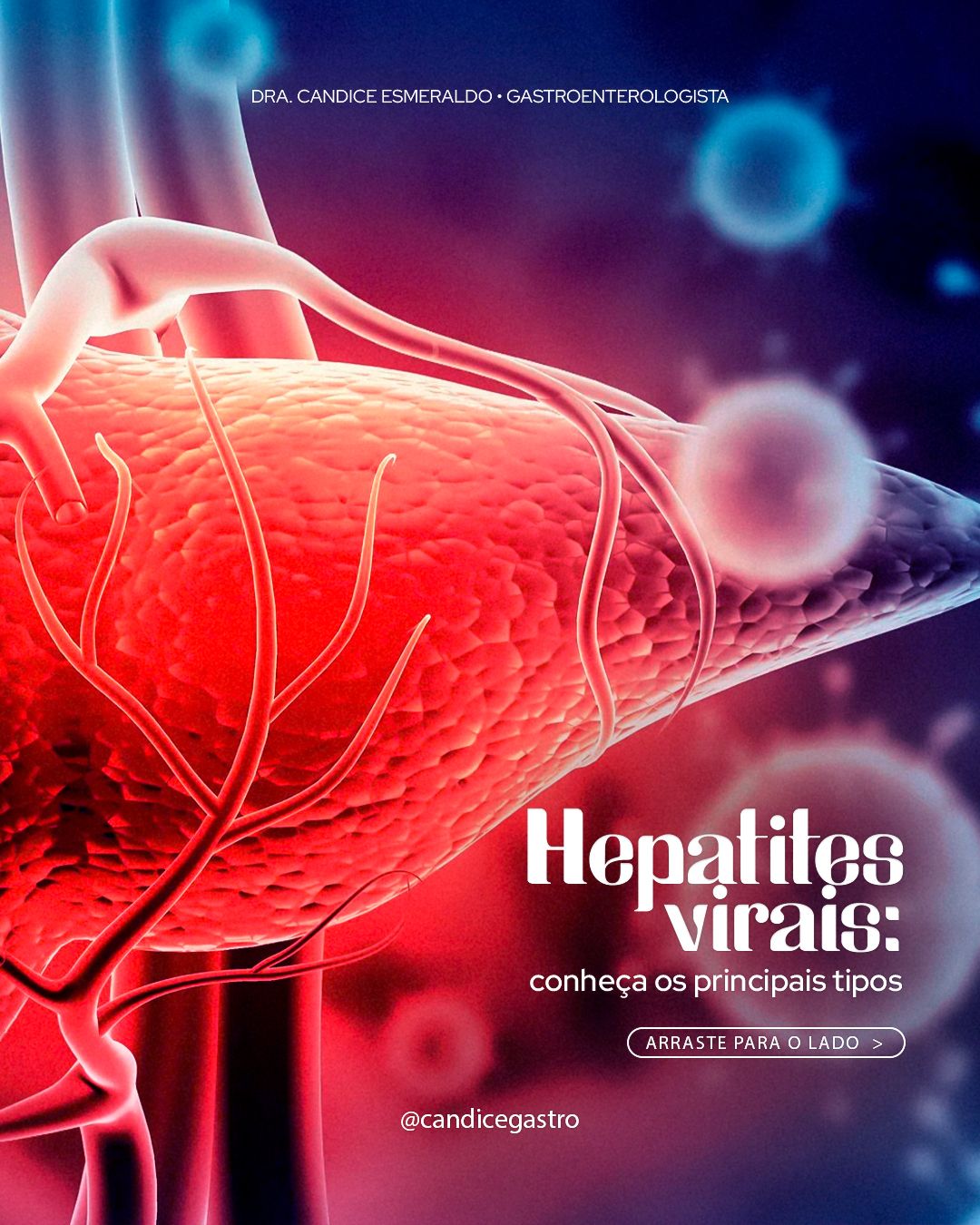




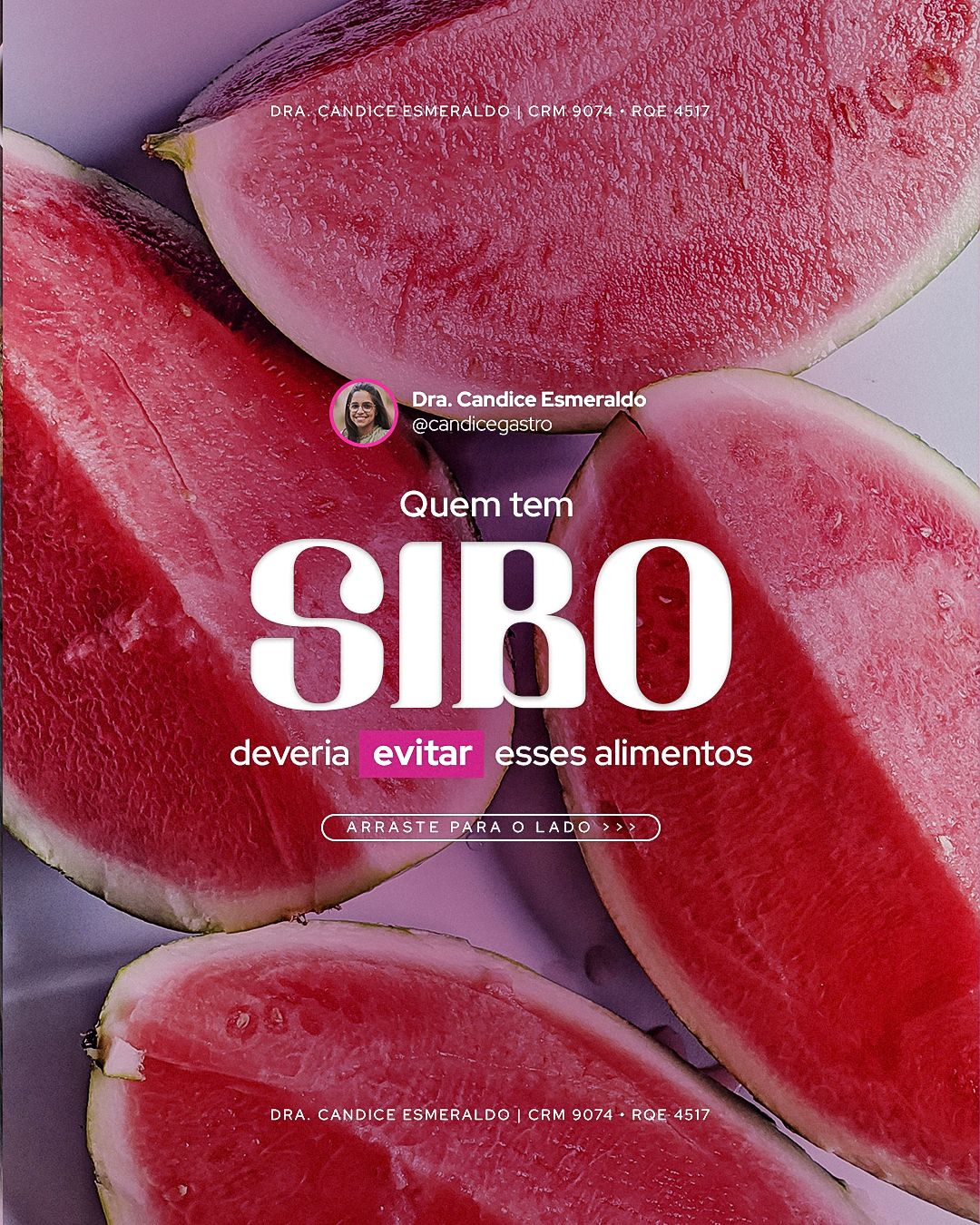


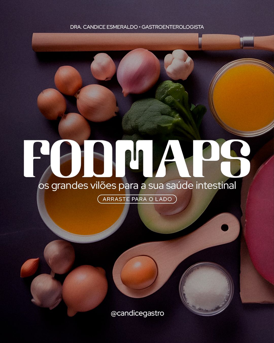
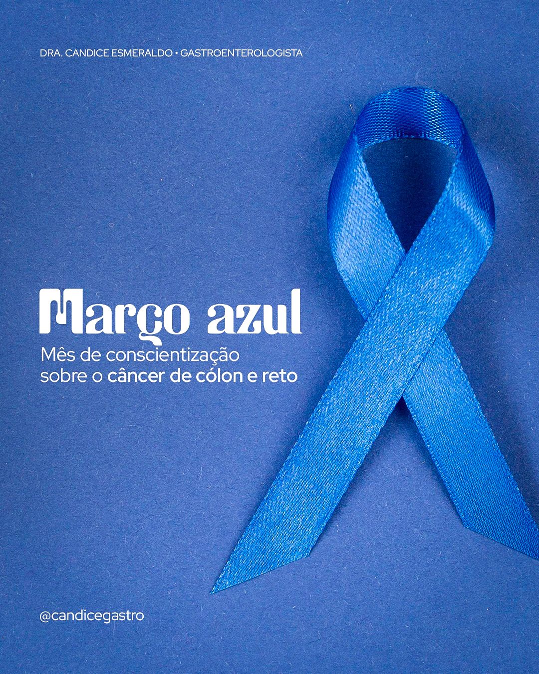

STAGE 04Carousels
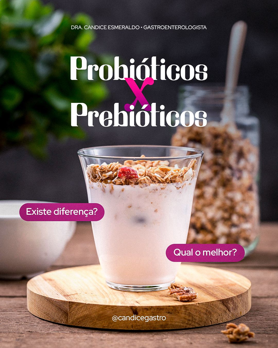
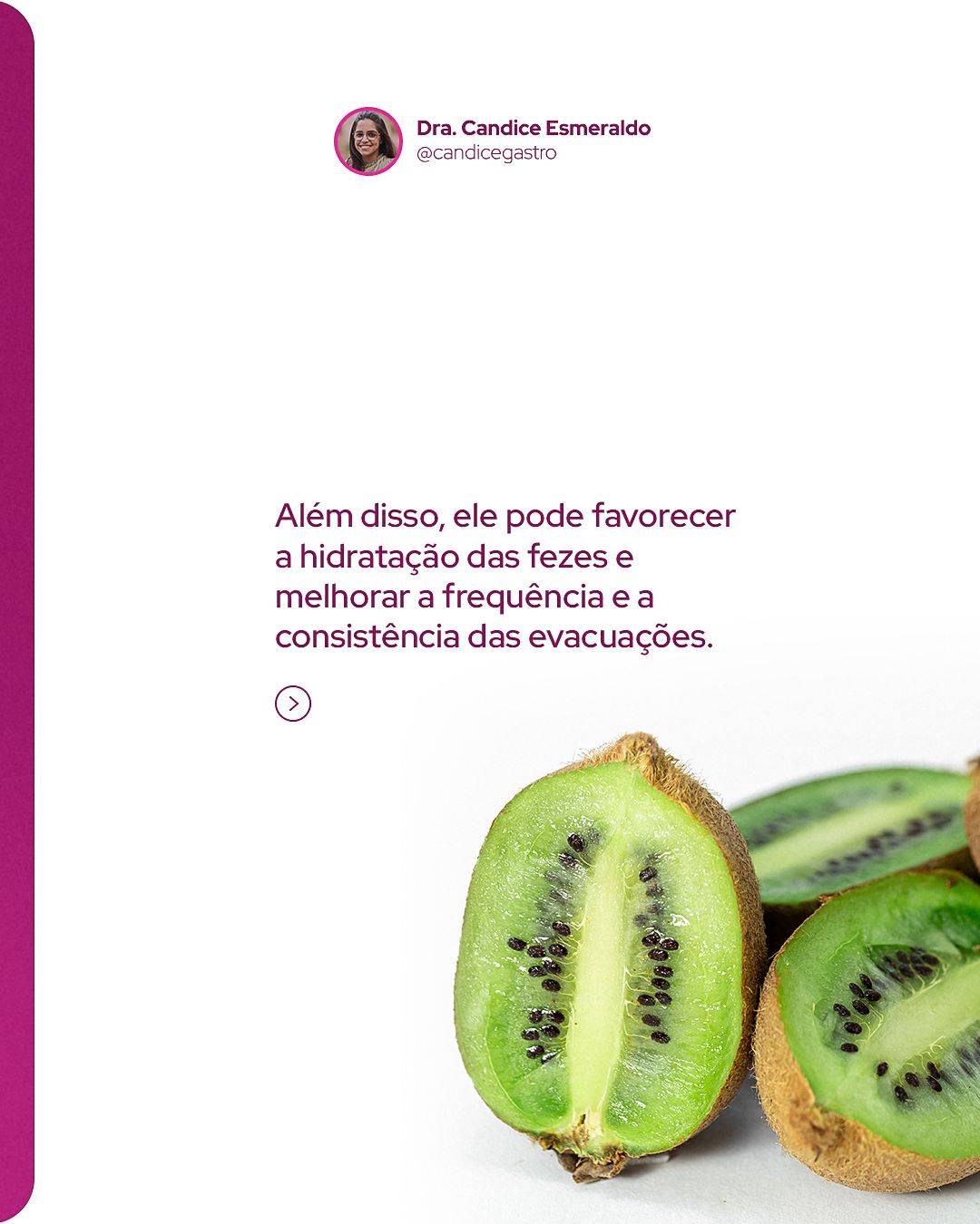
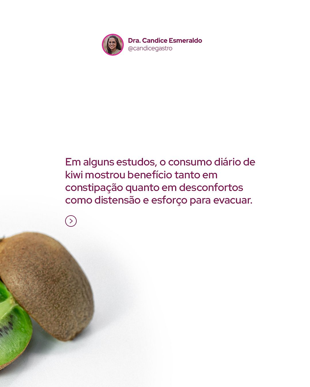
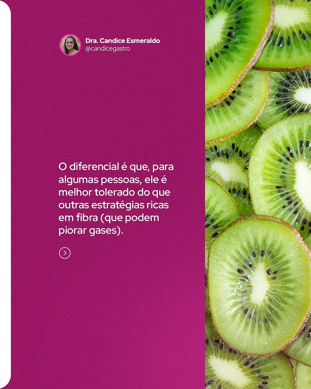
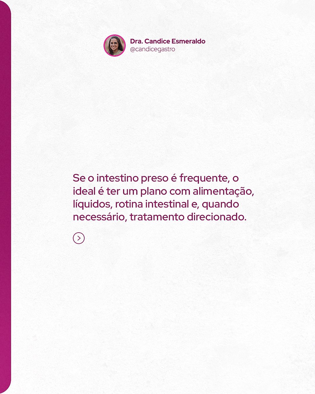
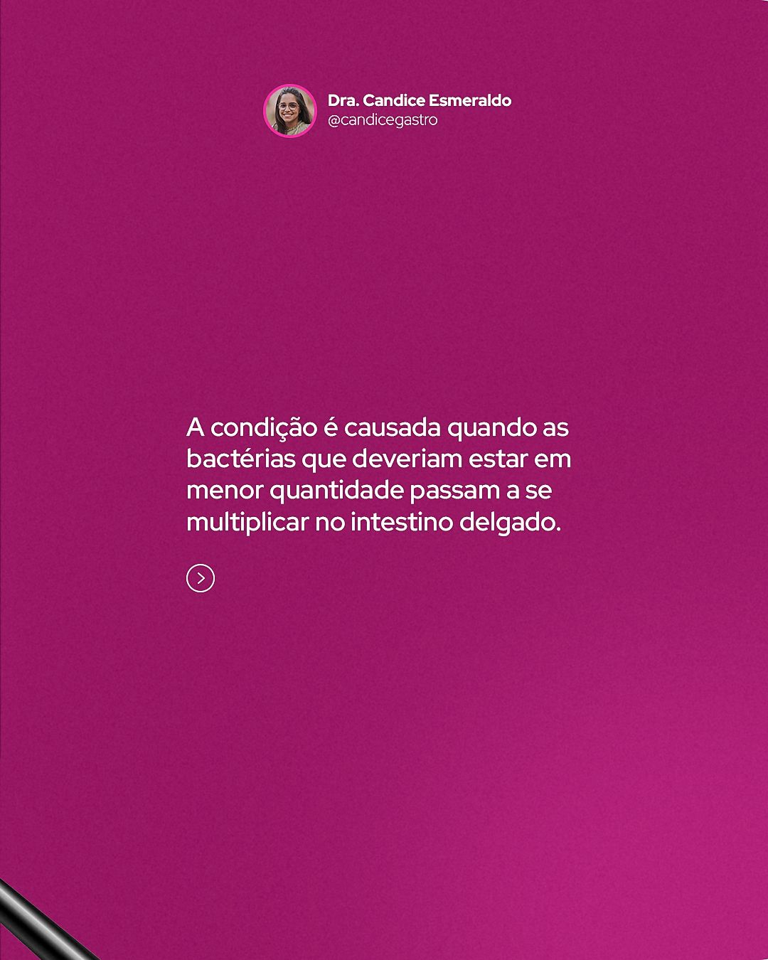
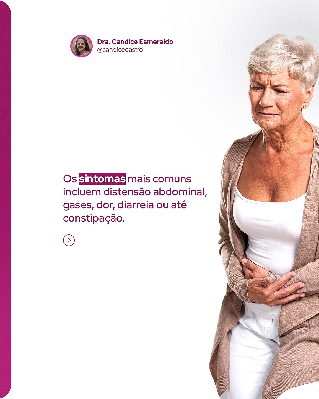
The carousels follow the same narrative logic: a cover with a question or promise, one idea per slide in short sentences and a closing call to book. Repeating colors and positions makes followers recognize the format before reading.



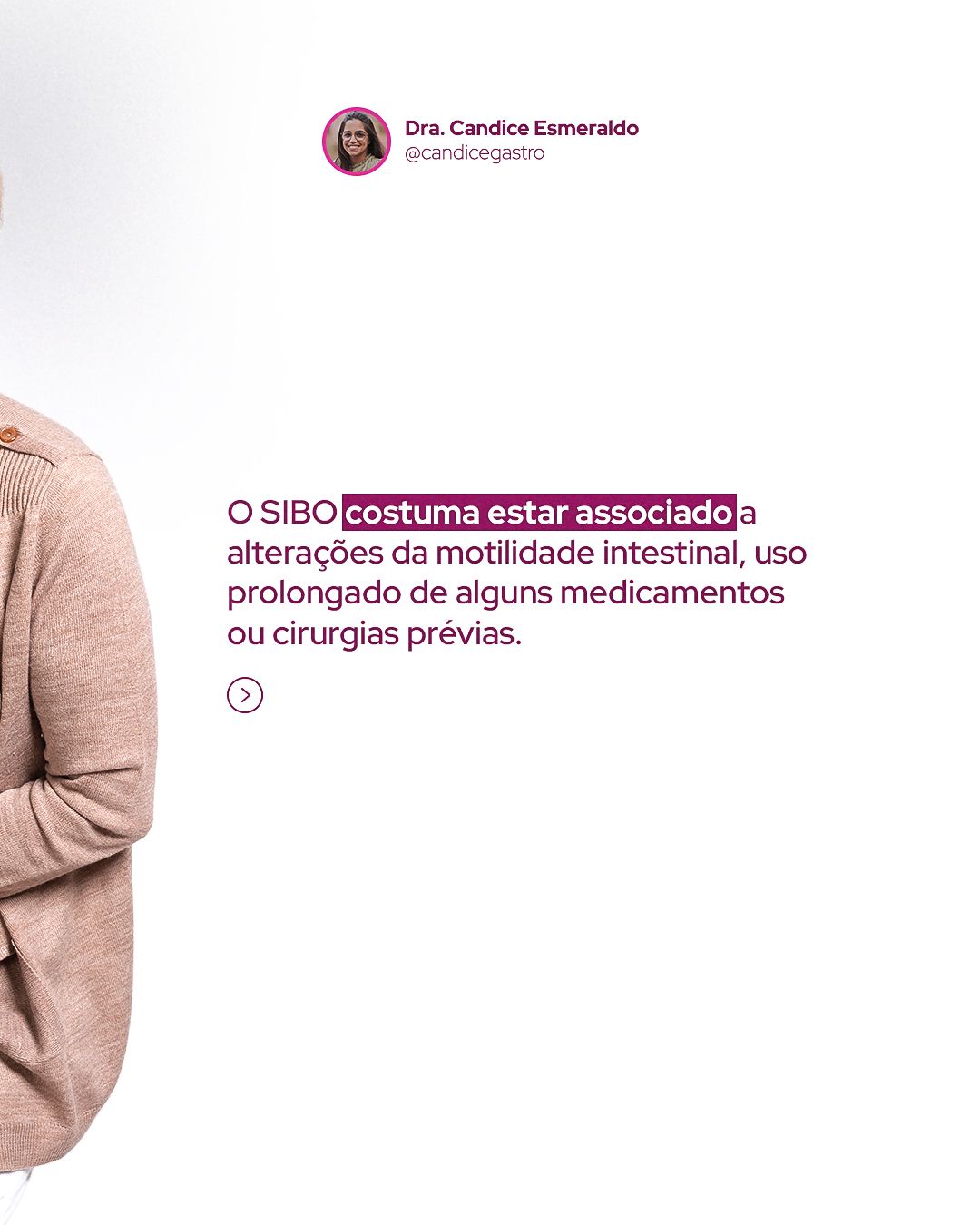
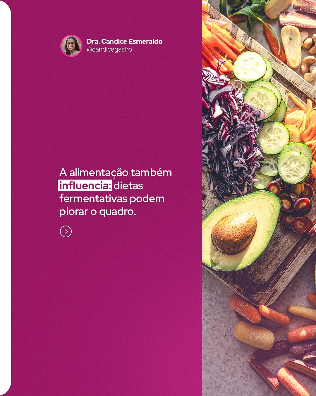
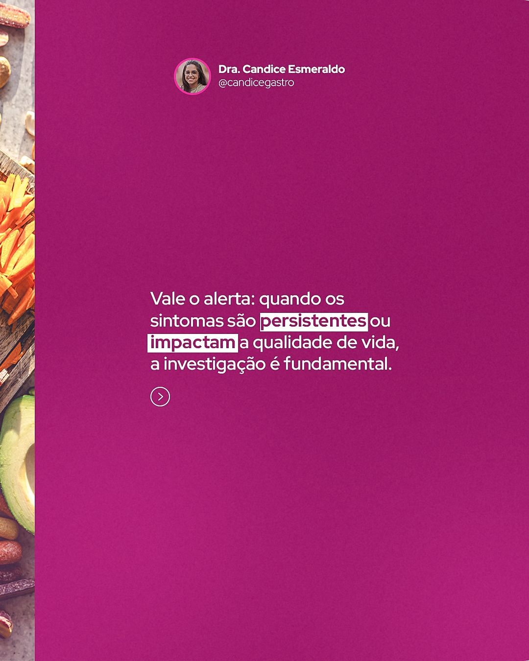
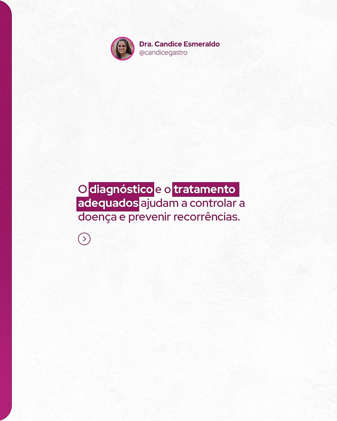

STAGE 05Color theory
The palette is analogous: wine, magenta and purple sit on neighboring hues (from purplish red to purple), which creates harmony and instant identity. The color conveys femininity and warmth, useful for an intimate subject like the gut. On awareness dates the color changes by convention: purple for Purple May (inflammatory bowel diseases) and blue for Blue March (colorectal cancer).
- #7E034DWineHeavier backgrounds and titles
- #C1277EMagentaSignature color and highlights
- #841A82PurpleTransition and purple May
- #FE6CBBPinkAccents and badges
- #0163B0BlueBlue March (colorectal cancer)
- #FAFAFAOff-whiteClean background and breathing room
| Pair | Use | Contrast | WCAG |
|---|---|---|---|
| Aa | White text on wine | 10.46:1 | AAA |
| Aa | White text on magenta | 5.44:1 | AA |
| Aa | Wine on off-white (titles) | 10.02:1 | AAA |
| Aa | White text on blue | 6.15:1 | AA |
STAGE 06Typography and layout
Titles use heavy sans-serif in magenta or white, with keywords highlighted by color or size. For impact, the topic appears in a high-contrast serif at giant scale, cropped by the edge. Supporting text is small and discreet, because the image does the main work.
The layout follows the 4:5 feed grid with constant inner margin, and the call-to-action footer always sits in the same place. In health topics, clarity comes before effect: one idea per piece and enough contrast for reading on a small screen.