Wow Cookies — Menus and social media
Menus (digital and print-ready), feed posts, carousels and in-store materials for an artisan cookie shop, in a chocolate-and-cream palette that makes you hungry just by looking.
STAGE 01Context and goal
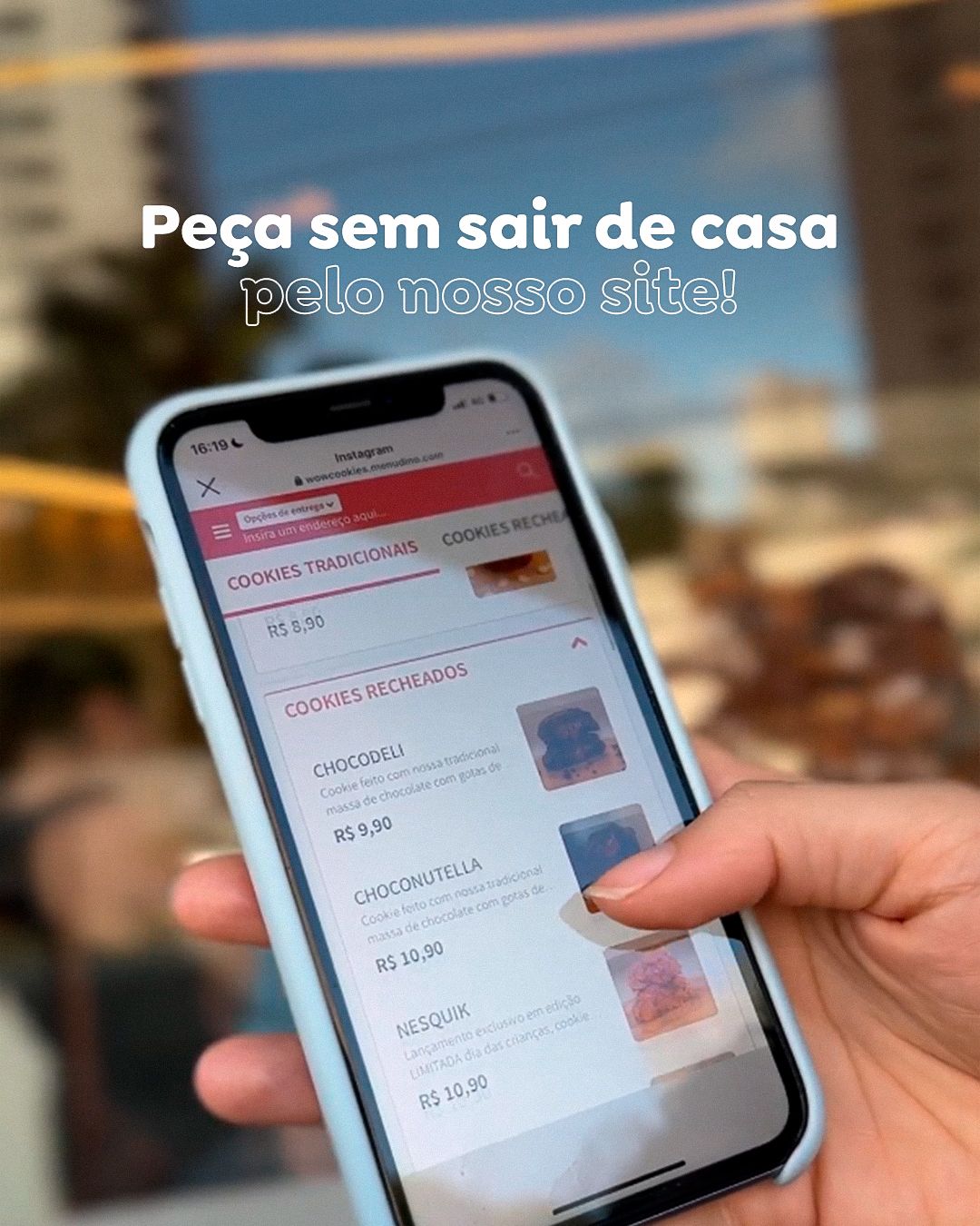
Wow Cookies sells large, filled artisan cookies in the store and by order (site and WhatsApp). The materials needed to sell by sight: show the filling, state flavor and price clearly and keep a cozy, coffee-with-friends mood.
About authorship: the brands, logos and identities belong to the clients and already existed. Here I show my art direction, layout and application of the identity across the pieces.STAGE 02Menus
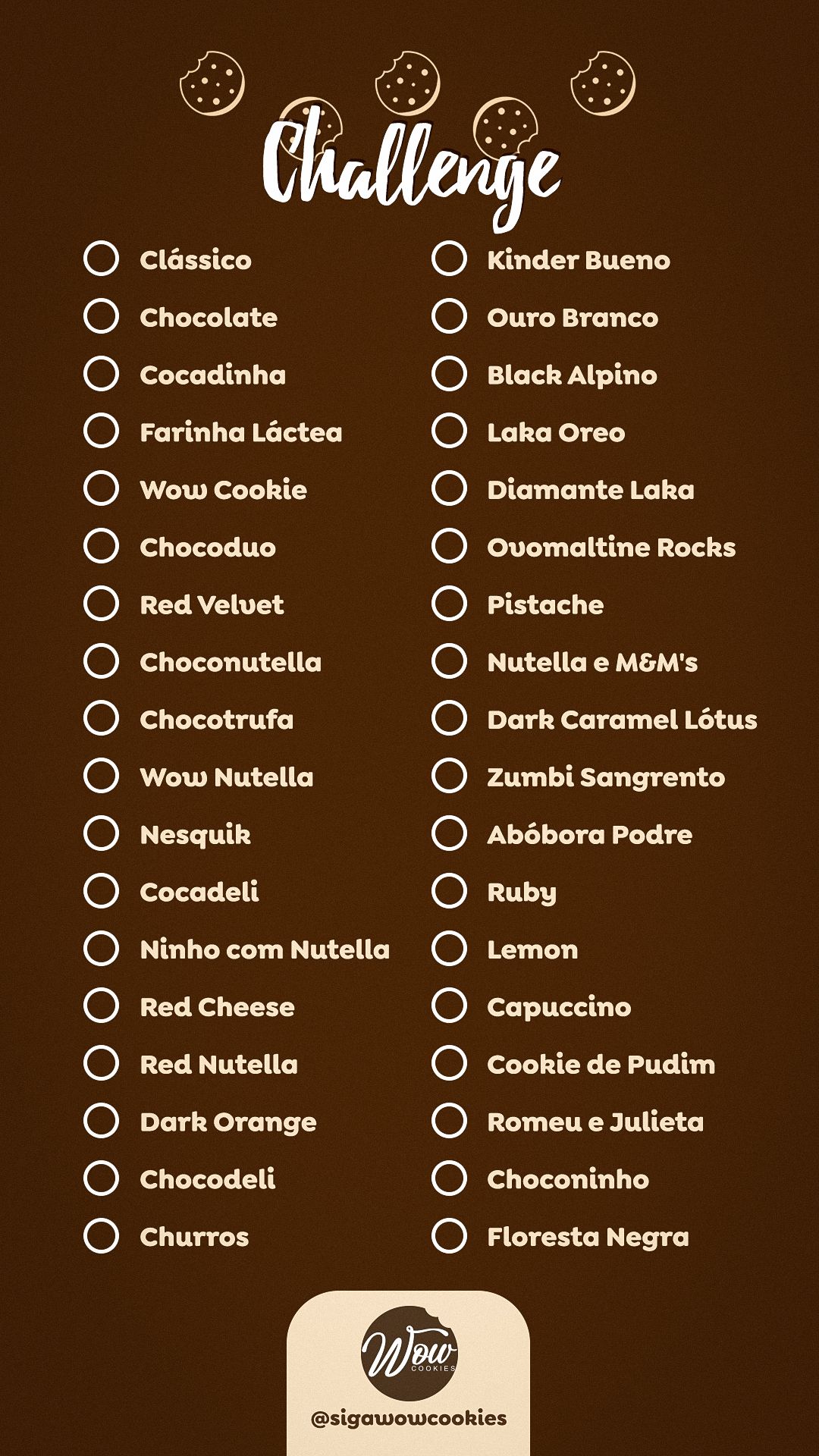
A menu is an information hierarchy problem: the customer must find name, description and price effortlessly. In the flavor menus, each item is a strip with the cut-out photo, a prominent name, a short description and the price in a badge. The strips repeat the same pattern, and the eye learns to read in rhythm. The “Wow Lovers Challenge” turns the list into a checklist for flavors already tried, a game mechanic that encourages repeat purchases.
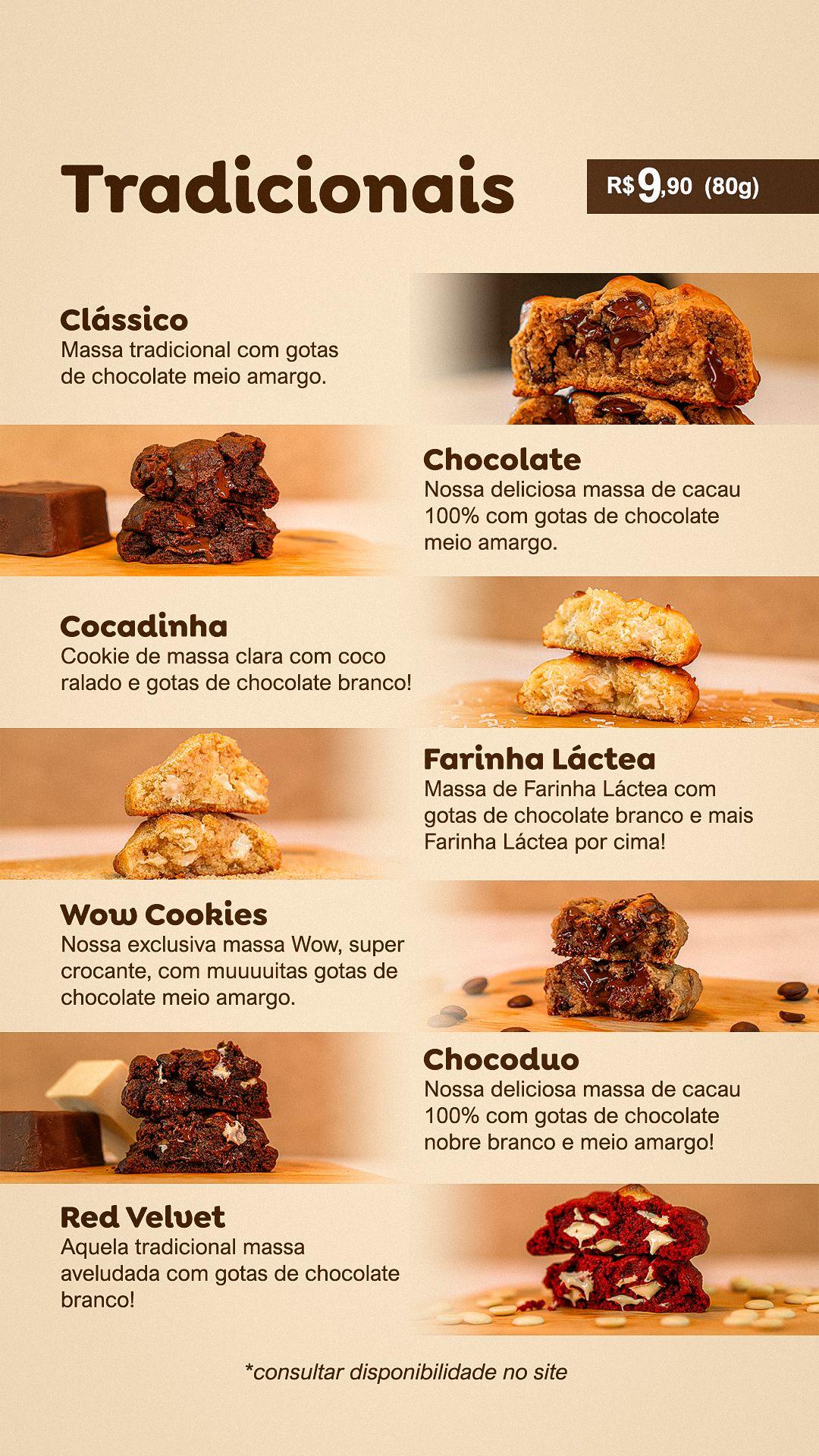
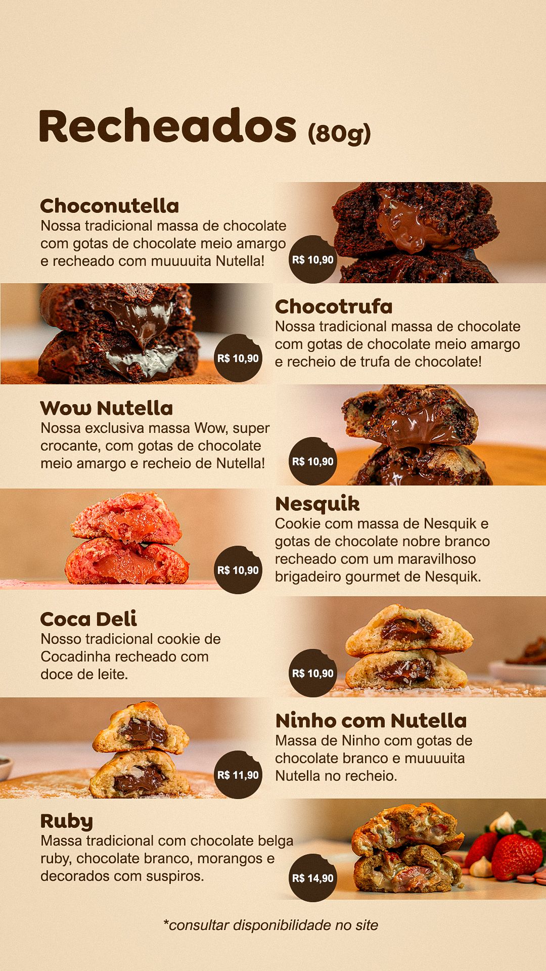
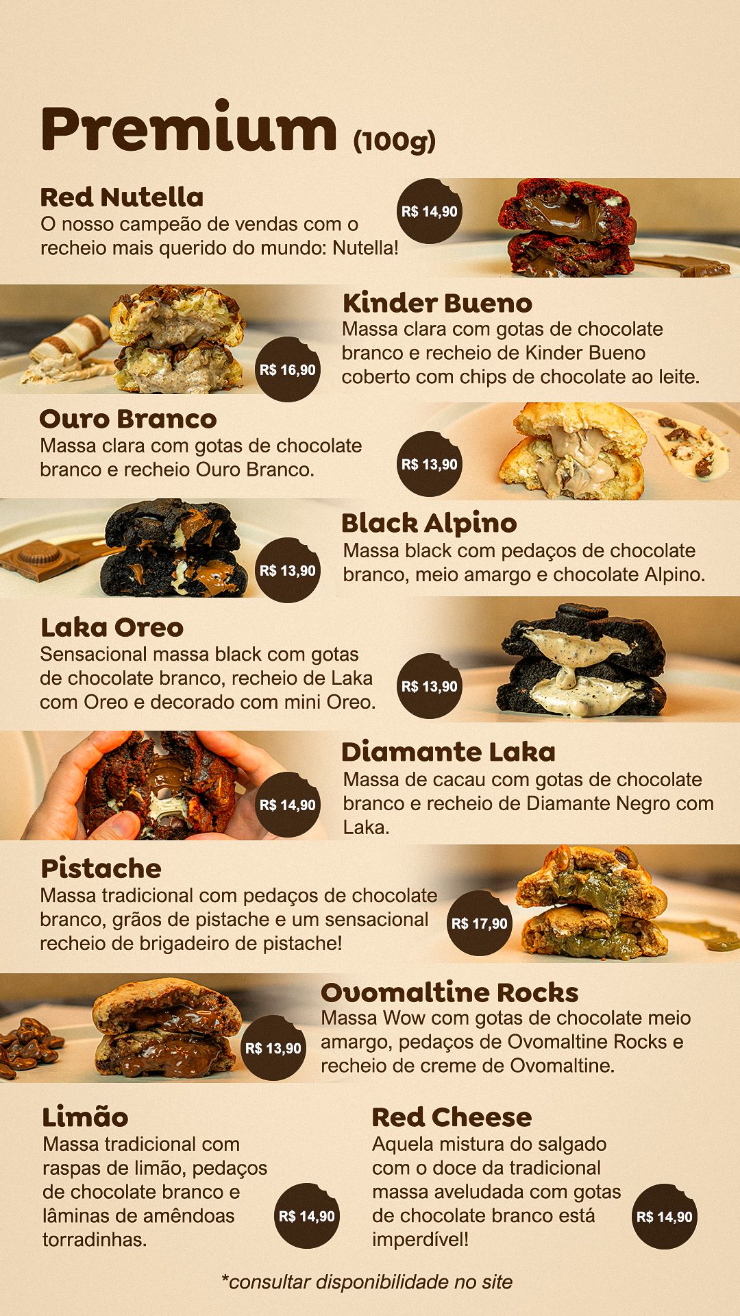
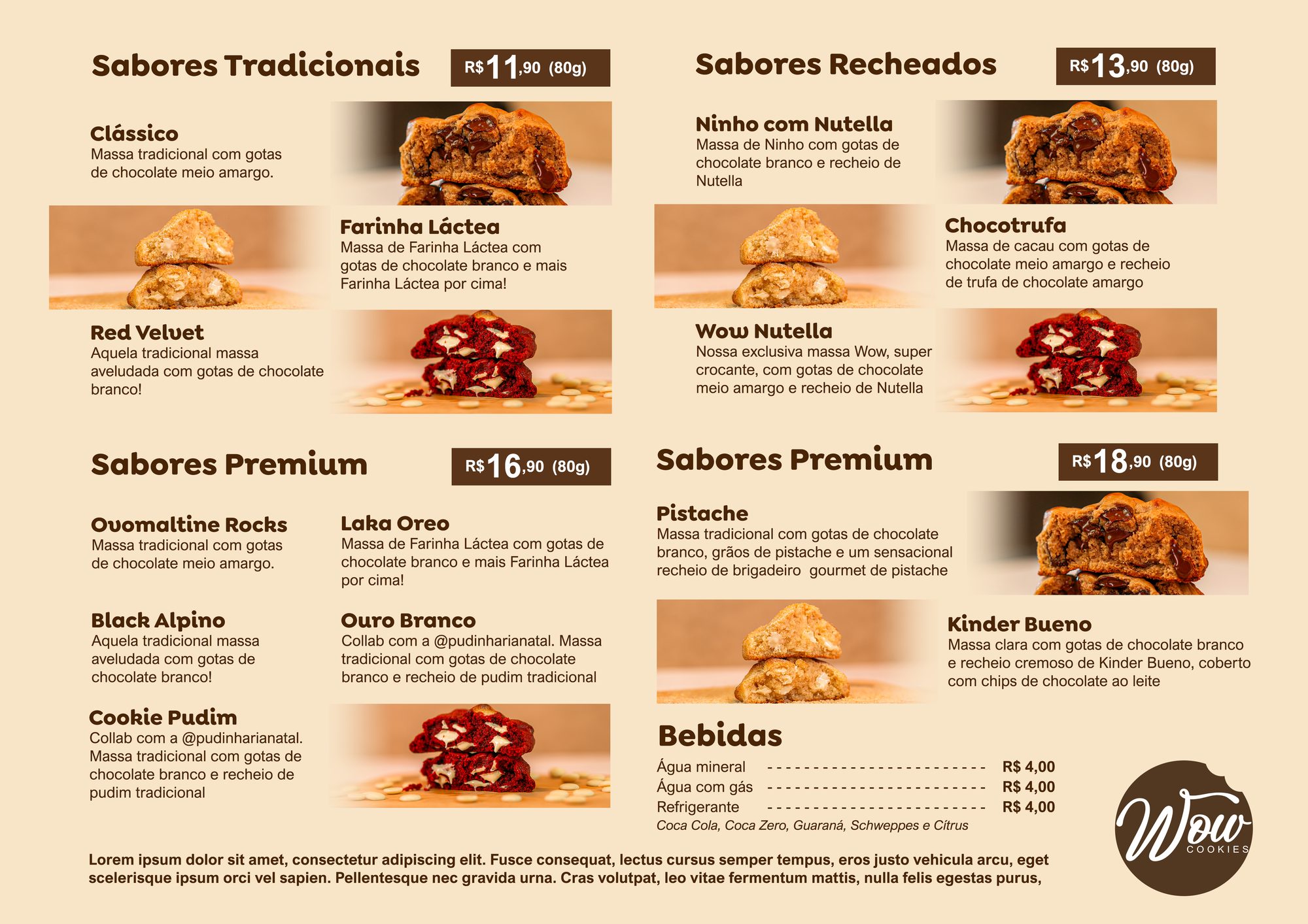
The print summer menu was laid out in A3 landscape (4961 × 3508 px at 300 dpi), bringing traditional, filled and premium flavors, drinks and prices onto a single sheet, with small photos and a column grid.
STAGE 03Easter menu
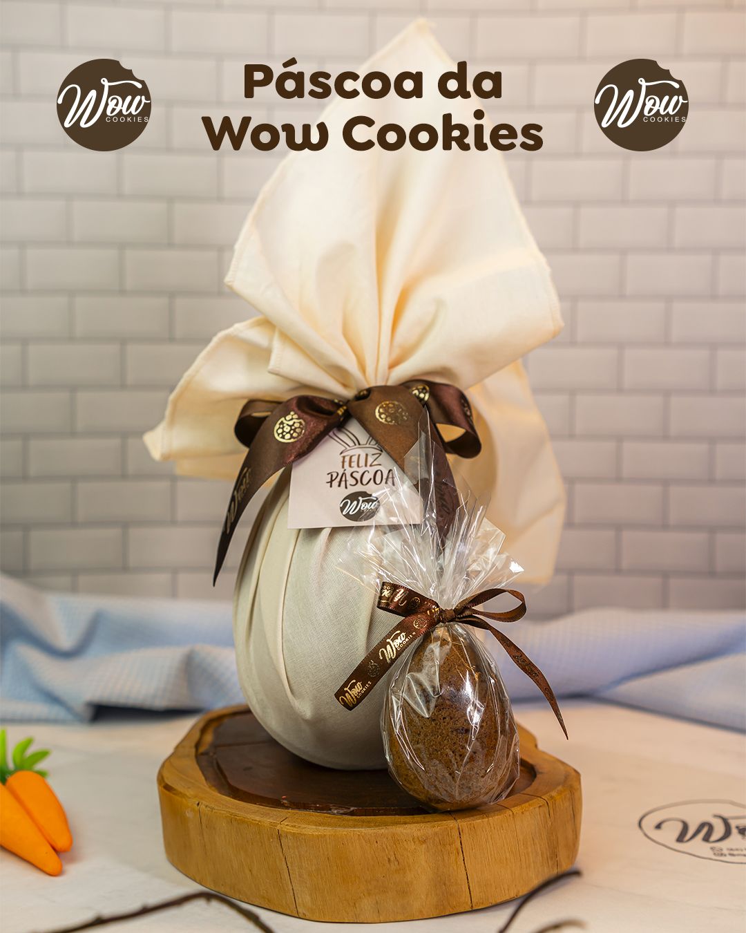
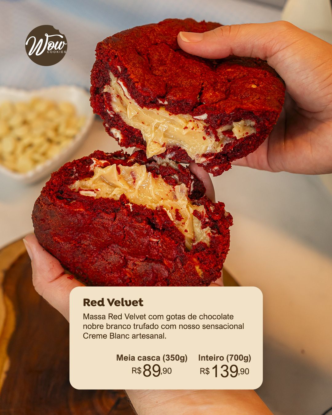
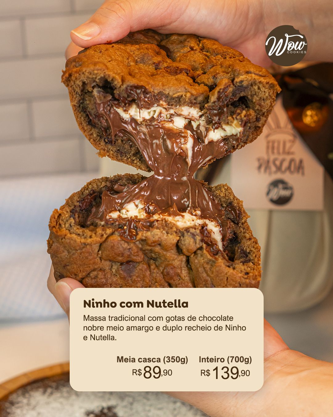
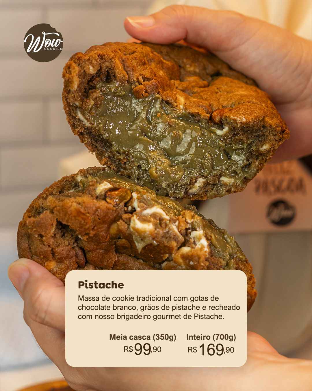
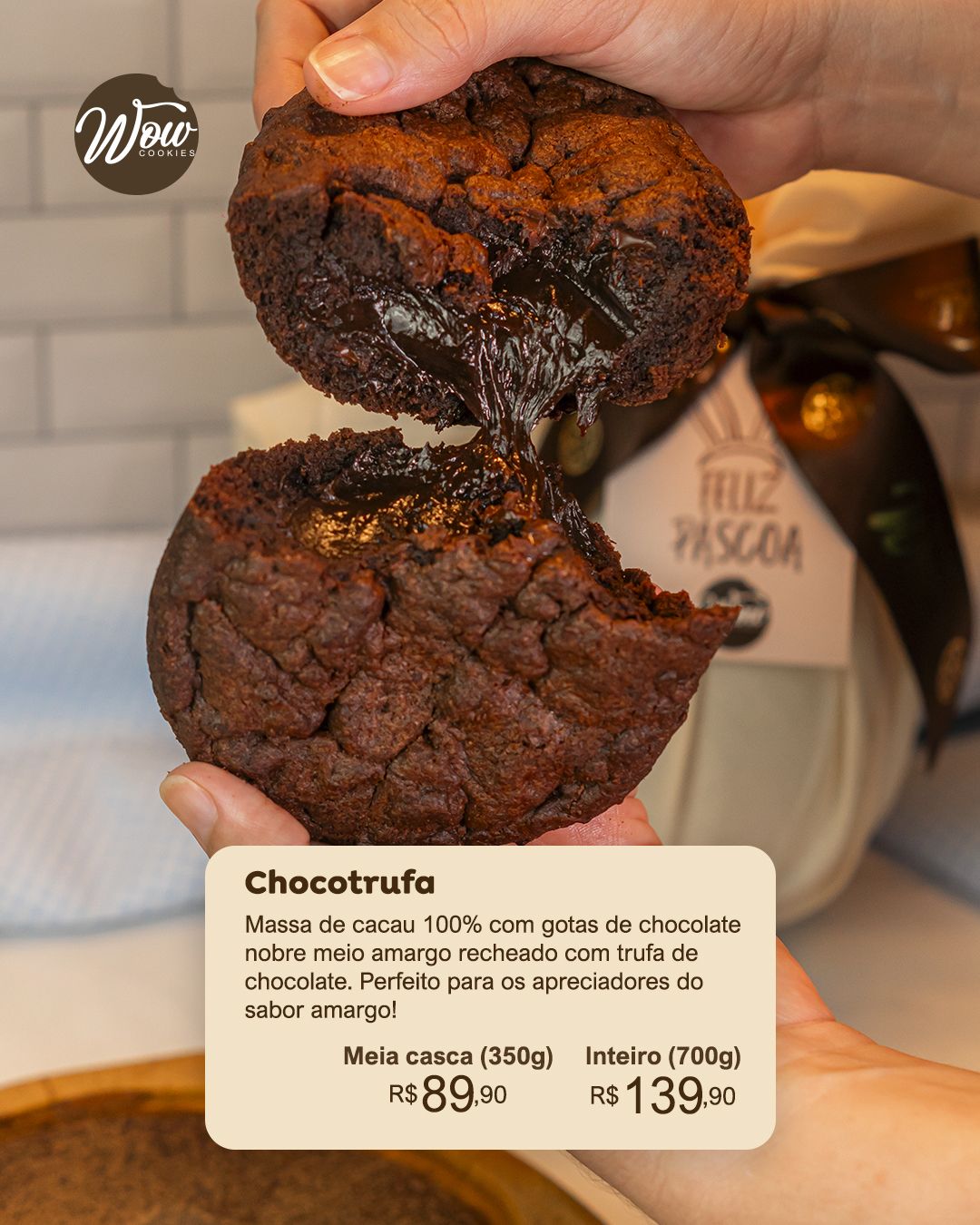
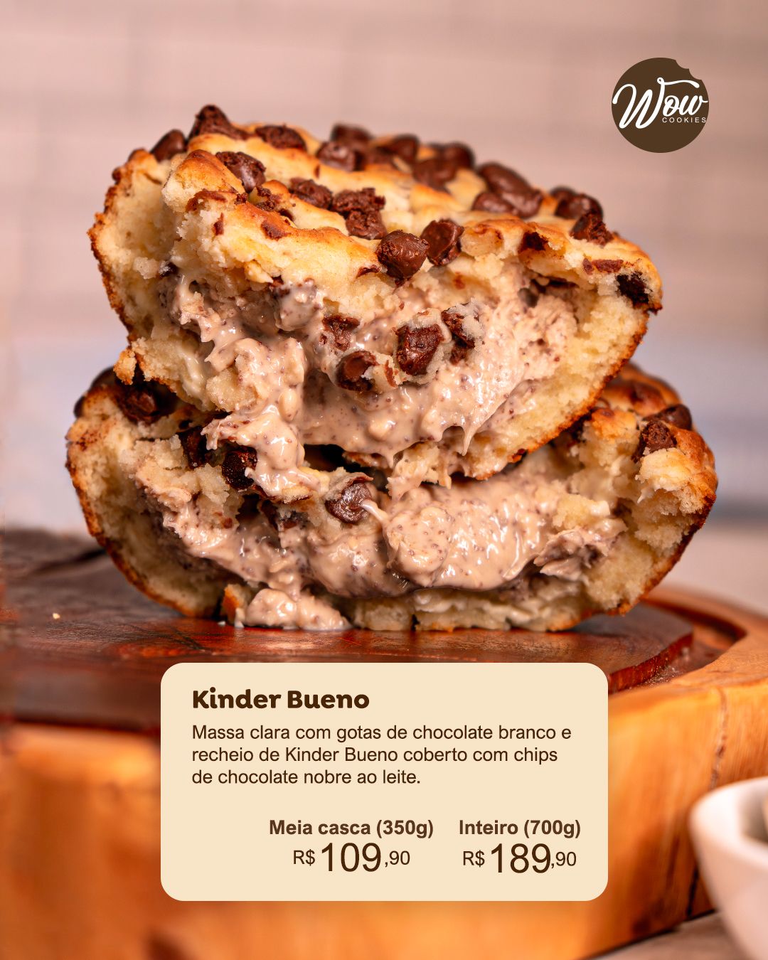
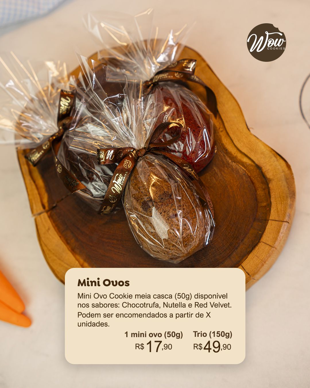
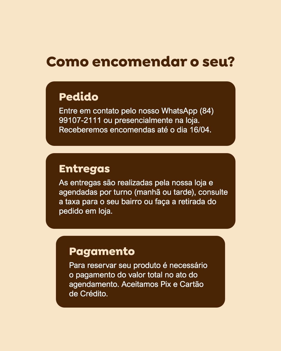
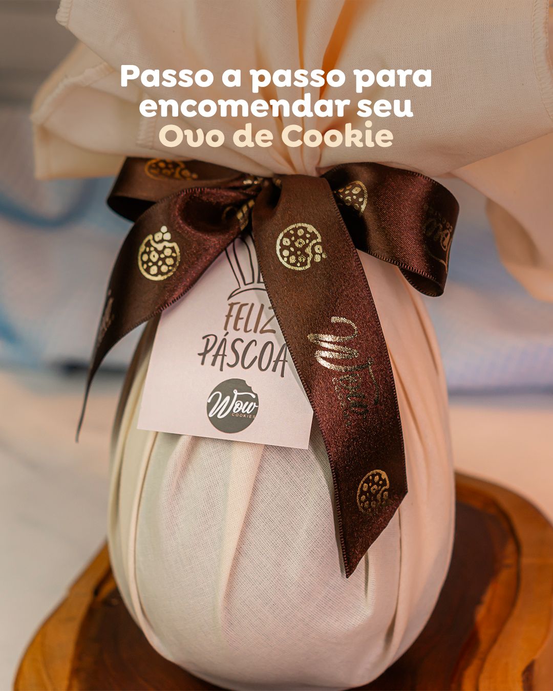
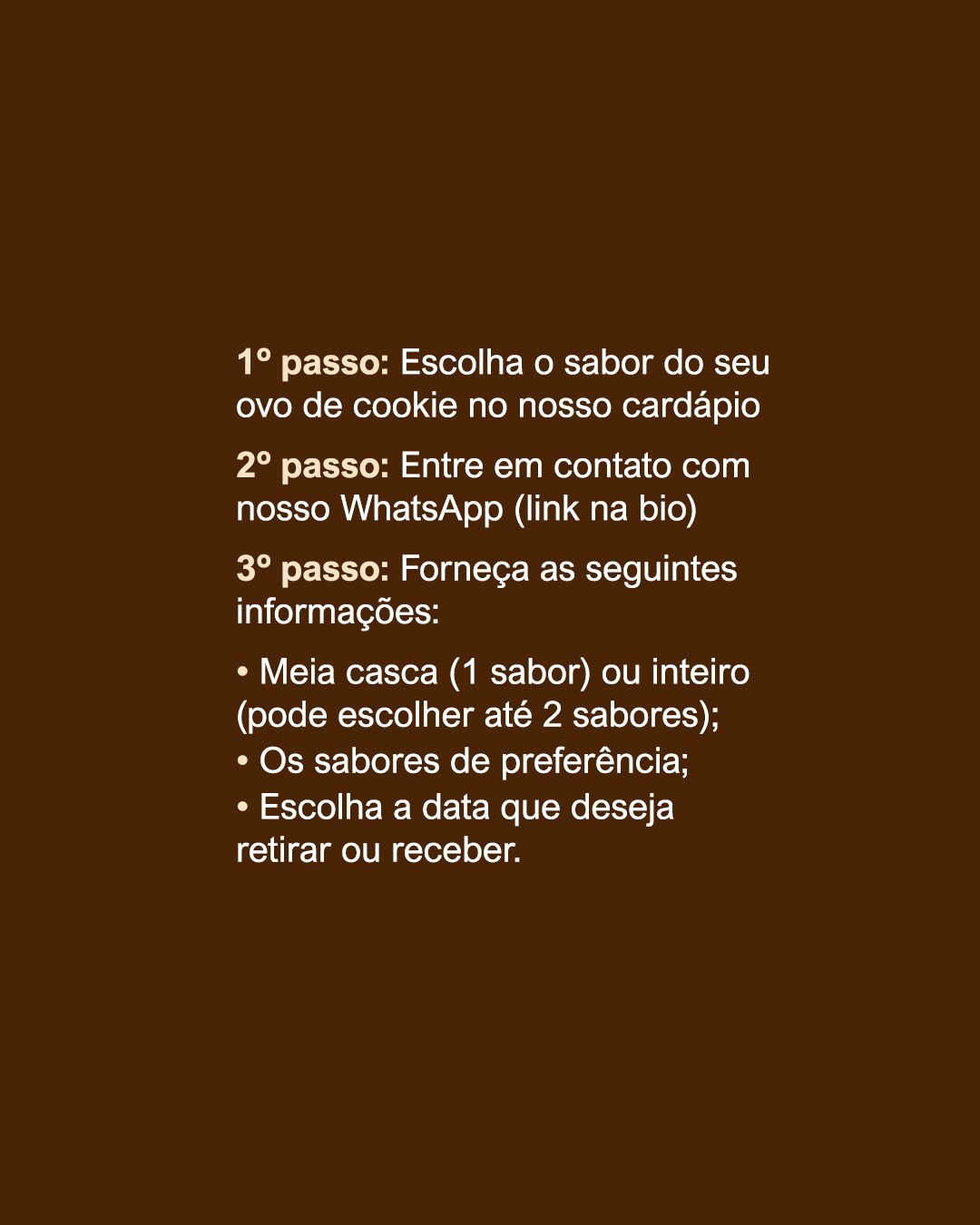
For Easter, the menu became a product carousel: a large photo of the cookie or egg, a hand holding it for scale, and a cream card with description, sizes and prices always in the same position. The last slide explains how to order in three steps (order, delivery and payment).
STAGE 04Feed
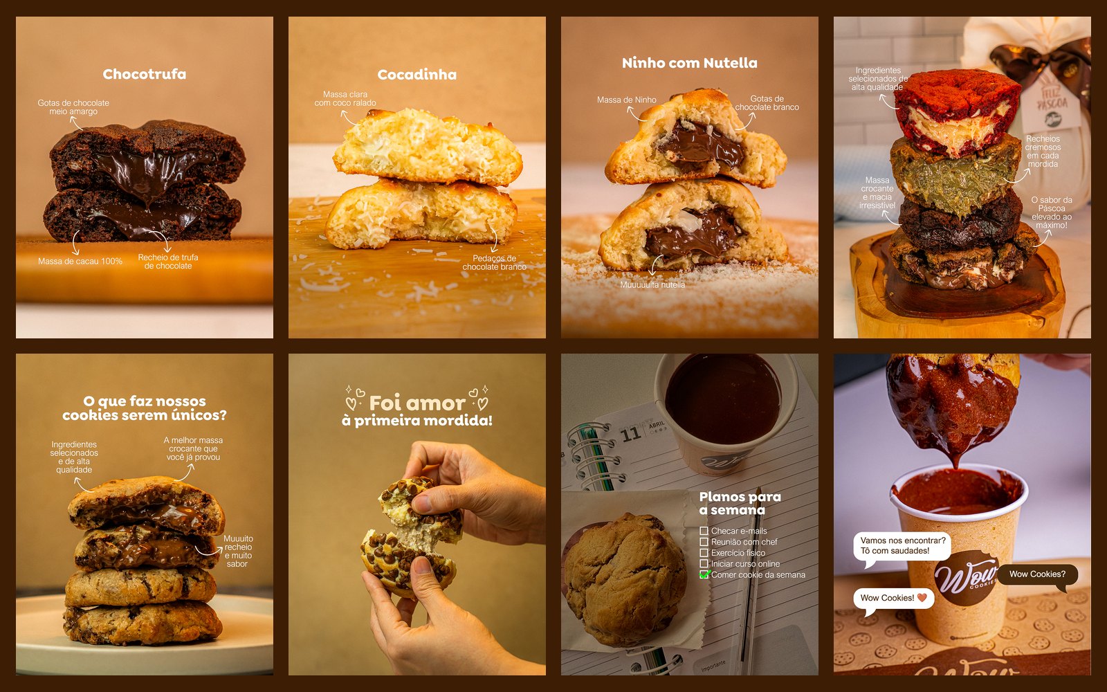
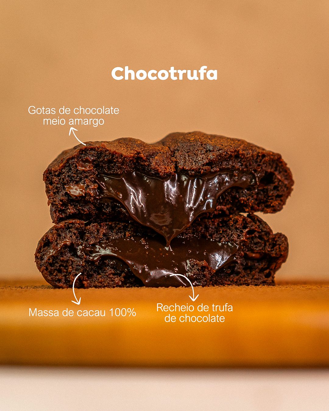
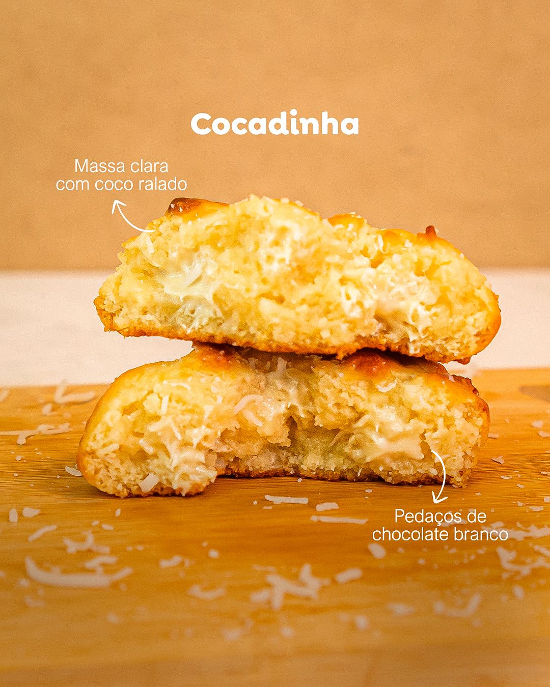
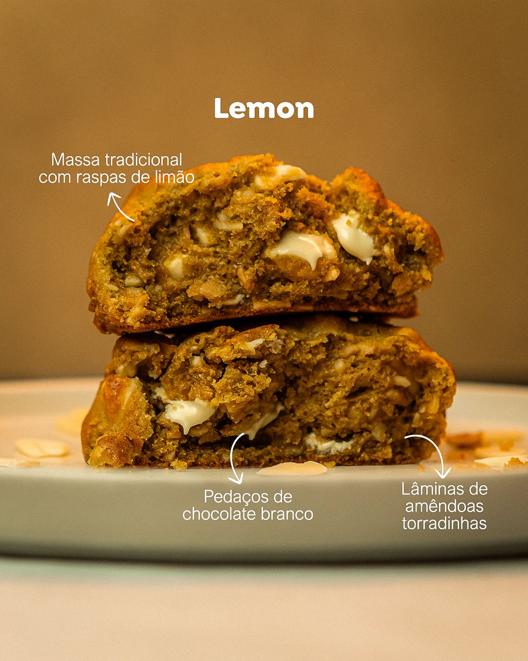
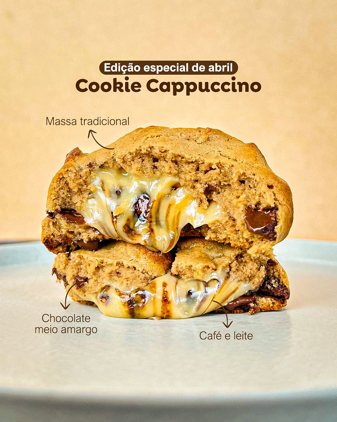
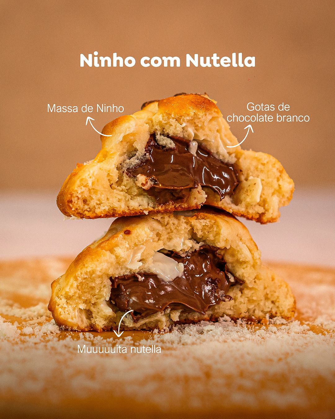
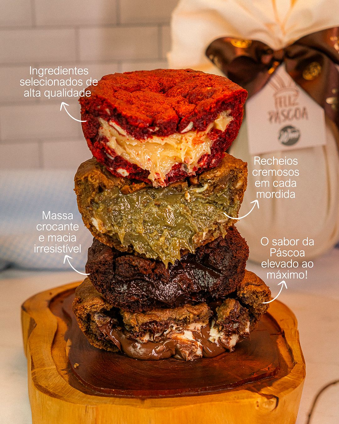
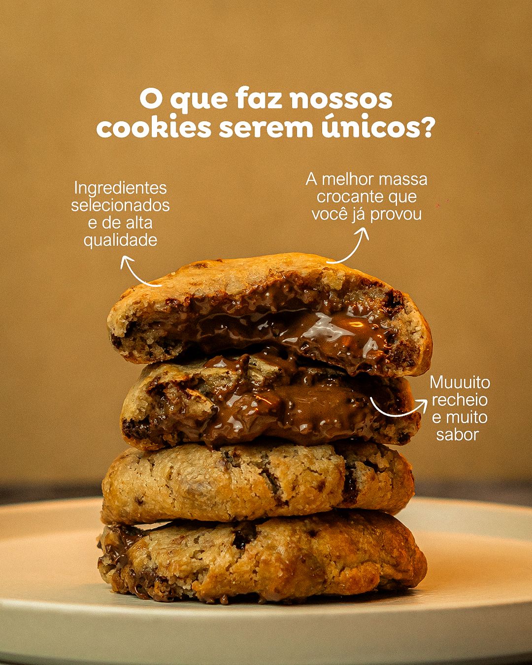
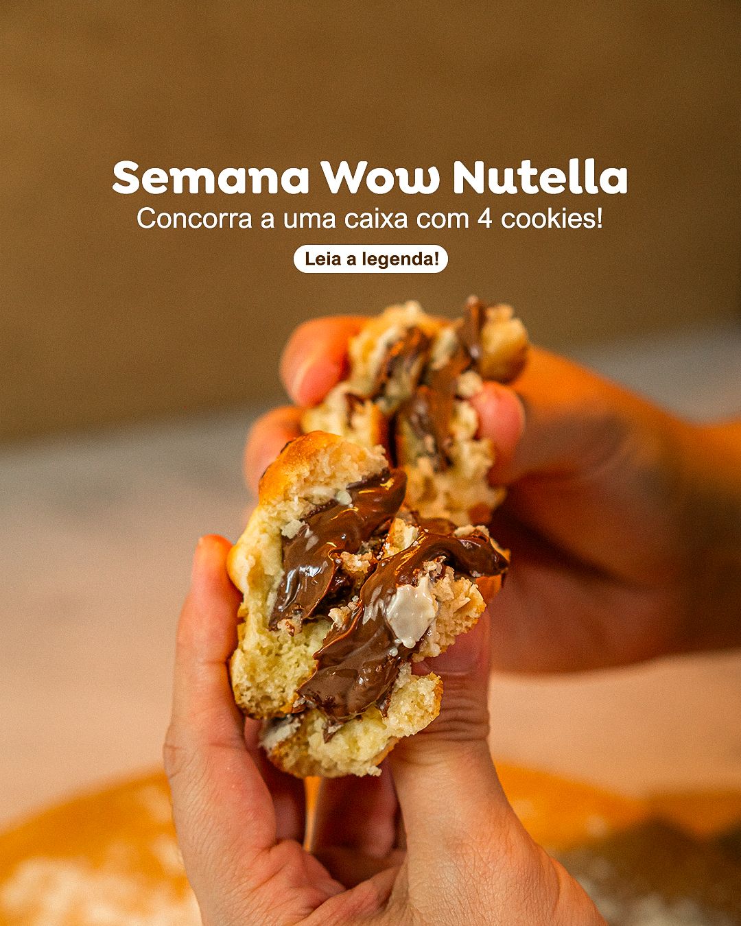
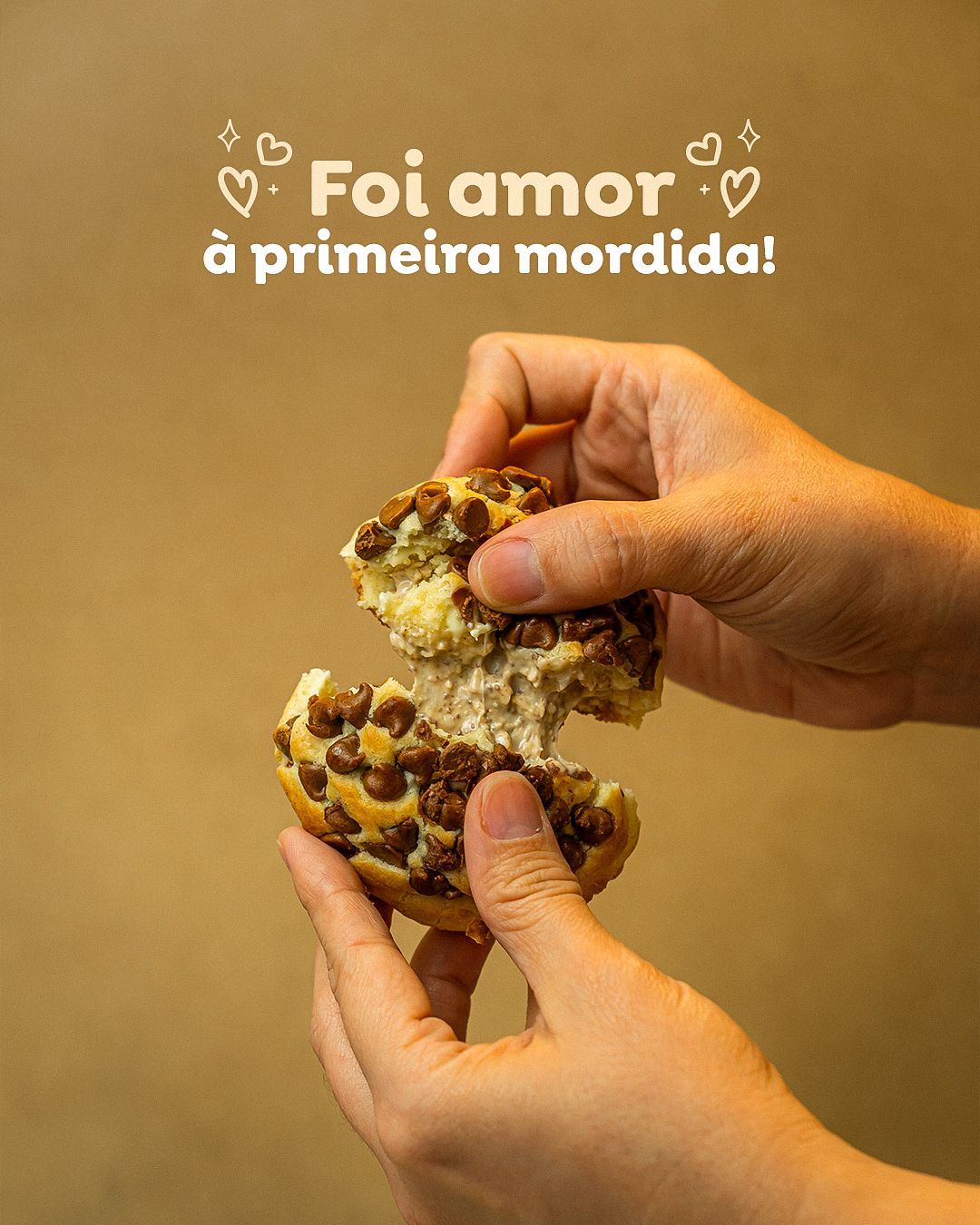
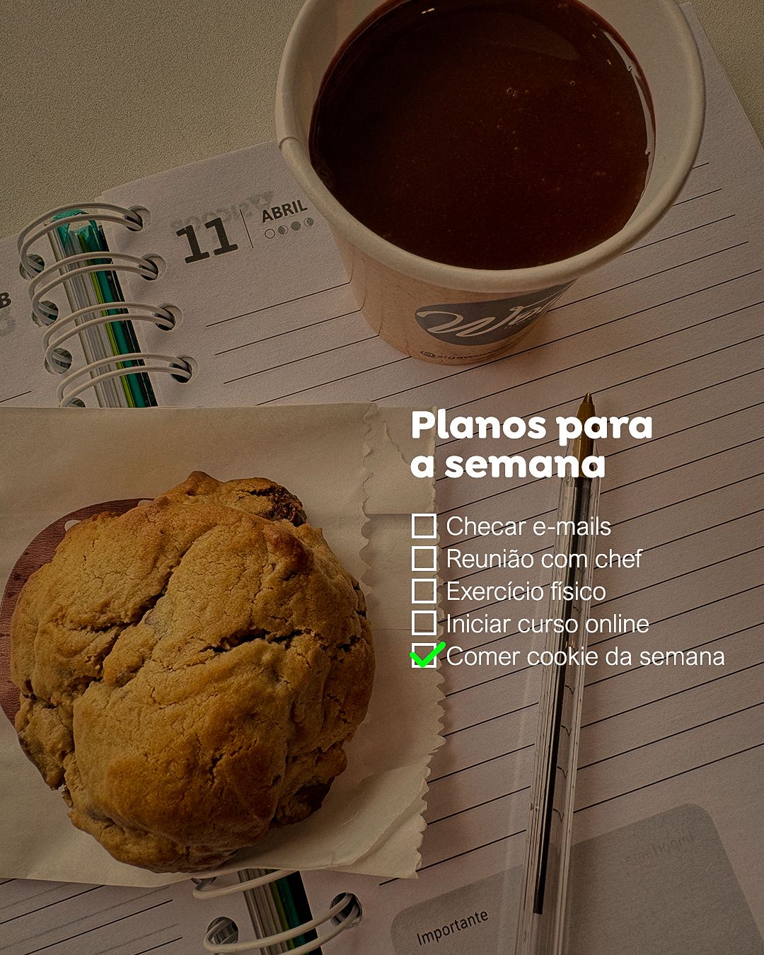
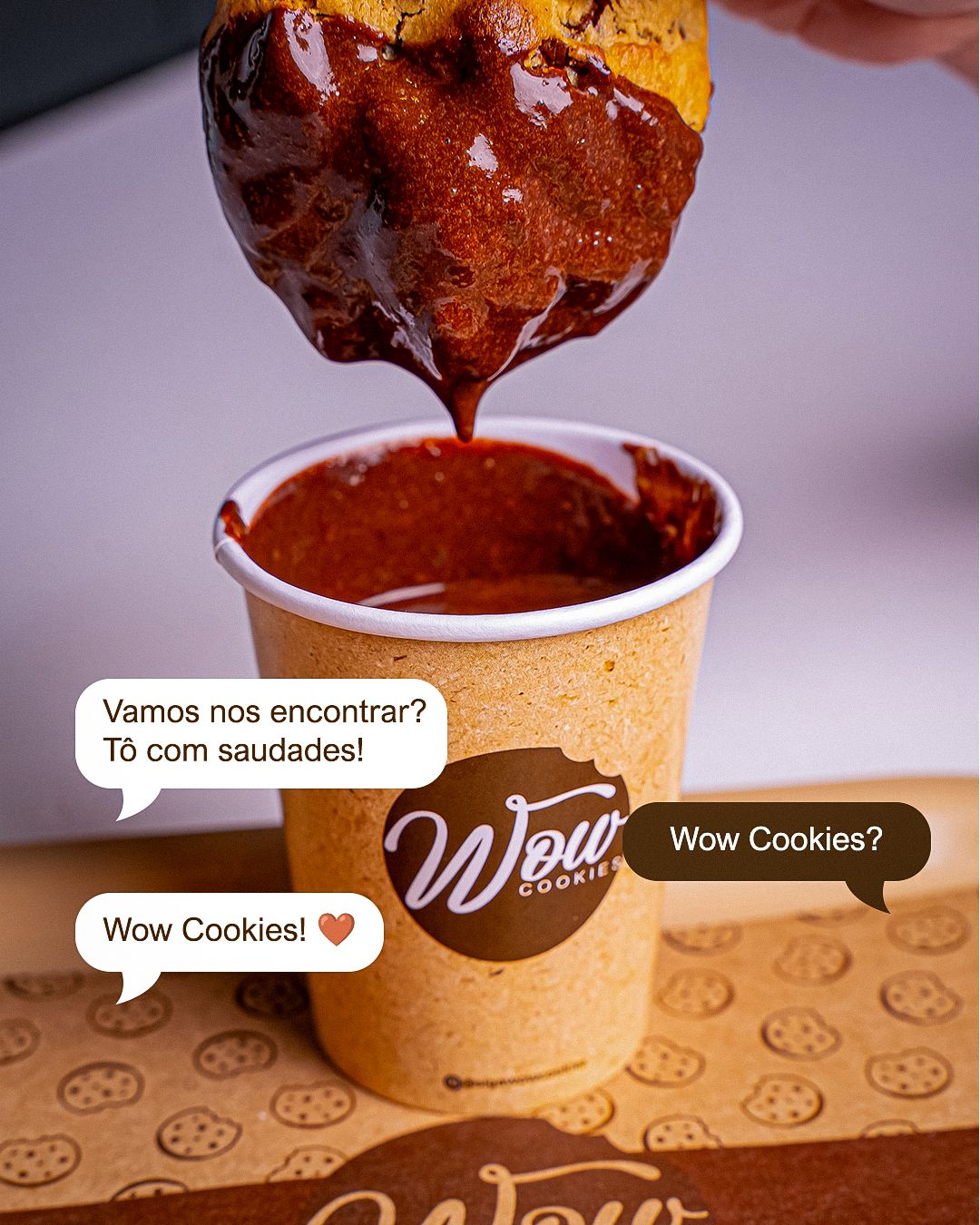
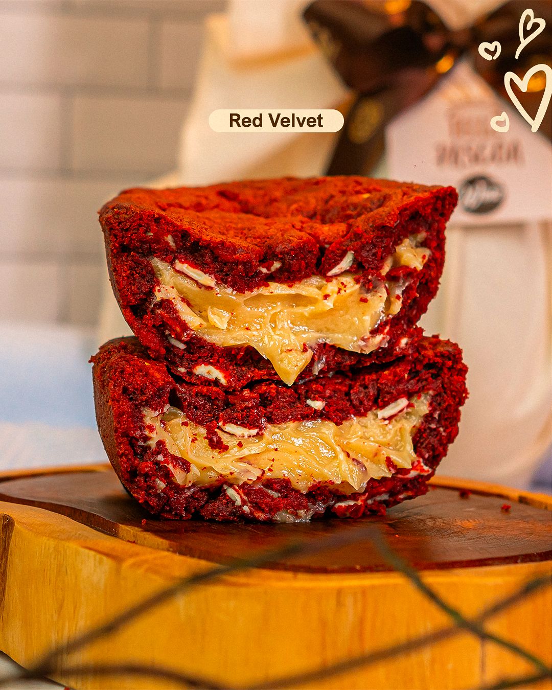
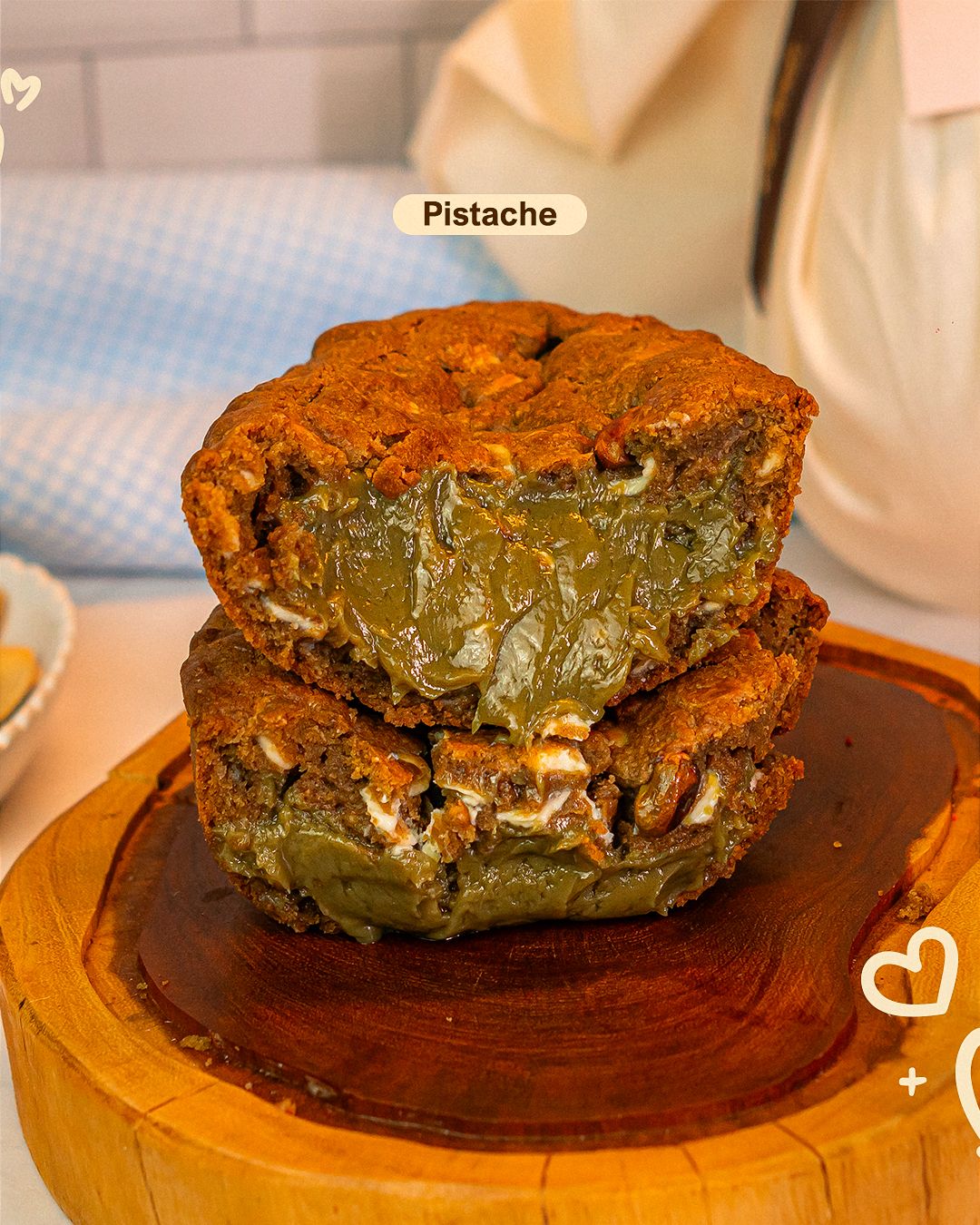
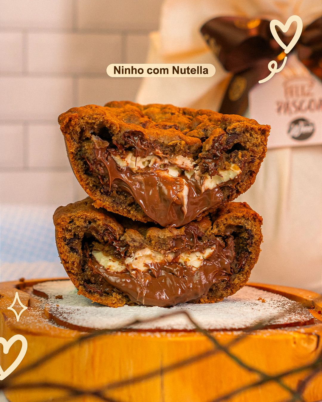
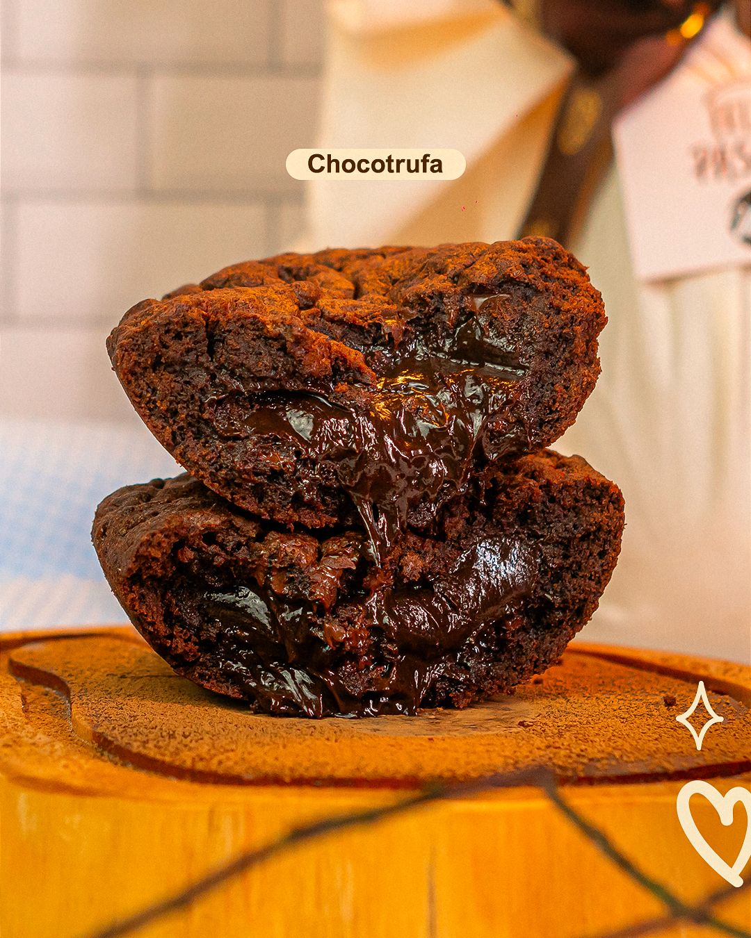
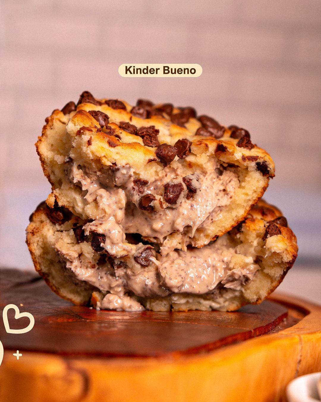
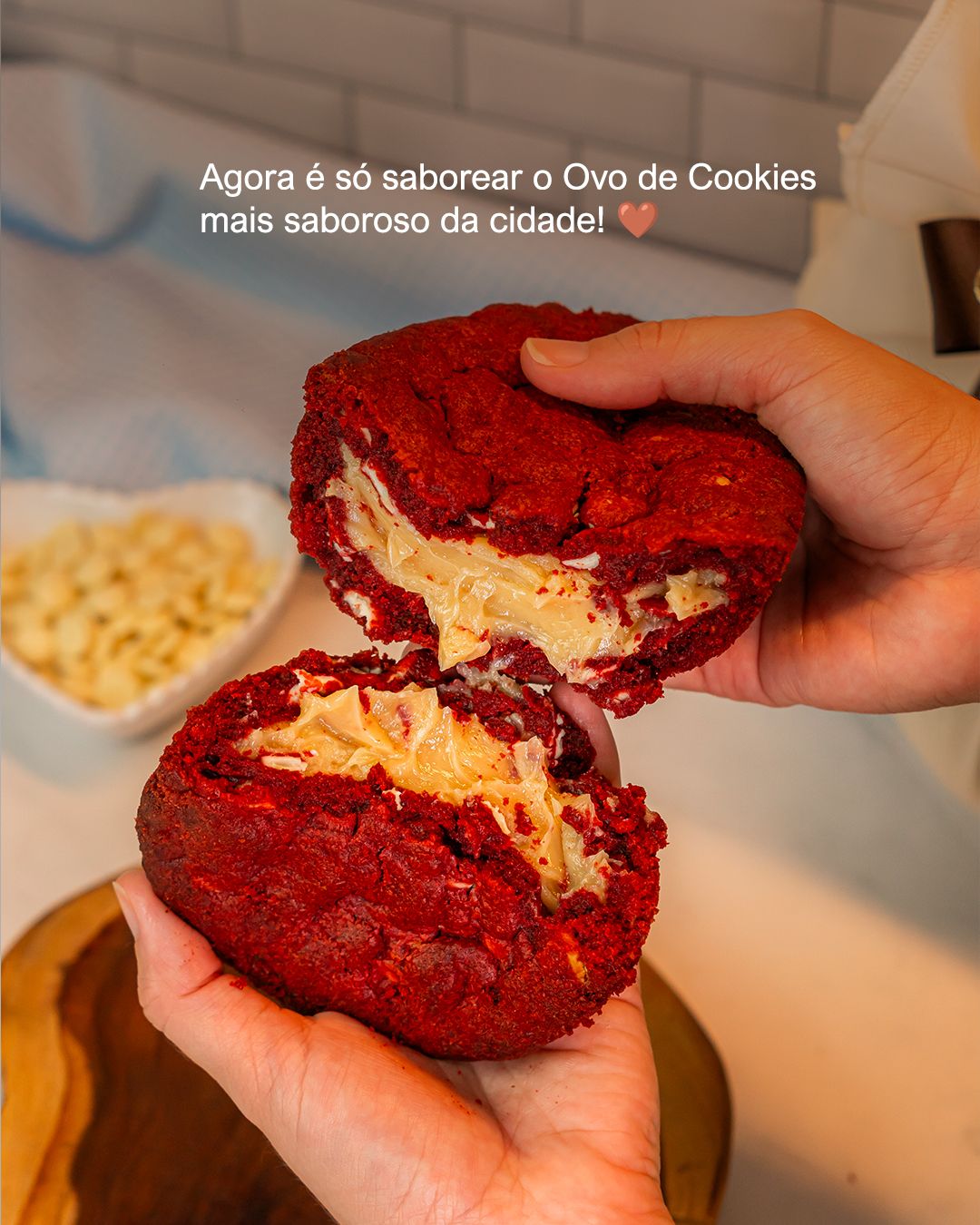
The breakdown posts work as flavor infographics: the cookie split in half, with arrows and captions pointing to dough, filling and toppings. Information and appetite in the same image. The photo is always the protagonist and the text is short, on a warm background drawn from the photo itself.
STAGE 05In-store materials and special dates
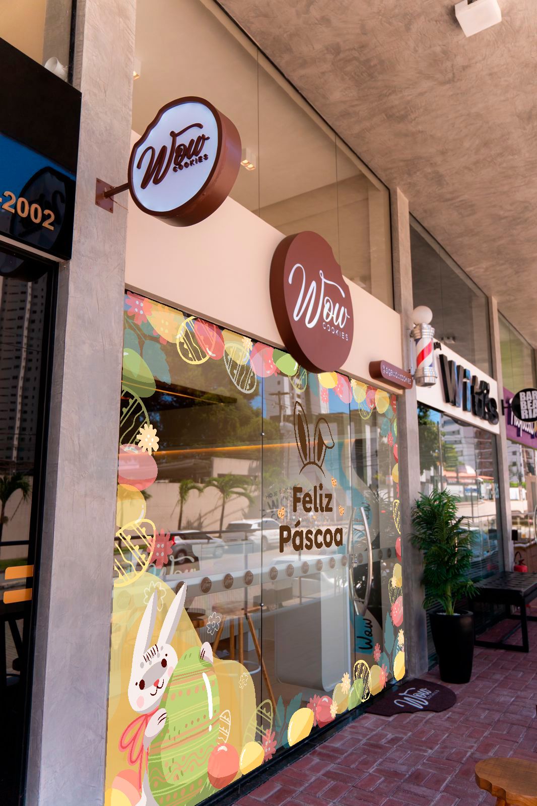
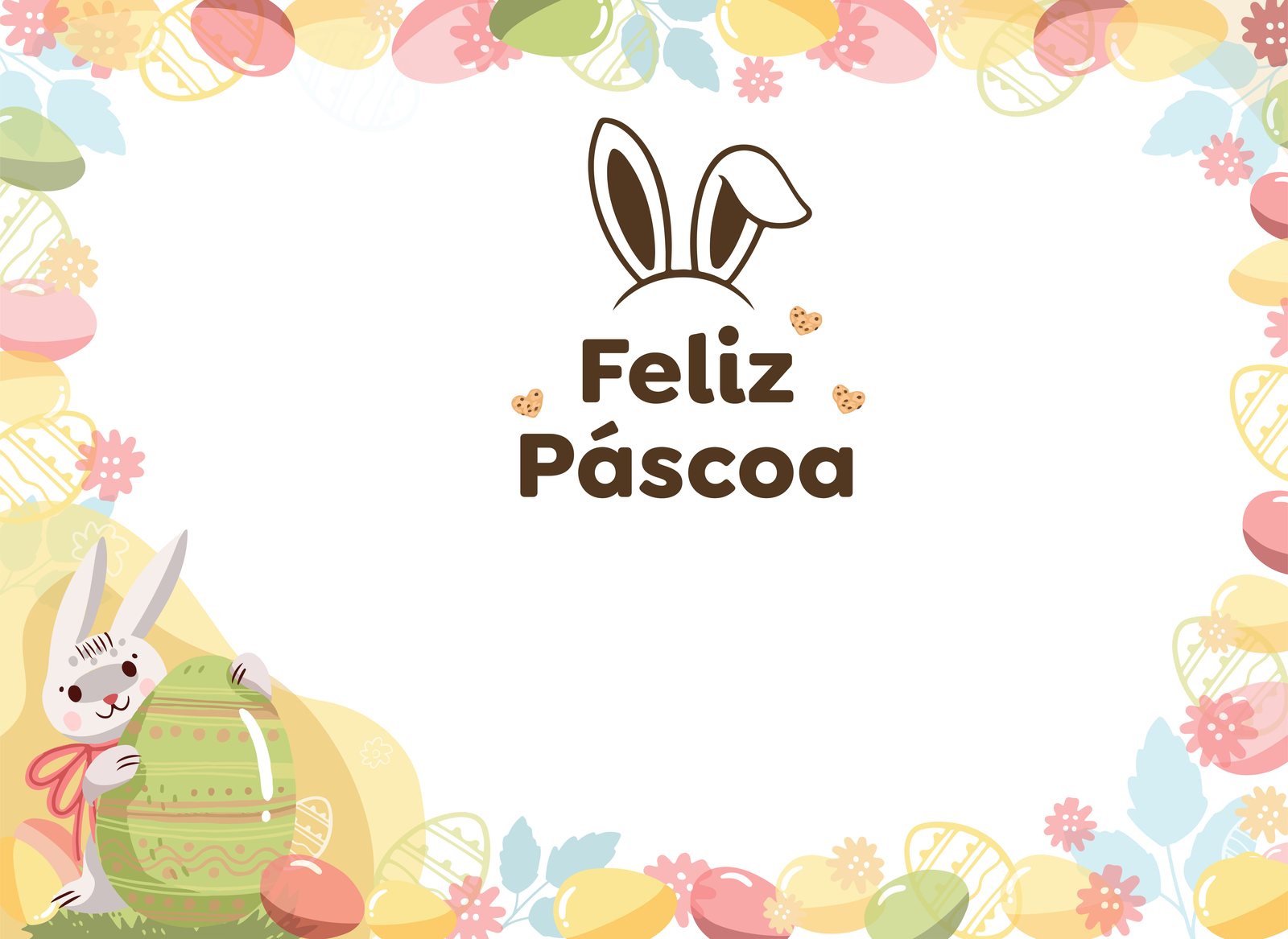
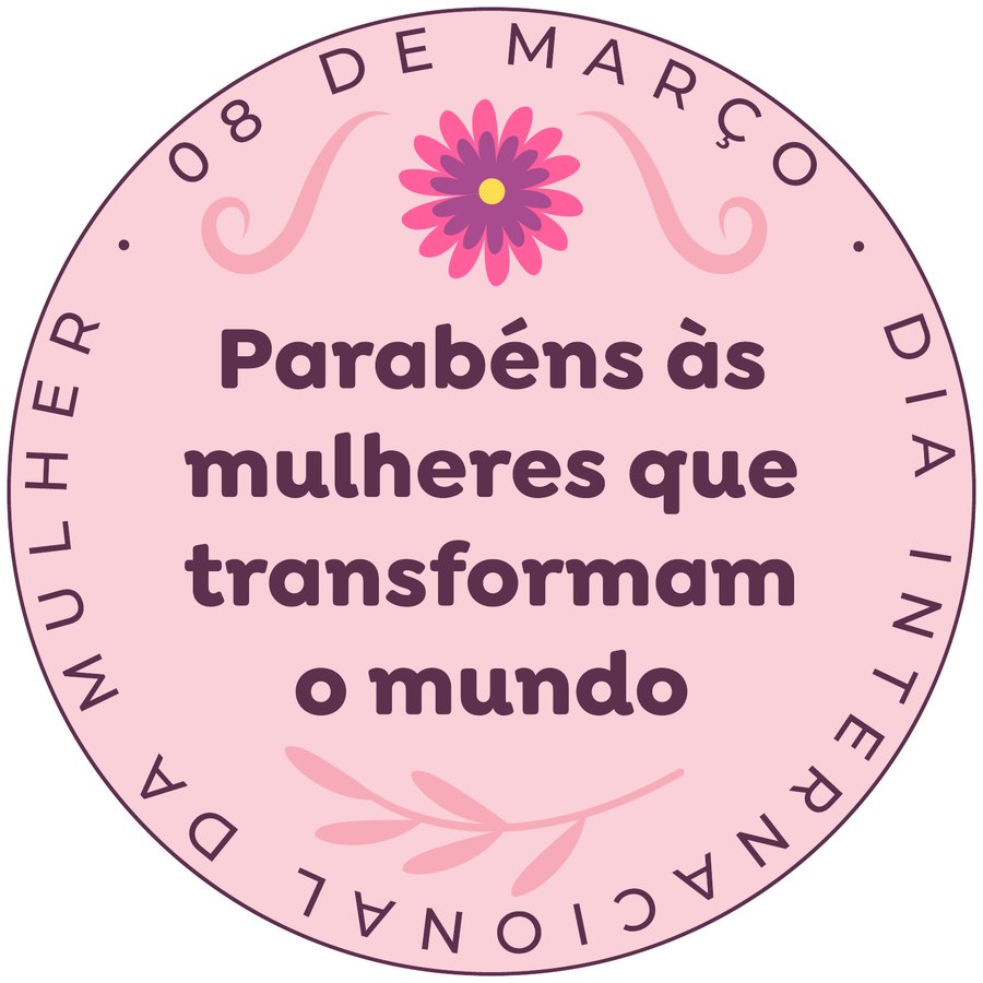
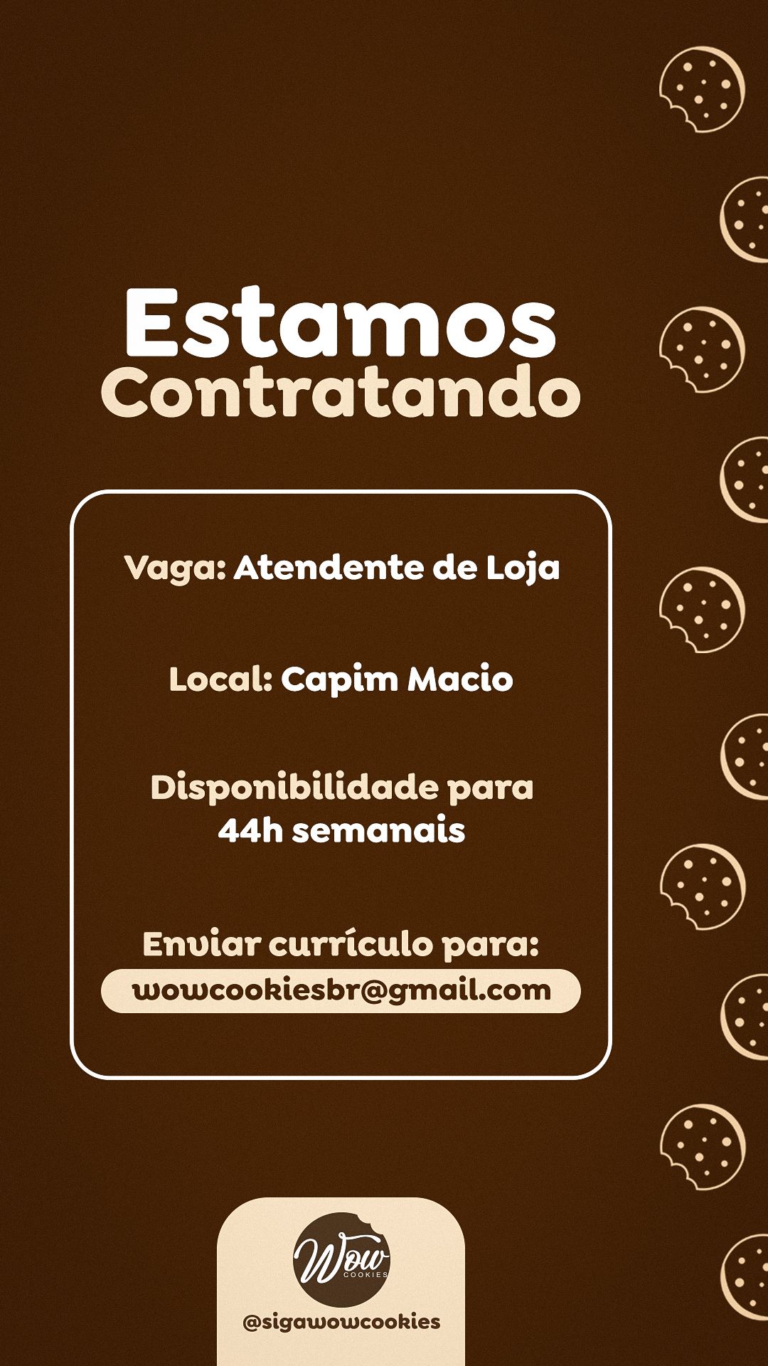
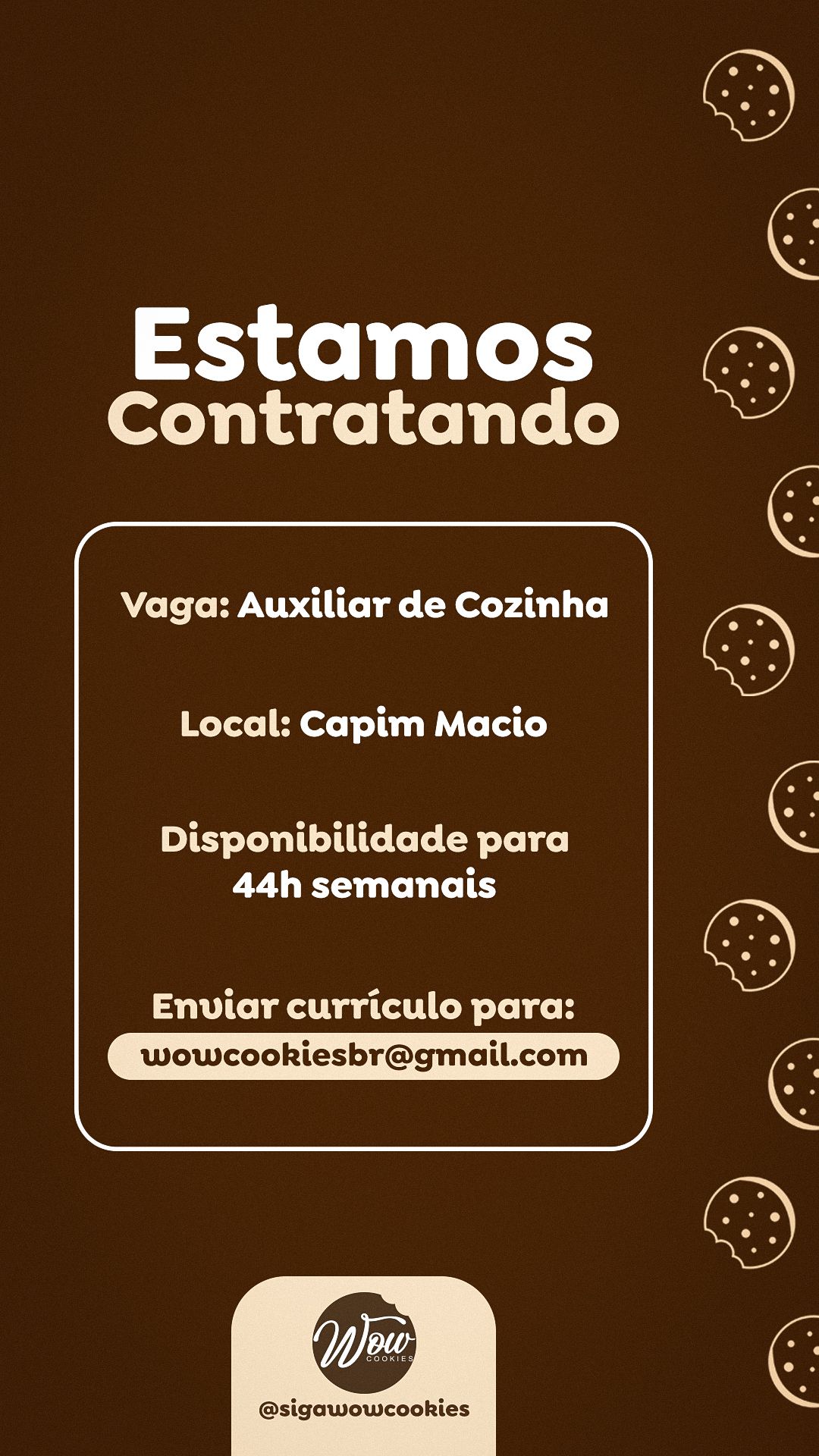
Beyond social media, I developed pieces for the point of sale and special dates: an Easter sticker for the window (vector art with pastel eggs, flowers and the bunny), a circular Women's Day gift tag and job openings for the team, in the brand's own style.
STAGE 06Carousels
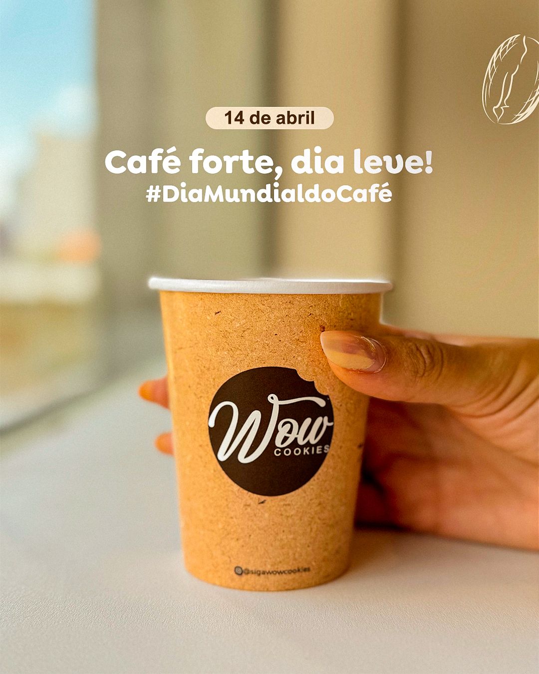
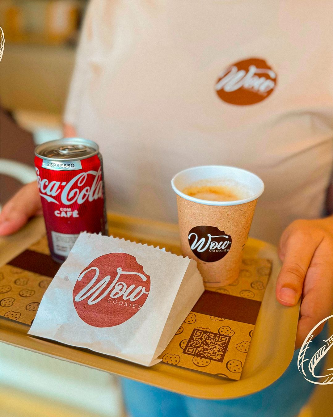
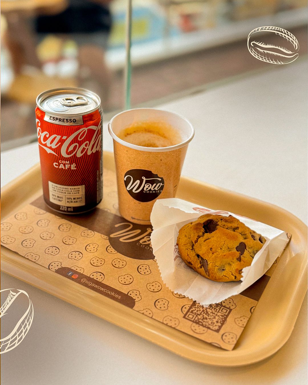
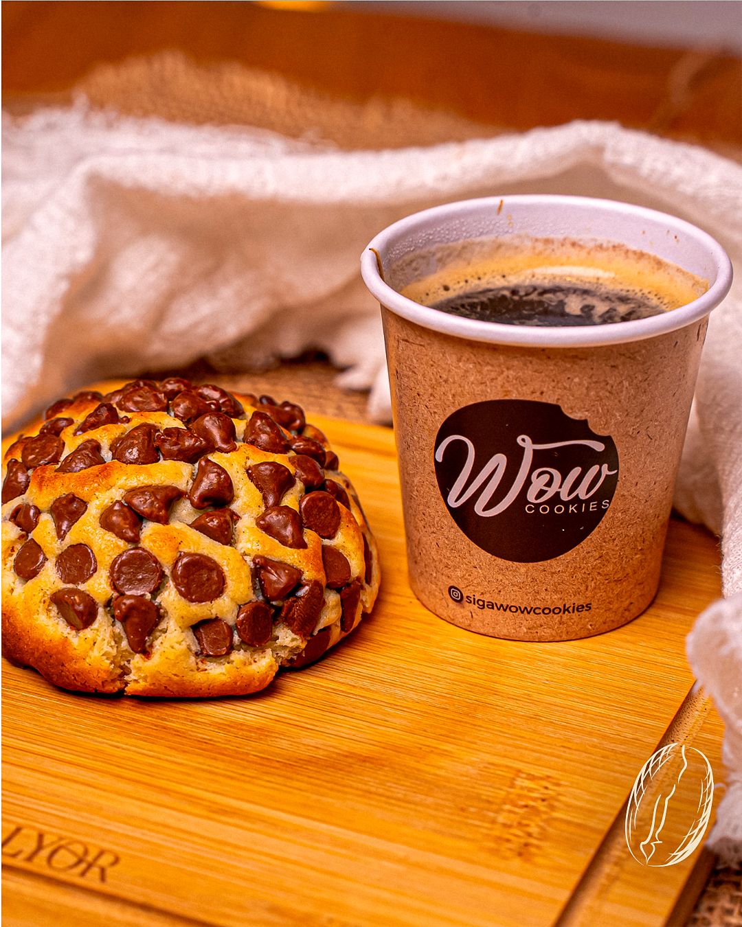
The carousels tell short product stories: egg flavors (one per slide, in the same frame), how to order (step by step with brown cards on a cream background) and World Coffee Day, which shows the brand in everyday life.
STAGE 07Color theory
The palette is almost monochromatic and warm: chocolate brown (hue ≈ 27°), caramel (≈ 33°) and cream (≈ 37°) sit on neighboring hues, which gives harmony. Brown and caramel echo the product itself (chocolate, baked dough) and warm tones stimulate appetite. Cream adds lightness and opens space for text.
Accent colors come from the product: the red of Red Velvet, the green of pistachio and the white of coconut enter through the photos. Since the background is warm and neutral, each flavor stands out without fighting the packaging.
- #3D1E05Marrom chocolateTexto, fundos escuros e marca
- #492505Marrom torradoVariação para cartões e títulos
- #876043Marrom médioMadeira, sombras e apoio
- #D79B52CarameloFundos quentes das fotos
- #F8E5C7CremeCartões de preço e fundos claros
| Pair | Use | Contrast | WCAG |
|---|---|---|---|
| Aa | Chocolate brown on cream (menus) | 12.28:1 | AAA |
| Aa | Cream on chocolate brown (job posts) | 12.28:1 | AAA |
| Aa | Chocolate brown on caramel | 6.28:1 | AA |
STAGE 08Typography
The brand combines a rounded geometric sans-serif (titles, prices and text), which conveys friendliness, with a handwritten script in moments of personality, like “Challenge”. The rounded type mirrors the cookie's shape and keeps reading friendly. Prices use heavy weight so they can be found quickly. The rounded family is Nunito (Google Fonts).